Contents
- Canvas Overview
- Properties View For Each Component
- Editor Commands
- Component Stamping
- Icon Decorations
- Side-by-Side Canvas Windows
- Multiple Canvas Windows on the Same File
- Renaming Components
- On-the-Fly Port Adding
- Automatic Port Deletion for Union Operator
- Navigating Your Component Selection History
- Component and Arc Layout Controls
- Commenting Out
- Quick Outline
- Compare Schemas
- Groups
- Notes
- Tooltips
The Editor tab of the EventFlow Editor contains the main editing canvas for EventFlow modules, on which you can graphically assemble the components of your module. The EventFlow Editor has several specialized features that help you edit modules and solutions composed of modules. Use the links in the contents above to navigate to each section.
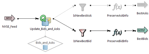
The figure below shows an EventFlow Editor canvas with one Map operator selected.
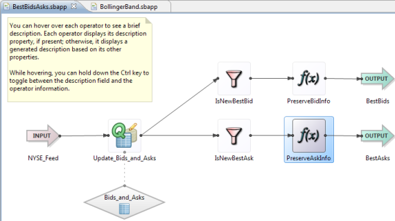
On the Editor canvas, you can:
-
Select a component to display and configure its properties. The currently selected component appears with blue highlighting.
-
Draw arcs connecting components to one another and to associate operators with data constructs. See Using Arcs.
-
Move components around to create an easier-to-follow arrangement.
-
Organize components into callable modules.
-
Group components into collapsible groups.
-
Add notes to document your application.
Each component in the Editor tab has an associated Properties view, where you can view and define the properties of the selected component. See Properties View for more on using the Properties view.
The commands that operate on components on the EventFlow Editor canvas are shown in EventFlow Editor Command Reference. The same command might have several ways to invoke it: from the Studio menus, a toolbar button, the context menu of the canvas, or a keyboard shortcut.
As an alternative to dragging components from the Palette view, you can use component stamping. Proceed as follows:
-
Click to select an icon in the Palette view.
-
Release the mouse button.
-
Click in the canvas to place the selected component.
-
Hold down the Shift key to place more than one copy of the selected component on the canvas.
-
Press Esc to clear stamping mode from the cursor.
Any operator icon that supports a Concurrency tab in its Properties view can show on the canvas with overlay decorations:
-
A concurrency setting of Run this component in a parallel region is marked by default with a circle within the tile boundaries. You can suppress the drawing of these circles with a Preferences setting.
-
A concurrency Multiplicity setting of multiple is shown with an overlaid number that reflects the number of instances specified.
Extension Point operator icons can also show a numeric decoration. In this case, the circled number represents the number of module instances defined in the operator's Modules tab in its Properties view.
 |
Studio supports alternate layouts of canvas windows within the EventFlow Editor view. You can arrange two or more canvas panels side-by-side or top-and-bottom, which allows you to see multiple canvas sessions at once.
To rearrange canvas windows, click the tab of an open canvas window and drag it toward the bottom or either side of the current
window. While dragging, the cursor changes into a multi-folder shape  . When the cursor nears the bottom or either side, it changes into a bold arrowhead. When that happens, drop the icon on either
side of the current canvas to place the selected Editor session on that side of a side-by-side view. Drop the arrowhead icon
on the bottom to create a top-to-bottom arrangement. You can continue to drag different Editor session tabs to different portions
of remaining windows to further subdivide the EventFlow Editor view.
. When the cursor nears the bottom or either side, it changes into a bold arrowhead. When that happens, drop the icon on either
side of the current canvas to place the selected Editor session on that side of a side-by-side view. Drop the arrowhead icon
on the bottom to create a top-to-bottom arrangement. You can continue to drag different Editor session tabs to different portions
of remaining windows to further subdivide the EventFlow Editor view.
You can also arrange canvas windows by right-clicking the tab of one window and selecting > from the context menu. Then drag the outline of the selected window to the side or bottom of an open window. When the cursor changes into a bold arrowhead, drop the window on the side or bottom. If you select >, you can drag the current collection of adjacent tabbed windows to a new location.
Your alternate window layout is preserved and restored when you close and reopen Studio.
StreamBase Studio provides limited support for opening more than one EventFlow Editor session on the same EventFlow file. To do this, with the first Editor window open, open a second panel using either of the following methods:
-
With the first Editor session active, select > from Studio's top-level menu.
-
Right-click the tab of the first Editor session and select from the context menu.
When working with large EventFlow modules, using two windows allows you to scroll to different portions of the same canvas at 100% zoom or larger, each portion in its own window. Or, you can open the Definitions or Parameters tab in one window while viewing the canvas of the same module in another.
You can switch between the two windows at will, and can edit the same EventFlow module in either window. However, make it a practice to edit and save changes only in one of two windows open on the same file. Studio provides no version tracking for different sets of changes made to the same file in two windows.
When you save the changes made in the first window, the next time you click to open the second window, Studio prompts:
The file filename.sbapp has been changed on the file system.
Do you want to load the changes?
Click in the prompt dialog. Studio closes the second Editor window, reloads the newly saved file from disk, then reopens the second window.
If you click in the prompt dialog, or if you end up making changes in both windows, only the changes from the last saved window are preserved.
When using two windows on the same module file, you can drag one of the two to the side or bottom of the other to form side-by-side or top-and-bottom views of the same file. However, when you save changes in one window, and Studio prompts to reopen the second window, Studio closes and reopens the second window's tab next to the first window's tab at the top of the EventFlow Editor view, losing the side-by-side or top-and-bottom arrangement. You can immediately select and re-drag the second window's tab to its alternate arrangement.
To rename a component or group directly on the canvas, select the component or group, and then click its name or press F2 (Windows) or, press Enter (macOS). In the cell editor that appears, type a new name. You can also invoke the rename cell editor by invoking Rename from the canvas context menu.
When you press Enter to close the edit window, the component remains selected so that you can continue to configure its properties, if desired. You can also press Tab to jump to the next component in the downstream flow and open a rename edit window for that component.
F2/Enter renames the component in the local module only, and does not propagate the name change. You can also rename a component and at the same time propagate the name change to all modules and expressions that reference that component in the current module search path. To do this, use > from the selected component's context menu instead of F2 or Enter.
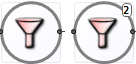
For operators that have a user-controlled number of ports (including Split, Union, Filter, Gather, and Pattern), you can drag an arc to or from a hover port that appears in gray in the bottom right corner while the mouse hovers over the operator. The hover port for a Filter operator is circled in red in the following illustration:
 |
Drag an arc from the hover port to another component, or drag an arc from another component and drop it onto the hover port. This creates a new input or output port for that operator automatically.
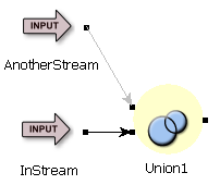
When you delete an arc entering a Union operator, or you delete the component immediately upstream of such an arc, the corresponding input port is automatically removed from the Union operator, and the count of input ports on the Union Settings tab of that operator's Properties view is decremented.
Studio keeps a history of the selections you make among individual components in the EventFlow canvas. You can use Alt+Left to move backwards in that selection history, and Alt+Right to move forward. These keys go back or forward to the previous or next selected component in the history, even if that selection is in another EventFlow tab.
You can also navigate your selection history using the yellow left and right arrows in the main Studio toolbar. Use the dropdown arrows next to these arrow icons to see your navigation history in list form. Select a location in the list to navigate directly to that location.
 |
The EventFlow Editor provides commands to automatically rearrange your EventFlow canvas:
-
The Rearrange components and arcs function (
 button on the main Studio toolbar, or Ctrl+L on Windows, or command+L on macOS) rearranges all components and arcs on the current canvas for the best and clearest left-to-right layout, then runs
the Reroute Arcs function. By default, this function uses animation to show components moving. You can disable animation in Studio Preferences.
button on the main Studio toolbar, or Ctrl+L on Windows, or command+L on macOS) rearranges all components and arcs on the current canvas for the best and clearest left-to-right layout, then runs
the Reroute Arcs function. By default, this function uses animation to show components moving. You can disable animation in Studio Preferences.
With no components selected, the function acts on the canvas as a whole. With two or more adjacent components selected, this function rearranges only those components, then centers the EventFlow canvas on them.
The rearranging algorithm implemented by this function tends to pull data constructs to the left of their associated Query operators.
-
The Reroute Arcs function (
 button on the main Studio toolbar, or Ctrl+Alt+L on Windows, or command+Option+L on macOS) routes arcs around components, using curves and bends in the arcs as needed. Only connection arcs (solid lines)
are affected; dotted line association arcs are not.
button on the main Studio toolbar, or Ctrl+Alt+L on Windows, or command+Option+L on macOS) routes arcs around components, using curves and bends in the arcs as needed. Only connection arcs (solid lines)
are affected; dotted line association arcs are not.
With one or more arcs selected, this function acts only on the selected arcs. With no arcs selected, it acts on all arcs on the current canvas.
Use this function when you are satisfied with the component layout of the current canvas, but want to add curved arcs to it.
-
You can route arcs manually by adding shape points to them. Select an arc and drag the handle that appears at the center of the arc. New handles appear on either side of those you displace to let you refine the arc's shape. For more information, see Changing the Shapes of Arcs.
You can comment out or disable a branch of an EventFlow module. You might do so when trying to isolate a problem, or you might disable portions of a module during development that are only needed at deployment time.
Disable an arc by selecting Disable Arc from the context menu. Re-enable with Enable Arc on the context menu of a disabled arc. You can also select an arc and press Ctrl+/ (Windows) or command+/ (macOS). This keyboard shortcut is a toggle, so you can use it to quickly disable and re-enable arcs and components.
Disabling an arc prevents tuples from reaching the end of the arc, and automatically disables all downstream components. Disabled arcs can still have breakpoints. Disabled components are shown dimmed in gray on the EventFlow canvas, as in the following example:
 |
You can disable components with Disable Component from the context menu. This disables all of the selected component's input and output ports, and all components downstream.
If a component has more than one input port and you disable one port, the component is partially disabled and still processes tuples through any enabled ports. Partially disabled components appear in the canvas marked with a light yellow background, as in the following example:
 |
Quick Outline is a pop-up summary of the components in the current EventFlow module, and is a quick alternative to the Outline view. Use the Quick Outline feature to:
-
See a summary of any component or its schema
-
Navigate quickly in a large EventFlow diagram
To open a Quick Outline for the currently active EventFlow view, use one of these methods:
-
Press Ctrl+O (Windows) or command+O (macOS)
-
Right-click in the EventFlow canvas and select .
-
In the StreamBase Studio menu, select >.
The Quick Outline pop-up window has two panes:
- Left Outline pane
-
The left pane contains a tree of component types, which you can expand to see instances of each type. Use the mouse or keyboard arrow keys to navigate the tree. Click a component instance to display a summary in the right pane.
Use the text entry field at the top of the left pane to filter entries. As you begin typing, the list displays (after a short delay) the first item that matches. You can enter simple strings or patterns, using the StreamBase Pattern Matching Language. After you type anything in the filter edit box, you can use the Clear button on the right to clear the edit box and restore the full component tree.
- Right Outline pane
-
The summary pane on the right describes the currently selected component, including its schema fields, group settings, and any typecheck problems detected.
To navigate with the Quick Outline window, use the component tree or edit field to locate a component of interest. When located and selected, press Enter. This closes the Quick Outline, centers the EventFlow diagram on the selected component, and, if necessary, increases the zoom factor so that the selected component is clearly visible.
To close a Quick Outline, press Esc, or change focus to anywhere in StreamBase Studio outside the Quick Outline.
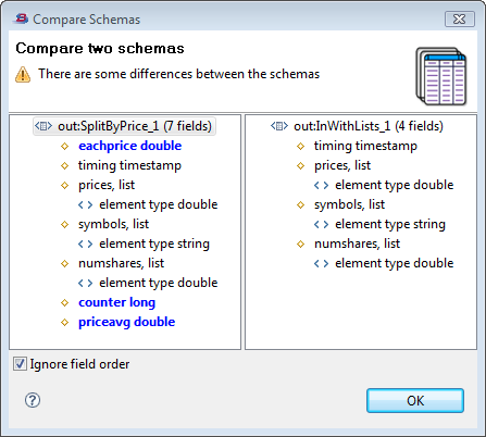
To compare the schemas of two arcs or two streams in the canvas, hold down the Ctrl key (Windows) or command key (macOS) and select two arcs or two streams. Comparing schemas is best used on closely related schemas, such as an old and new version of the same schema. The comparison is more meaningful if one of the selected arcs or streams is downstream of the other in the same flow of tuples.
With two arcs or streams selected, right-click and select Compare Schemas from the context menu. Compare Schemas only appears in the context menu under these selection conditions.
This opens the Compare Schemas dialog, which shows a side-by-side view of the schemas of the two selected components. Use this feature to see what fields are added or removed in schemas as tuples flow downstream. Select the Ignore field order checkbox to compare for the presence of fields by name, regardless of field order.
 |
You can group collections of components on your canvas, drawing a box with a colored background around the selected components. With a group in place, you can collapse the contents of the group to a single icon on the canvas.
Groups are a visual tool that can help you edit large modules more efficiently, but they do not affect the functionality or logic of your module. See Using Groups for more on groups.
To document your EventFlow modules, you can add Notes. Notes can attach to the EventFlow canvas, to individual components, to two or more components selected together, or to groups. It is even possible to attach a Note to another Note. See Using Notes for more on notes.
For quickly viewing properties without modifying them, StreamBase provides an extensive set of tooltips. If tooltips are enabled (the default setting), StreamBase Studio displays key properties for each component when you hover your cursor over it (sometimes called mouseover). The contents of each tooltip depends on the component type and the location of the cursor on the component's icon.
This section describes how properties of some components are shown using tooltips. In the screens that follow, the relevant component is indicated by the mouse pointer. The subsections are:
Here are some examples of tooltips for different operators. Notice how the information varies with each operator.
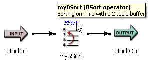 |
For the Bsort operator, the tooltip shows its name, component type, and describes the sort operation defined.
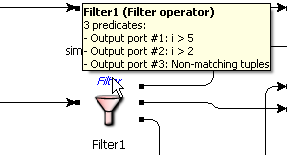 |
For the Filter operator, the tooltip displays the predicate (boolean expression) that corresponds to each output port.
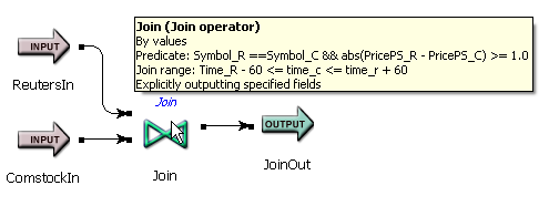 |
For the Join operator, the tooltip tells you that the join is by value (instead of by tuples), shows the predicate (boolean expression) to be applied, and all the other settings defined in the Properties view.
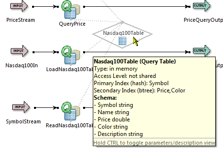 |
For the Query Table, the tooltip tells you the location of the table's storage (in heap, disk, or transactional memory), as well as its index fields and schema.
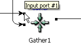
Each port on a component is depicted as a black square. The tooltip for an input port on the left side or an output port on the right side displays the port's number. For example:
 |
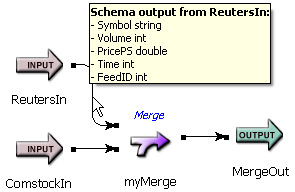
The tooltip for an arc between components displays the schema of the tuples on that arc (if known). For example:
 |
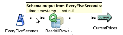
In some arc tooltips, the text not null is appended to fields that cannot have a null value. The text is informational, not part of the actual field name or value.
In the example below, the timestamp field coming out of the Heartbeat operator will always have a value. In the output stream's
tooltip, the same field would not have this text, because it is possible for the intervening operator to change it to a null
value.
 |
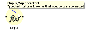
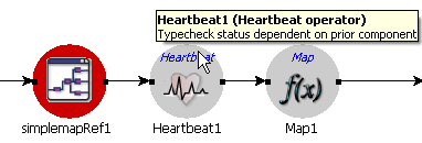
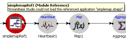
If a component has a yellow, gray, or red background, its tooltip displays a relevant error message. For example:
-
Yellow background when the schema compatibility is unknown (for example, the component has not yet been connected to another component):
-
Gray background when a prior (upstream) component has a typecheck error or was disabled:
-
Red background (typecheck failure):
For more information about typechecking, see Typechecking.
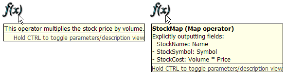
If you have added comments in the General tab of the Properties view of a component (which is a good documentation practice), the tooltip displays those comments by default instead of the component's properties. To display properties, press and hold the Ctrl key on both Windows and macOS. To toggle back to comments, release Ctrl. The following example illustrates:
 |