Formatting Axis Labels
|
In this section: |
Vertical and horizontal axes are based on the orientation of the visual. For example, in a vertical visual, the horizontal axis refers to the X axis and the vertical axis refers to the Y axis. In a horizontal visual, the horizontal axis refers to the Y axis and the vertical axis refers to the X axis. This is important to consider, since options could change depending on the orientation of the visual.
A chart can contain the following types of axis labels:
- Horizontal axis labels represent the X axis.
- Vertical axis labels represent the Y1 axis in a single axis chart. They represent a numeric scale, usually located on the left side of a vertical chart.
- Secondary horizontal and vertical labels can only be used when dual axes charts are selected.
Format Axis Dialog Box
|
Reference: |
The Format Axis dialog box includes options for formatting both vertical and horizontal axes. The Format Axis dialog box contains the following tabs:
- General (for horizontal axes)
- Scale (for vertical axes)
- Title
- Labels
- Advanced
Reference: Format Vertical Axis Dialog Box
You can use the Format Vertical Axis dialog box to specify formatting options for the vertical axis in your chart.
Use the Scale tab to modify scale properties.
The Scale tab contains the following options:
- Automatic Minimum. Supplies the minimum value on the
Y-axis scale automatically. To use manual scaling, clear this option.
You can then set the minimum value by entering a number into the
Value text box.
- Value. Type the minimum value in this text box if you have not selected Automatic Minimum.
- Automatic Maximum. Supplies the maximum value on the
Y-axis scale automatically. To use manual scaling, clear this option.
You can then set the maximum value by entering a number into the
Value text box.
- Value. Type the maximum value in this text box if you have not selected Automatic Maximum.
- Automatic Grid
Step. Calculates the number of major grid steps automatically.
To use manual scaling, clear this option. You can then set the
value by typing the number into the Value text box.
- Value. Type the value in this text box if you have not selected Automatic Grid Step.
- Logarithmic Scale. Controls whether or not the Y-axis scale progresses logarithmically instead of linearly. This option is disabled by default. When selected, the logarithmic base is set to 10.0, but can be changed by entering another value.
- Include zero on scale. Controls whether or not a zero (0) value appears on the scale. This option is enabled by default.
When working with vertical axis options in InfoAssist, the Include zero on scale check box is cleared by default when setScaleMustIncludeZero() is not present in the StyleSheet. When this setting is not present, the value is false. The TIBCO WebFOCUS® Reporting Server, however, sets the value to true. This produces inaccurate results at run time.
To resolve this issue, add the setScaleMustIncludeZero() setting to the StyleSheet. For example, setScaleMustIncludeZero(getY1Axis(),true);
You can also select the Include zero on scale check box in the Format Vertical Axis dialog box, which can be accessed from the Axes option in the Labels group on the Format tab, and then clear it. This writes the setting into the FOCEXEC and sets the value to false. Select the check box for this option again to set the value to true.
Use the Title tab to show or hide the axis title, and create and style the title for the axis.
The Title tab contains the following options:
- Show title. Select this check box to show the axis title (default) or clear the check box to hide the axis title.
- Text. Enter a title for the axis.
- Style text. Opens the Style dialog box, where you can style the text.
Use the Labels tab to format the layout of the axis labels.
The Labels tab contains the following options:
- Show Labels. Displays
labels next to the axis. This is enabled by default. Clear this
option to suppress labels.
- Axis side. Contains a list of position options for the labels on the axis. The options are Left (default), Right, or Both.
- Style labels. Opens the Style dialog box, where you can style text.
- Format Labels. Contains a list of preset formats that can be applied to the labels.
- Custom Format. Allows you to use a custom format. This option is activated when Use Pattern /100 and Use Pattern are selected as the format labels.
The Format Labels drop-down menu provides a list of preset formats that you can apply to labels. When you select a custom format, it must be defined using a custom format pattern. See the following table for a list and description of the characters that you can use in a custom format.
|
Character |
Description |
|---|---|
|
# |
Is a digit. |
|
0 (zero) |
Shows as absent. |
|
. (period) |
Is a placeholder for a decimal separator. |
|
, (comma) |
Is a placeholder for a grouping separator. |
|
; (semicolon) |
Separates formats. |
|
- (dash) |
Is the default negative prefix. |
|
% (percent) |
Divides by 100 and shows as a percentage. |
|
x |
Determines that any other characters can be used in the prefix or suffix. |
|
‘ (apostrophe) |
Is used to quote special characters in a prefix or suffix. |
Use the Advanced tab to modify additional axis properties.
The Advanced tab contains the following options:
- Exclude Minimum Label. Excludes the label with the lowest axis value from the chart.
- Exclude Maximum Label. Excludes the label with the highest axis value from the chart.
- Descending Axis. Draws the axis in descending order.
- Show axis line. Controls the display of the axis baseline.
- Line Style. Opens the Line Style dialog box, where you can edit the color, weight, and style of the axis line.
- Show zero line. Controls the display of the zero line.
- Line Style. Opens the Line Style dialog box, where you can edit the color, weight, and style of the zero line.
- Custom Baseline. Controls the display of the custom baseline.
- Value. Type a value for the custom baseline.
- Line Style. Opens the Line Style dialog box, where you can edit the color, weight, and style of the custom baseline.
For instructions on how to open this dialog box, see the procedures in Using Axis Properties.
Reference: Format Horizontal Axis Dialog Box
You use the Format Horizontal Axis dialog box to specify formatting options for the horizontal axis in your chart.
The General tab contains the Show axis line check box, which controls the display of the axis line. When this check box is selected, you can style the axis line.
The General tab contains the following options:
- Show axis line. Enables
the display of the axis line.
- Line Style. Opens the Line Style dialog box, where you can edit the color, weight, and style of the axis line.
Use the Title tab to create and style the title for the axis.
The Title tab contains the following options:
- Show title. Enables the display of the title.
- Text. Type a title for the axis.
- Style. Opens the Style dialog box, where you can style the text.
Use the Labels tab to format the layout of the axis labels.
The Labels tab contains the following options:
- Show Labels. Displays
labels next to the axis. This is enabled by default. Clear this
option to suppress labels.
- Axis side. Contains a list of position options for the labels on the axis. The options are Left (default), Right, or Both.
- Style labels. Opens the Style dialog box, where you can style text.
- Stagger Labels. Sets the labels to appear staggered.
- Concatenate Labels. Concatenates the labels in your visualization. This is enabled by default.
Use the Advanced tab to modify additional axis properties.
The Advanced tab contains the following options:
- Exclude Minimum Label. Excludes the label with the lowest axis value from the chart.
- Exclude Maximum Label. Excludes the label with the highest axis value from the chart.
- Reverse Groups. Reverses the order of the display of the groups on the horizontal axis.
For instructions on how to open this dialog box, see the procedures in Using Axis Properties.
Using Axis Properties
|
How to: |
The following sections contain procedures for customizing an axis. The procedures are organized by the tab and group in which their associated options appear on the ribbon.
Axis labels appear by default.
Procedure: How to Hide Axis Labels
- Create a chart.
- On the Format tab, in the Labels group,
click Axes, point to the axis that you are
working with, and clear the Show Labels option.
The axis labels are hidden from the chart.
Procedure: How to Stagger Axis Labels
Note: You can only apply a staggered effect to horizontal axis labels.
- Create a chart with at least one horizontal axis label on display.
- On the Format tab, in the Labels group,
click Axes, point to Horizontal
Axis, and click Stagger Horizontal Labels.
The axis labels are staggered.
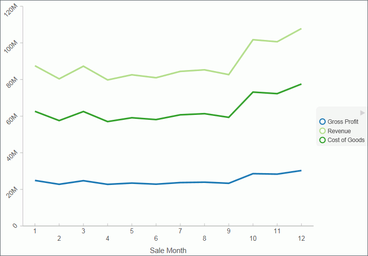
The following image shows a chart with the horizontal axis labels staggered.

Procedure: How to Rotate Axis Labels
- Create a chart with axis labels.
- On the Format tab, in the Labels group,
click Axes, point to the axis that you are
working with, point to Rotate Labels, and
then select the degree to which you want to rotate the axis labels.
The axis labels are rotated.
The following image shows a chart with the vertical axis labels rotated 45 degrees.

Procedure: How to Format Axis Labels
- Create a chart with an axis label.
- On the Format tab, in the Labels group,
click Axes, point to the axis that you are
working with, and click More Vertical Axis Options,
or More Horizontal Axis Options.
The Format Axis dialog box opens.
- Click the Labels tab.
- From the Format Labels list, select the formatting option
that you want.
The axis labels are formatted accordingly.
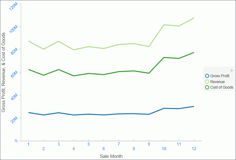
The following image shows a chart with the vertical axis label styled in blue Arial font.

Procedure: How to Manually Set the Scale of an Axis
Note: You can only set axis scale to vertical axis labels.
- Create a chart.
- On the Format tab, in the Labels group,
click Axes, point to Vertical
Axis, and click More Vertical Axis Options.
The Format Axis dialog box opens.
- On the Scale tab, clear the Automatic Minimum option and enter your own minimum value in the Value text box.
- Clear the Automatic Maximum option, and enter your own maximum value in the Value text box.
- Clear the Automatic Grid Step option, and enter your own grid step value in the Value text box.
- Optionally, you can select the Logarithmic Scale option and enter the log scale base in the text field of that name. You can also clear the Include zero on scale option if you do not want zero to appear on the axis.
- Click OK to close the dialog box.
The axis scale is set accordingly.
Procedure: How to Add an Axis Title
- Create a chart with an axis label.
- On the Format tab, in the Labels group,
click Axis, point to the axis that you are
working with, and click More Vertical Axis Options,
or More Horizontal Axis Options.
The Format Axis dialog box opens.
- On the Title tab, type the axis title in the Text field.
- Click the Style text icon to open
the Style dialog box, where you can style the text.
The axis title is styled accordingly.
The following image shows a chart with titles added to the vertical and horizontal axis labels.

Procedure: How to Set Advanced Axis Properties
- Create a chart with an axis label.
- On the Format tab, in the Labels group,
click Axes, point to the axis that you are
working with, and click More Vertical Axis Options,
or More Horizontal Axis Options.
The Format Axis dialog box opens.
- On the Advanced tab, set the following options, as described
in the following table:
Options
Available for Vertical Axis Labels
Available for Horizontal Axis Labels
Exclude Minimum Label


Exclude Maximum Label


Descending Axis


Show axis line


Show zero line


Custom Baseline (Value)


Reverse Groups


You can edit the color, weight, and style of all the lines that you set in the Line Style dialog box.
- Click OK.
The axis advanced options are set accordingly.
Formatting Data Labels
|
How to: |
Data labels highlight important data points on a chart. They identify exact numbers. You can customize data labels in a variety of ways to make them stand out more clearly on the chart. For example, using the Format Labels dialog box, you can change the position, angle, color, or size of data labels.
Note: The Format Labels dialog box offers different options depending on the chart type that you are using.
Procedure: How to Access the Format Legend Dialog Box
The Format Legend dialog box contains options for formatting a legend on a chart.
- Create a chart.
- On the Format tab, in the Labels group,
click Legend, and then click More
Legend Options.
The Format Legend dialog box displays.
- Use the following options to modify your legend:
- Legend Options. This allows you to set options for showing or hiding the legend, setting the legend position, and showing the legend in reverse order.
- Markers & Labels. This allows you to set Marker Style and Position. It also lets you stylize labels using a Style editor.
- Fill. Determines how items in the legend will be filled. Options include No Fill, Solid Fill, or Gradient Fill. The default is No Fill.
- Border Styles. Enables you to activate the display of a border for your legend. You can also specify a color.
Formatting the Legend
|
How to: |
A legend contains information that is necessary to accurately interpret the data on a chart. By default, a chart displays either a vertical axis title if there is a single measure field, or a legend if there are multiple measure fields.
You can use the Format Legend dialog box to format the legend and customize its appearance on a chart.
Procedure: How to Access the Format Labels Dialog Box
- Create a chart.
- On the Series tab, in the Properties Group,
click Data Labels, and then click More
Data Label Options.
The Format Labels dialog box opens.
Formatting a Series
|
How to: |
A series is a measure field that is included in a chart. You can format a series in a variety of ways. For example, you can change the color of a series or change the appearance of markers on a series.
Procedure: How to Change the Appearance of a Marker
Markers are used to display points of data on a line chart. They are also used in the legend to identify the data that is on the chart. The different marker shapes distinguish one series from another.
- Create a line chart.
- Select a series on the line chart.
- On the Series tab, in the Line group, click Marker,
then select the marker shape.
The markers are formatted.
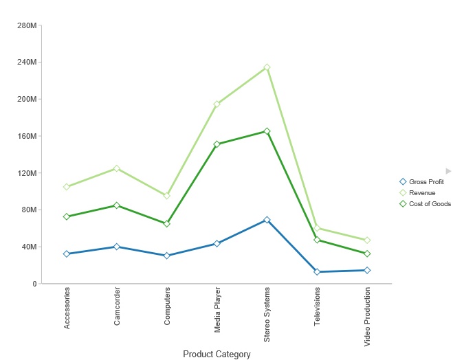
The following image shows a diamond marker for Product Category.

Formatting and Display Tools for Data in a Visual
When working with visualizations, you can use various filtering and editing tools to format the display of measure and dimension data in any given visual. For example, for measures, you can use the Edit Format option to set the display of decimals in the values of your selected measure. For measures and dimensions, you can add filters to limit the display of information. These options, which can be found on the right-click menu of a field, are defined and described in the following table.
| Option | Description |
|---|---|
|
Filter Values |
Creates a filter for the selected measure or dimension. You can select all values or only the one the data values that you want to display. In this way, you can exclude unwanted data. For visualizations, prompts are created, by default. However, you can clear this option when setting your filter options. This option displays for both measures and dimensions. |
|
Sort |
Enables you to set sorting options for the measure or dimension that you select. For example, you can sort your data values in ascending or descending order, or you can set limits for the display of information, the value for which is set to No Limit, by default. This option displays for both measures and dimensions. |
|
Visibility |
Controls the display of the selected measure or dimension in a visual. The default value is Show, but if you set the option to Hide, the values are hidden from the visual. This option displays for both measures and dimensions. |
|
Change Title |
Enables you to edit the title of the measure or dimension. In the Edit Title dialog box, type the new title in the Enter Title field, and click OK. Depending on the axis that you select, the new label will be applied accordingly. This option displays for both measures and dimensions. |
|
Edit Format |
Enables you to change the format of a field. This includes field type, display options, field length, and the specification of applicable decimal points. For more information, see Changing a Field Format. This option displays for measure fields only. Note: Any changes to the format of a field will be reflected in the tooltip for visualizations at design and run time. |
|
Drill Down |
Opens the Drill Down dialog box, where you can create multiple drill down links on a data field to external procedures or websites. This option is available for any measure field in a visualization. |
|
More |
Provides access to Aggregation functions, which enables you to apply Aggregation functions (for example, Sum, Average, and Count) to the numeric field that you select. This option is only available for measure fields. This option displays for both measures and dimensions. |
|
Delete |
Deletes the selected field. This option is available in every field container. Note: In the Query and Filter panes, you can select and delete multiple data fields at one time. Press the Ctrl key, select two or more data fields, right-click, and then click Delete. |
|
Create Group |
Allows you to create a group of elements based on the field data type that you select. Once you define a new group, a higher-level field is created that contains the selected elements. This option is available for dimension fields of non-numeric format or attribute. For more information, see Dynamic Grouping. |
