In this section: |
How to: |
WebFOCUS Designer is divided into a Data tab, which provides options to prepare, profile, and join your data sources, and a Visualization tab, where you can create charts and reports using that data and arrange your content on a page. When creating a visualization with existing content, only the Visualization tab is available, since you do not specify a data source.
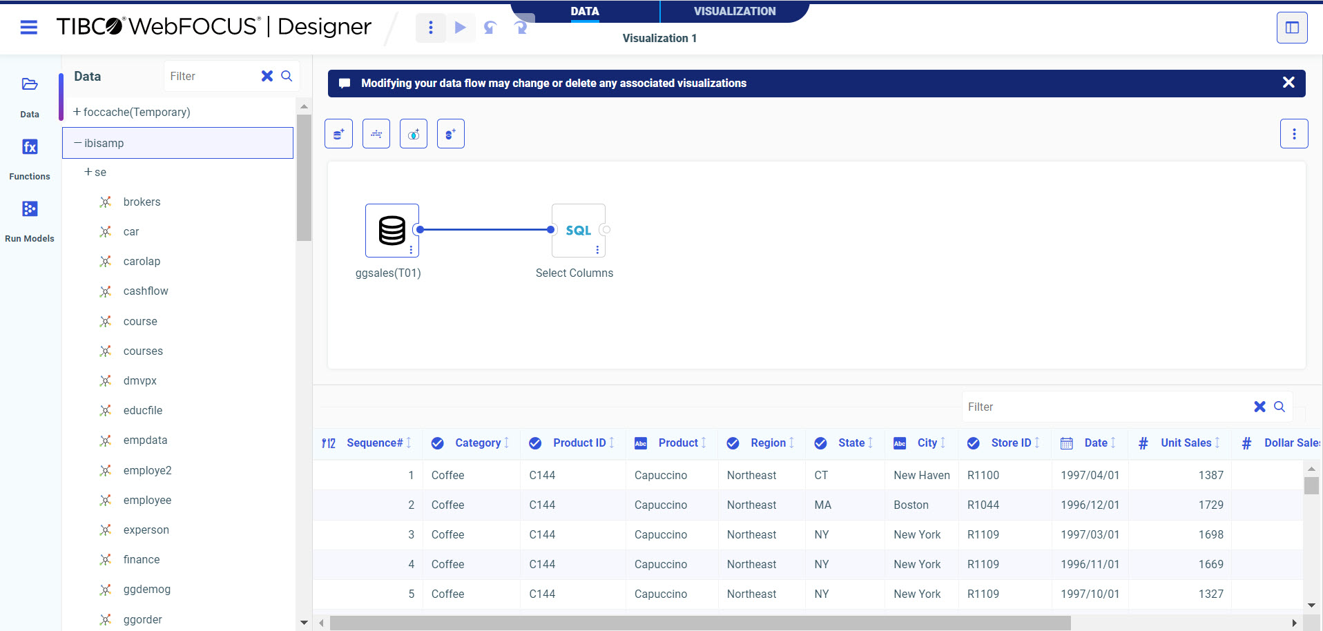
In the Data tab you can create and define a data flow. A data flow contains the parameters for extracting information from data sources and loading it into data targets. Modifying your data flow may change or delete any associated visualizations from the Visualization tab.
The WebFOCUS Designer Data tab with a data source on the canvas is shown in the following image.
The Data tab includes the following tools and components.
Note: Before deleting a recursive Join (when a table is joined to itself) you must remove any fields with active content from the first instance of the table.
To create joins in WebFOCUS Designer, drag a synonym from the Resources tree onto a synonym in the canvas to which you want to create a join. A join is created automatically based on common field names and values, but you can change the default join using the Join Configurator. For more information, see Joining Data.
In this section: |
The data flow defined in the Data tab is used to create content in the Visualization tab. In the Visualization tab, you can create charts and reports and arrange them on a page in different types of containers, or you can create a visualization from charts, reports, images, and more that you have created and saved previously. If you are creating a visualization with existing content, you can access items in your workspaces and add them to your visualization.
To create a visualization with new content, on the WebFOCUS Hub, click the plus button and then click Create Visualizations. Alternatively, on the WebFOCUS Home Page, click Visualize Data, or click the plus button and then click Create New Visualization. To assemble existing content into a visualization, click the plus button on the Hub or Home Page and then click Assemble Visualizations.
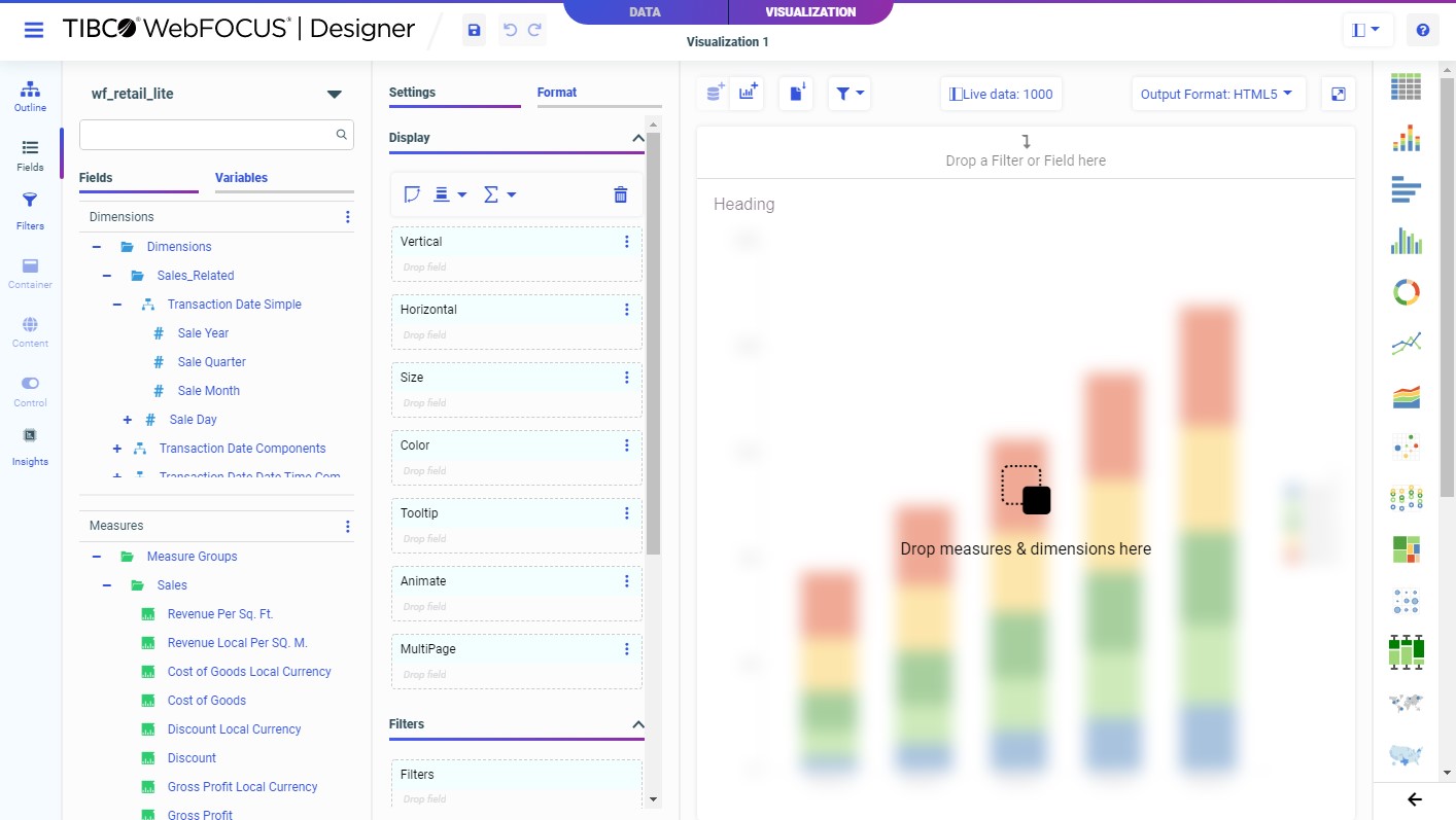
The Visualization tab displays, as shown in the following image.
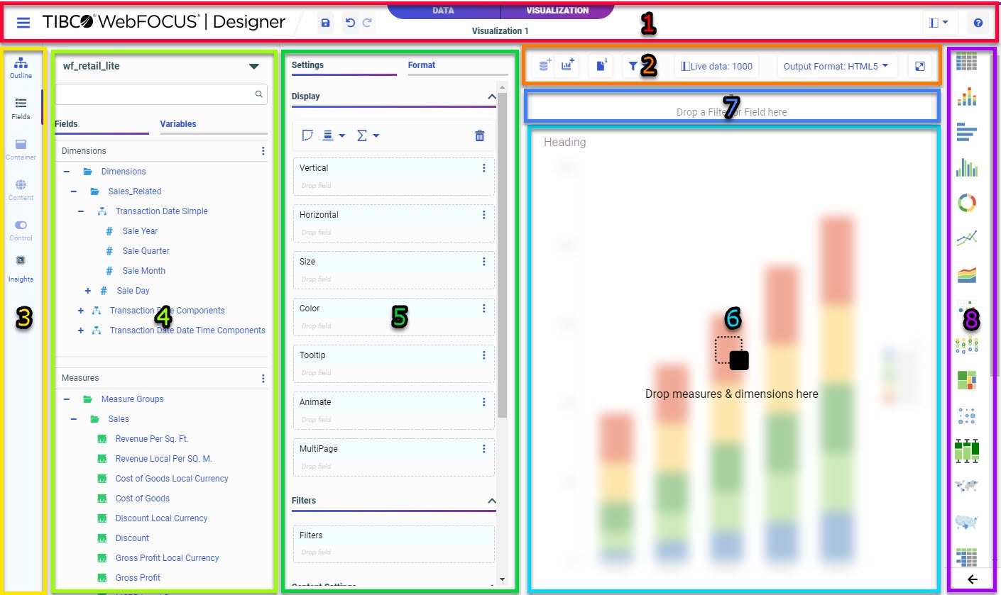
The Visualization tab includes the following tools and components.
The position of each item is indicated by the associated number in the following image.
The WebFOCUS Designer toolbar includes a set of options and controls that affect the entire interface or the entire visualization. The toolbar is shown in the following image.
The following table lists the controls that you can access from the WebFOCUS Designer toolbar.
Icon |
Description |
---|---|
|
WebFOCUS DESIGNER Menu. Opens a menu that includes the following options:
|
|
Save. Opens the Save dialog box, where you can save the visualization to a specific location in your environment. When the visualization contains a single chart or report, it saves as a single chart or report file. When the visualization contains multiple items, whether it was previously saved as a single item or you are saving it for the first time, it is saved as a compound document with multiple content items within it. |
|
Undo. Undoes the previous action. |
|
Redo. Redoes the last undone action. Available when you have undone an action. |
|
Data and Visualization tabs. Allows you to toggle between the Data tab, where you can add joins to your data source, and the Visualization tab, where you can create new content items or import existing items in a responsive page. |
|
Hide/show panes. Allows you to hide or show the Resources panel, Properties panel with Settings and Format tabs, and Content picker. |
|
Help. Launches the online Help content. |
The Visualization toolbar includes contains options that are specific to the WebFOCUS Designer Visualization tool. The Visualization toolbar is only accessible from the Visualization tab. The Visualization toolbar is shown in the following image.
The following table lists the controls that you can access from the Visualization toolbar.
Icon |
Description |
---|---|
|
Add data. When creating a visualization with new content, click this button to select a data source. This button is not available when building a visualization from existing content. |
|
Add container. Adds a new panel container to a page. If the visualization is being created with new content, you can build a new chart or report in the container. If the visualization is being assembled from existing content, you can drag a content item into the new container. This button replaces the Convert to page button once the visualization is converted to a page. |
|
Convert to page. When creating a single content item, converts the visualization from a single item to a page. |
|
Filter options. When creating a visualization with new content, allows you to enable or disable on-chart filtering and determine filter chaining behavior. |
|
Add to filter bar. When you add external content with parameters to a page, this button appears. Click it to create filters on the Filter toolbar for all parameters. Expand the menu and click Choose filters to add to page to select which specific filters to create. |
|
Settings. When creating new content, opens the Canvas Data Limit dialog box, where you can change the following settings:
These settings affect all new content items on the page. For more information, see Configuring Sample Data Settings. |
|
Output Format. Allows you to select an output format for stand-alone charts and reports. The following options are available:
Pages created from new content always use the Interactive output format. For more information, see Changing Output Formats in a Chart or Report. |
|
Info. When creating a visualization using external, existing content, enables an informational mode that changes the view of all content items on the canvas to display their paths in the repository and parameters configured within these items. This is useful to identify which filters affect which items. |
|
Run in new window. Runs a preview of the page in a new browser tab, allowing you to keep a run-time view of your content available as you develop it. When you click Run in new window again, the content is reloaded in the same new tab. |
The sidebar contains tabs that allow you to access, modify, and view properties for different elements and items in a visualization. Each tab in the sidebar displays a related set of resources and options in the Resources panel. The tab selected in the sidebar is indicated by a line next to it, as shown in the following image, where the Fields tab is selected.
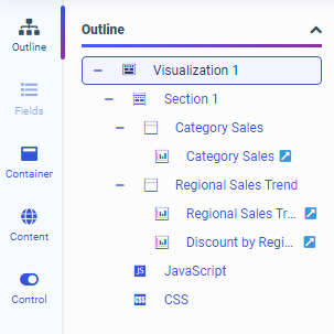
The Outline tab provides a high-level overview of all of the items in a visualization, including all pages, page sections, visualization containers, and content items. The Resources panel when the Outline tab is selected is shown in the following image.
When you first open WebFOCUS Designer, the visualization consists of a single chart or report. Only this item appears in the outline. You can right-click the item to view its WebFOCUS language source syntax.
Once additional visualizations are added, page, section, visualization, and content levels appear in the Outline, as the visualization transforms from a single content item to a page.
The item that you select for editing in the canvas is highlighted in the outline. You can also click an item in the outline to select it, as an alternative to selecting it from the canvas.
You can right-click an item in the outline to access a relevant set of options. For example, if you right-click a section, you can rename it or add a new visualization to it if you are creating new content. You can right-click a container to rename or delete it. Right-click a content item to rename it, duplicate it, or to remove it if it's in a multi-content container. If the item was created in the visualization, you can view the WebFOCUS source syntax or save the item as a separate file.
When the visualization has been transformed into a page, the outline also includes the JavaScript and CSS options, which allow you to add custom code to style and add run-time behavior to your visualization. This code can reference classes that you specify for visualization components using the Classes property.
You can click the Fields tab to display fields from the data source in the Resources panel. The Resources panel when the Fields tab is selected is shown in the following image.
You can use these fields to create content by double-clicking them, dragging them into a bucket on the Properties panel, or dragging them directly onto your content on the canvas. The bucket to which the field is added determines how the values display in your content.
If you drag a field onto an empty area of the canvas, a new container is created. If you drag a field onto the title bar of a container, you are presented with the option to replace the content in the container or add the content to the container as a new tab, accordion panel, or carousel slide. If you drag a field onto a chart, report, or map, then it is added to that content item in the default bucket for the field type.
Right-clicking a field provides further options, depending on the type of field. These options include the ability to add the field to the chart or the filter toolbar, use a dimension field as a measure or a measure field as a dimension, create bins for measure fields, or create a define field using the selected field. You can also create a define using the menu to the right of the Dimensions and Measures sections.
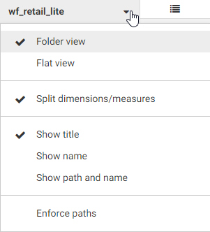
You can control how fields and variables are presented by using the View Selector menu, which is shown in the following image.
The following options are available:
You can search for a field or a variable using the search bar. Type a text string into the search bar text box to filter for fields or variables whose titles or names contain that string. The list of fields or variables refreshes dynamically to display values that contain the string. The string can appear at any point in the field name or title.
To clear the search query, delete your search query or click the X button in the search bar, as shown in the following image.
The search bar X button is browser dependent, so it may not appear in certain web browsers. For example, it is available in Google Chrome, but not in Mozilla Firefox.
The fields in your data source are available from the Fields tab. By default, if the data source uses folders to organize the fields that it contains, these folders are reflected in the Fields tab. This folder organization is called a business view. For dimension fields, these folders could be field hierarchies defined in the data source or segments in the data based on different tables that have been joined together. Measures can also be grouped based on segments.
Icons identify whether a folder is a basic folder or a hierarchy , and whether a field is a character , geography , date , or numeric field. Calculated fields are indicated by a function symbol added to the field icon.
By default, the Fields tab is divided into two sections, one for dimension fields and one for measure fields.
Dimension fields are categories that sort and organize the values in your data. For example, product categories, customer names, geographic locations, and dates are all commonly used as dimensions. In a chart, each value in a dimension field often defines a separate section of the chart. For example, each dimension value might be represented by a riser in a bar chart, a slice in a pie chart, or a point in a scatter plot.
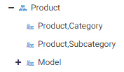
Dimension fields in your data source can be organized into hierarchies, where the top field is the most general and the bottom field is the most specific. The following image shows a hierarchy of product fields.
Note: Hierarchies in cube data sources do not include a Values list in WebFOCUS Designer.
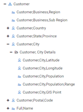
Some dimension fields can also be expanded to show attributes. Attributes are other fields that provide additional information about field values. Each attribute field value is correlated to a value of the field that it describes. For example, in the following image, the attribute fields for the Customer City field, listed in the Customer, City Details folder, provide information such as the latitude, longitude, and population of each city value.
Measure fields supply quantitative values for each category defined in a chart or report, often providing aggregated values in a report or sizing components, applying a color scale, or appearing in tooltips in a chart or map. Measure fields typically use a numeric field format. You can add up to 16 measure fields to a chart or report.
To add a field to your content, double-click the field or drag it from the Resources panel on the Fields tab into a bucket or onto the canvas. When creating a chart, different buckets are configured to use different kinds of fields. For example, in a vertical bar chart, a measure field added to the Vertical bucket is used as a measure to aggregate the sort values in the chart by determining the height of each bar. On the other hand, putting a dimension field in the Vertical bucket creates matrix rows for each dimension value, breaking the chart into multiple smaller charts. Therefore, you will typically use at least one measure field in this bucket to define different bar heights. Similarly, you will typically use a dimension field in the Horizontal bucket for a bar chart in order to determine the values that each bar represents. If you use a measure field in the Horizontal bucket using the Add as dimension option, a bar will be generated for each value in the measure field.
Some chart buckets accept both measures and dimensions but display them differently. For example, the Color bucket in a bar chart creates a color scale for measure fields, and assigns colors to values in a legend for dimension fields.
In a chart, if a bucket is designed to use only measure fields or only dimension fields, you cannot drag an incompatible field into it from the Fields tab. To indicate this, the cursor changes to a cancel sign when pointing to an invalid bucket. For example, when creating a vertical bar chart, you cannot drop a measure field into the Horizontal bucket, or a dimension field into the size bucket.
Instead, to add a measure field to a dimension bucket, right-click the field in the Fields tab and click Add as dimension. The field is added to the default dimension bucket, and appears in blue, indicating that it is a dimension, as shown in the following image.
Similarly, to use a dimension field as a measure, right-click it and click Add as measure. The field is converted to a measure by applying the CNT. aggregation function, which provides a count of data records, and added to the default measure bucket. The field appears in green, indicating that it is a measure, as shown in the following image.
You can then move the field into another bucket that accepts measure fields.
You can also right-click the aggregated dimension field in a measure bucket and point to Aggregate to change the prefix operator aggregation from count (CNT.) to count distinct (CNT.DST.), which provides the number of distinct values for the field, or percent of count (PCT.CNT.), which computes percentages based on the number of instances found.
The Tooltip bucket, meanwhile, behaves somewhat differently. The Tooltip is a measure bucket that displays field values in the tooltip when you point to an area of a chart. Unlike other measure buckets, you can drag a dimension field directly into the Tooltip bucket. The dimension is aggregated using the FST. prefix operator, so the first value of the field is displayed in the tooltip. This ensures that the dimension field generates only one value for the tooltip. The Tooltip bucket is best used when each area of the chart is associated with a single value of the selected tooltip fields. As with any bucket, you can right-click a field in the Tooltip bucket and point to Aggregate to change the aggregation.
Since reports simply display field values based on the rules for each bucket, with no dependencies based on field type, they do not have these limitations. All distinct values are shown for any field dropped into the Rows or Column Groups buckets, while values are aggregated for any field added to the Summaries bucket.
The Rows bucket creates a row for each unique value in each field within it, while the Column Groups bucket creates a set of measure columns for each unique value. These buckets sort the aggregated or detail values in the report. You can add multiple fields to the Rows and Column Groups buckets to display more granular information in a report.
The Summaries bucket aggregates measure field values for each sort value of the Rows and Column Groups fields in the report. Adding multiple fields to the Summaries bucket creates multiple measure columns in the report. These measure columns are repeated for each column group value, if there are any fields in the Column Groups bucket.
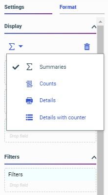
While the Summaries bucket is the default measure bucket, it is not the only option for displaying measure values. You can use the display options to change the Summaries bucket to the Counts, Details, or Details with counter bucket to display different information for the fields within it. The display options can be accessed above the buckets from the Calculation Options menu, as shown in the following image.
The Counts bucket, enabled by selecting the Counts display option , aggregates values in the report by displaying the number of records for each field within it, for each sort value. The Details bucket, enabled by selecting the Details display option , does not aggregate the values of the fields within it. Instead, it displays all values for the selected fields. The Details with counter bucket, enabled by selecting the Details with counter display option , displays all values for the selected fields, similar to the Details bucket, and also counts the rows for each primary sort field value.
You can add fields to other areas, as well. If you drag a field to the Filter toolbar, you can create a filter for the field. If the field is a character field, you can select values from a list. If the field is a numeric field, you can use a slider to specify filter values. If the field is a date field, you can use a calendar to select dates or use a predefined date range.
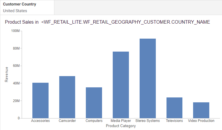
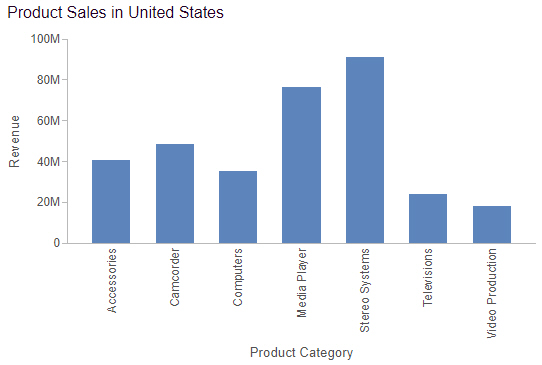
If you drag a field into a header or footer, the field is used as a parameter to dynamically provide a value in the header or footer text. The first value found for the field is displayed at run time. Using a field in the header or footer is especially useful if that field is also used to filter your content or if it is used as a multipage field in a chart or to create breaks in a report. The following image shows WebFOCUS Designer with the Customer Country field added to the header of a chart that is filtered to only show data for the United States.
The following image shows the chart at run time. The chart header displays United States, which is the value of the Customer Country parameter.
You can manipulate fields from the Fields tab as well. You can right-click a field to add it to your content, create a filter for it, or create a calculated DEFINE field using the field that you selected. If you right-click a dimension field, you can add it to the chart as a measure. When you do this, an aggregation function that calculates a count of the dimension values is applied to the Dimension, and the field is placed in the bucket.
Similarly, you can right-click a measure field and add it as a dimension. In this case, the measure value in each row of the data source is used as a sort value in the chart. You can right-click a dimension and click Group values to create groups, or right-click a measure and point to Bin values to create bins. Groups are groups of related values, and bins are ranges of values. You can use groups and bins to create new sort fields for your content. For example, bins are used in histograms to plot the distribution of data values. Each bin value generates in a bar in the histogram.
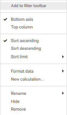
You can right-click a measure or dimension once they are added to your content to access additional options. For example, if you right-click a dimension added to a chart, you can change the location of the axis, the sort order, create a compute, and more, as shown in the following image.
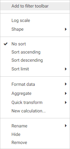
If you right-click a measure added to a chart, you can set it to use a logarithmic scale, which is useful when there large disparities between values on the same axis, set sorting, apply an aggregation function, use a quick transform, and more, as shown in the following image.
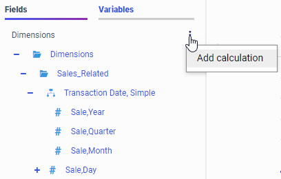
In the Fields tab of the Data pane, you can also create a calculation that runs before aggregation (DEFINE) or after aggregation (COMPUTE) by clicking the ellipsis buttons on the top right of the Dimensions and Measures panes, and clicking Add calculation, as shown in the following image.
The Variables tab contains a list of variables and preset filters defined in your data source, as well as default system variables. To add a variable to the chart to use as a filter, drag it into the Filter toolbar.
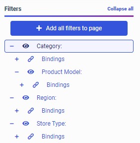
When you assemble a page from existing content, using the Assemble Visualizations option, the Filters tab on the sidebar allows you to display and chain filter controls. When you add an existing chart or report to a page, WebFOCUS Designer identifies any parameters present in the item. A badge appears on the Filters tab on the sidebar, indicating that you can add filters to the page, as shown in the following image.
When you open the Filters tab, the Add all filters to page button and a list of parameters from the content items on the page display. Click Add all filters to page to create filter controls for all of the listed parameters, or right-click each one and click Add to page to add them individually. Once added, the visibility icon next to the parameter is no longer faded.
Below each parameter on the Filters tab is an expandable list of Bindings. The Bindings list shows the data source and target items on the page that are associated with each parameter, providing information about each filter. Click a target item in a Bindings list to briefly highlight the border of that item on the page in order to easily locate it.
Note: Numeric, date, and date-time filter bindings do not indicate the associated data source, but you can click the Info button on the Visualization toolbar to see which data sources are used for the associated target items in order to determine the data source for each filter parameter.
Filters for fields that are part of the same hierarchy in the data source are automatically chained. This means that when you select a value from one of the filter controls, the other controls are filtered and updated based on the value that you select, ensuring that you can only select valid filter values. You can also manually apply chaining by dragging one parameter onto another in the parameter list. The filter becomes a child, for chaining purposes, of the field onto which it was placed. To unchain a parameter, drag it into the empty space between the Add all filters to page button and the top parameter in the list. The parameter is removed from the chaining hierarchy and moved to the bottom of the list.
Chaining relationships are indicated by indents in the parameter list. Filter controls are chained to any filters indented under it in the list. For example, in the following image, the Category filter is chained to the Product Model filter, so when you select a category, the list of available models in the filter control updates.
In this example, selections from the Category filter do not affect the Region or Store Type filters, since they are not part of the same chaining hierarchy, and, since filtering in an assembled page is unidirectional, values selected from the Product Model filter do not chain back up to the Category filter.
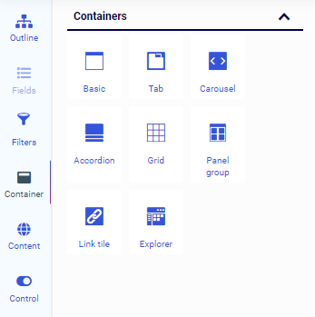
The Container tab provides a selection of container types and widgets that you can use in your visualization.
The Container tab is shown in the following image.
Using this tab, you can select empty containers and widgets that you can drag to the canvas and populate with the content of your choice.
The types of containers available to you include the following:
The panel, tabbed, carousel, and accordion container types are used to hold content, such as charts, reports, or images. You can add multiple content items to a tabbed, carousel, or accordion container and navigate between them using the paging behavior of the container.
When assembling a visualization from existing content, you can add multiple filter controls to cells in a grid container as an alternative to or in addition to the Filter toolbar, providing more freedom in the placement of your filter controls. The panel group container, meanwhile, can contain multiple other containers within it, allowing you to keep them together when responsive folding occurs in the visualization.
The Container tab also allows you to access the Link Tile and Explorer widgets. The Link Tile widget allows you to click through from a content item displayed on the page to a target item from your Repository. You can configure the Link Tile using the Link Tile options on the Settings tab of the Properties panel. The Explorer widget allows you to embed the Workspaces view of the Hub into a WebFOCUS Designer page that can be added to a portal, allowing users to create new content and access existing files in the Repository.
You can add existing content to a visualization from the Content tab. This content can be a WebFOCUS procedure such as a chart or report, a URL, an image, and more.
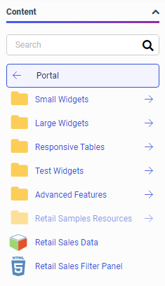
The Content area provides access to the Resources tree, where you can navigate to your content. The initial view of the Resources tree displays the directory in which the page is created. You can navigate to other workspaces and folders using the back arrow. Each item on the tree is represented by a thumbnail, making it easy to locate content. The following images show the Resources tree displaying two different levels of the repository hierarchy. The first image shows folders and items within the Portal folder.
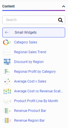
The second image shows the content in the Small Widgets folder, within the Portal folder. You can click the name of the folder, in this case, Small Widgets, to return to the parent folder.
You can use the search bar to find an item more easily. Once you have typed a search term, to return to the view of all items, delete the text in the search bar, or, in certain browsers, click the X button.
Drag a content item onto the visualization canvas or into a container to add it. If you drag content onto a container that already contains content, you are asked whether you want to replace the content in the container or add a new tab, accordion panel, or carousel slide to it.
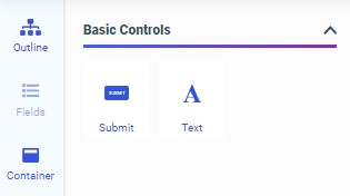
When assembling existing content into a visualization, you can use the Control tab to add empty filter controls, a text label, or Submit and Reset buttons to a cell in a filter control area, such as the Filter toolbar or a grid container.
The Control tab is shown in the following image.
You can add empty controls to the Filter toolbar or a filter grid if you want to select the particular types of filters to use in your page before binding specific filter parameters to them. To add an empty filter control, drag one of the following filter controls into a filter cell:
Some filter controls can only be used under specific conditions. For example, the calendar control can only be used with date and date-time fields, and the slider can only be used with numeric fields. The toggle control only takes the first two values from your data set, so it best used with Boolean fields. Others are best suited to selecting either a single value or multiple values. For example, the check box and double list box are commonly used with multi-select parameters, while the radio button control is commonly used with single-select parameters. Still others, like the input edit box and toggle control, can only accept a single value, and so should always be used with single-select parameters.
You can use a text label to add contextual information to a filter cell. The Submit and Reset buttons, meanwhile, change the filter behavior so that instead of refreshing the page to apply filtering whenever a user makes a control selection, the page does not refresh until the user clicks Submit. This is useful when you have many filter controls on a page. The Reset button allows the user to reset all filter controls to their default selections. The options on the Control tab cannot be used when creating new content in a visualization.
Once added, you can choose to delete either the Submit button or the Reset button to include the functionality of just one of these buttons.
To add a text label or Submit and Reset buttons to a visualization, drag the object into a cell in the Filter toolbar, a modal filter window, or a grid container.
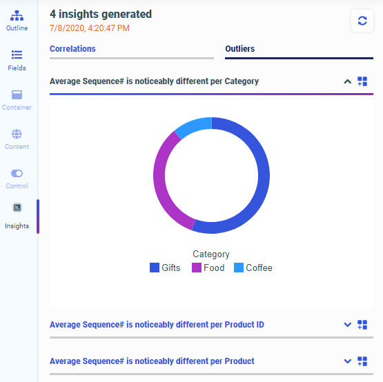
You can click the Insights tab on the sidebar to easily run advanced analyses and generate visualizations and narratives on your data set, without manually preparing and analyzing your data, or having prior knowledge of data science or statistics. An example of the Insights tab with some generated content is shown in the following image.
To learn more about Automated Insights, see Generating Instant Insights in TIBCO WebFOCUS Designer.
You can view and modify the properties of an item on the page, including content, containers, filter controls, and pages, from the Properties panel. The Properties panel includes configuration options on the Settings tab and styling and formatting options on the Format tab. The Properties panel appears to the right of the Resources panel, and changes based on the item that you have selected in the canvas.
The Properties panel for a bar chart is shown in the following image.
When you select a chart or report, the Properties panel shows a list of buckets on the Settings tab. Drag a field from the Resources panel with the Fields tab selected into a bucket to add it to your content. The buckets that you place your fields into determine how they are displayed.
When creating a chart, depending on the type of chart that you create, you may see some of the following buckets:
When creating a report, you can use the Rows and Column Groups buckets to sort a report based on the values of the fields in those buckets. The Summaries bucket aggregates measure field values based on these sort values.
The Settings tab also includes the Filter bucket. The Filter bucket allows you to create static filters specific to a content item, as opposed to the Filter toolbar, which creates prompted filters that affect the entire visualization. To create a static filter, drag a field from the Resources panel into the Filter bucket. You can specify filter values using the Add Filter dialog box with a set of controls appropriate to the type of field that you are filtering.
You can use the display options, available from menus above the buckets on the Settings tab, to change the display of values in your content. When creating a report, the display options allow you to change the Summaries bucket to the Counts, Details, or Details with counter bucket to display different information for the fields within it, as shown in the following image.
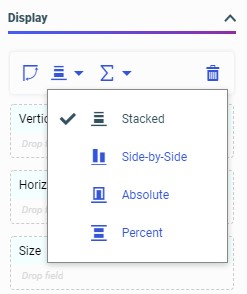
When creating a chart, the display options additionally allow you to modify its structure, depending on the chart type. The layout display options for a bar chart are shown in the following image.
In addition to changing the display of measure values and the layout of the chart, you can swap the axes in eligible charts and clear the fields from all buckets.
The menu to the right of each bucket label also provides different options for charts and reports, depending on the bucket. These options include the ability to clear the bucket, create a new calculation in a report, or split the y-axis for multiple measures in a bar, line, or area chart.
When placed in certain sort buckets, fields display icons indicating the sort order of the field and provide an option to use the field as a matrix row or column if it is used as a dimension, or switch y axes to create a dual-axis chart, if the field is used as a measure in certain chart types. In the following image, the Vertical bucket contains a matrix row field and a vertical axis measure field.
You can also right-click a field in a bucket to access options pertaining to that field. These options include field format, sorting, aggregation options, and more.
Below the field container buckets in the Display area, you can access the Filters and Content areas. The Filters area includes the Filters bucket. You can drag a field into the Filters bucket to create a static filter. Static filters affect only the selected content item, and cannot be modified at run time.
The Content area includes a variety of options to modify the structure and behavior of the chart. You can show or hide the header and footer areas for charts and reports, add row and column totals to reports, and enable Auto Drill and Auto Linking for single content items. For single-content charts only, you can also enable automatic refresh and enable Insight. Auto Drill, Auto Linking, and Insight provide run-time interactivity to your content, expanding the amount of information accessible from a single item. Automatic refresh allows you to reflect changes to your data source in real time by updating your content at set intervals.
When editing content, the Format tab provides access to options to style your content and change the output format. For a report, you can change the theme and, for a stand-alone report, the output format. The theme applies an overall set of styling properties to the entire report, while the output format allows you to change the type of file generated at run time.
When editing a chart, the Format tab provides access to even more options. You can use the Quick Access menu at the top of the Format tab to access styling options for different sections of a chart, such as the legend, axes, or different series. You can also access options for different sections of a chart by right-clicking an area of the chart on the canvas and clicking Style. The General options include the ability to change the theme and output format, as well as styling the chart frame and background color.
When you select a container in a visualization that has been transformed into a page, the available options on the Properties panel allow you to style the container and configure its behavior within the visualization as a whole. On the Settings tab, you can change display settings such as whether to include a title or toolbar on the container and on which types of devices the container should be visible. You can also allow content customization and provide cascading style sheet class names that you can use in custom CSS and JavaScript code. The Format tab allows you to change the style of the container. The Style options are based on the selected theme, which you can change using the Theme option on the Format tab when you select an entire page. The selected theme is also applied to content in the visualization, by default, although you can specify a different theme for each chart or report.
When you select a section of a page, which is a horizontal area of the visualization that contains one or more rows of containers, you can use the Settings tab to assign CSS classes, make the section collapsible, and set the height of the section. On the Format tab, you can select a style to change the background color of the section. You can add more sections to the visualization by right-clicking the first section, in the space directly surrounding the containers in the visualization, and clicking Insert section above or Insert section below.
You can select an entire page of a visualization by clicking the page toolbar or the area of the canvas below all of the sections on a page, or by using the outline. When you select the page, you can use the Settings tab to assign CSS classes and show or hide the title and toolbar for the page. On the Format tab, you can change the theme for the entire page, the page margins and maximum width of the page, and the appearance of the page heading text.
The canvas displays the current state of your content as you create it. You can select items in the canvas to edit them, drag resources such as fields or containers onto the canvas to add them to your content or page, and use on-chart filtering to create filters based on visual selections.
The canvas also contains, if enabled from the Properties panel, heading text for each component, as well as optional footers for charts and reports. You can double-click this text to edit it, and then type new text, make styling changes to header and footer text using the text toolbar that appears, and even drag a field into the header to create dynamic header text that displays the first available value for the field at run time.
Initially, if you choose to create a visualization with new content, the canvas allows you to create and edit a single chart or report.
The chart or report fills the entire canvas. Some options are only available when creating a single content item. For example, you can only enable Auto Drill or Auto Linking for stand-alone content items and only make a stand-alone item an Auto Linking target.
When creating a single content item, two canvas behaviors are available. The output format that you use determines which of these behaviors is used.
At design time, the AHTML and HTML5 output formats use the responsive canvas. Reports present In-Document Analytic paging controls at the bottom of the report that allow you to navigate through it. Some report styling properties are unavailable when using the responsive canvas. Charts in these output formats present informational tooltips and allow on-canvas filtering at design time.
The HTML, PDF, PPTX, and XLSX output formats, on the other hand, use a paginated canvas at design time. Some report styling properties are only available when using the paginated canvas. You can scroll through an entire report using a scrollbar, and charts do not present interactive options, such as tooltips.
At run time, the HTML5 and HTML output formats are functionally equivalent. The two options are available to allow you to use the two different canvas types. For more information about output formats for charts and reports, see Changing Output Formats in a Chart or Report.
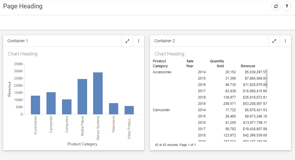
You can create multiple new content items on a page. To transform a single item into a page, click Convert to page. Once you have converted a chart or report into a page, you can drag a container onto the page from the Resources panel when the Container tab is selected on the sidebar. Click the Add container button or click and drag a container from the Resources panel, and drop it in the desired location. An empty container is created, to which you can add content. Alternatively, with the Fields tab selected on the sidebar, click and drag a field into an empty area of the page to create a basic panel container with a default content item that uses the selected field. The canvas with two containers is shown in the following image.
Once a container is placed on the page, you can click and drag the container toolbar to move it. A blue highlighted area shows where the container will be dropped. If necessary, other containers on the page will move to accommodate the placement of the container that you have moved.
If you point to a container, a set of sizing handles appears. If you click and drag one of these handles, you can resize a container on the page. The contents of the container automatically resize to fit the new container dimensions.
The same types of components are available in a page assembled from existing content. These pages are created by clicking the plus button on the WebFOCUS Hub or WebFOCUS Home Page and clicking Assemble Visualizations. When assembling content into a visualization, you cannot edit individual, external content items. However, additional options are available for certain components. For example, you can change styling and default values for filter controls, style and rearrange the filter grid, and unlock a container for run-time customization. When assembling a page from existing content, if you hold the Ctrl key, you can select multiple containers, controls, or sections to apply the same changes to each.
You can click and drag to select an area of a new chart created in a visualization to filter it. When you make a selection, a tooltip appears, giving you the option to filter for the values in the selected areas of the chart, or filter the visualization to exclude those values. A filter control is added to the Filter toolbar, and all content created in the visualization is affected, allowing you to filter your content quickly and intuitively. To clear the filter, remove the filter control from the toolbar. The filter is removed from all affected content.
The canvas shows a design view of your content. To see a full run-time view of your visualization, with run-time functionality such as drilldowns, In-Document Analytics, and more, click Run in new window on the Visualization toolbar. Your content runs in a new browser tab or window.
Filters in WebFOCUS Designer can utilize one of two behaviors. These are static filters and prompted filters. Static filters are always applied to your content whenever it is run, and allow you to apply consistent filter values without prompting the user to make filter selections. They are applied to a single content item at a time, and can only be added to new content. Prompted filters, on the other hand, allow users to select the filter values to use in your visualization at run time. When you create a prompted filter, a control appears on the Filter toolbar, allowing you to make filter selections. The user can see these controls and make selections from them at run time. Run-time controls are not displayed for static filters. Prompted filters can be created for new content, or added to a visualization from referenced content.
Prompted filters are created, accessed, and modified from the Filter toolbar. You can create a prompted filter in one of the following ways:
The Filter toolbar is displayed below the page heading in the following image.
When creating a prompted filter in a new chart or report, you can click a control on the Filter toolbar to change the filter selection, or right-click the it to access additional filtering options, such as making the filter required, changing the aggregation, changing the number of values that can be selected, or changing the filter operation from value selection to exclusion.
Right-click a prompted filter generated for external content to change the control type or merge controls for the same field. You can also use the options on the Settings and Format tabs to set default values for the filter, specify how the filter interacts with items in a page or portal, and style the filter.
Different types of filters provide different controls on the Filter toolbar. Filters on alphanumeric fields provide a list from which you can select values, measure fields provide a slider on which you can provide maximum and minimum values, and date fields provide a calendar from which you can select a range of dates or use a default range option.
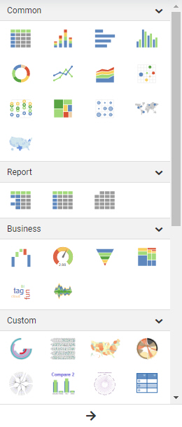
You can use the Content picker, on the right-side of the WebFOCUS Designer interface, to change chart and report types in your visualization.
When a chart or report is selected, the Content picker allows you to select a chart type or report layout. This includes the ability to change your content from a chart to a report in addition to changing to different varieties of each content type.
By default, the Content picker is collapsed, allowing you to scroll through common options, as shown in the following image.
You can click the arrow at the bottom of the Content picker to expand it to display all content options, including additional report layouts, different map types, additional chart types, and chart extensions that you have enabled in your environment. The expanded Content picker is shown in the following image.
When you change the chart or report type, fields may need to be rearranged in, and in some cases removed from, their buckets to accommodate the new type. You can rearrange them as needed.
WebFOCUS Designer provides a wide variety of content creation options, allowing you to create new charts and reports in a page, or create a page with existing content. If you create a visualization with new content, you can also customize the data that you use in your content by joining additional tables to your original data source.
The following are a general set of steps that you can use to create new content in WebFOCUS Designer:
Or, on the WebFOCUS Home Page, click Visualize Data.
WebFOCUS Designer opens in a new browser tab.
Once you select a data source, WebFOCUS Designer loads with options to create a single content item.
You can also double-click a field or drag it onto the canvas to add it to the default bucket for that field type.
Prompted filters in the Filter toolbar affect the entire page, while static filters in the Filters bucket affect only the item for which they were created.
The first item you created is moved into a container, and a second container is created.
To create a page that contains the single item that you have created, click Convert to page on the Visualization toolbar. The item is moved into a container, but a second container is not added.
The entire page, sections, containers, filter controls, and filter cells all have their own set of styling and formatting options.
WebFOCUS Designer provides a wide variety of content creation options, allowing you to create new charts and reports and create pages with new content, or create pages using existing content. If you have created charts and reports in WebFOCUS Designer, InfoAssist, or other content creation tools, or if you have external items such as images and URLs, you can add them to a page that uses external content.
The following are a general set of steps that you can use to create content with existing items in WebFOCUS Designer:
WebFOCUS Designer opens in a new browser tab.
The entire page, sections, containers, filter controls, and filter cells all have their own set of styling and formatting options.