Creating a stacked bar chart
In a stacked bar chart, the bars are split into colored bar segments placed on top of each other. The total height of a bar shows the numerical value for a certain category, and the heights of the bar segments represent how different components contribute to that value.
About this task
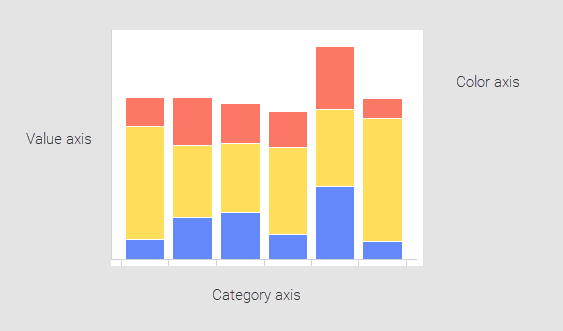
In a stacked bar chart, the Color axis in the legend is one of the main axes in addition to the Value and Category axes described in Creating a bar chart. The Color axis is used to split the data in the different categories on the Category axis into further categories.
Another display option of bar charts with bar segments is a side-by-side bar chart, see Creating a side-by-side bar chart. In a side-by-side bar chart, you can easily compare the heights of the bar segments, because they are placed next to each other.
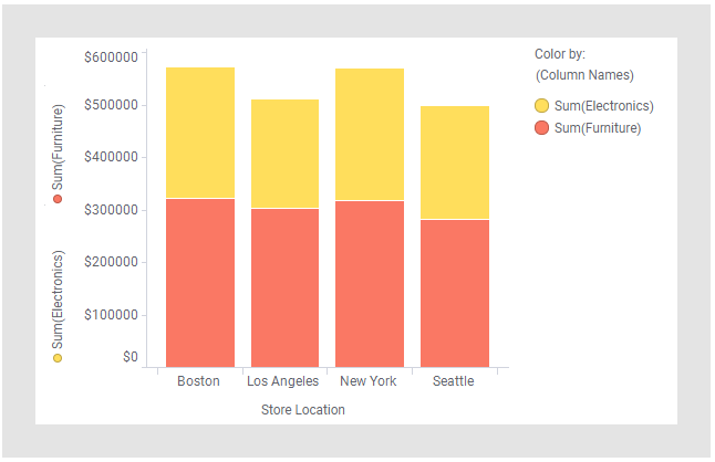
The categories, or segments, into which a bar is split can be of different types as illustrated below: entire columns that you want to compare, or categorical values within a column.
Depending on what you want the bar segments to represent, you create a stacked bar chart in different ways.
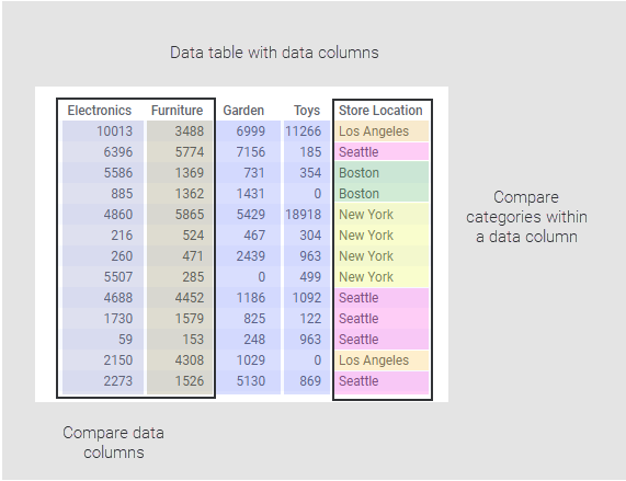
Comparing data columns
Procedure
-
On the authoring bar, click
Visualization types
 to open the flyout.
Example
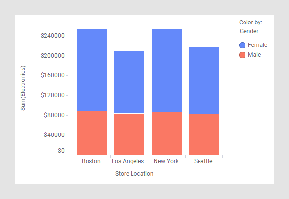
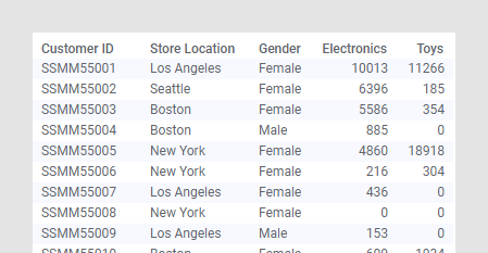
Assume the data table below is loaded. It contains electronics and toys purchases made by customers at different store locations. Gender is also registered.
See the settings made to examine differences in purchases made at different store locations. The total sums of electronics and toys purchases can be viewed as well as the electronics and toys contributions to the total sum at each location.
Comparing categories within a column
Procedure
-
On the authoring bar, click
Visualization types
to open the flyout.
Example
Assume the data shown in the example above is loaded. See the settings made to display electronic purchases made by men and women, respectively, at different store locations.