Creating a bar chart
In a bar chart, you can compare values for different categories in your data.
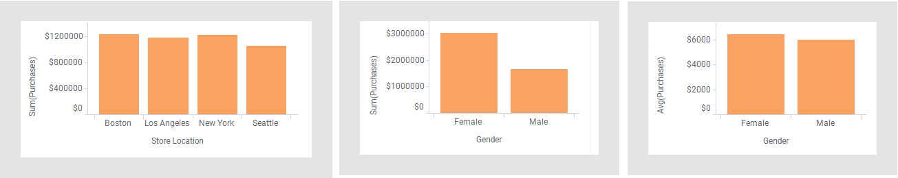
The heights of the bars represent a certain aggregated value for each of the categories. An aggregated value could be, for example, a sum or an average.
Procedure
-
On the authoring bar, click
Visualization types
 to open the flyout.
Examples
The lefthand and middle bar chart show the total sum of purchases but split into different categories on the Category axis. In the rightmost bar chart another aggregation value, average, is set.
See also Creating a stacked bar chart, Creating a side-by-side bar chart, and Creating a 100% stacked bar chart.