Bar chart
In a bar chart, you can compare values for different categories in your data (continuous data can be made categorical by auto-binning).
There are two types of axes in the bar chart, a Category axis and a Value axis. In most cases, columns containing numerical data are selected on the Value axis, and columns with categories are selected on the Category axis.
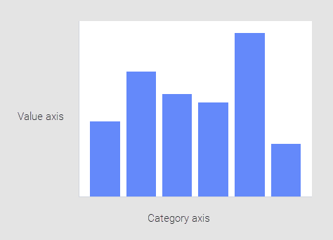
The bar chart shows data using a number of bars, each representing a particular category. The height of each bar is proportional to a specific aggregation (for example the sum of the values in the category it represents). The categories could be something like an age group or a geographical location. It is also possible to color or split each bar into another categorical column in the data, which lets you to see the contribution from different categories to each bar or group of bars in the bar chart.
Example
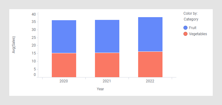
The bar chart below shows the total sum of sales for fruits and vegetables over three years.
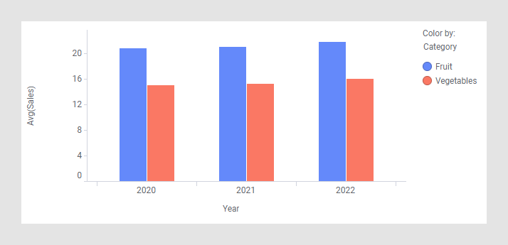
Another way to get a similar appearance is to add the column Category to the category axis to create a hierarchy on that axis. See Hierarchies to learn more about multiple columns on an axis.
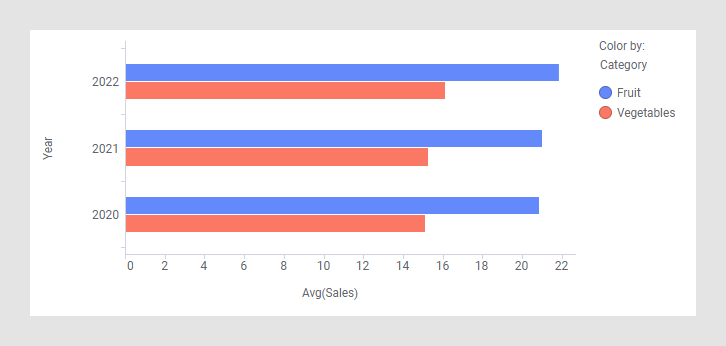
If you prefer the bars to be displayed horizontally, locate the bar orientation section in the visualization properties and click the Horizontal option.
Note that in some cases the category axis is referred to as X-axis, and the value axis is referred to as Y-axis. This is the case when adding some lines and curves, for example, as well as in OVER statements in custom expressions.
All visualizations can be configured to show data limited by one or more markings in other visualizations only (details visualizations). Bar charts can also be limited by one or more filterings. Another alternative is to configure a bar chart without any filtering at all. See Adding data limitations for a visualization for more information.