KPI showing absolute and relative profit
The following example gives a hint of how to create a KPI that shows absolute and relative profit in the tiles. The starting point is a data table that contains columns with sales and purchase figures for a number of products. To retrieve these KPI values, custom expressions are used on the KPI axes.
For details about specifying different KPI values that are mentioned in the example, see Adding a new KPI to a KPI chart.
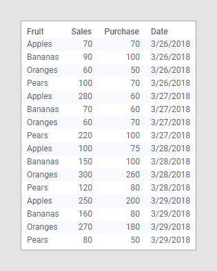
The data table below lists, for four days, the purchase and sales figures for some fruit types.
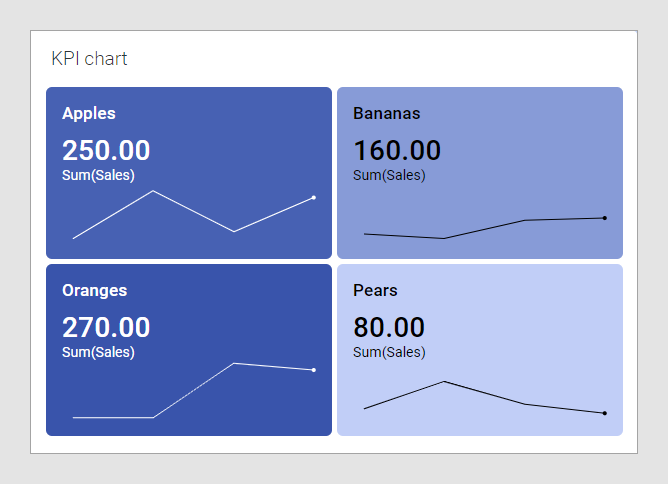
Assume you want to monitor, for the most recent date, the absolute profit as well as the relative profit per fruit type. In addition, you want to use background colors of the tiles to indicate if the relative profit falls below 30% for any fruit type, or if it exceeds 70%.
Creating a KPI chart from scratch based on the data above results in this KPI:
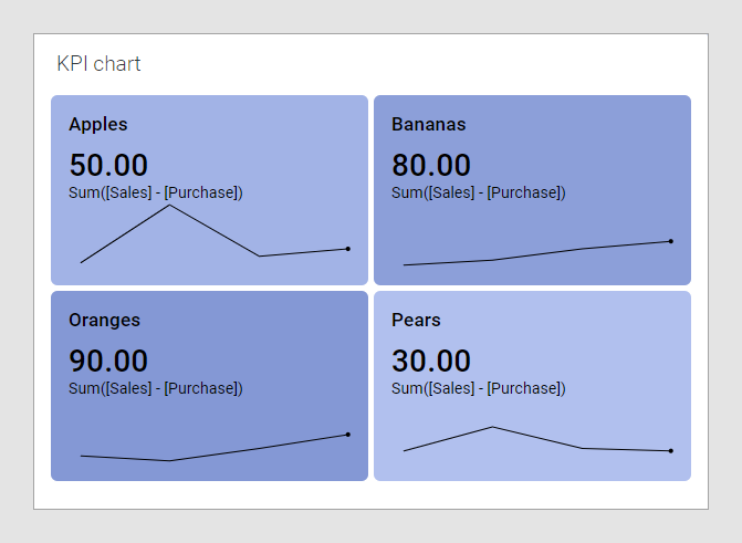
However, you want the primary values to indicate the absolute net profit instead of the actual sales figures. On the Value (y-axis), specify the following custom expression, which calculates the absolute net profit:
Sum([Sales]- [Purchase])
The result is shown below. For example, the pears net profit for the most recent date is 80 - 50 = 30 (see the data table).
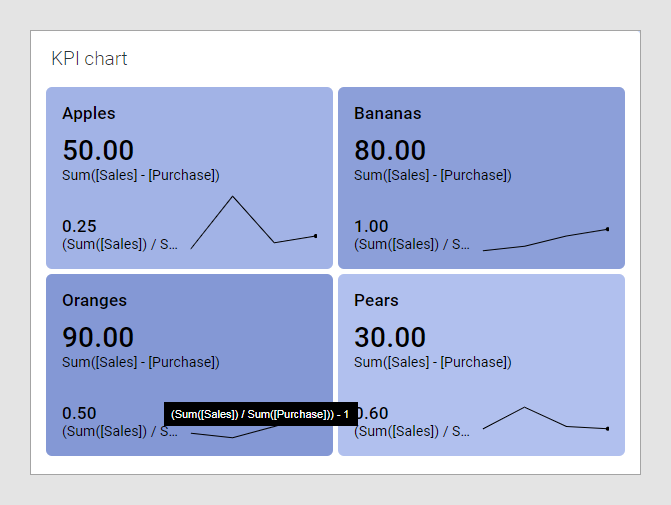
The comparative values in the tiles can be used to display the relative profit. On the Comparative value axis, specify the following custom expression, which calculates the relative profit:
(Sum([Sales]) / Sum([Purchase])) - 1
The relative profits are added to the chart below. For example, the relative profit for pears is 80/50 - 1 = 0.60.
Using different colors of the tile backgrounds, you can easily make it possible to spot fruits whose profit falls below or exceeds certain values. On the Color section of the Properties dialog, rules can be added that color the tiles differently.

In this example, you want the background colors to reflect what is calculated on Comparative axis, that is, the relative profit. So Color by is set to (Comparative axis values), and the tiles below are colored according to the color rules that have been added (see the image above).

