Creating a waterfall chart
A waterfall chart shows how a value changes after being affected by various factors that either increase the value, or decrease it. The resulting value is then presented.
About this task
The waterfall chart can, for example, be useful for visualizing the development of a value over time or visualizing the contributions of different factors to a total.
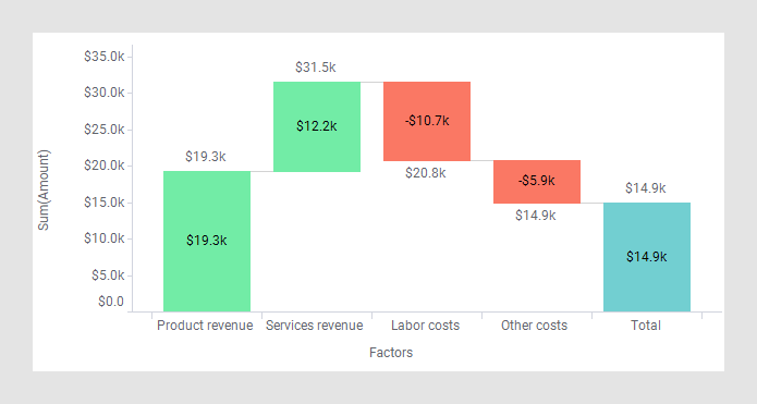
The starting value and the resulting value in the visualization are represented by bars, and the value changes in-between by floating blocks that indicate the ups and downs. As a means to follow the development of the value from start to end, transition lines can be added between the different blocks.
By default, positive value changes are indicated by a green color, and negative value changes by a red color. If you want, you can specify another coloring.
If applicable, bars representing intermediate calculated totals can be shown.
Depending on how your data is organized, in a tall/skinny or short/wide format, the waterfall chart is created in slightly different ways. The data tables below both contain the same statistics for population changes over time but are organized differently.
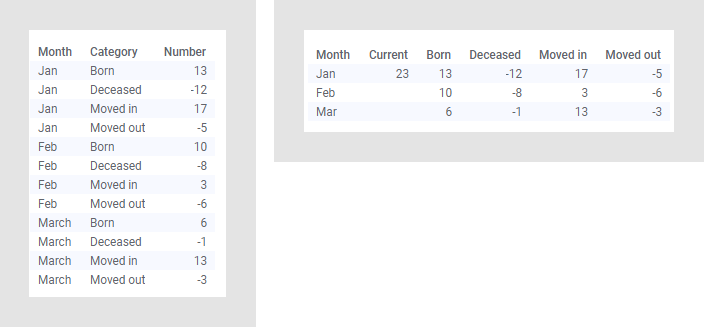
In the tall/skinny data table to the left, numbers are provided in a single data column, and in the short/wide data table to the right, the numbers are split on multiple data columns. Procedures how to create waterfall charts based on values in a single data column, and values split on multiple columns, follow.
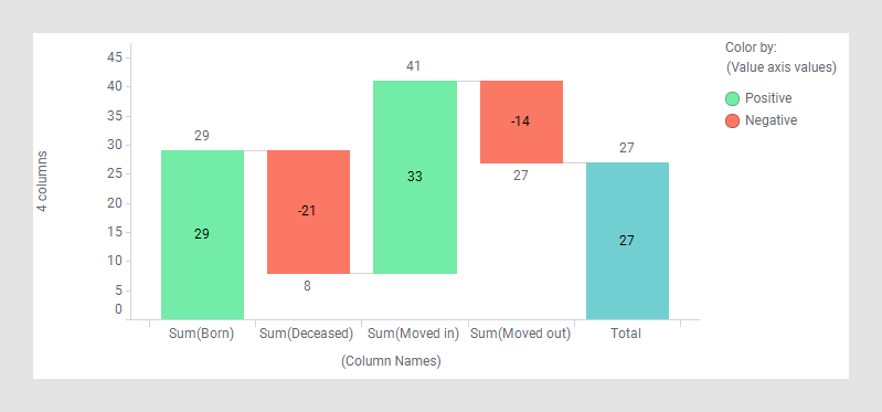
Waterfall chart based on a single column (tall/skinny data)
Procedure
-
On the authoring bar, click
Visualization types
 to open the flyout.
Results
Example
The waterfall chart below is based on the data table above with numbers in a single column. It gives an overview of the population changes for the entire time period.
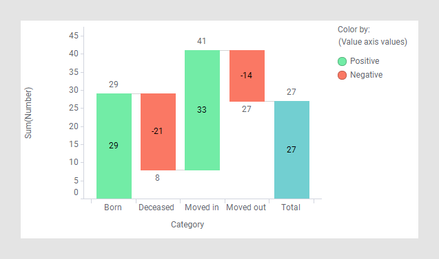
Waterfall chart based on multiple columns (short/wide data)
Procedure
-
On the authoring bar, click
Visualization types
to open the flyout.
Results
Example
This waterfall chart is based on the data table above with the numbers provided in multiple columns. It gives the same overview of the population changes as shown above.