In the column selectors of some visualizations there are a number of aggregation measures available that are in fact shortcuts to expressions. These shortcuts show up in the axis selector of the visualization’s value axis if you have chosen a column that can be used with them. For example, if you have (Row count) on an axis most of these shortcuts will not be available, but if you select [Sales] they can show up. See the list of available expression shortcuts at the bottom of this page.
Since these expressions depend on what you have selected on the other axes in the visualization, this may also affect their availability. For example, if you have a continuous expression on the X-axis of a bar chart you will not be able to add one of these expressions to the Y-axis, since the axis to aggregate over must be categorical. You can either change the X-axis state to categorical or bin the continuous values into categorical bins to continue. Adding a hierarchy on the X-axis (for example, for a date column you can add a Year >> Quarter >> Month hierarchy) will also allow the shortcuts to be used on the Y-axis. These calculations are typically performed on the aggregated plot data, but may also be done at the row-level data or a combination of the two levels with some modifications.
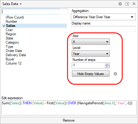
When opening a shortcut to an expression from a column selector and the column selector menu is in Expanded mode you will get access to some contextual controls which allow you to set various parameters:
For example, some controls give you the possibility to change the axis to work on, the hierarchy level to affect, the possibility to modify the window size of a moving average, etc. The controls provide an easy way to modify the expression. However, the resulting expression can also be edited directly in the column selector menu.
When editing an expression in a column selector, remember that what you see in the column selector is a sub-expression in the comma-separated list that represents the entire axis expression (and which you can see if you right-click and open the Custom Expression dialog). You can add multiple expression shortcuts to an axis by clicking on the plus sign, just as with any other aggregation:

The expression shortcuts are added to make it easier to add common calculations, like "year over year" or "cumulative sum", to a visualization. Similar results can be obtained by writing custom expressions directly, but the shortcuts can speed up the process of creating this type of expressions considerably. Axis formatting is not applied automatically as a result of a calculation. However, the formatting options are easily accessible from the column selector menu for those expressions that can be shown as percentages. If no display name has been specified, the axis name will be the name of the selected aggregation.
See also:
Change Relative to Fixed Point