Option |
Description |
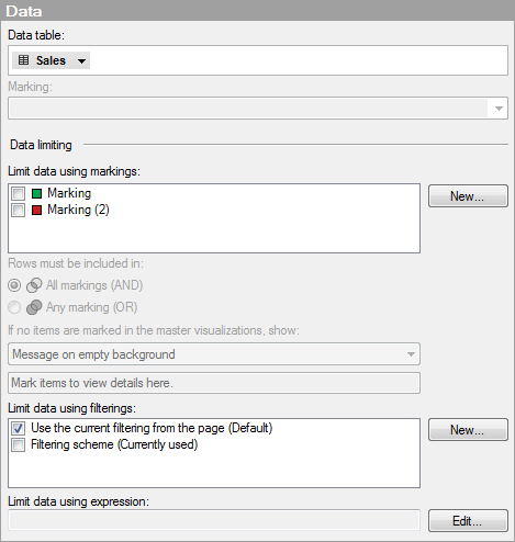
Data
table |
Specifies the data table on which the visualization will work. |
Marking |
Specifies the marking (that is, the color and relationships to other marked items) that will be used to mark items in this visualization. |
Data limiting |
Settings used for limiting the data shown in this visualization. |
Lists the available markings that can be used to limit what is shown in this visualization. This means that the visualization only displays data that has been marked in other visualizations (master visualizations). If more than one marking is selected, you can choose how the data in the markings should be combined. See What is a Details Visualization? to learn more about how you can use master-details visualizations to drill down into your data. Tip: You can specify what should be shown in the visualization if no items have been marked in the master visualizations. See If no items are marked in the master visualizations, show below. |
|
New... |
Opens the New Marking dialog where you can specify a new marking. The color and name of a previously created marking is edited in the Document Properties dialog. |
Rows must be included in |
Specifies how the data in the markings should be combined if you have selected to limit the data by more than one marking. |
All markings (AND) |
Use this option if you want this visualization to show the intersection of the markings selected in Limit data using markings. This can be used if you have two visualizations with different markings and want to see which markers are present in both markings. This visualization will then show only the data that has been marked using both of the selected markings. |
Any marking (OR) |
Use this option if you want this visualization to show the union of the markings selected in Limit data using markings. This can be used if you have two visualizations with different markings and want to see which markers are present in either of the two markings. This visualization will then show data that has been marked using either of the selected markings. |
This setting is applicable if this visualization is set up as a details visualization where the marking in one or more master visualizations decides what will be shown. It allows you to specify what this visualization should show when no items have been marked in its master visualizations. See Limit data using markings to identify which markings have been set to limit the data in this visualization. See When no items are marked in the master visualizations for examples of the different options. |
|
All
data |
Use this option if you want this visualization to show all the data from the master visualizations that control the content, if no items have been marked in those visualizations. |
Empty
visualization |
Use this option to display only the column headers and the row headers if no items have been marked in the master visualizations. |
Message
on empty background |
Use this option if you want to display a message if no items have been marked in the master visualizations. For example, you may want to write a text letting anyone using the analysis know which visualizations are the master visualizations that control the content of this visualization. |
Limit data using filterings |
Defines how different filtering schemes in the analysis should affect this visualization. Select Use the current filtering from the page if you want the visualization to always utilize the filtering scheme that is used on the page where the visualization is located. If you move the visualization to a new page, then the visualization will automatically start reacting on the filtering scheme that is used on the new page. Select a specific filtering scheme from the list if you want the visualization to always use that filtering scheme. Moving the visualization to another page with a different filtering scheme will not affect this setting. If you select to limit data using more than one filtering scheme, the intersection of the filterings will be used. This means that the visualization will show only the data that is made visible by all of the filtering schemes. |
New... |
Opens the New Filtering Scheme dialog where you can specify a new filtering scheme. The color and name of a previously created filtering scheme is edited in the Document Properties dialog. |
You can limit what data should be available for a certain visualization using an expression. If you have defined a limiting expression, it will be displayed here. |
|
Edit... |
Opens the Limit Data Using Expression dialog where you can define a boolean expression to use for limiting the data in this visualization. |
Data
table matching |
Settings applicable when the visualization is set up with columns originating from different data tables. Read more about using data from different data tables in one visualization in Multiple Data Tables in One Visualization. |
Columns
matched in this visualization |
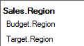
Lists the column matches currently used in this visualization. The matches are listed per main data table column. The first part of each name is the data table name, the second part is the column name:
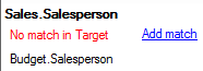
The example above shows that 'Sales' is the main data table, while 'Budget' and 'Target' are the additional data tables used in the visualization. 'Region' is the name of the columns used for matching the data tables to each other and bringing them together into the visualization. If a match is missing, this will be indicated by red text and a link:
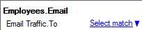
The column 'Salesperson' exists in the main data table and is used in the visualization, but it does not have a match in the 'Target' data table. If there actually is a column that matches, but it does not have the same name as the corresponding column in the main data table, no match will be added automatically. If this is the case, click on the Add match link to open the New Match dialog where you can add the match manually. If a column in the main data table has column matches to more than one column in another data table, you need to select which match to use. This will be indicated as seen below:
Click on the link to select another match than the one currently used. In the example above, the column 'Email' in the main data table is currently matched to the column 'To' in the 'Email Traffic' data table, but other matches exist. Comment: Many other possible column matches may exist between data tables in the analysis, but those are not listed here unless they are actually used in the visualization. To view all the current matches for a specific data table, open the Data Table Properties dialog and go to the Column Matches tab. |
Show
notifications about mismatches |
Specifies whether or not notifications should be shown in the visualization if there are possible mismatches between data tables. There are cases when the visualization is still valid even though a column without a match in the main data table is used. In those cases it can be useful to turn off notifications to minimize the visual clutter. However, use this setting carefully, and make sure the visualization is valid before you turn notifications off. See Column Matching to learn when mismatching columns can still make a valid visualization. |
Edit
Column Matches |
Opens the Column Matches tab in the Data Table Properties dialog, where you can add new column matches, or edit existing ones. |
See also: