Accessing Reporting Components

In this section:

The following topics describe the tabs and panels that are available when you are developing reports in the Report canvas.

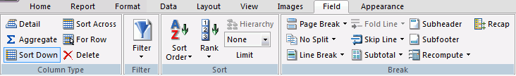
Building a Report Using the Report Tab

In this section:

You use the Report tab to modify report properties, change the style of rows and columns on your report, or create filters. The Report tab contains the following groups: Filter, Report, Traffic Lights, Style, and Links. The Report tab is located at the top of the trademark and rebranding WebFOCUS App Studio interface and is available only when you are creating or working with a report. The Report tab is shown in the following image.

Defining a Filter Field Using the Filter Group

In this section:

You use the Filter group to define filter fields when creating a report. The Filter group is shown in the following image.
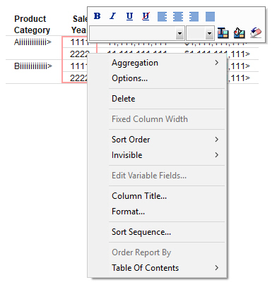
The commands are:

Filter

Filters fields using Where, If, Where Total, and Limits screening options. You can access the Expression Builder by selecting Where, If, or Where Total from the Filter drop-down menu.

Using the Expression Builder, you can create expressions quickly by selecting fields, relations, operators, and values from lists. You can base selection criteria on a specified value, a variable value, or a field value. For more information, see Creating Expressions Using the Expression Builder.

If you select Limits, the Retrieval Limits dialog box opens, where you can set the record limit and read limit values. This enables you to set how much data is displayed or previewed.

Creating Expressions Using the Expression Builder

How to:

Reference:

The Expression Builder enables you to create expressions quickly by selecting fields, relations, operators, and values from lists. You can base selection criteria on a specified value, a variable value, or a field value.

You can access the Expression Builder by clicking Where, If, or Where Total from the Filter drop-down menu. The Expression Builder dialog box displays.

The Expression Builder is divided into four sections. The Data section is located in the upper-left of the Expression Builder. The Criteria section is located to the lower-left of the Expression Builder. The Expression Grid is located to the upper-right of the Expression Builder. The Advanced section is located in the lower-right of the Expression Builder.

The Data section displays a list of all fields in the data source. Double-click or drag the field into the Expression Grid to build an expression using the options provided. You can also drag fields to the Criteria section and the Advanced section, once it is enabled.

The Criteria section displays which expression you are working on, as well as which expressions, of the same type, you have already created. If you double-click a field and it is added to the Expression Grid, the field will be shown in the Criteria section. Alternatively, you can drag a field into the Criteria section to begin working on a new expression. Dragging more than one field into the Criteria section allows you to create multiple of whatever type of statement you selected (Where, If, or Where Total). For example, if you clicked Where to open the Expression Builder, dragging more than one field into the Criteria section will create multiple Where expressions. Selecting an expression in the Criteria section will show you the details of that expression in the Expression Grid and/or the Advanced section.

Note: The type of expression you are creating is shown next to the Criteria section.

The Advanced section is where, instead of creating an expression using the Expression Grid, you are creating the expression using syntax. The Advanced check box is only available to be selected once a field is in the Criteria or Expression Grid. Once the Advanced check box is selected, the Advanced section, the Function button, and the Variable button are available for use.

The Expression Grid is where you build an expression using the drop-down options available. You can add more fields to the Expression Grid to make a more complex expression by using OR and AND.

Note: If you close the Expression Builder dialog box using the close icon (X), you are prompted to save changes, if changes were made.

Reference: Expression Builder Dialog Box

The Expression Builder dialog box has the following sections:

Data section

Displays a list of all of the fields in the data source. Double-click or drag a field to add it to the Expression Grid.

If the selected field has a title attribute defined in the Master File, the title will be used in the prompt text for the variable. If the selected field does not have a title attribute, the name of the field will be used in the prompt text for the variable.

Expression Grid

Create an expression by using the drop-down menus in correlation with a field.

You can delete expressions from the Expression Grid using the Delete key or right-click Delete option when either the And/Or or Column to filter columns are selected. If you use the Delete key or right-click Delete option on any other column, it will only delete that column option. You can only delete entire expressions, using the Expression Grid, when there are multiple expressions present. If you want to delete a single expression, you must do it from the Criteria section.

And/Or

Displays the keyword used in the expression listed in the Expression list box. You must select more than one field for the expression to activate this option.

Parentheses

Allows you to add one, two, or three parentheses before and after an expression.

Column to filter

The field you clicked or dragged from the Data section. This field can be changed after being added by clicking the drop-down list and selecting a different field.

Logical Relation

Displays a list of possible relations between the selected data source field and the value, parameter, or other field that WebFOCUS will compare it to. Select a relation to activate the Compare Type column.

The following relations are available from the drop-down list:

  • equals
  • does not equal
  • is greater than
  • is greater than or equal to
  • is less than
  • is less than or equal to
  • is
  • is not
  • contains
  • does not contain
  • matches the pattern
  • does not match the pattern
  • is like
  • is not like
  • is missing
  • is not missing
  • includes
  • excludes
  • is from
  • is not from
  • is in literal list
  • is not in literal list
  • is in external file of literals
  • is not in external file of literals
  • none

Note: The is and is not relations are only available for an IF statement. The matches the pattern, does not match the pattern, is like, is not like, is in literal list, is not in literal list, is in external file of literals, and is not in external file of literals relations are only available for a WHERE statement.

Compare Type

Indicates the nature of the comparison you wish to make to the field selected in the field section.

The following is a list of the available Compare Types and a brief description of what each is:

  • Value is a set value the user creates, using the Multiple or Single Value Builder, in the Compare Value section.
  • Field is a selected field the user specifies, using the Multiple or Single Value Builder, from the Compare Value section.
  • Parameter (Editor) is a parameter created by the user, using the Variable Editor, in the Compare Value section.
  • Parameter (Optional) is a parameter option that allows a user to create a parameter that does not require a value at run time.
  • Parameter (Dynamic) is a parameter option that allows a user to multiselect values using a button. This option automatically generates the required syntax so that the Variable Editor does not need to be invoked.
  • Parameter (Static) is a parameter option that presents a value list to select from. This option automatically generates the required syntax so that the Variable Editor does not need to be invoked.
  • Parameter (Simple) is a parameter option that prompts the user to enter a value. This option automatically generates the required syntax so that the Variable Editor does not need to be invoked.
  • Function is a function created by the user, from the Compare Value section, using the Function Arguments dialog box.
  • Import Values is a list of values, created by the user, using the Multiple or Single Value Builder, in the Compare Value section.

    Note: The external file should be a text file with new line delimiters.

  • Other allows you to enter your own expression.
    Note: After choosing Other and double-clicking on Compare Value to enter a value, you will be prompted with the following warning message. You can choose to not show this message again by selecting the option at the bottom of the warning window.
    If using a literal value, it must be enclosed in single quotes. 
    Please use "Compare Type" "Value" instead for quotes to be added automatically.
Compare Value

Specifies the literal value, parameter, or other field to which the selected field is compared.

The choices available here are dependent on the selection you make in the Compare Type column.

Criteria

The Criteria section shows the different expressions you created. Selecting an expression in the Criteria section will show you details of the expression in the Expression Grid and/or the Advanced section.

Advanced check box

This option can only be checked if there is an expression in the Criteria or Expression Grid section. This option will enable you to use the Advanced section, the Function button, and the Variable button.

Advanced section

In this section, you can type an expression using syntax, instead of using the Expression Grid.

Function

Only available when Advanced is checked. Opens the Function Arguments dialog box to assist in the creation of an expression that is being made with the Advanced section.

Variable

Only available when Advanced is checked. Opens the Variable Editor dialog box to assist in the creation of an expression that is being made with the Advanced section.

Delete

Deletes an expression.

Up

Moves an expression up one.

Down

Moves an expression down one.

Procedure: How to Display Records Based on Specified Values

In the Expression Builder dialog box:

  1. Select a field name from the Data section.

    The field is added to the Expression Grid.

  2. Select a relation from the Logical Relation column.
  3. In the Compare Type column, select Value.
  4. Double-click the Compare Value column. The Multiple Value Builder dialog box opens.
  5. Click the Select a field button and select a value from the list.
  6. Double-click the value to add the value to the list.

    Note: Repeat this process to add other values to the list.

  7. Click OK.

The values are shown in the Compare Value column.

Procedure: How to Display Records Based on a Variable Value

In the Expression Builder dialog box:

  1. Select a field name from the Data section.

    The field is added to the Expression Grid.

  2. Select a relation from the Logical Relation column.
  3. In the Compare Type column, select Parameter (Dynamic).

    This creates a Single Select parameter. If you want to create a Multiselect parameter, double-click the Compare Value column to open the Variable Editor and change the Variable Type to Multiselect.

Procedure: How to Display Records Based on Field Values

In the Expression Builder dialog box:

  1. Select a field name from the Data section.
  2. Select a relation from the Logical Relation column.
  3. In the Compare Type column, select Field.
  4. Double-click the Compare Value column to open the Single Value Builder dialog box.
  5. Double-click a field from the Data Source section to move it to the Value List.
  6. Click OK to close the Single Value Builder dialog box.

    The field is added to the Compare Value column.

Procedure: How to Display Records Based on Imported Values From an External File

In the Expression Builder dialog box:

  1. Select a field name from the field list.

    The field is added to the Expression Grid.

  2. Select a relation from the Logical Relation column.
  3. Select Import Values from the Compare Type list options.
  4. Double-click the Compare Value column.

    The Multiple Value Builder opens.

    Note: A Single or Multiple Value Builder dialog box opens, based on your Logical Relation selection. In the Multiple Value Builder dialog box, you may select more than one value. In the Single Value Builder dialog box, only one value may be selected.

  5. Click the Select File button to import values from an external file.
  6. Select a text file from your local machine and click Open.

    Note: The external file should be a text file with new line delimiters.

    The imported values are loaded into the Data Source area of the Multiple Value Builder dialog box.

  7. Double-click an imported value to add it to the Values List.
  8. Click OK to close the Multiple Value Builder dialog box and return to the Expression Builder.

    The imported values are added to the Compare Value area.

Procedure: How to Select Multiple Values and Fields

In the Expression Builder dialog box, you can select multiple values or fields to be used for record selection criteria by selecting options in the And/Or column. The And/Or column is only available if you have more than one Column to filter.

  1. Select more than one field name from the Fields window and drag them to the Expression Grid.

    Note: For every Column to filter after the topmost one, And is already selected for you.

  2. Click the down arrow in the And/Or column. Select one of the following:
    And

    To start a new expression that will be combined with the previous expression by the keyword AND.

    Or

    To start a new expression that will be combined with the previous expression by the keyword OR.

  3. Select remaining criteria from the other columns in the Expression Builder to complete the expression.
  4. Click OK.

When the keyword And is used, WebFOCUS only selects data that meet both conditions. When the keyword Or is used, WebFOCUS selects data that meet either condition.

Reference: Using the Variable Editor Dialog Box

You can use the Variable Editor dialog box to specify attributes for parameter filters, such as the name, prompt, type, and list of values.

To access the Variable Editor dialog box from the Expression Builder, point to Parameter in the Compare Type column and click Editor, right click the compare value for a parameter filter and click Edit, or select the Advanced check box and then click Variable.

The Variable Editor dialog box includes the following options:

  • Name. The name of the parameter.
  • Prompt. A description for the parameter that appears above it in an Autoprompt form.
  • Variable Type. Determines the number of values that can be selected and how they will be handled. The parameter can accept a single value, multiple discrete values, or a range of values.
  • Validate Input. When selected, uses .VALIDATE. syntax. The parameter will not pass any values that do not match its format.
  • Accept List. Specifies whether the values available for selection are specified explicitly as a static list, retrieved from the data source as a dynamic list, or retrieved from an ACCEPT list in a data source.

    If you select Static list, you can add new values by clicking the New button and clicking Add New Item to type them in, or you can double-click field names or values from the Data Context area.

    If you select Dynamic list, you can select a data source and then select a field from that source containing the return and display values for the parameter.

    If you select Accept list from file, you can select a data source and a field in that data source from which to accept values. Fields that include an ACCEPT list in the Master File are listed in red. Values in the ACCEPT list will be available for use in the parameter. If there is no ACCEPT list for the selected field, only All Values will be available for selection.

Using Filters in the Autoprompt Page

In this section:

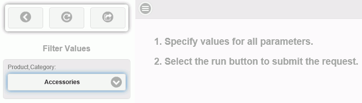
Filters that you define in the Report canvas appear at run time in the autoprompt page. The autoprompt page appears before the report is run and allows users to select the filter values that they want to see in the report.

In the example shown in the following image, there is one filter for Product Category, appearing in the Filter Values area. Using the drop-down arrow in the Product Category field, select the product category that you want to see. Accessories is the selected value in the following image.

If there were multiple filters, the user would see multiple fields in the Filter Values area.

Using the autoprompt page button bar, you can click:

  • Run with filter values. (Rightmost button) To run the report with the values displayed in the filter fields.
  • Reset filter values. (Center button) To remove the selected values and display the default values. The default value for a filter is the first valid value, listed alphabetically.
  • Close filter panel. (Leftmost button) To hide the autoprompt filter panel.

Additionally, you can toggle the hamburger control on the top of the report to reveal or hide the filter panel.

Chaining Input Controls in the Autoprompt Page

How to:

Chaining lets you link two or more input controls when they call the same dimension hierarchy. For example, if you had chained input controls for State and City, the available list of cities would automatically be limited to those in the specified state. This saves users from scrolling through a list of invalid options when specifying a parameter value.

The Report canvas in WebFOCUS App Studio allows for cascading or chaining input controls in the autoprompt page. Chaining is also available in the HTML canvas. For more information, see Chaining in the HTML Canvas.

Procedure: How to Chain Input Controls in the Autoprompt Page

When you create a report with a dynamic WHERE filter, an input control prompt displays at run time asking the user to select a value. When you have multiple WHERE filters that reference the same dimension hierarchy, the input controls can be chained together, as detailed in the following procedure.

  1. Open the Report canvas and create a report that has two or more columns showing fields from the same dimension. Position the columns in the same order in which they appear in the dimension hierarchy.

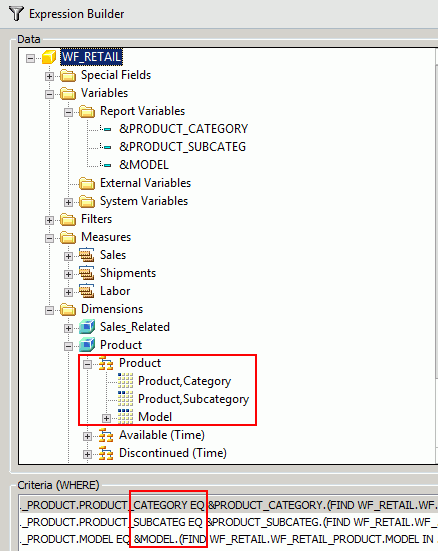
    In the example below, we use the Category, Subcategory, and Model fields from the Product dimension of the WF_RETAIL database.

  2. On the Report tab, click the down arrow under the Filter command and select Where.

    The Expression Builder dialog box is opened.

  3. In the Data area, expand the dimension that you used in your columns. Select the first field (which appears in the first column) and drag it down to the Criteria (WHERE) window below.

    The Column to filter field in the main area of the Expression Builder is automatically populated with the field you selected. In the example below, we selected Category. Complete the main area as follows:

    1. In the Logical Relation field, select equals.
    2. In the Compare Type field, select Parameter. From the sub menu, select Dynamic.

    The first WHERE filter is complete.

  4. Repeat Step 3 for the next field, in order, that you want to include in the chain.

    In the example below, a second filter for Subcategory and a third filter for Model are created.

    Note: To support chaining, the WHERE filters must be created individually, as detailed above, in the correct order. A single WHERE filter that references multiple fields will not support chaining.

    The following image shows three WHERE filters that will support chaining for the Product dimension.

  5. Click OK to close the Expression Builder. Click the Run button on the Quick Access toolbar.

    The Autoprompt Filter Values window is displayed.

  6. Select values for all filters and click the autoprompt Run button.

    A report like the following sample is displayed.

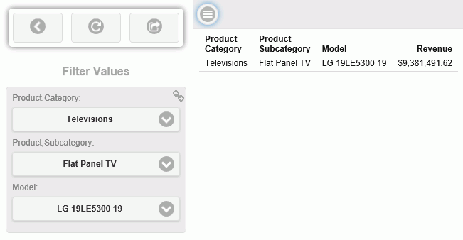
    Note the chain icon in the upper right corner of the Filter Values box. This indicates that the input controls are chained.

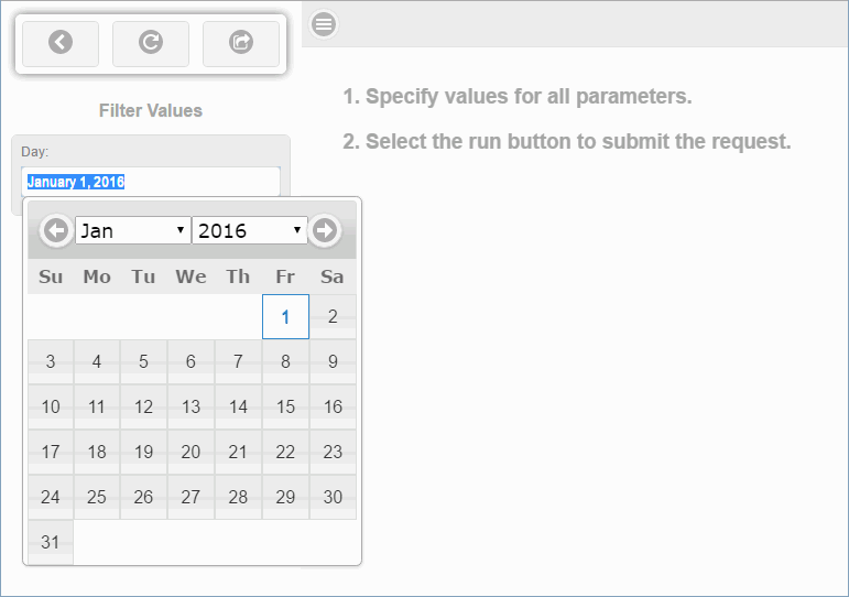
Using a Calendar Control in the Autoprompt Page

How to:

The Report canvas in WebFOCUS App Studio allows for calendar input controls in the autoprompt page, when you filter on full date fields. The calendar control appears as shown in the following image.

Responsive autoprompt calendar control

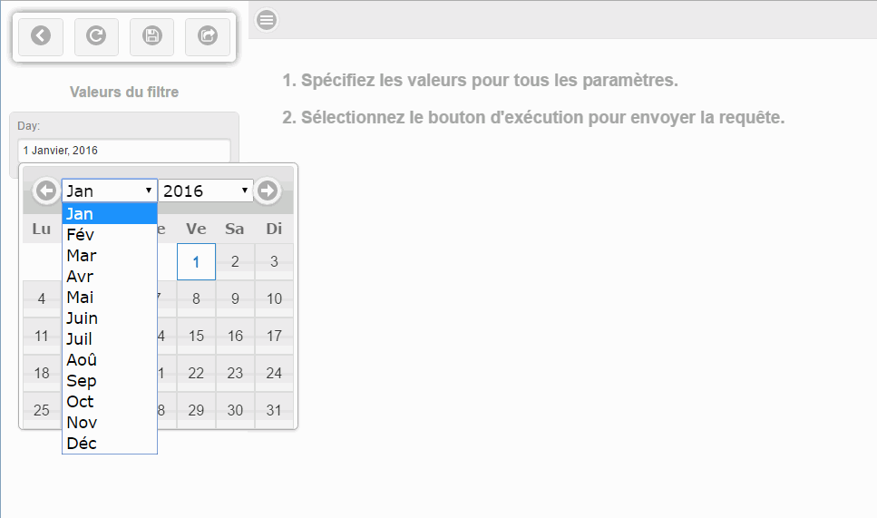
The default date will display in the calendar control in the language that the user used at sign in. The following image shows the filter pane with the default value in French and the calendar control with the month expanded to show the month values are French.

Autoprompt calendar control in French

Calendar input controls are also available in the HTML canvas. For more information, see How to Set Calendar Properties.

Procedure: How to Use a Calendar Control in the Autoprompt Page
  1. Open the Report canvas and create a report that you want to filter by time.
  2. On the Report tab, click the down arrow under the Filter command and select Where.

    The Expression Builder dialog box is opened.

  3. In the Data area, expand a dimension that includes a full date field. For example, in the WF_RETAIL database, the Sales_Related dimension includes Transaction (Time). In this hierarchy, Sale,Day has an attribute Sale,Date that you can use to filter with a calendar control.

    Drag the selected field down to the Criteria (WHERE) window.

    The Column to filter field in the main area of the Expression Builder is automatically populated with the field you selected.

    1. In the Logical Relation field, select equals.
    2. In the Compare Type field, select Parameter. From the sub menu, select Simple.

    The WHERE filter is complete. The calendar is enabled by the (|FORMAT=YYMD) syntax which is automatically inserted in this, and all other expressions.

    Note: To support the calendar control, the WHERE filter must be created individually, as detailed above. A single WHERE filter that references multiple fields will not support the calendar control.

  4. Click OK to close the Expression Builder. Click the Run button on the Quick Access toolbar.

    The Autoprompt Filter Values window is displayed with the calendar control.

Customizing a Report Using the Report Group

In this section:

How to:

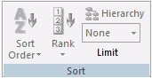
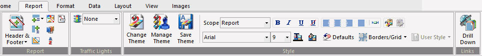
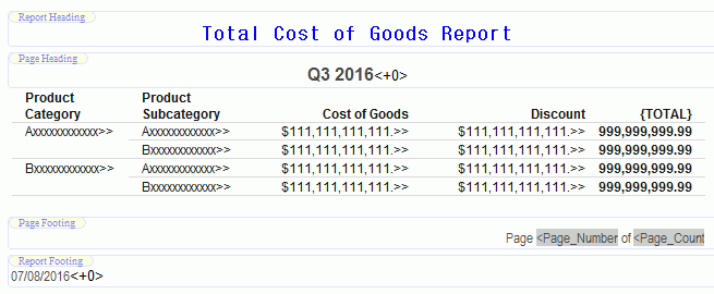
You use the options on the Report tab, in the Report group, to customize your reports. For example, you can add a header and footer to your report and include column and row totals. You can also sort the data on your report. The Report group is shown in the following image.
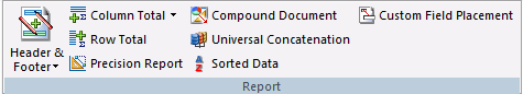
Report group

The commands are:

Header & Footer

Adds a header, footer, or both to your report. You can define a Report Header, Page Header, Page Footer, or Report Footer. For more information, see Adding a Header and Footer.

Column Total

Displays a menu of options for column totals:

  • No Totals. To show no column totals or to remove existing column totals.
  • Column Totals. To display totals below each numeric column.
  • Subtotal. To create a subtotal on the table level. In effect, this creates column totals.
  • Summarize. To create a summary on the table level. A summary performs calculations any again on total aggregated field values instead of simply summing calculated values, which is useful for reports that contain COMPUTE fields.
  • Recompute. To create a recompute on the table level. A recompute performs calculations any again on total aggregated field values instead of simply summing calculated values, which is useful for reports that contain COMPUTE fields. When applied to the entire table, Recompute and Summarize behave the same.

For more information, see Adding Totals to a Report.

Row Total

Displays totals to the right of each numeric row.

Row and Column Titles

The default title for columns and rows appears in the reporting canvas as {TOTAL}. At run time, this is automatically translated into the language that you have selected for WebFOCUS App Studio. For example, if you have selected Italian, the title appears as TOTALE. For more information on setting a language, see General Tab.

To specify a different title:

  1. Right-click the total and select Title (for row) or Column Title (for columns) from the shortcut menu.

    The Title dialog opens.

  2. Clear the Default Title check box and type the desired title in the Enter Title field.
  3. Click OK.

    At run time, the title appears as entered. Manual titles are not translated into the language that you have selected for WebFOCUS App Studio.

For more information, see Adding Totals to a Report.

Precision Report

Converts your report to a precision report. For more information, see Accessing the Precision Reports Canvas.

Compound Document

Converts your report to a Compound document. The original report remains unchanged while a copy of that report is placed on the Document canvas.

Universal Concatenation

Retrieves data from unlike data sources in a single request. Opens the Universal Concatenation dialog box, where you can add the additional data sources to concatenate. For more information, see How to Concatenate Data Sources.

Sorted Data

Assumes that the data is already sorted in the database. If the data you are accessing is already in the correct sort order, you can prevent WebFOCUS from resorting it. This feature provides a fast method of retrieving data if it is already stored in the order required for display, and no further sorting is required.

Custom Field Placement

Allows sort fields to be moved from their default location.

Adding a Header and Footer

How to:

The Header & Footer option in the Report group enables you to add a header or footer to your report, as well as to the page. The following options are available from the Header & Footer drop-down list:

  • Report Header
  • Page Header
  • Page Footer
  • Report Footer

When you select one of the header or footer options, a text box displays in the appropriate location on the Report canvas. Type your text or right-click inside the Header or Footer text box to select one of the following options in the shortcut menu:

Footing Bottom. Available only in the Page Footer and Report Footer options, it adds a blank line to the bottom of the page or report, as specified.

Page Break. Available only in the Report Header and Report Footer options, it adds a page break either before or after the report, as specified.

Insert Date. Enables you to select the date format.

Insert Spotmarker. Enables you to refine the positioning of a header or footer.

Alignment Grid. Inserts grid lines so you can align text with one or more columns in the report.

Procedure: How to Add Headers and Footers to a Report

The following steps provide details on adding headers and footers to a report.

  1. On the Home tab, in the Content group, click Report, or in the Environments Tree panel, right-click the desired folder, point to New, and click Report.
    The Report Wizard opens.
  2. Click Create Report.
  3. On the Report tab, in the Report group, click Header & Footer. The following options are available from the Header & Footer drop-down list:
    • Report Header
    • Page Header
    • Page Footer
    • Report Footer
  4. Select the type of header or footer you would like to add.
    A text box is added to the report where you can add the desired text.

    Note: You may add ad many of the header and footer types as you like to your report or page.

  5. Use the Style group on the Report tab to change the font or placement of each header or footer in relation to the report. For more information on the Style group, see Applying a Theme and Style to a Report Using the Style Group.

    The following image shows the Report canvas with content added to all four header options.

    Report canvas with headers and footers

Adding Totals to a Report

How to:

To help interpret detailed information in a report, you can summarize the information using column and row totals, grand totals, and subtotals. You can use these summary lines in a report to clarify or highlight information. You can produce totals for columns or rows of numbers in a report.

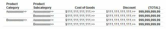
You can use column totals and row totals in matrix reports (created by using a BY sort field and an ACROSS sort field in your report request), rename column and row total titles, and include calculated values in your column or row totals. You can also create row totals using ACROSS-TOTAL.

Procedure: How to Create a Report with a Column Total

  1. On the Home tab, in the Content group, click Report, or in the Environments Tree panel, right-click the desired folder, point to New, and click Report.

    The Report Wizard opens.

  2. Click Create Report.
  3. Navigate to where you want to create the new procedure and select a data source. For example, select wf_retail.mas.

    The Report canvas opens.

  4. Add the following fields to your report in the order shown. You can double-click the fields in the Object Inspector, or drag them to the Report canvas.
    • Product Category
    • Product Subcategory
    • Revenue
    • Gross Profit.
  5. On the Home tab, in the Report group, click Column Total and select Column Totals from the drop-down menu.

    A grand total row is added at the bottom of the report that sums numeric data in each column.

Procedure: How to Create a Report With a Column Total on Selected Fields

  1. On the Home tab, in the Content group, click Report, or in the Environments Tree panel, right-click the desired folder, point to New, and click Report.

    The Report Wizard opens.

  2. Click Create Report.
  3. Navigate to where you want to create the new procedure and select a data source. For example, select wf_retail.mas.

    The Report canvas opens.

  4. Add the following fields to your report in the order shown. You can double-click the fields in the Object inspector, or drag them to the Report canvas.
    • Product Category
    • Product Subcategory
    • Revenue
    • Gross Profit
  5. On the Report tab, in the Report group, click Column Total, and select Column Totals Summarize

    , or Recompute from the drop-down menu.

    A grand total row is added at the bottom of the report that sums numeric data in each column.

  6. To add column totals to only specific columns in the report, right-click the Column Total row and select Options.

    The General dialog box opens.

  7. Select the columns for which you want a column total and click OK.
Procedure: How to Create a Report with a Row Total

  1. On the Home tab, in the Content group, click Report, or in the Environments Tree panel, right-click the desired folder, point to New, and click Rept.

    The Rept Wizard opens.

  2. Click the Create Rept button.
  3. Navigate to where you want to create the new procedure and select a data source. F example, select wf_retail.mas.

    The Rept canvas opens.

  4. Add fields to your report. You can double-click the fields in the Object inspector, or drag them to the Report canvas. For example, add the fields listed below to your report in the following order.
    • Product Category
    • Product Subcategory
    • Cost of Goods
    • Discount
  5. On the Report tab, in the Report group, click Row Total.

    A grand total column that sums numeric data in each row is added at the far right of the report.

    Report Canvas with a total for each row.

Procedure: How to Concatenate Data Sources

Universal concatenation specifies how to combine data from sources with dissimilar Master Files.

  1. Create the main request.

    This contains all the formatting for the resulting report and names the first file to be concatenated. It also contains all printing and sorting information. The fields printed and the sort fields must exist as real or DEFINE fields in each file.

  2. On the Report tab, in the Report group, click Universal Concatenation.

    The Universal Concatenation dialog box opens.

  3. Click the Add Source button to add additional data sources.

    The Open File dialog box appears.

  4. Select a Master File and click OK.

    If there are temporary HOLD files associated with the procedure, HOLD files are available from the Open dialog box.

    The selected data source is added, showing the Report Field Resolutions and Filters. Additionally, the Define Tool is activated.

    Note: If the field names for the selected data source are not the same names and formats as the fields being printed and sorted in the main request, the Universal Concatenation dialog box indicates that you need to define these fields with status icons.

  5. Create or modify a field for the universal concatenation with the Define Tool.
    • Click the Define button from the Universal Concatenation toolbar.

      or

    • Double-click the field name from the Additional Data Sources list.

    The Define Tool opens.

    Note: The Define Tool opens automatically if the Create all needed fields for a data source when launching the Define tool option is selected. This creates the missing defines for the data source. A message appears before the Define Tool opens, stating which DEFINEs will be created and require expressions, followed by a list of the created DEFINE fields. This option is off by default.

    • Create the DEFINE expression using the selected universally concatenated Master File, generating the required DEFINEs for the data source to have the same field names and formats as the fields used in the main request.
    • Click OK to close the Define Tool.

      The DEFINE expression is written in the procedure ahead of the TABLE request.

  6. Create selection criteria for the universal concatenation with a filter.

    You may create a filter through a WHERE clause.

    • Select the Where/If button to open the Expression Builder.
    • To modify or view the filter, double-click the filter expression from the Additional Data Source list to open the Expression Builder.
  7. Click OK to close the Universal Concatenation dialog box and add the MORE command to the procedure.

Setting Conditional Styling Using the Traffic Lights Group

You use the Traffic Lights group to set styling conditions. The Traffic Lights group is shown in the following image.
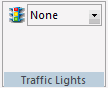
Traffic Lights

Sets the current condition for styling and hyperlinks. Options include:

  • None. Displays a preview of the report with no visible conditional styling. This is the default.
  • Forecast. Lets you apply conditional styling to the predictive analytics shown in a forecast column. For more information, see Overview of Forecasting.
  • Add/Edit Conditions. Opens the Condition List dialog box. From this dialog box, you can define new conditions, and then apply styling to them.

The styling you add to a condition appears as a preview in the Report canvas when you select the condition in the Traffic Lights drop-down list box.

For a sample procedure, see How to Use the Traffic Lighting Feature to Set Conditional Styling.

Applying a Theme and Style to a Report Using the Style Group

In this section:

You use the tools in the Style group to apply stylistic changes to a report, including data, title, and all other components of the report. The Style group is shown in the following image.

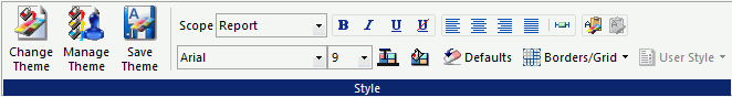
This section details the Style group of the Reports tab, which you can use to apply report-level styles. The Style group also appears on the Appearance tab (excluding the Theme commands) which you use to apply field-level styles. For more information, see Styling Data, Titles, and Text Using the Style Group.

The commands are:

Change Theme

Changes the theme of the report from a list of available style sheets.

Manage Theme

References or embeds an external StyleSheet or applies no styling to your report. The WebFOCUS StyleSheet is applied by default. When you click this button, the StyleSheet Selection dialog box opens.

Save Theme

Saves your current theme options.

Scope

Indicates the scope to which your changes will apply. For example, if you choose Report, your style changes will be applied to the whole report. If you choose Footing, your changes will be applied to the footer only. You can use the Scope function to apply styling to different areas of your report. The Scope options available from the Report tab are:

  • Report
  • Title
  • Data
  • Report Header
  • Report Footer
  • Page Header
  • Page Footer
  • Subhead
  • Subfoot
  • Subtotal
  • Subtotal Tag
  • Across Title
  • Across Data
  • Column Totals
  • Column Totals Tag
  • Report Totals (Report)
  • Report Totals (Title)
  • Report Totals (Data)
  • Recap
  • Cell
  • Page Color
  • (Selected Item)

Note: The (Selected Item) scope is only available when you select a text or field item. The type of item selected will come before (Selected Item). For example, if you have text selected in the Page Footer, the Scope would display Page Footer (Selected Item).

Bold

Applies bold font formatting to the highlighted text or text within a selected object.

Italic

Applies italic font formatting to the highlighted text or text within a selected object.

Underline

Underlines the highlighted text or text within a selected object.

No Underline

Does not display underlines, even for drilldowns.

Left

Aligns the highlighted text or text within a selected object to the left.

Center

Aligns the highlighted text or text within a selected object to the center.

Right

Aligns the highlighted text or text within a selected object to the right.

Default

Aligns the highlighted text or text within a selected object to the default alignment option. This aligns numbers to the right and text to the left.

Report Width

Sets report width options.

Copy Style

Copies the current style settings, enabling the Paste Style button.

Paste Style

Pastes the copied style settings.

Font Name

Changes the font of the highlighted text or text within a selected object. Fonts are listed in alphabetical order.

Font Size

Changes the font size of the highlighted text or text within a selected object. Font sizes range from 8 to 72 (whole numbers only).

Color

Changes the font color of the highlighted text or text within a selected object. Applies the color change to the selected Scope. Opens the Color dialog box, where you can select the font color.

Background Color

Changes the background color of the highlighted text or text within a selected object. Applies the color change to the selected Scope. Opens the Color dialog box, where you can select the background color.

Defaults

Resets the style settings of the highlighted text or text within a selected object to the default (original) style.

Borders/Grid

Turns on or disables borders and grid lines. You can apply borders and gridlines to HTML, Excel, and PDF reports. For all other report types, this option is disabled.

User Style

Enables you to set User Format Style Blocks, if available.

Referencing or Embedding a Style Sheet Using the StyleSheet Selection Dialog Box

How to:

Reference:

The StyleSheet Selection dialog box enables you to reference or embed an external style sheet, use the default WebFOCUS StyleSheet, or apply no styling to your report. You may also save and include multiple style sheets. The StyleSheet Selection dialog box is accessible from the Style group on the Report canvas ribbon.

The StyleSheet Selection dialog box provides the following capabilities:

  • Include a StyleSheet.
  • Apply an external cascading style sheet (CSS).
  • Embed a StyleSheet.
  • Apply the default WebFOCUS StyleSheet.
  • Save the modified style sheet as a new style sheet file (.sty).

To open the StyleSheet Selection dialog box, on the Report tab, in the Style Group, click Manage Theme.

Note: The StyleSheet Selection dialog box opens to the Include StyleSheet File section, since every procedure has existing embedded styling, by default. You may click Change Options and choose to embed or reference an external StyleSheet, use the WebFOCUS default StyleSheet, or turn off all report styling, as described in the following procedures.

Procedure: How to Include a StyleSheet in a Report

Since every procedure has existing styling, the Include StyleSheet File section opens, by default.

When a StyleSheet is included, part of the styling is embedded in the report. You may include StyleSheets up to an INCLUDE depth of three in your report, with the last selected StyleSheet having precedence.

  1. On the Report tab, in the Style group, click Manage Theme.

    The StyleSheet Selection dialog box opens.

  2. Click the Add new item button.

    The Open File dialog box opens.

  3. Select a StyleSheet file and click OK.
  4. Optionally, you may select to include additional StyleSheets, up to an INCLUDE depth of three in your report.

    Note: The last selected StyleSheet has precedence in the report. You may use the arrows to reorder the arrangement of StyleSheets.

    The following syntax will be added to the procedure for the included StyleSheets.

    ON TABLE SET STYLE *
         INCLUDE = citrus,
    $
         INCLUDE = teal,
    $
         INCLUDE = olive,
    $
    .
    .
    .
  5. Click Finish to close the StyleSheet Selection dialog box.
  6. Optionally, you may apply styling options from the Report canvas and save the StyleSheet code using the Save Theme command, in the Style group, on the Report tab.
Procedure: How to Apply an External Cascading Style Sheet (CSS)

In addition to applying StyleSheets to your report, you may apply an external cascading style sheet to your report. An external cascading style sheet (CSS) is an extension to HTML that enables you to specify formatting for an HTML document. To link the CSS to the report, use the External Cascading Style Sheet URL field in the StyleSheet Selection dialog box.

Note: An external cascading style sheet is only applicable when using the HTML report output format.

  1. On the Report tab, in the Style group, click Manage Theme.

    The Stylesheet Selection dialog box opens.

  2. Type a name of the customized StyleSheet (.css) in the External Cascading StyleSheet URL input field.

    Note: The external CSS (cascading style sheet) file should be saved in an alias on the web server.

  3. Optionally, you may include StyleSheets to be added to the report.

    Note: A CSS file is separate from a StyleSheet file and can exist on its own.

  4. Click Finish to close the StyleSheet Selection dialog box.
Procedure: How to Embed a StyleSheet in a Report

Embedding a StyleSheet stores your style information within the report, from which you can read an existing file as a starting point, start with an empty style, or leave the current StyleSheet contents without any modifications.

  1. On the Report tab, in the Style group, click Manage Theme.

    The StyleSheet Selection dialog box opens.

  2. Click Change Options to change the StyleSheet Selection dialog box options. The StyleSheet Selection dialog box displays.
  3. Accept the default, Normal Embedded Styling, and click Next.
  4. To read an existing file as a starting point:
    1. Select Initialize with the contents of a pre-existing file.

      Note: Preserve referenced StyleSheets so any “INCLUDE=name” will not be deleted is selected, by default. When a StyleSheet is included, a reference of the StyleSheet is added to the report syntax as INCLUDE=name. This reference is added to the existing style information already in the TABLE request.

    2. Click Next.

      The StyleSheet File Selection dialog box appears.

    3. Select a Predefined Template file to use as your starting point and click OK.

      The selected StyleSheet file is shown as the origin embedded StyleSheet file. Optionally, you may include additional StyleSheets or add an External cascading style sheet (CSS).

    4. Click Finish to close the StyleSheet Selection dialog box.

    The selected StyleSheet code is imported into the procedure and overwrites any existing styling in the report.

  5. To start with an empty style:
    1. Click Change Options to change the StyleSheet Selection dialog box options.
    2. Keep Normal Embedded Styling selected and click Next.
    3. Select Start fresh with an empty StyleSheet.

      Note: Preserve referenced StyleSheets so any “INCLUDE=name” will not be deleted is selected, by default. When a StyleSheet is included, a reference of the StyleSheet is added to the report syntax as INCLUDE=name. This reference is added to the existing style information already in the TABLE request.

    4. Click Next.

      The Include StyleSheet File section opens indicating that the origin of the embedded StyleSheet file is unknown.

      Tip: You may select StyleSheet files to embed to your currently empty style.

    5. Click Finish to close the StyleSheet Selection dialog box.
    6. Click OK to close the StyleSheet Selection dialog box.

    Starting with an empty style clears any styling from the report and initializes a procedure with the WebFOCUS default style code (basic styling that is used when styling is not specified).

  6. To leave Report canvas generated styling untouched:
    1. Click Change Options to change the StyleSheet Selection dialog box options.
    2. Keep Normal Embedded Styling selected and click Next.
    3. Select Leave current StyleSheet contents without modification.

      Note: Preserve referenced StyleSheets so any “INCLUDE=name” will not be deleted is selected, by default. When a StyleSheet is included, a reference of the StyleSheet is added to the report syntax as INCLUDE=name. This reference is added to the existing style information already in the TABLE request.

    4. Click Next.

      The Include StyleSheet File section opens indicating that the origin of the embedded StyleSheet file is unknown.

      Tip: You may include StyleSheets to be added to the report.

    5. Click Finish to close the StyleSheet Selection dialog box.
  7. Optionally, you may apply styling options from the Report canvas and save the StyleSheet code.
Procedure: How to Apply the Default WebFOCUS StyleSheet

The WebFOCUS Default Styling section applies the default StyleSheet to your report, with no styling visible in the procedure.

Note: The default WebFOCUS StyleSheet disables any styling options in the report. No further styling options of any kind can be applied to the report.

  1. On the Report tab, in the Style group, click Manage Theme.

    The StyleSheet Selection dialog box opens.

  2. Click Change Options to change the StyleSheet Selection dialog box options.
  3. Select WebFOCUS Default Styling and click Finish.

    Tip: To remove the default WebFOCUS StyleSheet and enable styling, click the Style File Selection button to open the StyleSheet Selection dialog box and select the Normal Embedded Styling option.

Procedure: How to Reset the Default Report Canvas Styling

To reset the default the Report canvas styling in the StyleSheet Selection dialog box:

  1. On the Report tab, in the Style group, select Manage Theme.

    The StyleSheet Selection dialog box opens.

  2. Highlight the added StyleSheet files (.sty) listed in the Include StyleSheet File section and click Delete selected items (Del).
Procedure: How to Save a StyleSheet

After including StyleSheets and applying styling options from the Report canvas, you may save the StyleSheet as a new StyleSheet file (.sty).

  1. On the Report tab, in the Style group, click Save Theme.

    The Save As dialog box opens.

  2. Type a name for the StyleSheet in the File name input field and click OK.

    The .sty file is saved in the working directory. You may browse to select a different location.

    Tip: The saved StyleSheet can be included in other reports from the StyleSheet File Selection dialog box.

Reference: Usage Notes for the StyleSheet Selection Dialog Box

The following apply when using the StyleSheet Selection dialog box in the Report canvas:

  • Applying StyleSheets through the StyleSheet Selection dialog box follows the same rules of WebFOCUS StyleSheet inheritance. For details, see WebFOCUS StyleSheet Attribute Inheritance in the Creating Reports With WebFOCUS Language manual.
  • When including or referencing a StyleSheet that is not in the current application, the StyleSheet gets copied to the working directory.

    If the StyleSheet already exists in the current application, it does not get overwritten.

    To refresh an existing StyleSheet, you must copy the new StyleSheet to the working directory or remove the StyleSheet from the procedure, delete it from the working directory, and then add it back to the procedure.

  • The default location for StyleSheets that are Included or referenced in WebFOCUS App Studio is drive:\AppStudionn\ibi_html\javaassist\intl\locale\combine_templates, which contains a set of sample StyleSheets. You can also search other WebFOCUS locations for available StyleSheets.
  • When a StyleSheet is used in the procedure and the StyleSheet Selection dialog box is opened, it opens in the Include StyleSheet File section, enabling you to change the included StyleSheet. You may also change the StyleSheet options. This occurs even when the Defaults option (located in the Style group on the Report canvas ribbon in WebFOCUS App Studio) is clicked.

    Note: If you go back and select to embed or reference a StyleSheet, or use the WebFOCUS default option, the StyleSheet that was in the report will get overwritten.

  • If the report does not have any styling, the StyleSheet Selection dialog box opens to the Change Options section. The report code contains the command:
    ON TABLE SET STYLE OFF

Assigning a Color Value Using the Color Dialog Box

How to:

The Color dialog box lets you choose a color by selecting it from the color palette or entering a hexadecimal value.

Procedure: How to Access the Color Dialog Box
  1. On the Report tab, in the Style group, click Color or Background Color.

    The Color dialog box displays.

  2. Click Default to restore the formatting back to its original state.
  3. Click Custom to access custom coloring.
  4. Click OK to close the Color dialog box.

Adding Borders to a Report Using the Borders Dialog Box

How to:

You use the Borders dialog box to add borders to your report.

Procedure: How to Add Borders to an HTML, Excel, or PDF Report

You can add borders to an entire report, a column, or another object area, such as a heading or footing.

Note: You must remove grids from the report, column, or object area before you can apply borders.

You can set borders to a report globally, so that they will apply to all objects you subsequently add to the report.

Note: Ensure that HTML, Excel, or PDF is selected as the report output format on the Format tab.

To set global borders:

  1. On the Report tab, in the Style group, click Borders/Grid and then click Borders, or right-click the Report canvas area and click Borders.

    The Borders dialog box opens.

    Note: By default, the Make all borders the same option is selected.

  2. To specify border settings for the top, bottom, left, and right borders, click the Make all borders the same check box to disable that option. Make your border selections:
    • Select the following options from the Width drop-down list:
      • OFF to turn borders off. (This is the default.)
      • LIGHT to apply thin border lines.
      • MEDIUM to apply medium border lines.
      • HEAVY to apply thick border lines.
    • From the Style drop-down list, select a line style.
    • From the Color drop-down list, select a color.

    After you select your border width, style, and color selections, you can see them in the Border Preview window in the Borders dialog box.

    Note: You can restore the original default borders by clicking the Default button.

  3. Click OK.

To apply a border to a column:

  1. Select the column to which you want to apply a border.
  2. On the Appearance tab, in the Style group, select an option from the Scope drop-down command. The options are:
    • Data and Title applies grids to the column title and data.
    • Data Only applies grids to the column data.
    • Title Only applies grids to the column title.
  3. On the Appearance tab, in the Style group, click Borders.

    The Borders dialog box opens.

  4. To specify border settings for the top, bottom, left, and right borders, select the Make all borders the same check box to turn off that option.
  5. Make your border selections:
    • Click the down arrow in the Width drop-down list box and select:
      • OFF to turn borders off. (This is the default.)
      • LIGHT to apply thin border lines.
      • MEDIUM to apply medium border lines.
      • HEAVY to apply thick border lines.
    • From the Style drop-down list, select a line style.
    • From the Color drop-down list, select a color.

    After you select your border width, style, and color selections, you can see them in the Border Preview window in the Borders dialog box.

    Note: If the OFF option is selected in the Width drop-down list, no borders will be shown.

  6. Click OK.

To apply a border to cells in a header, footer, subheader, or subfooter:

You can divide a header or footer into cells, which you can align to columns in the report. In PDF, PowerPoint PPTX, and DHTML formats, you can add borders to all header, footer, subheader, or subfooter cells at once.

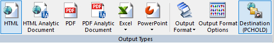
  1. On the Format tab, in the Output Types group, click PDF to set the output format to PDF, click PowerPoint and then click PowerPoint PPTX to set the output format to PowerPoint PPTX, or click Output Format, point to Styled report formats, and click DHTML Web Document (DHTML) to set the output format to DHTML.
  2. Optionally, set output format options in the Output Format Options dialog box.
  3. Add fields to the report.
  4. On the Report tab, in the Report group, click Header & Footer and click Report Header, Page Header, Page Footer, or Report Footer, or select a field and, in the Field tab, in the Break group, click Subheader or Subfooter.
  5. Right-click the header, footer, subheader, or subfooter and click Alignment Grid.

    The Insert Alignment Grid dialog box opens.

  6. Select Align with Data to make the cells in the header, footer, subheader, or subfooter line up with the cells in the report.
  7. Use the Number of lines option to set the number of rows in the header or footer grid.
  8. Use the Default justification or Decimal alignment options to specify how text is aligned in each cell.
  9. On the Report tab, in the Style group, select the header, footer, subheader, or subfooter object that you added a grid to from the Scope menu.
  10. On the Report tab, in the Style group, click Borders/Grid and then click Borders.

    The Borders dialog box opens.

  11. Select the Border all cells in the grid check box to add the same borders to every cell in the header, footer, subheader, or subfooter grid.
  12. Make your border selections:
    • Click the down arrow in the Width drop-down list box and select:
      • OFF to turn borders off. (This is the default.)
      • LIGHT to apply thin border lines.
      • MEDIUM to apply medium border lines.
      • HEAVY to apply thick border lines.
    • From the Style drop-down list, select a line style.
    • From the Color drop-down list, select a color.

    After you select your border width, style, and color selections, you can see them in the Border Preview window in the Borders dialog box.

    Note: If the OFF option is selected in the Width drop-down list, no borders will be shown.

  13. Click OK.
  14. When you run the report, all of the cells in the header, footer, subheader, or subfooter use the specified borders.

To apply a border to another object area:

  1. On the Report tab, in the Style group, select an option from the Scope drop-down command. The options are:
    • Report
    • Title
    • Data
    • Report Header
    • Report Footer
    • Page Header
    • Page Footer
    • Subhead
    • Subfoot
    • Subtotal
    • Subtotal Tag
    • Across Title
    • Across Data
    • Column Totals
    • Column Totals Tag
    • Report Totals (Report)
    • Report Totals (Title)
    • Report Totals (Data)
    • Recap
    • Cell
    • Page Color
    • (Selected Item)
  2. On the Report tab, in the Style group, click Borders/Grid and then click Borders.

    The Borders dialog box opens.

  3. To specify border settings for the top, bottom, left, and right borders, select the Make all borders the same check box to turn off that option.
  4. Make your border selections:
    • Select the following options from the Width drop-down list:

      OFF to turn borders off. (This is the default.)

      LIGHT to apply thin border lines.

      MEDIUM to apply medium border lines.

      HEAVY to apply thick border lines.

    • From the Style drop-down list, select a line style.
    • From the Color drop-down list, select a color.

    After you select your border width, style, and color selections, you can see them in the Border Preview window in the Borders dialog box.

    Note: If the OFF option is selected in the Width drop-down list, no borders will be shown.

  5. Click OK.

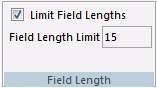
Specifying a Width Limit for a Value Using the Width Options Dialog Box

How to:

The Width Options dialog box allows you to set how values will be handled if they extend the report cell. You can also enter a value to specify a limit for how large or small a value can be before these options take effect.

Procedure: How to Set Width Options for a Report
  1. On the Report tab, in the Style group, click Report Width.

    The Width Options dialog box displays.

  2. From the <not set> drop-down dialog box, select one of the following options:
    • Minimum
    • Maximum
    • Truncate
    • Wrap
    • Wrap Off
  3. Indicate a value (in inches) by which to limit the width of the report.

    Note: This only applies to Truncate and Wrap.

  4. Click OK.

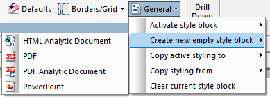
Specifying Styling for User Selected Output Formats Using the User Format Menu

How to:

If the output format for a report is set to user selection, the User Format menu becomes available. You can specify different styling for each available format by expanding the User Format menu, pointing to Create new empty styling block or Copy active styling to, and selecting an output format, as shown in the following image.


Once an output format is selected, styling changes that you make are applied only when that format is selected at run-time. Styling for the General output selection is applied to all output formats for which styling is not explicitly applied.

Selecting a format from the Create new empty style block submenu clears all styling for that for the selected format, including the StyleSheet. You can then style the report for the selected format.

If you point to Copy active styling to and then click an output format, you can copy the styling defined for another output format or for general output. Click the User Format menu, point to Activate style block, and select an output format to make additional changes specific to the selected format.

If you have multiple output format styles defined, you can point to Copy styling from and select an output format to apply the styling from that format to the active output format.

To reset the styling changes made for the active output format, open the User Format menu and click Clear current style block. To remove the specified styling for an output format entirely and instead use the styling specified for the General output type, click Delete current style block.

Procedure: How to Specify Styling for User Selected Output Formats
  1. Create a report in App Studio.
  2. On the Format tab, in the Output Types group, click Output Format, point to Styled report formats, and click User.

    The User Format Selection dialog box opens.

  3. Clear the check boxes for any output formats that you do not want to be available at run time. Optionally, click the double-arrows in the Options column to specify output format options for each available format, and change the text that displays in the user selection prompt at run time by changing the text in the Enter text for the WFFMT prompt text box.
  4. Click OK.

    On the Report tab, in the Style group, the User Format menu becomes available. It is initially set to General, allowing you to style the report for any output formats that do not have their own styling explicitly specified.

  5. Optionally, use the commands in the Style group to style the report for general output.
  6. Configure separate styling for an available output type using one of the following methods.
    • In the User Format menu, point to Create new empty style block and click an output format. The selected output format now uses its own style settings, and currently has not styling characteristics defined. The StyleSheet has also been removed for the selected output format. The selected output format is now active for editing.
    • In the User Format menu, point to Copy active styling to and click an output format. The selected output format now uses its own style settings, copied from the styling for the active output format.

      Note: Styling characteristics are copied to the selected output format, but that output format is not active for editing. To activate the selected output format, click the User Format menu, point to Activate style block, and select the output format that you want to edit.

  7. Optionally, use the commands in the Style group to style the report for the active output format.
  8. Repeat steps 6 and 7 for any other output formats that you want to have their own unique styling.
  9. Run the report.

    When you run the report with an output format for which you have defined unique styling, that styling is applied. When you run the report with an output format that you did not style separately, the styling characteristics defined for general output are used.

Creating Drill-Down Hyperlinks Using the Drill Down Command

In this section:

How to:

You can use the Drill Down command in the Links group to create hyperlinks in your report. These hyperlinks allow you to see more detail in the ad-hoc reports that are automatically created when you click a link. The Drill Down command is shown in the following image.

The Drill Down command appears in both the Report and the Appearance tabs. The resulting hyperlinks differ, depending on the tab you invoke the command from.

  • The Report tab Drill Down command creates hyperlinks in every field in the report.
  • The Appearance tab Drill Down command creates hyperlinks only in the fields of the specified column.

Procedure: How to Create Drill-Down Hyperlinks

  1. On the Report tab (for links in every field) or Appearance tab (for links in a column only), in the Links group, select Drill Down.

    The Drill Down dialog box displays.

  2. Click the Add new item button on the Drill Down dialog box toolbar.

    The Drill Down fields are enabled.

  3. In the Drill Down dialog box:
    1. The Drill Menu Items field is automatically populated with a default drill-down name. You may rename it as needed, or delete the name if you are using only one drill down.
    2. Select one of the following Drill Down Types from the drop-down menu:
      • Execute Procedure
      • Execute Guided Procedure
      • URL
      • URL from field
      • JavaScript
      • Refresh BI Portal

      Note: The Refresh BI Portal drill-down type will be displayed only when you are working with a report that was created in the Content development area.

    3. Double-click in the Source field.
      • If you selected the Execute Procedure Drill Down Type, the Open File dialog box opens.

        Select the procedure to drill to and click OK.

      • If you selected the Execute Guided Procedure Drill Down Type, the Guided DrillDown dialog box opens. For more information, see How to Create a Guided Drill Down Procedure.
      • If you selected the URL Drill Down Type, type a fully qualified URL to drill to.
      • If you selected the URL from field Drill Down Type, select a source field from the drop-down menu which contains the URL to drill to.
      • If you selected the JavaScript Drill Down Type, enter the function to drill to. In the Parameters field (Step 4 below), type the arguments for the function.
      • If you selected the Refresh BI Portal Drill Down Type, select Current page only or All pages in portal to refresh when the drill down is triggered.
    4. Select a Target Frame from the drop-down menu:
      • _blank opens the target procedure in a new window.
      • _self opens the target procedure in the same window as the source. This is the default. In addition, it is the only option available if you selected the Refresh BI Portal drill down type.
      • _parent opens the target procedure in the same frame as the anchor.
      • _top opens the target procedure in the current window.
    5. Double-click in the Parameters field.

      The Parameters dialog box opens.

  4. Click the Add new item button on the Parameters dialog box toolbar.

    The Parameter fields are enabled.

  5. In the Parameters dialog box:
    1. The Parameter Name field may appear, depending on the Drill Down Type you selected. Select a name from the drop-down menu or, if no drop-down menu appears, type a parameter name.
    2. Select a parameter type from the drop-down list box:
      • Field allows you to select a specific field from the Parameter Value drop-down menu.
      • Constant Value allows you to specify a constant value for the parameter in the Parameter Value field.
      • Variable allows you to specify a variable for the parameter in the Parameter Value field.
  6. Click OK.

    The Parameters dialog box closes and you return to the Drill Down dialog box.

  7. Click OK.

    The Drill Down dialog box closes.

Procedure: How to Create Guided Drill Down Hyperlinks

  1. On the Report tab (for links in every field) or Appearance tab (for links in a column only), select Drill Down.

    The Drill Down dialog box opens.

  2. Click the Add new item button on the Drill Down dialog box toolbar.

    The Drill Down fields are enabled. The Drill Menu Items field is automatically populated with a default drill-down name. You may rename it as needed, or delete the name if you are using only one drill down.

  3. In the Drill Down type list, click Execute Guided Procedure.
  4. Double-click in the Source field.

    The Guided DrillDown dialog box opens.

  5. Click Browse.

    The Open File dialog box opens.

  6. Select the drill-down procedures that you want to use.

    To select multiple procedures, hold down the Ctrl key and click the procedures.

  7. Click OK.

    You are returned to the Guided DrillDown dialog box, with the selected procedures displayed in the procedures list box.

  8. Optionally, use the procedures list box toolbar to change the order of the procedures, undo or redo changes, or delete a procedure from the list.
  9. To add parameters for a procedure, select it in the procedures list box, then click Add in the Parameters list box.

    The Drill Down Parameter dialog box opens.

  10. In the Drill Down Parameter dialog box, do the following:
    1. Type a parameter name in the Parameter name field.
    2. To specify a field as a parameter value, select Field and use the drop-down list to select a field from the highlighted procedure.
    3. To specify a constant value as a parameter value, select Constant value and type the value in the available field.
    4. To change the wording of the prompt that displays when users select a drill down procedure, type the new wording in the Prompt field.
  11. Click OK.

    You are returned to the Guided DrillDown dialog box.

  12. Click OK.

    You are returned to the Drill Down dialog box.

  13. In the Drill Down dialog box, select a Target Frame from the drop-down menu. The available options are:
    • _blank opens the target procedure in a new window.
    • _self opens the target procedure in the same window as the source.
    • _parent opens the target procedure in the same frame as the anchor.
    • _top opens the target procedure in the current window.
  14. Click OK.

    The Drill Down dialog box closes.

Creating a PDF Compound Report With Drill Through Links

How to:

Reference:

A common technique in business reporting is to create two related reports:

  • Summary Report. Contains condensed information for a category such as a business account, with summed data such as total balances and total sales.
  • Detail Report. For specified fields in the associated summary report, a detail report contains all the component values that contributed to each summary field value.

Drill Through provides a way to easily relate the data in these two types of reports. For example, a user scanning a summary report account may see an unusual figure in one of the accounts, requiring examination of the specific data behind that figure.

Drill Through Compound Layout Reports use document syntax declarations to create the compound procedure and define which reports will be related through hyperlinks.

Reference: Drill Through and Drill Down Compared

Using Drill Down, you can construct a summary report in which clicking a hyperlink displays detail data. A Drill Down is implemented dynamically. Clicking a hyperlink causes a new report to run. The detail report typically displays only the detail data for a selected field on the summary report.

In contrast, Drill Through reports are static. Drill Through creates a PDF document that contains the summary report plus the detail report, with the detail report containing all the detail data for designated fields in the summary report. Clicking a Drill Through hyperlink navigates internally in the PDF file. No additional reports are run. You can save the PDF file to disk or distribute it using ReportCaster. When opened with Adobe Reader, it retains its full Drill Through functionality.

Drill Through provides flexibility in the appearance of reports and location of hyperlinks:

  • Drill Through hyperlinks may appear in headings and subheadings, as well as, in rows of data.
  • You can format the reports using a WebFOCUS StyleSheet.
  • You can indicate a hyperlink by color, font, underlining, and so forth.
  • You can mix conventional Drill Down hyperlinks freely in the same report with Drill Through hyperlinks.
  • The PDF file created with Drill Through can consist of more than two reports.
Reference: Use With Other Features

You can use Drill Through with other WebFOCUS features:

  • Compound reports that contain linked Drill Through reports may also contain unrelated reports, before or after the Drill Through reports. For example, you can add to the compound report package a PDF report that contains embedded graphs.
  • You can add Drill Down and URL hyperlinks to a PDF report that contains Drill Through hyperlinks.
  • Since Drill Through reports are standard PDF compound reports packaged into a single PDF file, you can distribute them using ReportCaster.
  • Reports with DRILLTHROUGH syntax can be rendered in all other styled output formats: HTML, PostScript, XLSX, and so on. In these other formats, the DRILLTHROUGH syntax is ignored. It is useful, for example, to generate a PostScript version of a Drill Through report, which is formatted identically to the PDF version, but which you can send directly to a PostScript printer using ReportCaster or operating system commands.
  • Drill Through automates the process of navigating quickly and easily from general to specific information in related reports packaged in a single PDF compound report. Drill Through syntax sets up hyperlinks that take you from an item in a summary report to a corresponding item in a detail report.
Procedure: How to Create a Drill Through in a PDF Compound Layout Report

To create a Drill Through in a PDF Compound Layout report:

  1. Create the summary report with a DRILLTHROUGH hyperlink.
  2. Create the detail report with sort values that match the hyperlink field values.
  3. Create the Compound Layout report with page layouts for each component report, and define a DRILLMAP attribute within the calling report to specify the targets of the drill through hyperlinks.
Procedure: How to Create a Drill Through in a PDF Compound Report

To create a Drill Through in a PDF Compound Report:

  1. Create the summary report.
  2. Create the detail report.
  3. Connect the reports with hyperlinks.
  4. Merge the summary and detail reports into a PDF compound report.
Reference: Usage Notes for Drill Through
  • Individual component reports containing Drill Through designations can be run standalone. You will see a warning message in the Message Viewer indicating that outside of the compound report, the Drill Through will not be active.
  • Only one Drill Through behavior can be specified per report.
  • The field specified to contain a Drill Through behavior must also be present in the target report.
  • The originating report containing the Drill Through link must be rendered (by the Reporting Server) prior to the target report. The order of reports must be handled by the user.
  • Live Drill Through links are only generated for PDF output. Reports with DRILLTHROUGH syntax can be rendered in all other styled output formats: HTML, PostScript, XLXS, and so on. In these other formats, the DRILLTHROUGH syntax is ignored. It is useful, for example, to generate a PostScript version of a Drill Through report, which is formatted identically to the PDF version, but which you can send directly to a PostScript printer using ReportCaster or operating system commands.
  • Drill Through is only supported for reports (TABLE).
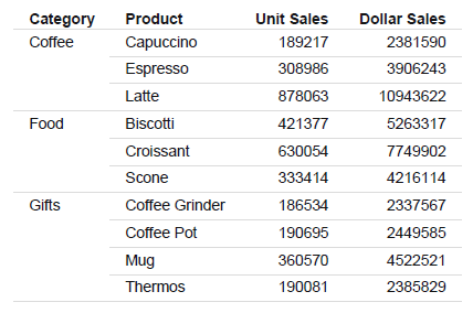
Procedure: How to Create the Summary Report (Step 1)

The following procedure generates a sample summary report.

  1. Create a report in the Report canvas using the GGSALES Master File.
  2. Add the following fields to your report in the following order. You can double-click the fields in the Object Inspector, or drag them to the Report canvas.
    • Category (By)
    • Product (By)
    • Units (Sum)
    • Dollars (Sum)
  3. On the Format tab, in the Output Types group, click PDF.

    The Output Format Options dialog box opens.

  4. Optionally, change the output format options, or click OK.
  5. Save and run the report.

    The output is:

Procedure: How to Create the Detail Report (Step 2)

The following procedure generates a sample detail report.

  1. Create a report in the Report canvas using the GGSALES Master File.
  2. From the Procedure View, right-click Comment, point to New, and then click Set.
  3. From the Available Settings pane, select SQUEEZE, click Add, and set Current Value to On.
  4. Add the following fields to your report in the following order. You can double-click the fields in the Object Inspector, or drag them to the Report canvas.
    • Category (By)
    • Product (By)
    • Units (Sum)
    • Budunits (Sum)
    • Dollars (Sum)
  5. Right-click the Category field and set Invisible to On.
  6. Right-click the Product field and set Invisible to On.
  7. Select the Category field, and from the Field tab, in the Break group, set Page-Break to On.
  8. On the Report tab, in the Header & Footer group, select Page Header.
  9. Double-click the Page Heading field:
    1. Type Category:
    2. From the Object Inspector, double-click the Category field. This inserts the Category value in the heading of the report.
    3. Press Enter to add a blank line between the heading and the report.
    4. Right-click and from the Styling toolbar, select Center.
  10. Select the Product field, and from the Field tab, in the Break group, select Subheader.
  11. Double-click the Subheading field:
    1. Type **** Product:
    2. From the Object Inspector, double-click the Product field. This inserts the Product value in the subheading of the report.
  12. Select the Product field, and from the Field tab, in the Break group, select Subfooter.
  13. Double-click the Subfooting field:
    • Press Enter to add a blank line between the report and the footer.
    • Type <15 **** Return to Summary ****.
  14. Select the Product field, and from the Field tab, in the Break group, set Page-Break to On.
  15. Add the Region and City fields, as sort fields, to the report after the Product field.
  16. On the Format tab, in the Output Types group, click PDF.

    The Output Format Options dialog box opens.

  17. Optionally, change the output format options, or click OK.
  18. Save and run the report.

    The output is:

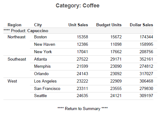
Procedure: How to Create the Summary Hyperlink Report (Step 3)

The following procedures describe how to use the Drill Through feature to create a compound report with a summary and detail report and navigate between them.

The example illustrates the following:

When you place a Drill Through hyperlink on a sort-break element, ensure the sort-break is at least at the level of the last sort field participating in the Drill Through. For example, in the second report, the Drill Through hyperlink is on the subfooting associated with PRODUCT rather than the heading (with a sort break) associated with CATEGORY.

Although the code can infer a value of PRODUCT for the CATEGORY heading (you can verify this by embedding the field <PRODUCT> in the heading), it is always the value of the first PRODUCT within that CATEGORY. Typically you want a Drill Through hyperlink for each value of PRODUCT within each CATEGORY.

You do not need to place the hyperlink on an embedded item. You can just as effectively place it on a text item. Any item in the subfooting is associated with the same values of CATEGORY and PRODUCT. Similarly, you can place a hyperlink on any field in a DATA line, and the values of the associated link fields will be identical. Conventional Drill Down hyperlinks also work this way.

The summary report:

  • Places a hyperlink on the PRODUCT field on each DATA line.
  • Specifies that the fields to link to the next report are CATEGORY and PRODUCT. Since the target fields in the detail report have identical names in the summary report, you can use the notation CATEGORY rather than CATEGORY=CATEGORY.
  • Specifies the action DOWN, so that clicking a hyperlink brings you to the location in the next report that has the corresponding values of the two link fields.
  • Uses the default appearance for the hyperlinks, which is blue, underlined text.
  1. Open the report you created in How to Create the Summary Report (Step 1).
  2. Select the Product field, and on the Appearance tab, in the Style group, select Data Only from the Scope drop-down menu.
  3. On the Appearance tab, in the Links group, select Drill Down.

    The Drill Down dialog box displays.

  4. Click the Add new item button on the Drill Down dialog box toolbar.

    The Drill Down fields are enabled.

  5. In the Drill Down dialog box:
    1. From the Drill Down Types drop-down menu, select Drill Through.
    2. From the Source drop-down menu, select Down.
    3. Double-click in the Parameters field.

    The Parameters dialog box opens.

  6. Click the Add new item button on the Parameters dialog box toolbar.

    The Parameter fields are enabled.

  7. In the Parameters dialog box:
    1. From the Parameter Value drop-down menu, select the Category field.
    2. Click the Add new item button on the Parameters dialog box toolbar.
    3. From the Parameter Value drop-down menu, select the Product field.
    4. Click OK.

    The Parameters dialog box closes and you return to the Drill Down dialog box.

  8. Click OK.

    The Drill Down dialog box closes.

  9. Save the report.
Procedure: How to Create the Detail Hyperlink Report

The detail report:

  • Places a hyperlink in the subfooting associated with the link field PRODUCT. Since CATEGORY is a higher level BY field than PRODUCT, each PRODUCT subheading is also associated with a unique value of CATEGORY.
  • Places a hyperlink on the first item of the second line of the subfooting, which is the text Return to Summary.
  • Specifies action FIRST, so that clicking the hyperlink jumps to the line in the first (summary) report that contains the same values of the two link fields CATEGORY and PRODUCT.
  1. Open the report you created in How to Create the Detail Report (Step 2).
  2. Select the **** Return to Summary **** line in the Subfoot field.
  3. On the Report tab in the Links group, select Drill Down.

    The Drill Down dialog box displays.

  4. Click the Add new item button on the Drill Down dialog box toolbar.

    The Drill Down fields are enabled.

  5. In the Drill Down dialog box:
    1. From the Drill Down Types drop-down menu, select Drill Through.
    2. From the Source drop-down menu, select First.
    3. Double-click in the Parameters field.

    The Parameters dialog box opens.

  6. Click the Add new item button on the Parameters dialog box toolbar.

    The Parameter fields are enabled.

  7. In the Parameters dialog box:
    1. From the Parameter Value drop-down menu, select the Category field.
    2. Click the Add new item button on the Parameters dialog box toolbar.
    3. From the Parameter Value drop-down menu, select the Product field.
    4. Click OK.

    The Parameters dialog box closes and you return to the Drill Down dialog box.

  8. Click OK

    The Drill Down dialog box closes.

  9. Save the report.
Procedure: How to Create the Compound Layout Report (Step 4)

Perform this version of Step 4 if you are creating a Compound Layout report.

To create the Compound Layout report:

  • Add a COMPOUND LAYOUT and SECTION declaration to the top of the procedure.
  • Add PAGELAYOUT and COMPONENT declarations for the two reports. Add DRILLMAP attributes to the COMPONENT declarations.
  • Add SET COMPONENT commands and the two reports.
  • End the procedure with a COMPOUND END command.
  1. On the Home tab, in the Content group, click HTML/Document, or in the Environments Tree panel, right-click the desired folder, point to New, and click HTML/Document.

    The HTML/Document Wizard opens.

  2. In the File Type area, select Document.
  3. Navigate to where you want to select a recent procedure.

    Note: If you used the shortcut menu in the Environments Tree panel to create your document, a location is already selected.

  4. Click Next to set the Document Properties.

    The Document Properties dialog box opens.

  5. From the Output Format list, choose PDF.
  6. Click Finish.

    The Document canvas and Properties panel open.

  7. Insert a report component.
  8. Right-click the report and select Reference existing procedure.
  9. Select the summary procedure and click OK.
  10. Right-click the Document canvas and select Insert new page after.
  11. Insert a report component.
  12. Right-click the report and select Reference existing procedure.
  13. Select the detail procedure and click OK.
  14. Select the Summary report and in the Properties panel, select the Detail report for the Drill Through Destination parameter.
  15. Select the Detail report and in the Properties panel, select the Summary report for the Drill Through Destination parameter.
  16. Save and run the report.
Procedure: How to Run the Drill Through Report (Step 5)

When you run the drill down report, the first page of output has the summary report with the hyperlinks to the individual products in blue and underlined, as shown in the following image.

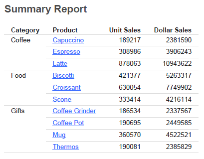
Click the Croissant hyperlink for the Food category. You jump to the detail information. In the detail report, the hyperlink back to the summary report is underlined, as shown in the following image.

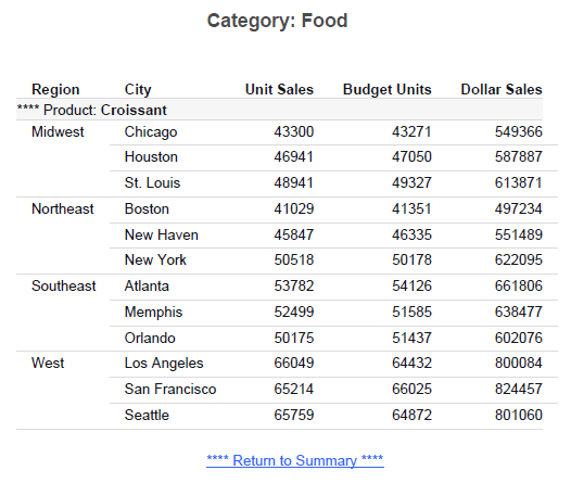
Click the Return to Summary hyperlink to return to the first page (summary report).

Reference: Guidelines on Links For FIRST

The following guidelines apply:

  • The set of link fields used with FIRST must correspond to the set of link fields used with DOWN on the first report.
  • The action of a FIRST hyperlink in the last report should return to the corresponding line in the first report. The chosen set of links must uniquely identify that line of the first report.
  • The DOWN hyperlink on the line of the first report must uniquely identify that line of the first report to locate the matching line of the detail report. The set of links for the DOWN in the first report and the FIRST link in the last report are the same, since they both must uniquely identify a line in the first report.
Reference: Rules For Drill Through Hyperlinks

Reports linked with Drill Through must follow certain rules to ensure that the hyperlinks between them work correctly. The following are key concepts:

  • Source report. The report from which you are linking. The source report contains hyperlinks to the target report.
  • Target report. The report to which you are linking.
  • Link field. One of a set of corresponding fields of the same data type that exist in both the source and target reports. Link fields locate the position in the target report to which a hyperlink in the source report jumps.

Source and target terminology refer to each pair of linked reports. For example, if there are three reports linked with Drill Through, the second report is generally the target report of the first report, and also the source report of the third report.

To process a report as a Drill Through, you must identify the link fields in the source report that relate to the target report:

  • Choose meaningful link fields whose values match in the source and target reports. For example, if a field in the source report contains a part number and a field in the target report contains a Social Security number, the field values will not match and you cannot construct hyperlinks.
  • Specify as many link fields as necessary to uniquely locate the position in the target report that corresponds to the link fields in the source report. For example, if the source report is sorted by STATE and CITY, specifying CITY alone as the link field will be problematic if different states contain a city with the same name.
  • The link fields in the source and target reports must have the same internal (actual) format: the stopped data type and internal length must be identical. Formatting options, such as number of displayed digits and comma suppression, may differ. For example, an A20 field must link to another A20 field. However, an I6C field may link to an I8 field, since internally both are four-byte fields.
  • The link fields must be sort fields or verb objects in both the source and target reports. You can include a NOPRINT (non-display) field, which is useful when constructing a report in which a field is in embedded in heading text.
  • Designing Drill Through reports is very similar to designing Drill Down reports. Choosing the link fields for a Drill Through report is similar to choosing the parameter fields in a Drill Down report. Likewise, the syntax of a Drill Through closely parallels the syntax of a Drill Down.
  • Since Drill Through reports are linked by corresponding values of link fields, the hyperlinks must appear on report elements associated with a particular value of a link field. However, hyperlinks do not have to appear on any link itself.
  • Not all line types are appropriate for placement of a Drill Through hyperlink. For example, if a page break occurs on a BY field that is also a Drill Through link, each page heading is clearly associated with a value in that field. However, if a page break occurs because of page overflow, avoid placing a Drill Through link in a heading. Similarly, subheadings, subfootings, subtotals, and recaps are associated only with the values of particular BY fields.

Managing Output Formats Using the Format Tab

In this section:

You use the Format tab to change the output type of the report, control the navigational settings of a report, and access the special features of a report. Accordingly, this tab contains the Output Types, Navigation, and Features groups. The Format tab is located at the top of the WebFOCUS App Studio interface and is available only when you are creating a report. The Format tab is shown in the following image.


Selecting a Type of Report Using the Output Types Group

How to:

Reference:

The Output Types group enables you to choose the type of report (for example, PDF, Excel, or Analytic Document) that you would like to produce. You can also set the output format and the destination of the report using the elements in this group. The Output types group is shown in the following image.


Format tab Output Types group

The report type options are:

HTML

Changes the report output type to HTML. This is the default value. For more information, see Output Format Options Dialog Box for an HTML Report.

HTML Analytic Document

Changes the report output type to HTML Analytic Document (AHTML).

PDF

Changes the report output type to PDF. For more information, see Output Format Options Dialog Box for a PDF Report.

PDF Analytic Document

Changes the report output type to PDF Analytic Document, which creates a PDF report for Adobe Flash Player.

Excel

Changes the report output type to Excel. You can select the following types of Excel Reports: Excel XLSX, Excel XLS, Excel XLSX Formula, Excel XLS Formula, or the Excel XLS PivotTable. For more information, see Output Format Options for Excel Reports.

PowerPoint

Changes the report output type to PowerPoint. You can select PowerPoint PPTX or PowerPoint PPT. For more information, see Output Format Options for PowerPoint Reports.

Output Format

Changes the output format of a report. The options that are available to you change depending on which output format you select. Formats are grouped into the following categories: Styled report formats, Unstyled formats, and Database formats.

The following output formats are available:

  • Styled report formats
    • HTML Web Document (HTML)
    • HTML Table (HTMTABLE)
    • HTML Analytic Document (AHTML)
    • PDF Analytic Document (APDF)
    • DHTML Web Document
    • Portable Document Format (PDF)
    • PostScript (PS)
    • Excel XLSX (XLSX)
    • Excel XLS (EXL2K)
    • Excel XLSX Formula (XLSX FORMULA)
    • Excel XLS Formula (EXL2K FORMULA)
    • Excel XLS PivotTable (EXL2K PIVOT)
    • Excel 97 (EXL97)
    • PowerPoint PPTX (PPTX)
    • PowerPoint PPT (PPT)
    • Default
    • User (&WFFMT)
  • Unstyled formats
    • Binary numbers with file description (BINARY)
    • Binary numbers with file description, no internal padding (INTERNAL)
    • Sequential file with a Master File (DATREC)
    • Comma delimited text file with blanks (COMMA)
    • Comma delimited text file with field names (COMT)
    • Data Interchange Format (DIF)
    • Excel 95 (EXCEL)
    • Fixed format text file with file description (ALPHA)
    • Standard XML (XML)
    • Tab delimited text file (TAB)
    • Tab delimited text file for Visual Discovery (VISDIS)
    • Tab delimited text file for Visual Discovery AE (VISDISAE)
    • Tab delimited text file with field names (TABT)
    • Text file with layout and line breaks (DOC)
    • Text file with layout and without line breaks (WP)
    • Format Magnify (MAGNIFY)
    • Delimited Sequential File (DFIX)
    • Generate SQL Select (SQL_SCRIPT)
  • Database formats
    • FOCUS database (FOCUS)
    • XFOCUS database (XFOCUS)
    • Native database table (SAME_DB)
    • Other
      • Db2 Database table (DB2)
      • Dbase extract file (DBASE)
      • Informix database table (SQLINF)
      • Ingres database table (INGRES)
      • Microsoft Access database table (SQLMAC)
      • Microsoft SQL Server database table (SQLMSS)
      • ODBC database table (SQLODBC)
      • Oracle database table (SQLORA)
      • Sybase database table (SQLSYB)
      • Teradata database table (SQLDBC)
      • HP Neoview database table (SQLNEO)
Output Format Options

Opens the Output Format Options dialog box where you can set a report title, turn on cascading style sheets, set how to expand report rows and turn on line suppression.

Destination

Opens the Output Destination dialog box, where you can set the destination of your output to Web Browser, Temporary File, or Save File. If you select Temporary File or Save File, you can set the name and location of that file using the Name text box and directory selection icon. For more information, see How to Set the Output Destination.

Procedure: How to Set the Output Destination

  1. On the Format tab, in the Output Types group, click Destination (PCHOLD).

    The Output Destination dialog box displays.

  2. For Destination, select one of the following options:
    • Web Browser
    • Temporary File
    • Save File
    • Default

    Note: If you select Temporary File or Save File, the Name field is activated.

  3. Enter a file name and click the ellipsis button (...)

    The File name and location dialog box displays.

  4. Select where you want to save the file.

    Note: The file name that you specified on the Output Destination dialog box is carried over to the Filename field in the File name and Location dialog box.

  5. Click OK.
  6. Click OK on the Output Destination dialog box.

Reference: Output Format Options Dialog Box for an HTML Report

The following options are available for an HTML report:

Report Title

You can type a report title into the text box.

Cascading Style Sheets

You can select whether or not to include cascading style sheets in your report. You can select On or Off. On is selected by default.

Expand By Row

You cans select how you would like rows to be expanded. Only show top level is the default.

  • Only show top level. Creates a report which initially displays only the highest sort field level. To see rows on lower levels, click the plus sign (+) next to one of the displayed sort field values.
  • Off. Does not create a report where you can expand rows.
  • Expand everything. Creates a report in which all sort field levels are initially expanded. To roll up a sort field level, click the minus sign (-) next to one of the sort field values on that level.

Note: If you want to set your report rows to expand to a specific number, you must type an integer into the text box rather than selecting one of the options.

Suppress blank lines

You can select whether to suppress blank lines or not.

  • Off. The suppression of blank lines will not occur.

  • Only within report body. The suppression of blank lines will only occur within the body of the report.

Reference: Output Format Options Dialog Box for a PDF Report

The following options are available for a PDF report:

Repeat sort fields per panel

Enables the display of By fields in the left portion of each panel of a multi-panel report.

Repeat headings/footings per panel

Repeats headings/footings on each panel page when the columns presented on PDF reports cannot be displayed on a single page.

Use settings for Postscript printing

Sends the page settings to a PostScript printer when printing in PS format.

Display grid for object placement evaluation

Displays a grid in the report output, which enables you to evaluate the correct placement of data and objects during your report design.

Align borders in subheading/subfooting with data

Aligns the borders in a subheading or subfooting with the data in the report output.

Reference: Output Format Options for Excel Reports

The following options are available for an Excel report:

Create separate worksheets for each primary sort value

Adds the highest-level sort field and its values as a TOC in the report. This option deactivates all other options on the Format tab.

Report Title

You can type a report title into the text box.

Generate overflow sheets

This indicates where the overflow rows of data break in the Excel worksheet. The default is 65,000 rows of data before an overflow sheet is generated.

Note: When you change formats from XLSX to EXL2K and ROWLIMIT exceeds 65,000, you will receive a message asking you if you want to proceed. If you decide to continue, ROWLIMIT will be set to 65,000. If you decide not to continue, the format will revert to XSLX, with no change to ROWLIMIT.

Rows per sheet

Specifies the number of rows per sheet. This option is set to max and unable to be edited when Generate overflow sheets is turned off.

Define a range name for the data

Assigns a named range to a group of cells in Excel. There is a 256 character limit for named ranges.

Template

You can set which template to use in your Excel report.

Item to populate

Sets the number of items to populate.

Reference: Output Format Options for PowerPoint Reports

The following options are available for a PowerPoint report:

Template

You can set which template to use in your PowerPoint report. Type the name of the template including the file extension. The template must be accessible in your environment. For example, it can be saved in an application folder.

Item to populate

Only available if you have selected a template. Allows you to select which slide of the template the report should start on.

Reference: User Format Selection Dialog Box

You can use the User Format Selection dialog box to choose which formats and options are available, at run time, when you select the User output format from the Styled report formats, from the Output Formats command. You can select which formats a user can choose from, and customize the options specific to each format.

The options are:

Selection

Provides a list of check boxes that indicate whether or not an output format is available to the user. All formats are selected by default. You can click the check box for a format to clear it.

Format

Displays a list of available output formats.

Description

Provides a brief description of the output format which is displayed to the user, at runtime. You can edit the description by double-clicking the description text box.

Options

Indicates which output formats have options you can customize. You can click the double-arrow to open the Output Format Options dialog box, which displays the options available for that format. For example, if you click the double-arrow for the HTML output format, the Output Format Options dialog box opens, displaying the options for the HTML output format.

Enter text for the WFFMT prompt:

You can type what the user sees when prompted to select an output format, at run time.

OK

Accepts the changes and closes the dialog box.

Cancel

Discards the changes and closes the dialog box.

Setting Navigational Options for a Report Using the Navigation Group

In this section:

How to:

The navigation group contains the functionality for setting navigational options for your report (for example, adding a Table of Contents or freezing an area of the report). You can also create drilldowns with the Auto Drill command. The Navigation group is shown in the following image.

The commands are:

Table of Contents

Displays every value of the highest-level sort field as a hyperlink, and then toggles between a display of the entire report and a designated section. It also applies a dynamic table of contents to the first By field in an HTML report. You can select Report, Heading, or None.

Note: You create a Table of Contents on a BY field.

For more information, see How to Add a TOC or Disable the TOC Feature.

Freeze

Freezes the scrolling area of a report so that Headings or Footings display with the full report in a narrow browser window. You can select Off, On, Top, Bottom, or Custom. For more information, see How to Freeze the Scrolling Area for HTML Report Output.

Note: The Top, Bottom, and Custom freeze options are not available for HTML Analytic Documents.

On-Demand Paging

Displays one page of an HTML report at a time. You use controls on your browser to display the next or previous page, all pages, or to navigate to a specific page. You can select On or Off (default). For more information, see Navigating with On-Demand Paging.

Auto Drill

Creates an automatic drill down. This changes the Enable Auto Drill property value to Yes. You can use the Auto Drill with the HTML or HTML Analytic Document output types only. For more information, see Link to Ad Hoc Reports, Charts, and Visualizations Using Auto Drill.

OLAP Options

Opens the Auto Drill & Analysis dialog box. You can select options related to OLAP and automatic drill downs. For more information, see Working With Auto Drill & Analysis Functionality.

Note: This option only appears if you select the Enable OLAP check box in the Reporting tab of the App Studio Options dialog box.

Procedure: How to Add a TOC or Disable the TOC Feature

  1. Select a BY column in your report.
  2. On the Format tab, in the Navigation group, click Table of Contents.
  3. Choose one of the following options:
    • Report to embed the TOC in the executed report as an expandable tree control.
    • Heading to add the By columns as the last objects in the page heading. The TOC appears in a drop-down list in the heading when the report is executed.
    • None to turn the TOC feature off.

      Tip: Click the Properties tab in the Object Inspector to verify that the Table of Contents is turned on.

    or

    1. Right-click the first By column in the Report canvas and click Table of Contents.
    2. Select one of the following options: Report, Header, or None.

Procedure: How to Freeze the Scrolling Area for Report Output

You can freeze page headings/footings, report headings/footings, column titles, and totals for your report output. The freeze option is available from the Navigation group of the Format tab.

  1. On the Format tab, in the Navigation group, select Freeze.
  2. Select the freeze type from the drop-down list.

    The options are:

    • Off. This is the default.
    • On. Freezes the headings/footings, column titles, and totals.
    • Top. Freezes the headings and column titles.
    • Bottom. Freezes the totals and footings.
    • Custom. Enables you to set the scroll height for the freeze type.

    Note: The Top, Bottom, and Custom freeze options are not available for HTML Analytic Documents.

  3. Save and run your report.

Navigating Large Reports with On-Demand Paging

How to:

On-Demand Paging is a feature that minimizes load time by opening requested pages only when you run a report. This is particularly useful when running large reports that can otherwise take a long time to load.

When On-Demand Paging is enabled, your browser consists of the following two sections:

  • Report frame. The Report frame is the main section of the browser and contains one page of report output. When you first run a report, the Report frame contains the first page of report output.
  • On-Demand Paging Toolbar. Located at the bottom of the screen, this toolbar contains the navigational controls you use to display the next or previous page, the first or last page to display a specific page.

The following image provides an example of a report with On-Demand Paging.

HTML Report with On-Demand Paging
Procedure: How to Enable On-Demand Paging in a Report Canvas
  1. Create a report with HTML as the output type. (This is the default.)
  2. On the Format tab, in the Navigation group, click On-Demand Paging.
  3. Run the report.

    On-demand paging delivers the first page of the report output to the browser and holds the remaining pages on the server disk. A page of report output is determined by the Margins, Report Page, and Page Type selections on the Page Setup group of the Layout tab.

Procedure: How to Use the On-Demand Paging Toolbar

The On-Demand Paging Toolbar offers you several ways to view pages in your report or search for a string of text.

  • To display a specific page:
    1. Enter a page number in the Page field.
    2. Click the Go to Page button.
  • To display the previous or next page in the sequence, click the Previous or Next arrow button.
  • To display the first or last page of the report, click the First Page or the Last Page button.
  • To download the entire report to your browser as a single document, click the All Pages button.

    Your browser displays the entire report without the On-Demand Paging toolbar. You can return to viewing a single page of your report by clicking the Back button on your browser toolbar.

  • To search for string of text or numbers:
    1. Enter or paste the string into the Search field.
    2. Click the Find button.
  • To match the case of your search text, click the Match Case button. The default setting is unmatched.
  • To change the direction of your search, click the Search Direction button. The default setting is forward.

Working With Auto Drill & Analysis Functionality

This section describes the functionality for Auto Drill & Analysis.

Auto Drill and Analysis
OLAP Options
  • Disable. OLAP options are disabled and not shown in the OLAP report. By default, the Enable OLAP option is set to Disabled.
  • Off. Turns off the OLAP Control Panel and the OLAP Selections pane, but allows OLAP functionality from the report itself. You can access options on right-click menus, drag columns within the report, and use up and down arrows to sort columns from high-to-low or vice versa.
  • On. Provides access to the OLAP Selections pane from a square button to the left of the column titles. You can open the Control Panel by clicking the OLAP button in the OLAP report.
  • Top Panel. Opens the OLAP Selections pane above the report. The Measures, Graph, and Dimension controls, the band containing the OLAP, Run, and Reset buttons appear above the report output. You can open the Control Panel by clicking the OLAP button on the Selection pane.
  • Bottom Panel. Opens the OLAP Selections pane below the report. The Measures, Graph, and Dimension controls, the band containing the OLAP, Run, and Reset buttons appear below the report output. You can open the Control Panel by clicking the OLAP button on the Selection pane.
  • Hidden Panel. Opens the OLAP report with the OLAP Selections pane hidden. You can perform a variety of analytic tasks from the report itself. Selection Criteria is shown next to the OLAP button.
  • Show Tabbed. For OLAP reports that have multiple dimensions, this option groups the dimension elements under a tab labeled with the dimension name.
Auto Drill Options

Automatic Drill Down controls access to automatic drill downs in a report:

  • None. Disables automatic drill downs. By default, the Automatic Drill Down option is to None.
  • Dimensions. Enables automatic drilldowns on dimensions in a report.
  • Dimensions and Measures. Enables automatic drilldowns on dimensions and measures in a report.

Working With the Features Group Commands

In this section:

How to:

Options in the Features group enable to you control the appearance of pop-up descriptions, whether a report is an Accordion Report, whether to repeat a sorted value, whether to use special In-Document Analytic options, and if accessibility options are on. The Features group is shown in the following image.

The commands are:

Popup Description

Enables the display of pop-up field descriptions for columns in your report. You can select On or Off. The default is <not set>. For more information, see Displaying Pop-up Field Descriptions for Column Titles.

Accordion Report

Changes a report to an Accordion Report. Use the Accordion dialog box to customize the accordion report. Accordion reports provide a way to control the amount of sorted data that appears on an HTML report page. You can produce reports with expandable views of data for each vertical sort field. When an Accordion Report first appears, only data values of the first (highest-level) vertical sort field are shown, unless an Expand option is selected. All other data is hidden. You can manually expand your view to expose data values of lower-level sort fields. For more information, see Controlling the Display of Sorted Data With Accordion Reports.

Repeat Sort Value

Displays all repeated sort values instead of blanks in the output after the first instance of a new sort value, which is the default behavior. You can select On or Off. The default is <not set>. For more information, see How to Use the Repeat Sort Value Option.

Lines per Page

Determines how many lines are displayed on each report page. Options are 10, 20, 30, 40, 50, and Show All. The default is 57. For more information, see How to Use the Lines per Page Option.

Accessibility

Offers options that help users with disabilities to interact with the report.

Mailing Labels

Opens the Mailing Label Options dialog box, which allows you customize the layout, dimensions, spacing, and print order of your mailing label. This option is only available for PDF and PostScript reports.

For more information, see Customizing Mailing Labels Using the Mailing Labels Options Dialog Box.

Displaying Pop-up Field Descriptions for Column Titles

How to:

You can have pop-up field descriptions display in an HTML report when the mouse pointer is positioned over column titles. Field description text displays in a pop-up box near the column title using the default font for the report.

Note: Pop-up Field Descriptions are available for HTML Web Document (HTML), HTML Table (HTMTABLE), Default, and User styled report formats.

The pop-up text displayed for a column title is defined by the Description attribute in the Master File for the corresponding field. If a column title has no Description entry in the Master File, then no pop-up box is generated when your mouse is positioned over the title.

The following procedure provides information on displaying pop-up descriptions in an HTML report.

Procedure: How to Display Pop-up Field Descriptions in an HTML Report
  1. Open a report in WebFOCUS App Studio.
  2. On the Format tab, in the Features group, click Popup Desc.

    The selection menu displays.

  3. Select one of the following options:
    • On. Turns Pop-up Field Descriptions on.
    • Off. Turns Pop-up Field Descriptions off.
    • <not set>. Indicates that a value has not been set for Pop-up Field Descriptions. This is the default value.

Controlling the Display of Sorted Data With Accordion Reports

How to:

Reference:

Accordion Reports provide a way to control the amount of sorted data that appears on an HTML report page. You can produce reports with expandable views of data for each vertical sort field. When an Accordion Report first appears, only data values of the first (highest-level) vertical sort field are shown. All other data is hidden. You can manually expand your view to expose data values of lower-level sort fields.

Note: Two vertical (BY) sort fields are required. If your report does not contain two vertical sort fields, then the Accordion Reports option is ignored and a standard HTML report is created.

The use of horizontal (ACROSS) sort fields is supported with Accordion Reports. The horizontal sort headings that appear above vertical sort headings in a standard HTML report are not displayed in an Accordion Report until at least one sorted data value has been manually expanded in each expandable sort column.

PDF and Excel formats are not supported with Accordion Reports.

To create an accordion report, create a report that has multiple sort or BY fields and, on the Format tab, in the Features group, click Accordion Report.

In the Accordion dialog box, you can specify the type of accordion functionality, and control additional settings depending on the type.

Reference: Requirements for Accordion Reports

The following requirements must be taken into consideration when creating Accordion Reports:

  • Adding a drill-down link to an Accordion Report requires that the TARGET parameter must be set to a value that specifies a new HTML frame.
  • Once an Accordion Report is created and delivered to the user, there are no subsequent calls to the TIBCO WebFOCUS® Reporting Server required when the user is interacting with the report. However, the collapsible folder controls on the sort fields require JavaScript and images that reside on the WebFOCUS Client. The user must be connected to the WebFOCUS web tier components in order to use this feature. For online connected users of WebFOCUS, no change is required to the report.
Procedure: How to Create an Accordion Report
  1. Create a report in the Report canvas using the GGSALES Master File.
  2. In the Report canvas main window, add the following fields:

    UNITS, ST, DOLLARS, CITY, REGION, CATEGORY

  3. Highlight the UNITS and DOLLARS fields and Sum these fields.
  4. Highlight the ST, CITY, and CATEGORY fields and make them By fields.
  5. On the Format tab, in the Features group, select Accordion Report.

    Note: Accordion Reports are available for HTML Web Document (HTML), HTML Table (HTMTABLE), Default, and User styled report formats.

  6. In the Accordion dialog box, specify the properties of the accordion report.
    1. Select a Type for the accordion report. Available options are By Row Tree, By Row, By Column, Off, and Not Set.
    2. If the Type is By Row Tree or By Row, select the number of levels to expand when the accordion report is initially run. Options are Not Set, All, or a specified number of levels.
    3. If the Type is By Row Tree, select an expansion icon. Options are Not Set, Plus/Minus Signs, and Right/Down Arrows.

Procedure: How to Use the Repeat Sort Value Option

The Repeat Sort Value option enables you to choose to display all repeated sort values in the output after the first instance of a new sort value.

  1. Open an existing report or create a new one that has at least one sort parameter specified in a Where clause.
  2. In the Features group of the Format tab, select Repeat Sort Value.
  3. Select one of the following options:
    • On to turn on the Repeat Sort Value option and display all the repeated sort values after the first instance.
    • Off to turn off the Repeat Sort Value option and display blanks instead of repeated sort values.
    • <not set> to indicate no choice.

    Note: The default value is <not set> and is the same as selecting No.

Procedure: How to Use the Lines per Page Option

The Lines per Page option allows you to adjust the number of lines displayed on a single page.

  1. Open an existing report or create a new one using the Report Wizard.
  2. In the Features group of the Format tab, select the Lines per Page drop-down list.
  3. Select the number of lines you want displayed. The options are 10, 20, 30, 40, 50 or Show All.

    Note: The default value is 57.

Customizing Mailing Labels Using the Mailing Labels Options Dialog Box

You can use the Mailing Labels Options dialog box to customize the settings for your mailing label. You can customize the layout, dimensions, spacing, and print order of your label.

Label type
  • None. Removes all label settings in the cascading style sheet.
  • Custom label. Enables you to specify custom label settings.
  • All other preset label types automatically load the appropriate settings into the cascading style sheet.
Label layout

Sets the number of rows and columns for the labels.

Label dimensions

Determines the height and width of each label.

Label spacing

Determines the amount of horizontal and vertical spacing between each label (in the current units of measure).

Print order

Determines whether the data output flows down a column or across a row.

  • Down. Labels are printed top-to-bottom and moves left-to-right until each column is filled.
  • Across. Labels are printed left-to-right and then moves down until all rows are complete.

Manipulating Mathematical Data Using the Data Tab

In this section:

You use the options on the Data tab to manipulate mathematical data in a report.

This tab contains the Calculation, Forecast, and Guided Reports groups. The Data tab is located at the top of the WebFOCUS App Studio interface. It is only available when you are creating a report. The Data tab is shown in the following image.

Creating Computations Using the Calculation Group

How to:

You can use the options in the Calculation group to include temporary calculated values or computations in your report. A temporary calculation field is a computed field whose value is not stored in the data source, but is calculated from the data that is there, or assigned an absolute value. A temporary field takes up no storage space in the data source, and is created only when needed.

When you create a temporary field, you determine its value by writing an expression. You can combine fields, constants, and operators in an expression to produce a single value. For example, if your data contains salary and deduction amounts, you can calculate the ratio of deductions to salaries using the following expression: deduction/salary.

You can specify the expression yourself, or you can use one of the many supplied functions that perform specific calculations or manipulations. In addition, you can use expressions and functions as building blocks for more complex expressions, as well as use one temporary field to evaluate another.

Choose a calculated value when you want to:

  • Evaluate the temporary field using total values or prefix operators (which operate on total values). You cannot use a virtual field, since it is evaluated before any totaling takes place.
  • Evaluate the temporary field using fields from different paths in the data structure. You cannot use a virtual field, since it is evaluated before the relationship between data in the different paths is established.

The Calculation group is shown in the following image.

The commands are:

Summary (Compute)

A calculated value (COMPUTE) is evaluated after all of the data that meets the selection criteria is retrieved, sorted, and summed. Therefore, the calculation is performed using the aggregated values of the fields. Calculated values are available only for the specified report request. You specify the COMPUTE command in the body of the report request, following the display command and optionally, introduced by AND. You can compute more than one field with a single COMPUTE command.

The Computed Field Creator (COMPUTE) dialog box allows you to create a computed field, type a name for the field, and enter a format. The Field List provides similar functionality, including options to display data source fields in a Logical, List, or Structured view. You can also view a complete set of functions, instead of data source fields, by clicking the Functions button. Using the Options button allows you to specify how missing values are handled. For details, see How to Create Computed Fields.

Across Compute

Opens the Across Compute dialog box, where you can create a calculated value to be used in a report. You can open the Field List which provides similar functionality, including options to display data source fields in a Logical, List, or Structured view. You can also view a complete set of functions, instead of data source fields, by clicking the Functions button. For details, see How to Use the Across Compute Option.

Note: An Across Compute can only be applied to an Across field. For example, if Sort Across is indicated on the Field tab, you can then apply an Across Compute to that field.

Procedure: How to Create Computed Fields

  1. Open an existing report or create a new report.
  2. Click the Summary (Compute) option on the Data tab in the Calculations group.

    The Computed Field Creator dialog box opens.

  3. Enter a name in the Computed Field Name field.
  4. Click Format.

    The Format dialog box opens.

  5. Select the formatting options you want to apply to this calculation and click OK.

    The entry in the Format field reflects any changes you made.

  6. Click Options to enable or disable the display of missing values for a COMPUTE field.

    The Override Missing Values Handling check box allows you to determine how missing values are displayed.

  7. Build an expression in the expression box.
    • Double-click fields from the Fields List to add them to the expression.
    • Use the calculator buttons under the expressions window to provide numbers and operators in the expression.
  8. Use the Functions button to open the Function Arguments dialog box which enables you to view a complete set of functions that can be selected for this computation.
    • The Select a category drop-down list provides the category for the new function.
    • The Select a function list box lets you choose the type of function you want to create.

      Field descriptions and the appropriate fields are displayed for each function.

    • Click OK when all selections are made.
  9. Click OK to close the Computed Field Creator dialog box.

Procedure: How to Use the Across Compute Option

  1. Open an existing report or create a new one.
  2. Click the Across Compute option on the Data tab in the Calculations group.

    The Across Compute dialog box opens.

  3. Select a Field using the drop-down arrow or click the Fields button to display the available fields in the Insert Field dialog box.
  4. Build an expression in the expression box.
    • Double-click fields from the Fields List to add them to the expression.
    • Use the calculator buttons under the expressions window to provide numbers and operators in the expression.
  5. Click Format.

    The Format dialog box opens.

  6. Select the formatting options you want to apply to this calculation and click OK.

    The entry in the Format field reflects any changes you made.

  7. Use the Functions button to open the Function Arguments dialog box which enables you to view a complete set of functions that can be selected for this computation.
    • The Select a category drop-down list provides the category for the new function.
    • The Select a function list box lets you choose the type of function you want to create.

      Field descriptions and the appropriate fields are displayed for each function.

    • Click OK when all selections are made.
  8. Click OK to close the Across Compute dialog box.

Calculating Data Trends Using the Forecast Group

In this section:

You can calculate trends in numeric data and predict values beyond the range of those stored in the data source by using the Forecast feature. The Forecast group is shown in the following image.

For more information on Forecasting, see Overview of Forecasting.

The command is:

Forecast

Opens the Forecast dialog box, where you can calculate trends in numeric data and predict values beyond the range of values stored in the data source. You can also add a Forecast column to the report. For more information, see How to Calculate a Simple Moving Average.

Overview of Forecasting

How to:

You can calculate trends in numeric data and predict values beyond the range of those stored in the data source by using the Forecast feature.

The calculations you can make to identify trends and forecast values are:

  • Simple Moving Average. Calculates a series of arithmetic means using a specified number of values from a field.
  • Exponential moving average. Calculates a weighted average between the previously calculated value of the average and the next data point. There are three methods for using an exponential moving average:
    • Single Exponential Smoothing. Calculates an average that allows you to choose weights to apply to newer and older values.
    • Double Exponential Smoothing. Accounts for the tendency of data to either increase or decrease over time without repeating.
    • Triple Exponential Smoothing. Accounts for the tendency of data to repeat itself in intervals over time.
  • Linear Regression Analysis. Derives the coefficients of a straight line that best fits the data points and uses this linear equation to estimate values.

When predicting values in addition to calculating trends, Forecast continues the same calculations beyond the data points by using the generated trend values as new data points. For the linear regression technique, the calculated regression equation is used to derive trend and predicted values.

Forecast performs the calculations based on the data provided, but decisions about their use and reliability are the responsibility of the user. Therefore, Forecast predictions are not always reliable, and many factors determine how accurate a prediction will be.

Conditional Formatting

You can create conditional formatting and data visualizations for forecast data. This makes it easy to distinguish between actual and forecast values in a column. For more information, see How to Set Conditional Styling for Forecast Data or How to Set Data Visualizations for Forecast Data.

Procedure: How to Calculate a Simple Moving Average
  1. Select the By and Across fields that you want to use for your calculations.
  2. On the Data tab, in the Forecast group, click Forecast.

    The Forecast dialog box opens.

  3. If you want to change the name of the output field that displays the Forecasted values, edit the default name that exists in the Field Name field.
  4. Select Moving Average from the Step 1: Choose a Method drop-down list.
  5. Select an input measure field from the Step 2: Choose a Measure drop-down list.

    If you select the same field as the By or Across field, this field will not appear in the output even if it is included in a display command.

  6. Select the increment number to count each instance of the By or Across field from the Step 3: Choose The Interval field.
  7. Select the number of predictions to be calculated for the Forecast field from the Step 4: Choose Number of Predictions field.
  8. Select the number of values to average from the Step 5: Choose Number Of Values to Average field.
  9. Optionally, change the default field format by clicking the Change Format button and selecting a different format from the Format dialog box.
  10. Click OK.
Procedure: How to Set Conditional Styling for Forecast Data

This procedure shows how you can use the Traffic Lights feature to set styling in your report for forecast data.

  1. Open a report that contains one or more columns of forecast data.
  2. Click in the data area of a forecast column.

    The Field and Appearance tabs open.

  3. On the Appearance tab, in the Display group, click Forecast from the Traffic Lights drop-down menu.
  4. In the Style group, click Data Only from the Scope drop-down.
  5. In the Style group, click the Color button.

    The Color dialog box opens.

  6. Click a color, for example, red.

    This means that forecast data will appear in red and actual data will appear in the default black.

    Apply other style attributes from the Style group as needed to visually distinguish your forecast data.

    Note: In cases where you have multiple forecasts in a report, all forecasts will appear with the same styling that you specify in this procedure.

  7. Save and run the report.
Procedure: How to Set Data Visualizations for Forecast Data

This procedure shows how you can use the Traffic Lights and Data Bars features to set data visualizations in your report for forecast data.

  1. Open a report that contains one or more columns of forecast data.
  2. Click in the data area of a forecast column.

    The Appearance tab opens.

  3. In the Display group, click Forecast from the Traffic Lights drop-down menu.
  4. In the Display group, click Data Bars.

    The Data Visualization dialog box opens.

  5. Click Visualize.

    The Conditional Styling button becomes active.

  6. Click Conditional Styling.

    The Data Visualization Conditional Styling dialog box opens.

  7. Click Forecast.
  8. In the Forecast area, specify the desired visualization and click OK.

    You are returned to the Data Visualization dialog box.

  9. Click OK.
  10. Save and run the report.

    Note: The Data Visualization Conditional Styling dialog box allows you to remove a Forecast data visualization after it has been saved. However, if you click Remove, it will also remove any conditional styling that you applied to the forecast. In this case, you would need to reset the conditional styling after the data visualization has been removed.

Creating a Parameterized Report Using the Guided Reports Group

In this section:

A Guided Report is a highly parameterized report that allows you to select fields and options that participate in a report at run time. Fields and options that have been added to the Guided Report are displayed in controls and are available for selection. Selecting fields from controls and running the report will display the data that correlates to the field values. For more information, see Overview of Guided Reports.

You use the options in the Guided Reports group to generate and delete parameter groups. The Guided Reports group is shown in the following image.

Guided reports

The commands are:

Generate Parameter Group

Generates a parameter group from the selected column or columns. It opens a drop-down menu that has the One variable for each selected column and One variable for all selected columns options. One variable for each selected column creates one control for every selected column with all the selected field names as values. One variable for all selected columns creates one control for all selected columns with all the selected field names as values. For more information, see How to Generate a Parameter Group for One or More Columns.

Remove from Parameter Group

Removes a column or columns from the parameter group. This command is available only when the selected columns are part of a parameter group. For more information, see How to Remove One or More Columns from a Parameter Group.

Overview of Guided Reports

How to:

A Guided Report is a highly parameterized report that allows you to select fields and options that participate in a report at run time.

Fields and options that have been added to the Guided Report are displayed in controls and are available for selection. Selecting fields from controls and running the report will display the data that correlates to the field values.

The advantage of using a Guided Report is that you can create one streamlined, highly parameterized report, and from that one report, you can generate thousands of different report outputs at run time. It requires no knowledge of code to customize the final report with the data you want displayed.

Procedure: How to Generate a Parameter Group for One or More Columns

You use this procedure to assign one or more columns to a Parameter Group with either a unique or common variable.

  1. Create a report with multiple columns.
  2. Select the column or columns to include in the Parameter Group.
  3. On the Data tab in the Guided Reports group, click Generate Parameter Group.
  4. Select one of the following options:
    • One variable for each selected column. Assigns a unique variable to each column.
    • One variable for all selected columns. Generates one unique variable for all selected columns.

    Note: To reverse a parameter group assignment, you can press Ctrl-Z, provided that this is immediately following the assignment and no other action has taken place on the canvas.

Procedure: How to Remove One or More Columns from a Parameter Group

You use this procedure to remove one or more columns from a Parameter Group assignment.

  1. Open or create a report with multiple columns.
  2. Review the Parameter Group assignment.

    Note: Parameter Group assignments are indicated by an ampersand (&) in the top-left to signify that it is a member of a parameter group. If multiple variables were indicated, each column icon will have a different color scheme. For example, COLUMN1 may have a blue background with a yellow ampersand (&) and COLUMN2 may have a blue background with a white ampersand (&). The color scheme varies depending on how the Parameter Groups were assigned (one variable for each selected column or one variable for all selected columns).

  3. Select the column or columns for which you want to remove the Parameter group assignment.
  4. On the Data tab in the Guided Reports group, click Remove from Parameter Group.

Controlling the Page Properties of a Report Using the Layout Tab

In this section:

How to:

You can control the page properties of a report using the functionality available on the Layout tab. You can change the margin size, page layout, type of material the report will be printed on, the unit of measurement the report uses, page numbering, cell padding, and whether to autofit columns. The Layout tab is located at the top of the WebFOCUS App Studio interface. It is available only when you are creating a report. The Layout tab is shown in the following image.

Layout tab

Changing the Page Properties Using the Page Setup Group

You can change the margins, orientation, paper type, unit of measurement, and page numbering of a report. The Page Setup group is shown in the following image.

Page Setup group

The commands are:

Margins

Changes the margin dimensions. You can change the margin dimensions using the Custom option or use one of the other four preset margin types, Normal, Narrow, Moderate, or Wide. Selecting Custom opens the Margins dialog box, where you can set each margin value.

Report Page

Changes the orientation of the report page. You can select Landscape or accept the default, Portrait.

Paper Type

Displays a list of paper types and media outlets for the report output.

Units

Displays the unit of measurement in inches, centimeters, or points.

Page Numbering

Adds page numbering or removes lead space. You can select On, Off, or OFF without lead space. Select On to turn page numbering on. Select Off to turn page numbering off. Select OFF without lead space to turn off page numbering and the two leading blank lines on each page.

Applying Cell Padding Using the Report Group

You can change the way that columns are shown. The Report group is shown in the following image.

Report group

The commands are:

Cell Padding

Edits the space between the gap values in the cascading style sheet. The cell padding displays values that indicate the top, left, bottom, and right margins. The values increment by 1/100 of an inch. For more information, see How to Access the Cell Padding Dialog Box.

Procedure: How to Access the Cell Padding Dialog Box

  1. On the Layout tab, in the Report group, click Cell Padding.

    The Cell Padding dialog box displays.

  2. Enter values for Top, Bottom, Left, and Right.

    Note: Values increment by 1/100 of an inch.

  3. Click OK.

Applying Data or Field View Preferences Using the View Tab

In this section:

You use the View tab to change the way that you view your data or fields. The View tab is shown in the following image.

View tab

Changing the Data or Field View Using the Object Inspector Group

You can change the way that you view your data or fields. When a command is used on the Object Inspector group, that same option is respected on the Object Inspector shortcut menu. The Object Inspector group is shown in the following image.

Object Inspector

The command types are:

Dimension View

Enables you to view the hierarchical structure of the data if there is a dimension view defined in the Master File. Options include No Extended Information, Alias, Title, and Description. The default is No Extended Information.

List View

Enables you to view fields in a list. You can select one or more field categories to view, including Sort Field List, Name, Alias, Title, Description, Format, and Type. Name and Description are selected by default.

Tree View

Enables you to view fields by type in a tree showing the relationship between the segments. Options include No Extended Information, Alias, Title, and Description. The default selection is No Extended Information.

Show Qualified Fields

Enables you to display any list of field names as qualified field names, which includes data sources and table names.

Field Details Section

Enables you to display the field details section in the Object Inspector.

Displaying and Hiding View Components Using the General Group

Allows you to display boundaries, test data, tooltips, invisible fields, and the ruler. The General group is shown in the following image.

General group
Boundaries

Enables you to show or hide the boundaries for report objects, such as headings and footings.

Test Data

Enables you to display test data in design mode.

Show Field Tooltips

Enables you to display tooltips.

Show Invisible Fields

Enables you to display hidden fields.

Show Ruler

Enables you to display the standard ruler at the top of the Report canvas.

Limiting the Field Length of Data Using the Field Length Group

Allows you to edit the amount of data displayed by a field. The Field Length group is shown in the following image.

Field Length group
Limit Field Lengths

Enables you to limit the length of data displayed by a field at design time.

Field Limit Length

Enables you to set the maximum length of a field in your report. This option is only available when Limit Field Lengths is selected.

Specifying the Number of Test Data Instances Using the Repetitions Group

Allows you to edit the amount of data displayed by a field. The Repetitions group is shown in the following image.

Repetitions group
Repetitions

Enables you to specify the number of test data instances that appear for a field. The default value is 2. You can select 1, 2, or 3.

Specifying the Size of the Report Canvas Using the Zoom Group

Allows you to edit the amount of data displayed by a field. The Zoom group is shown in the following image.

Zoom group
Zoom

Enables you to specify the size (magnification/scale) of the Report canvas. For example, 100%, 75%, 50%, or 25%. The default value is 100%.

Viewing Report-Generated SQL Using the SQL Group

Allows you to view the SQL code your report generates. The SQL group is shown in the following image.

SQL group
View Generated SQL

Allows you to view the SQL code generated by your report in a separate viewer. This command in only available if you are creating a report using an RDBMS data source.

Determining Report Space in an HTML Page Using the Virtual Screen Size Group

The Virtual Screen size group lets you set how much space the report will occupy when displayed in an HTML page. The Virtual Screen Size group is shown in the following image.

Virtual Screen Size group
Width

Sets the width your report will occupy when displayed in an HTML page.

Height

Sets the height your report will occupy when displayed in an HTML page.

Adding or Editing Images in a Report Using the Images Tab

In this section:

You use the Images tab to add images to your report or edit images that are already inserted into your report. The Images tab is shown in the following image.

Images tab

Inserting a New Image in a Report Using the New Image Group

Allows you to insert a new image into your report. The New Image group is shown in the following image.

New Image group
File

Enables you to select an image file to insert into your report.

When you add an image to your report from the Data Servers area, the image is saved to the domains folder where the report was created. If the same image is already present in that folder, you are prompted to save a new copy of the image, use the existing image, or overwrite the existing image file.

Field

Inserts a new image into your report by using a field that specifies the image file name. This option is enabled if the image is placed in an alpha-numeric field in a header or footer. The app path must contain an image that has the same name as a value in the field. That image will be available to be selected when the Field button is clicked.

Managing a Selected Image Using the Current Image Group

Allows you to select a specific image, delete an image, make an image a drill down, change the location of the selected image, and add a pop-up description to the selected image. This group is unavailable if there is no image in your report. The Current Image group is shown in the following image.

Image

Displays the name of the selected image. You can change the selected image by clicking the arrow and selecting the image name.

Delete

Deletes the selected image.

Drill Down

Opens the Drill Down dialog box, where you can make your image a drill-down procedure or a hyperlink to a URL.

Image Location

Displays where the image is located. You can click the arrow to change the image location to either the page or the background.

Popup Desc.

Displays the pop-up description for an image.

Changing the Position of an Image in a Report Using the Position Group

Allows you to change the horizontal and vertical position of the selected image. The Position group is shown in the following image.

Position group
X

Displays the horizontal position of the selected image.

Y

Displays the vertical position of the selected image.

Specifying Image Size Using the Size Group

Allows you specify whether the selected image will have a set size or custom size. The Size group is shown in the following image.

Size group
Custom Size

Allows you to select whether the image will have a set size or a custom size. When selected, you can enter values into the Width and Height fields.

Width

Specifies the width of the selected image. This field is unavailable when Custom Size is not selected.

Height

Specifies the height of the selected image. This field is unavailable when Custom Size is not selected.

Setting Options for a Selected Image Using the Options Group

Allows you to set various options pertaining to the selected image. The Options group is shown in the following image.

Line Break

Adds a line break after the selected image, when selected.

Include As Reference

Includes the current image as a reference, when selected.

The Include As Reference check box is available on the Images tab, in the Options group, and becomes active when you specify a local file as the image location. To specify a local file, type the location into the source syntax.

Preserve Ratio

Keeps the aspect ratio of the selected image.

Show Images in Design View

Shows images when in Design view. This option is selected, by default.

Setting Field Preferences Using the Field Tab

In this section:

You use the Field tab to change the field type, filter specific fields, sort data in fields, and style the titles and data of a field. The Field tab is located at the top of the WebFOCUS App Studio interface. It is accessible only when a field is selected on the Report canvas. The Field tab is shown in the following image.

Field tab

Specifying the Type of Field Using the Column Type Group

You can change the field type of a selected field. The Column Type group is shown in the following image.

Column Type group

The command types are:

Detail

Changes the field type of the selected field to Detail.

Aggregate

Changes the field type of the selected field to Aggregate.

Sort Down

Changes the field type of the selected field to Sort Down.

Sort Across

Changes the field type of the selected field to Sort Across.

For Row

Changes the field type of the selected field to For Row.

Delete

Deletes the selected field or column.

The Report canvas uses smart context functionality to determine what column type a field should be, given the metadata of the field and/or the position of the field on the canvas.

If smart context is on, and the metadata indicates that a field should be a measure or dimension, when you add that field to the canvas, it will automatically be added as an aggregate or sort down field type, respectively.

If smart context is on, but the metadata does not indicate whether a field is a measure or dimension, then alphanumeric fields and date fields are added as BY fields, while numeric fields are added as SUM fields.

If smart context is off, all fields are added as DETAIL fields.

If smart context is on, and you try to add a numeric field between two alphanumeric fields, a message will appear, prompting you to either add the field as a sort or an aggregate. If you try to add an alphanumeric field between two numeric fields, a message will also appear, prompting you to either add the field as a COUNT or as an aggregate.

Applying a Filter to a Field Using the Filter Group

You can filter fields when creating a report. The Filter group is shown in the following image.

Filter group

The commands are:

Filter

Filters fields using Where, If, Where Total, and Limits screening options. You can access the Expression Builder by selecting Where, If, or Where Total from the Filter drop-down list.

Using the Expression Builder, you can create expressions quickly by selecting fields, relations, operators, and values from lists. You can base selection criteria on a specified value, a variable value, or a field value. For more information, see Creating Expressions Using the Expression Builder.

If you select Limits, the Retrieval Limits dialog box opens where you can set the Record Limit and Read Limit values. This enables you to set how much data is shown or previewed.

Sorting, Ranking, and Limiting Data Using the Sort Group

You can sort data, rank data, or limit the amount of data shown. These options are enabled only when Sort Down is selected in the Column Type group. If Sort Across is selected, the options for Up and Down are available. The Sort group is shown in the following image.

Sort group

The commands are:

Up

Sorts column data from lowest to highest value. If the values were alphabetical, this option would place the columns in alphabetical order.

Down

Sorts column data from highest to lowest value. If the values were alphabetical, this option would place the columns in reverse alphabetical order.

Variable

Enables the user to select the sort order at run time.

Rank

Allows you to enable or disable numeric ranking for the selected column. This is particularly useful when sorting a report vertically.

Hierarchy

Sorts and formats a hierarchy, showing the parent and child relationships.

Note: This option is only available when using a multidimensional data source.

Limit

Limits the number of sort values shown. The options are 5, 10, 15, None, and Variable. When you use Limit with Up, the chosen number of lowest values is shown. When you use Limit with Down, the chosen number of highest values is shown. Limit is available only when the selected field is a By field.

Specifying Sort Field Break Options Using the Break Group

You can add a page break, line break, subheading or subfooting, and subtotal columns. You can also recompute calculated values and recap calculated values. The Break group is shown in the following image.

Break group

The commands are:

Page Break

Starts a new report page when the value of a selected sort field changes. Options include On, Off, Variable, or Restart Page Numbering. The default value is Off.

No Split

Breaks sort fields logically and regenerates the field heading on the next page or screen. Options include On, Off, or Variable. The default value is Off.

Line Break

Inserts a line break at a specified point in the report. The options are On, Off, or Variable. The default value is Off.

Fold Line

Causes columns to be placed on a separate line when the value of the sort field changes. This feature is not supported for HTML styled report formats. Click Variable to make the option a parameter whose value is prompted for at run time. Click the ampersand (&) to change the parameter name suffix, display text, order of values, and display or return values.

Skip Line

Skips a line on a report when the value of the selected sort field changes. To apply this action in HTML styled report formats, ensure that a cascading style sheet is selected. Click Variable to make the option a parameter whose value is prompted for at run time. Click the ampersand (&) to change the parameter name suffix, display text, order of values, and display or return values.

Subtotal

Adds a subtotal for the selected column or on all outer sort fields. The options are Apply to selected column or Apply to all outer sort fields. The Layout tab appears, where you can modify the Page Setup.

Subheader

Inserts a subheader for the selected column into the report. The Layout tab appears, where you can modify the Page Setup.

Subfooter

Adds a subfooter for the selected column into the report. The Layout tab appears, where you can modify the Page Setup.

Recompute

Recalculates totals for the selected column or on all outer sort fields. Recalculates only at the specified sort break, similar to Subtotal.

Recap

Creates subtotal values in a calculation for the selected column.

Accessing Field Properties

Reference:

The General and Field Properties dialog box contain options that pertain to the selected field. You can access the General and Field Properties dialog box by using the shortcut menu of a field, on the Report canvas, and clicking Options. You can also access the General and Field Properties dialog box by double-clicking a field on the Report canvas.

Reference: Field Properties Sort Tab

Select a Sort By field on the Report canvas and click Options from the shortcut menu to open the Field Properties dialog box at the Sort tab.

Current Sort Statement

Reflects the sort conditions that are in effect.

Sort Limit

Limits the number of sort values to display.

Subtotal others

If a sort limit is applied, subtotals the extra values.

Title

The title of the subtotal.

Total

These options allow you to simultaneously sort by and aggregate numeric columns.

  • On. Aggregates a numeric sort field. Total values for the numeric field are used to sort the report.
  • Off. Does not aggregate the sort field. Unique values are used to sort the report. This is the default option.
  • Variable. Makes the option a parameter whose value is prompted for at run time. Clicking the ampersand (&) button opens the Guided Variable Definition dialog box, which enables you to change the parameter name suffix, display text, order of values, and display or return values.
Sort Sequence

The Sort Sequence button opens the Sort Sequence Builder, which allows you to pull in data from a field and customize sorting priorities.

Reference: Field Properties Grouping Tab

The Grouping tab is only available when you sort a report using a numeric sort field.

Current Sort Statement

Reflects the sort conditions that are in effect.

Grouping
None

No grouping option will be in effect. This is the default option.

IN-GROUPS-OF

Groups sort field values in specified increments.

IN-RANGES-OF

Defines the range by which sort field values are grouped.

Variable

Variable makes the option a parameter whose value is prompted for at run time. Click the ampersand (&) button to open the Guided Variable Definition dialog box, which enables you to change the parameter name suffix, display text, order of values, and display or return values.

Range or Number of Tiles

Allows for a range of number tiles to be present with the grouping.

  • None is the default option.
  • Variable makes the option a parameter whose value is prompted for at run time. Click the ampersand (&) button to open the Guided Variable Definition dialog box, which enables you to change the parameter name suffix, display text, order of values, and display or return values.
Limit

If specified, this value limits the number of groups of the specified interval to be retrieved.

  • On. Allows for a limit to be in place.
  • Off. Does not allow for a limit to be in place. This is the default option.
  • Variable. Makes the option a parameter whose value is prompted for at run time. Click the ampersand (&) button to open the Guided Variable Definition dialog box, which enables you to change the parameter name suffix, display text, order of values, and display or return values.
Highest Value

In order to use the Highest Value option, Limit must be set to On or Variable. This option enables you set the highest value for the limit.

  • None is the default option.
  • Variable makes the option a parameter whose value is prompted for at run time. Click the ampersand (&) button to open the Guided Variable Definition dialog box, which enables you to change the parameter name suffix, display text, order of values, and display or return values.
Tiles

Select this option to group numeric data into any number of tiles (percentiles, deciles, quartiles, and so on). A new column, labeled TILE by default, is added to the report output and displays the tile number assigned to each instance of the tile field.

Title

You may type in a unique title name.

You can combine these selections with the list of defined Actions.

Formatting and Styling Report Fields Using the Appearance Tab

In this section:

You use the Appearance tab while creating or editing a report to filter specific fields, sort data in a field, and style the titles and data of a field. The Appearance tab is located at the top of the WebFOCUS App Studio interface. It is only accessible when a field is selected on the Report canvas. The Appearance tab is shown in the following image.

Styling Data, Titles, and Text Using the Style Group

In this section:

You can style data, titles, and text of a selected field. The Style group is shown in the following image.

This section details the Style group of the Appearance tab, which you can use to apply field-level styles. The Style group also appears on the Reports tab, which you can use to apply report-level styles. For more information, see Applying a Theme and Style to a Report Using the Style Group.

The commands are:

Scope

Indicates whether style options apply to the data, title, or both.

Bold

Applies bold font formatting to the text or selected object.

Italic

Applies italic font formatting to the text or selected object.

Underline

Underlines the text or selected object.

No Underline

Does not display underlines, even for drilldowns.

Left

Aligns the text or selected object to the left.

Center

Aligns the text or selected object to the center.

Right

Aligns the text or selected object to the right.

Default

Applies the default alignment options. In this case, numerals are aligned to the left and text is aligned to the right.

Column Width

Sets column width options.

Copy Style

Copies the style of the selected object, enabling the Paste Style command.

Paste Style

Pastes your copied style settings to the selected field.

Match Style

Copies the specific style settings from one column to another.

Font Name

Changes typed or highlighted text to the selected font.

Font Size

Changes typed text or a selected object to the selected size.

Color

Changes typed text or a selected object to the selected color.

Background Color

Changes the background color. Opens the Color dialog box, where you can select the background color.

Defaults

Resets the typed text or a selected object to the default style settings.

Borders

Turns borders and gridlines on or off.

Accessing the Styling Toolbar

By default, the Styling toolbar appears above the shortcut menu when you right-click in the Report canvas. If you right-click the canvas area or when the cursor appears as an insert pointer, the Styling toolbar allows you to style the entire report. If you right-click a section of the report, the Styling toolbar can be used to style that section, as shown in the following image.


Image showing Styling toolbar above shortcut menu

You can use the Styling toolbar to quickly apply styling changes to the selected element. For reports and the Data Matrix layer of precision reports, you can select the data and/or title areas for one or more columns in the report.

The Styling toolbar contains the following options:

Bold

Applies bold font formatting to the text or selected object.

Italic

Applies italic font formatting to the text or selected object.

Underline

Underlines the text or selected object.

No Underline

Do not display underlines, even for drilldowns.

Left

Aligns the text or selected object to the left.

Center

Aligns the text or selected object to the center.

Right

Aligns the text or selected object to the right.

Default

Applies the default alignment options. In this case, numerals are aligned to the left and text is aligned to the right.

Font Name

Changes typed or highlighted text to the selected font.

Font Size

Changes typed text or a selected object to the selected size.

Color

Changes typed text or a selected object to the selected color.

Background Color

Changes the background color. Opens the Color dialog box, where you can select the background color.

Defaults

Resets the typed text or a selected object to the default style settings.

Changing the Format of Numeric Fields Using the Format Group

In this section:

Use the tools in the Format group to change the formatting of numeric fields. For example, you can add percentage signs to data and indicate currency (with or without symbols). This group is unavailable when the format option or edit option for the selected field are eight characters in length or attempt to go over eight characters in length.

Note: If you select For Row, the options in the Format group will be unavailable.

The Format group is shown in the following image.

Format group

The commands are:

Currency

Adds a currency symbol in front of the field data. Enables the selection of a currency, for example Floating Dollar or Fixed Euro. The symbol used is that of the currency selected. If a Fixed currency is selected, no symbol appears. If a Floating currency is selected, the currency symbol appears.

Percent

Adds a percentage symbol after the field data.

Comma

Enables the display of commas in the field data.

More Decimals

Increases the number of decimal positions shown.

Less Decimals

Decreases the number of decimal positions shown.

Accessing the Format Dialog Box

Use the Format dialog box to modify the format of fields in your report.

To access the Format dialog box, right-click a field in the report and click Format.

The following format types and formatting options are available:

  • Alphanumeric. You can use alphanumeric format for any value to be interpreted as a sequence of characters and composed of any combination of digits, letters, and other characters.
    • Length. Is the number of characters to display.
  • Numeric formats, such as Decimal, Floating Point, Packed, and Integer, use the following format options:
    • Length. Is the number of characters to display for the field.
    • Decimal. Is the number of digits that follow the decimal point. This number must be less than the total length.
    • Comma Options. Choose whether to include thousands separators, suppress thousands separators, or accept the default.
    • Percent Options. Choose whether to not show a percent sign, append a percent sign to the values in the selected field, or multiply by 100 and add a percent sign to compute the percentage.
    • Negative Number Options. Choose how to indicate negative values. Selecting None places a minus sign (-) before negative values. You can also place the minus sign after negative values, put negative values in parentheses, mark negative values as credits, or suppress the minus sign.
    • Zero Options. Allows you to use the default options, display values equal to zero as blanks, or display leading zeroes.
    • Currency Options. Allows you to modify how currency values display. You can choose to display no currency symbol, the default currency symbol for your environment, dollar signs, pound sterling symbols, euro signs, yen signs, or currency symbols for other locales. You can also choose whether the currency symbol is fixed, floating, or spaced, and whether it appears to the right or left of the value.
  • Date/Time. Allows you to modify the order and display of components in date and date-time fields.
    • Field. Allows you to use a date, date-time, or numeric format.
    • Date. For date or date-time fields, allows you to select the order of date components, which date components to display, and how date components are represented.
    • Time. For date-time fields, allows you to select how precisely to show time components, whether to use 12-hour or 24-hour time, and the suffix.
    • Length. For numeric date and date-time fields, allows you to specify the number of digits to display.
  • VarChar. Can be used similarly to alphanumeric fields, but the length of the field is stored with the data, which can be useful when converting between different databases.
    • Length. Is the number of characters to display.
  • Dynamic. Uses values from a selected field as field formats. These values should be valid field formats. You can use this to use different formats for values in the same field.
    • Dynamic from field. Provides a list of fields from which you can select one to use as a list of field formats.

Managing Data Visualizations Using the Display Group

In this section:

You can add a data visualization column to a report, display numeric data differently, and add conditional styling. The Display group is shown in the following image.

Display group

The commands are:

Data Bars

Enable the Data Visualization dialog box, through which you can add a data visualization column to the right of a selected numeric field. The column displays values in each row using horizontal bars that extend from left to right in varying lengths, depending on the corresponding data values. For more information, see Data Visualization Dialog Box.

Aggregation

Displays numeric data using a variety of aggregation types. Different aggregation types are available depending on the field and the column type for that field. These aggregation types are:

  • None
  • Sum
  • Average
  • Count
  • Count Distinct
  • Percent of Count
  • Distinct Values
  • First Value
  • Last Value
  • Minimum
  • Maximum
  • Total
  • Percent
  • Row Percent
  • Median
  • Mode
  • Average Square
  • All

Note: You can also access these options from the Report canvas shortcut menu by right-clicking a field in your report and pointing to Aggregation.

Traffic Lights

You use the Traffic Lights functionality to set styling and hyperlinks conditions. Adds conditional styling or modifies existing conditional styling by applying colors to a field in the output when the field meets specified criteria. Options include None, Forecast, or Add/Edit Conditions. If you select Add/Edit Conditions, the selection option changes to Sorted Data.

To style a specific condition, select a condition and then use the Style group. This will only style the condition you selected.

The styling you add to a condition appears as a preview in the Report canvas when you select the condition in the Traffic Lights drop-down list box.

Hide Field

You can hide or show a selected field in the output. Fields added to a report or chart are visible in the output by default. Options include On, Off, or Variable. The default value is Off. When a data field is invisible, it appears on the Report canvas (dimmed) and is not visible in the report output.

Note: An invisible column or field may be used in the report as part of a calculation, even though it is set to invisible and will not display in the output.

Accessing the Data Visualization Dialog Box

You use the Data Visualization dialog box to define the data visualization bar graphs that appear in your report. You can access the Data Visualization dialog box by selecting a numeric field, and, on the Appearance tab, in the Display group, clicking Data Bars, or by right-clicking the canvas area and clicking Visualization Defaults.

If you are setting conditions to control the display of bar graphs, you use the Data Visualization Conditional Styling dialog box instead of this one.

The Data Visualization dialog box contains the following fields or options:

Visualize

Initiates the Data Visualization feature.

Color

Specifies the color of the bar graphs. Select a color from the drop-down list. Black is used as the default color.

The color option is the default for HTML, PDF, and PS formats.

Pattern

Specifies the shading patterns for bar graphs. Select a shading pattern from the drop-down list.

This option is only available for PDF and PS formats to make graphs in black and white reports more readable. If the report format is HTML, the Pattern option button is inactive because the shading option is only available for PDF and PS formats.

Graphlook

Specifies how the graph looks. Select a look from the drop-down list.

Note: Graphlook Gauge or Quality do not support negative values. Use Bar Graphs instead.

Scale

Specifies the relative bar graph scaling for multiple report columns under a common Across sort field to which you have applied data visualization.

Note: This option only appears when applied to the entire report.

Choose one of the following options from the Scale drop-down list:

Uniform

Specifies that each vertical bar graph be scaled based on the minimum and maximum values of the entire set of values compiled from each Across column to which you have applied data visualization bar graphs.

Distinct

Specifies that each vertical bar graph be scaled based on the distinct minimum and maximum values for each Across column to which you have applied data visualization bar graphs.

Maximum Length

Specifies the length of the longest bar graph.

Default. The default length of 60 pixels is used for a vertical bar graph and 80 pixels for a horizontal bar graph.

Custom. Sets the value for displaying the vertical or horizontal bar graph for the maximum data value in the associated report column. This value must be a positive number.

This value is initially expressed in the current windows measurement units (inches, centimeters), then converted into the corresponding number of pixels.

Width

Specifies the width of the bar graphs in a report.

Default. This value is preset based on the current font size.

Custom. Sets the value for displaying the width of the bar graphs in a report. This value must be a positive number.

This value is initially expressed in the current windows measurement units (inches, centimeters), then converted into the corresponding number of pixels.

Default Values button

Resets all defaults.

Conditional Styling button

Opens the Data Visualization Conditional Styling dialog box where you can define conditions and colors for bar graphs.

Links Group

You can add a hyperlink or drill-down procedure to a selected field in a report.

Note: The Links group also appears in the Report tab. For more information, see Creating a Drill-Down Procedure Using the Links Group.

Showing or Hiding Columns in an In-Document Analytic Report Using the Analytic Documents Group

You can choose to show or hide columns in an In-Document Analytic report, as shown in the following image.

Present Hidden

You can select which columns are hidden from view, in the report output, when using the HTML Analytic Document output format.

Setting In-Document Analytic Report Options Using the Analytic Document Options Tab

In this section:

You can change the options that apply to an Analytic Document. The Analytic Document Options tab is located at the top of the WebFOCUS App Studio interface and is accessible only when you have selected an Analytic Document output. The Analytic Document Options tab is shown in the following image.


Changing the Paging of an Analytic Document Using the Cache Group

You can change the paging of a report and the number of rows retrieved. The group is shown in the following image.


Cache group

The commands are:

On-Demand Paging

When on-demand paging is enabled, the viewer displays one page of report output and navigational controls. You use the navigational controls to change the report page that appears in the viewer.

Your browser consists of two frames, the Report Frame and the Viewer Control Panel frame. The Report Frame is the larger frame and contains one page of report output. When you first run a report, the Report Frame contains the first page of report output.

The Viewer Control Panel frame contains the controls you use to navigate through the report and to search for a string. The navigational controls allow you to display the next or previous page, the first or last page, or to display a specific page. You use the searching function to locate a page of the report that contains the search string you specify.

Rows Retrieved

Sets the number of rows displayed in the output. The default value is 100.

Setting a Password and Expiration Date of an Analytic Document Using the Viewing Restrictions Group

You can set a password to access an Analytic Document, and set an expiration date so that an Analytic Document is no longer viewable past that date. The Viewing Restrictions group is shown in the following image.

Viewing Restrictions group

The commands are:

Password

Sets a password that must be entered to view the Analytic Document output.

It is a character string up to 32 characters in length. Only standard alphanumeric English characters are allowed in the password for an Analytic Document in AHTML format. National Language Support (NLS) characters are not allowed in the password. Any NLS character in the password for an AHTML report makes the password invalid.

Expire

The date when an Analytic Document expires and the report output can no longer be viewed (displayed).

Enter the expiration date in year, month, day (yymmdd) format or in day format (1-999 DAYS) where the value indicates the number of days from the current date that the report expires. Valid values are 1 to 999 days. Note that you must enter the number and the word DAYS as part of the value.

Setting Preferences for Calculations Using the Calculations Group

You can set the color, position, and options available for calculations. The Calculations group is shown in the following image.

Calculations group

The commands are:

Calculation Options

Enables you to turn on calculations for fields in the report. All visible fields in the report appear in the Column list in the order they appear in the report. Hidden fields do not appear in the Column list.

You can select a calculation for each field in the Column list from the Calculations dialog box. Calculation options are determined by the field type. If the field is in an alphanumeric format, the drop-down list contains Count and Count Distinct. If the field is a numeric format, the drop-down list contains Sum, Average, Count, Count Distinct, Minimum, Maximum.

Values

Opens the Color dialog box, where you can set the color of calculation values.

Background

Opens the Color dialog box, where you can set the background color of calculations.

Top

Displays calculations at the top of the report.

Bottom

Displays calculations at the bottom of the report.

Setting Preferences for Legends Using the Legend Options Group

You can change the visibility, collapsibility, and position of the legend. The Legend Options group is shown in the following image.

Legend Options group

The commands are:

Fixed

Sets the legend to always be visible.

Collapsible

Sets the legend to be collapsible.

Bottom Left

Minimizes the legend and moves it to the bottom left.

Bottom Center

Minimizes the legend and moves it to the bottom center.

Bottom Right

Minimizes the legend and moves it to the bottom right.

Setting Display Options for Multiple Reports Using the Window Display Group

You can display multiple reports differently. The Window Display group is shown in the following image.

Window Display group

The commands are:

Default

View multiple reports with default windows.

Cascade

View multiple reports with cascading windows.

Tabs

View multiple reports in one window with a tab for each report.

Freezing Columns of a Report Using the Freeze Columns Group

You can freeze the selected column and all columns to the left of that column. The Freeze Columns group is shown in the following image.

Freeze Columns group

The command is:

Freeze columns

Freezes the report at a particular point so that columns to the left of the freeze point remain in view while you scroll through the other report columns. You can select any of the fields present on the Report canvas to freeze the report at that point, or you can select None to turn off the Freeze option.

If the report can be fully viewed in the browser window, then freeze is not applied.

The Freeze columns option is not available for expandable report (Accordion) views.

Setting Display Options for the Status Bar and Navigation Bar Using the Pagination Group

You can set the location and color of the status bar and page navigation bar. You can also specify whether or not to display these bars. The Pagination group is shown in the following image.

Pagination group

The commands are:

Top Left

Sets the record status bar and page navigation bar to display on the top left.

Top Center

Sets the record status bar and page navigation bar to display on the top center.

Top Right

Sets the record status bar and page navigation bar to display on the top right.

Bottom Left

Sets the record status bar and page navigation bar to display on the bottom left.

Bottom Center

Sets the record status bar and page navigation bar to display on the bottom center.

Bottom Right

Sets the record status bar and page navigation bar to display on the bottom right.

Off

Sets the record status bar and page navigation bar to not display.

Text

Sets the text color for the record status bar and page navigation bar. Opens the Color dialog box.

Background

Sets the background color for the record status bar and page navigation bar. Opens the Color dialog box.

Designating Colors for Positive and Negative Values in a Report Using the Visualize Group

You can apply data visualization to numeric fields in an Analytic Document. You can designate the colors of the bars and set different colors for positive and negative values. The default color for positive and negative values is black. The Visualize group is shown in the following image.

Visualize group

The commands are:

Positive

Sets the color for positive numeric values. Opens the Color dialog box.

Negative

Sets the color for negative numeric values. Opens the Color dialog box.

Icons

Sets which icon set to use for your Analytic Document.

Setting the Color of a Row in a Report Using the Row Selection Group

You can set the color of a row of data when you pause the mouse pointer on the row or when you select the row. The Row Selection group is shown in the following image.

Row Selection group

The commands are:

Hover

Sets the color of a row of data when you pause the mouse pointer on the row. Opens the Color dialog box.

Selected

Sets the color of a row of data when you select that row. Opens the Color dialog box.

Setting the Color of Menu Items in a Report Using the Menu Options Group

You can make specific options available in the Analytic Document and set the color of menu items. Click the Launch button on the bottom of the Menu Options group to display the Customize User Interactivity box.

The options are:

Show Records

Adds pagination options when selected.

Filter

Adds filter options when selected.

Freeze

Adds freeze options when selected.

Calculations

Adds calculation options when selected.

Hide/Unhide

Adds hide options when selected.

Chart

Adds chart options when selected.

Export

Adds exportation options when selected.

Visualize

Adds visualization options when selected.

Sorting

Adds sorting options when selected.

Rollup

Adds rollup options when selected.

Pivot (Cross Tab)

Adds pivot options when selected.

Comments

Adds comment options when selected.

Window Type

Adds window options when selected.

Restore Original

Adds restoration options when selected.

Send as Email

Adds email options when selected.

Save Changes

Adds save options when selected.

Print

Adds print options when selected.

Accordion

Adds accordion options when selected.

Advanced Tools

Adds tool options when selected.

Grid Tool

Adds grid options when selected.

Font Text

Sets the color of menu text. Opens the Color dialog box.

Font Hover

Sets the color of menu text when you pause the mouse pointer on menu text. Opens the Color dialog box.

Menu Background

Sets the background color of menu text. Opens the Color dialog box.

Menu Hover

Sets the background color of menu items when you pause the mouse pointer on the menu items. Opens the Color dialog box.

Menu Border

Sets the color of the border for menu text. Opens the Color dialog box.

User Level

Sets predefined options for the following user levels:

  • Default. Enables all options listed above except Advanced Tools and Grid Tool.
  • Power. Enables all options listed above.
  • Analytical. Enables the following options: Show Records, Filter, Freeze, Calculations, Hide/Unhide, Chart, Export, Visualize, Sorting, Window Type, Restore Original, Send as Email, Save Changes, Accordion.
  • Business. Enables the following options: Show Records, Freeze, Calculations, Hide/Unhide, Visualize, Sorting, Restore Original, Send as Email, Save Changes, Print.
  • Custom. If you select a combination of options that does not match one of the predefined user levels (Default, Power, Analytical, Business), the name Custom appears in the User Level field. This is not a default user type or a selectable user type. It is used to show that options for this user do not match any of the predefined user levels.

Setting the Width and Height for an Analytic Document Using the Application Container Group

Sets the width and height of FLEX or APDF formatted Analytic Documents. The Application Container group is shown in the following image.

Application Container group
Width

Sets the width of the In-Document Analytic report container for FLEX or APDF formatted reports.

Height

Sets the height of the In-Document Analytic report container for FLEX or APDF formatted reports.

Creating Financial Reports Using the Matrix Tab

In this section:

You can create, calculate, and present financially oriented data such as balance sheets, consolidations, profit and loss statements, budgets, and certain government mandated reports. These reports are distinguished from other WebFOCUS reports because calculations are inter-row as well as inter-column. Each row or line represents a unique entry or series of entries that can be aggregated directly from the input data, or calculated as some function of the data. The Matrix tab is located at the top of the WebFOCUS App Studio interface and is only accessible when a FOR field is selected on the Report canvas and the Matrix tab is selected from the bottom of the Report canvas. The Matrix tab is shown in the following image.

Matrix tab

Changing the Report Mode Using the View Group

You use the View group to change the type of a field. The View group is shown in the following image.

View group

The commands are:

Design Mode

Toggles the report between Design mode and Preview mode. Design mode is used to assist you in the creation of your report, and Preview mode allows you to preview what a user will see at run time.

In Preview mode, the Report canvas displays the following:

  • In the first column, a label assigned to each row in the report, such as R1 and R2 (or an explicit row label if you have supplied one).
  • In the second column, default titles, or titles you assigned to rows in the report, representing TAG values of the FOR field and other row types.
  • In subsequent columns, any other fields you specified for the report.
Display Properties

Shows the properties of the selected row in a dialog box named after the row type. For example, if your row was the DATA type, the DATA dialog box opens. You can edit the properties for that row from this dialog box.

Inserting a Specific Row Type Using the Insert Group

You can use the Insert group to insert or change a row in a report. The type depends on which button you click. You can choose between Tag, Recap, Text, Bar, Data, and Pickup. You can also change a row to a different type using the shortcut menu on the Report canvas. The Insert group is shown in the following image.

Insert group

The commands are:

Tag

Inserts a tag row or changes a row to a tag row. Tags identify the data values of the FOR field in your report. A report row can be associated with a tag that represents:

  • A single data value of the FOR field.
  • The aggregate of two or more data values of the FOR field.
  • The aggregate of a range of data values of the FOR field.
  • The aggregate of a related group of data values of the FOR field.

You can also identify tag values that are organized in a parent/child hierarchy up to 99 levels deep and extending over many rows in the matrix.

The Tag command opens the TAG dialog box, from which you can define all of these variations. You can also access the TAG dialog box by right-clicking a TAG row and clicking Row Properties or by clicking Display Properties on the Matrix tab, in the View group.

The TAG dialog box includes the following options on the Options tab:

  • Value. Identifies one or more data values for the TAG row. If you are identifying a range of values, this field identifies the first data value in the range. If you are using masking characters to specify a group of tag values with common identifying characters, enter the common and masking characters ($$) in the Values box.
  • To (optional). If you are identifying a range of values, identifies the last value.
  • Tags. Displays the values that you have selected for the current TAG row. Click Add to add the values identified in the Value and To fields, allowing you to add multiple separate values or ranges to the TAG row. Select a value or range of values and click Delete to remove it.
  • Children. These options are available when a parent/child relationship has been defined in the Master File being used for the financial report. You can also specify a descriptive caption in the Master File to display in place of the hierarchy field values in the report.
    • Show selected item. Retrieves the value for the specified tag in the hierarchy.
    • Show selected item consolidated. Displays a single summary row for the numeric data values of all children.
    • Show only children. Displays the hierarchy starting with the first child of the specified parent, up to 99 levels deep. Each child instance appears over the next child instance. The parent level is not included in the output.

      Successive levels of the hierarchy field are indented two spaces from the previous level. You can change the spacing of these indents by using the Indent settings in the TAG dialog box.

    • Show only children to level. Displays children up to the level that you indicate. The default value is 1, which shows direct children. Level 2 retrieves direct children and grandchildren. The parent level is not included in the output.
    • Show with all children. Displays the hierarchy starting with the specified parent and all children. The parent level is included in the output.
    • Show with children to level. Displays the values for the specified parent tag and its children, up to 99 levels deep. The default value is 1, which displays direct children. The parent level is included in the output.
  • Consolidate. Displays a summary row for children up to the level indicated, displayed below the detail rows for the children being summed. Consolidate is supported with the Show only children and Show with children options.
  • Display children's caption. If available, displays descriptive text from the Master File as a caption in place of FOR field values.
  • Indent. Allows you to determine the size indent spaces for children in the report. Children are indented 2 spaces, so the indent size is double the selected value. The default indent size depends on the default unit for the report. For inches, the default value is 0.125, which means children are indented 0.25 inches. The default for centimeters is 0.3175, for an indentation of 0.635 centimeters, and the default for points is 9, for an indentation of 18 points.

    You can use the default value, turn indentation off, or specify the indent value.

The TAG dialog box includes the following options on the General tab:

  • Title. Changes the title of the TAG row. If a title is not specified, the cell will be blank when the report is run. For hierarchical data, the caption defined in the Master File is used for the title.
    • If you add a parent to the matrix and specify Show selected item, the caption is applied. This value appears in the Title input line, where you can edit it.
    • If you add a parent and specify an option that retrieves its children, captions are used as titles and cannot be changed.
    • If no caption is specified in the Master File and you drag a tag value into the matrix, the tag value appears as the title, but can be edited.

      If you do not want the caption to appear, clear the Display children's caption check box.

  • Label. Lists the identification label for the TAG row. You can replace the default row label with one that you specify, although the default label (R1, R2, and so on) is retained internally.
  • Invisible. Makes the TAG row available for use in calculations, but does not display the row in the report.
  • When Exists. Displays a row only when data exists for the tag value. By default, a TAG row appears even if no data is found for the tag values.
  • Post To. Posts the output of a TAG row to a work file. This row can then be used as if it were provided in a DATA row.
Recap

Opens the RECAP dialog box, where you can create an expression that derives the value of the RECAP row and assign row properties. Recaps enable you to perform calculations on data in the rows of a report to produce new rows.

To initiate a recap operation, you must supply the format of the value that will receive the result of the calculation, and an expression that defines the calculation you wish to perform. Initially, the default row label (R1, and so on) serves as the identifying label for the calculated value. However, it is good practice to provide a more descriptive label for reference in other calculations.

The RECAP dialog box includes the following options on the Options tab:

  • Column. Identifies a single column that will contain the recap formula. This is also the column in which the recap output will appear on the report. You can select the column from the drop-down list.
  • Apply to row. Indicates that the same Recap formula is to be used for all columns in the row. The Column drop-down menu is disabled when you select Apply to row.
  • From Column/To Column. Defines a range of columns to which the Recap formula is to be applied.
  • Increment. Indicates an interval of columns in the range that should have the Recap formula applied. For example, a value of 2 will apply the formula to every other column.

    Note: Although not directly supported by options in the RECAP dialog box, there are a number of other ways in which you can identify the columns to which you want to apply the recap calculation: column address, column value, and cell notation. To use these features, you must type the required syntax directly into the expression box in the RECAP dialog box.

  • Format. Identifies the field type, field length, and display options that will be used for the recap output. You can type a format in the text box, or use the Format dialog box by clicking Format.
  • Calculator buttons. You can use the calculator buttons to enter values and operators for the recap formula instead of typing.
  • Labels. Allows you to add a row to the formula by selecting its label.
  • By Fields. Allows you to add a field to the formula.
  • Functions. Allows you to use a WebFOCUS function in the recap formula.

The RECAP dialog box includes the following options on the General tab:

  • Title. Changes the title of the RECAP row. If a title is not specified, the cell will be blank when the report is run. For hierarchical data, the caption defined in the Master File is used for the title.
  • Label. Lists the identification label for the RECAP row. You can replace the default row label with one that you specify, although the default label (R1, R2, and so on) is retained internally.
  • Invisible. Makes the RECAP row available for use in calculations, but does not display the row in the report.
  • Post To. Posts the output of a RECAP row to a work file. This row can then be used as if it were provided in a DATA row.
Text

Opens the TEXT dialog box, where you can enter a row of text, or a blank row. Type up to 256 characters in the text field or leave it blank to insert a blank row to the report.

The TEXT dialog box includes the Free Text option on the Options tab, which allows you to type text to display in the text row.

The options in the General tab are unavailable for a text row.

Bar

Opens the BAR dialog box, where you can add an underline character below columns of numbers. The options include a single (_) or double underscore (__) character.

The options in the General tab are unavailable for a bar row.

Data

Opens the DATA dialog box, where you can assign properties, such as title and label, to a row whose data you supply directly in the request, rather than retrieving it from a data source.

The DATA dialog box includes the following options on the General tab:

  • Title. Changes the title of the DATA row. If a title is not specified, the cell will be blank when the report is run. For hierarchical data, the caption defined in the Master File is used for the title.
  • Label. Lists the identification label for the DATA row. You can replace the default row label with one that you specify, although the default label (R1, R2, and so on) is retained internally.
  • Invisible. Makes the DATA row available for use in calculations, but does not display the row in the report.
  • Post To. Posts the output of a DATA row to a work file to retrieve later using a PICKUP row.
Pickup

Opens the PICKUP dialog box, where you can assign row properties, such as title and label, and indicate the name of a file from which to pick up a row of previously posted data.

The PICKUP dialog box includes the following options on the General tab:

  • Title. Changes the title of the PICKUP row. If a title is not specified, the cell will be blank when the report is run. For hierarchical data, the caption defined in the Master File is used for the title.
  • Label. Lists the identification label for the PICKUP row. You can replace the default row label with one that you specify, although the default label (R1, R2, and so on) is retained internally.
  • Invisible. Makes the PICKUP row available for use in calculations, but does not display the row in the report.
  • Post To. Retrieves the posted output from a specified work file.

Creating and Editing Rows and Cells Using the Row/Cell Group

You use the Row/Cell group to create and edit rows and cells. The Row/Cell group is shown in the following image.

Row/Cell group

The commands are:

Add Row

Adds a blank row at the bottom of the matrix.

Insert Row

Inserts a blank row between two existing rows.

Delete Row

Deletes the selected row.

Make Recap (Rows)

Creates a RECAP row based on the sum of other values in the matrix.

Make Recap (Cells)

Creates a RECAP cell based on the sum of other values in the matrix.

Controlling Report Properties Using the Report Properties Group

You use the Report Properties group to control report properties. The Report Properties group is shown in the following image.

Report Properties Group

The commands are:

Use Multiple Values

Allows you to add the same data value to multiple rows.

First Instance

When enabled, adds the .FST to all summed numeric columns, ensuring that the shared value is only counted once.

Controlling Row Properties Using the Row Properties Group

You use the Row Properties group to control row properties. The Row Properties group is shown in the following image.

Row Properties group

The commands are:

Invisible

When enabled, hides the selected row.

When Exists

When enabled, you can hide a row, if no data exists in that row.

Post To

You can enter the name of a file you want to add to a row of output.

Accessing TIBCO WebFOCUS RStat Using the Modeling Tab

In this section:

You can use the Modeling tab to access WebFOCUS RStat, a statistical modeling workbench that is embedded in WebFOCUS App Studio. You can perform common statistical and data mining tasks, and develop models that can be deployed as scoring applications on every platform. RStat enables data miners and Business Intelligence developers to collaborate with the same tools used to access, manipulate, or transform data, develop predictive models, and create and deploy scoring applications along with associated reports to any worker within their organization.

You can pass any data generated from the Report canvas directly into RStat. After you pass the data to RStat, you can develop your data, join various data sources, build virtual fields, and create data sets to pass to RStat for modeling. The Launch button extracts the data defined within your report and loads it directly into RStat. Within each report, you can customize the name of the hold file that you create, and the location at which it is stored. If you do not customize the name and location of the hold file, a default name and location are assigned.

Note: The Modeling tab is only accessible when RStat is installed.

Launching RStat Using the Modeling Group

In this section:

How to:

You can run RStat and edit the RStat configuration model options. You can also conduct sampling activities. The commands are:

Launch

Extracts the data defined in your report and loads it directly into RStat. RStat opens in a new window.

Note: The file name that loads in RStat is that which you define on the RStat Model Configuration dialog box. The default file name is HOLD (HOLD.CSV).

Parameters

When you click the Parameters button, the RStat Model Configuration dialog box displays. In this dialog box, you can name the hold file that will be used to pass the model data from the Report canvas into RStat (the default file name is HOLD). You can also define the directory in which the hold file should be placed. You can customize the default hold path for your procedures (.fex files). Your model configuration parameters are saved when you exit the RStat Model Configuration dialog box.

Sampling

Opens the Sampling dialog box. You can generate statistically representative data extracts for data examination and modeling purposes. You can select Random, Numeric Stratified, or Categorical Stratified sampling.

You can also disable sampling. Each option contains a set of criteria that you can edit for the sampling.

Note: In order for sampling to work, you must select a data field prior to clicking Sampling. If you do not select a data field, the message No field is available for sampling will be the only item that appears in the dialog box.

Procedure: How to Launch RStat

  1. Create a report in WebFOCUS App Studio.
  2. Add fields to the report.
  3. On the Modeling tab, in the Modeling group, click the RStat icon.

    RStat launches in a separate window.

  4. Optionally, customize the variables that are imported into RStat.

    Note: The fields that you define on your Report canvas are imported into RStat in the order specified in your report.

    For more information on using RStat, see the Using WebFOCUS RStat for Predictive Analytics manual.

Procedure: How to Set Parameters Using the RStat Model Configuration

You use the Parameters option to specify a name for the data file, as well as an output directory.

  1. On the Modeling tab, in the Modeling group, click Parameters.

    The RStat Model Configuration dialog box displays.

  2. In the Hold File Name field, enter a name for the file or optionally browse to select an existing file.

    Note: The default Hold file name is HOLD and displays in the file name field on the Data tab in RStat. If you change the name of the file on the RStat Model Configuration dialog box, this revised file name is reflected in RStat.

  3. In the Hold File Path field, enter or select a path in which to save the file.

    Note: You can restore the original drive and directory by clicking Default.

  4. Click OK.

    When you launch RStat, this file name is the default Hold file used upon entry into the application.

Working With Sampling Functionality

The sampling functionality is accessible through the Modeling tab in WebFOCUS App Studio. Sampling offers three sampling techniques: Random, Numeric Stratified, and Categorical Stratified.

  • Random Sampling is a basic sampling technique where you select a group of subjects (a sample) from a larger group (a population). Each individual is chosen entirely by chance and each member of the population has an equal chance of being included in the sample.
  • Stratified Sampling is obtained by taking separate samples from each sub-group of a population (commonly referred to as a stratum).

    When you sample a population, stratified sampling allows us to ensure that the proportion of each stratum in the sample is the same as in the population. Numeric stratified sampling is used when the field identifying the strata is a number and can be defined in terms of a range. Categorical stratified sampling is used for all other data.

Accessing sampling criteria within the Modeling tab requires that at least one field is defined within the report extract. If no fields have been defined, you will receive a warning message informing you that no fields are available for sampling and the Sampling tab will be present, but no actions will be available. For Random Sampling, which is not tied to a specific field value, any field will open the option. For Stratified sampling, the stratum field (the field on which the strata will be defined) must be included in the report.

Basic Sampling Concepts and Terminology

To produce a valid output sample, each sampling definition requires information about the file to be sampled. In each sampling routine, you can use the sample calculator to calculate the values for each of the following or enter your own values:

  • Population Size. The number of records in the overall data set to be sampled. Before performing a sampling routine, the population size must be determined. Within the sampling function, the population size can be retrieved at design time, generated live at run time, or defined as a fixed value. Although the population size is usually the total number of records in the file, there will be times when you want to sample a subset of the file. To ensure a statistically valid sample, the specified population size must be the same as the number of records sampled.
  • Confidence Level. Is the probability, expressed in percent, that the selected sample will represent the total population. Most guidelines establish a minimum acceptable confidence level of 90%, 95%, or 98%.
  • Margin of Error. Represents the amount of error, expressed in percent, that you can tolerate. Lower margins of error require larger sample sizes.
  • Response Distribution. Allows you to correct for skewness in the sample (if the sample deviates from the normal standard deviation). Use the Response Distribution percentage to account for the skewness in population.
  • Seed. The statistical sampling routines use a seed value for the pseudo random number generator. This generator produces a series of random numbers from the entered seed. These random numbers are then used to determine each record to include in the sample. The seed has no effect on the number of records included in the sample, it only affects which records are selected. A single seed will produce the same set of random numbers, so if you want to replicate a sample, use the same seed, population size, and record order. To generate a unique sample, enter a new seed value each time.
  • Sample Size. The number of records that you want to store in the output file. The number should be a positive integer, greater than zero and less than the population size.