Marking
The action of marking visualization items means selecting parts of the data that you find of certain interest to examine in more detail, or to work at in various ways. To gather the marked items, and to recognize them as marked, they are associated with a certain marking.
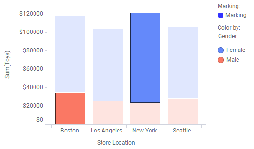
You mark items in different ways, for example by clicking them. Example of items are bar segments, markers, lines, and pie sectors. Items that have been marked are easily distinguished: the unmarked items' colors fade out, but the marked items keep their original colors and get a dark outline as shown above.
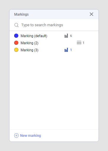
When you mark items in a visualization, you in fact mark the corresponding rows in the data table. To identify and represent this entire set of marked rows, a special concept is used, marking. A marking is assigned two attributes, a name and a color, and can be viewed in the legend, see the image above.
Because rows in the data table become marked, every visualization in your analysis that uses the data table and the same marking is affected. If items in other visualizations include any of the marked data rows, they become marked too.
You can add more than one marking to the analysis, if desired. See Adding a new marking for more information. If there are more than one marking available, the default marking is used when creating new visualizations, but you can change which marking to use in a specific visualization from the visualization properties.
In the Markings panel (), you can see on which page, or in which visualization, a certain marking is used.