Creating a combination chart
In a combination chart, you have the option to display both bars and lines in a single visualization. Because of the overlay effect, lines are drawn on top of the bars, it is easy to compare values for different columns or categories in your data. Trends can be identified, and you can spot deviations directly.
The combination chart has similarities to both bar charts and line charts. As with these visualizations, columns usually containing numerical data are selected on the Y-axis. For each X-axis data point, the data is aggregated into values on the Y-axis. An aggregated value could be, for example, a sum or an average. These values are then displayed either in the form of bars or in the form of a line for each column or category to be compared.
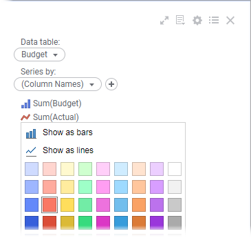
You can separate the different columns or categories to be compared by coloring them differently. The colors are specified on the
Series axis in the legend, and this is also where you specify whether to show the aggregated values as bars or lines.
On the X-axis, columns containing categorical values are selected, or columns with time data when comparing data over time.
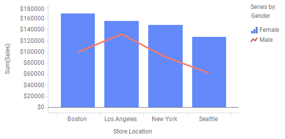
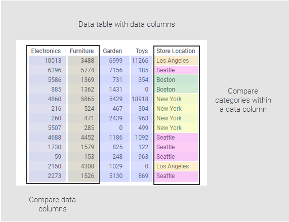
As mentioned above, you might want to compare columns in your data, or you might want to compare different categories within a column, as illustrated below.
Depending on what you want to show, or on how your loaded data is organized, you set up the combination chart in different ways.
Comparing data columns
Procedure
-
On the authoring bar, click
Visualization types
 to open the flyout.
-
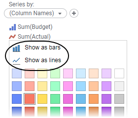
On the
Series axis in the legend, click a column and select display option;
Show as bars or
Show as lines.
Example
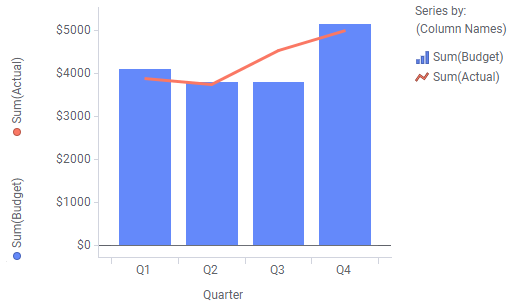
Assume you want to compare on a quarterly basis estimated figures in a budget to actual figures. The "Actual" and "Budget" columns below contain the monthly actual and estimated figures respectively.
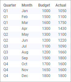
See the settings made to compare the Actual to estimated Budget figures. Deviations are easily identified, for example, the budget was exceeded a lot in Q3.