How to Specify the Data for the Cause-and-Effect Diagram
The Statistica cause-and-effect diagram options are used to specify the variables containing the major categories or classes of causes to be depicted; the numeric, text, date, or other types of values contained in the rows (cases) of each variable will be interpreted as the minor or individual causes, belonging to the respective category or class (variable).
See also the Introductory Overview for additional details and description of this type of chart.
Example
The cause-and-effect diagram provides an efficient summary of factors that impact a process, and so can be used as a map to guide the overall quality improvement efforts (see Introductory Overview).
The general idea of the chart is rather straightforward. Suppose you want to turn on a reading light in your house one evening, and it won't light up. Now consider the various variables or characteristics that make up the process (cause the light to come on) and that should be considered in order to fix this quality problem:

The cause-and-effect diagram shown above (adapted from Rath & Strong's Six Sigma pocket guide, 2000) spells out the various potential causes of the problem encountered.
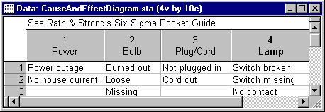
The data file for this simple diagram would look like this:
To create the chart shown above, select the first two variables Power and Bulb (two major categories of causes) as the causes to be plotted above the center arrow, and Plug/Cord and Lamp as the major causes to be plotted below the center arrow.
By default, the variable names and text values typed into the cells for each variable will be used to label the diagram. The diagram shown above also includes custom graphics text (Lamp doesn't turn on), to illustrate some simple additional customization that can be used to augment the basic diagram. See also Customization of Graphs for additional details.