Correspondence Analysis Overview
Correspondence analysis is a descriptive/exploratory technique designed to analyze simple two-way and multi-way tables containing some measure of correspondence between the rows and columns.
The results provide information which is similar in nature to those produced by Factor Analysis techniques, and they allow you to explore the structure of categorical variables included in the table. The most common kind of table of this type is the two-way frequency crosstabulation table (for example, the Basic Statistics or Log-Linear module).
In a typical correspondence analysis, a crosstabulation table of frequencies is first standardized, so that the relative frequencies across all cells sum to 1.0. One way to state the goal of a typical analysis is to represent the entries in the table of relative frequencies in terms of the distances between individual rows and columns in a low-dimensional space. This is best illustrated by a simple example, which is described here. There are several parallels in interpretation between correspondence analysis and Factor Analysis, and some similar concepts are also pointed out here.
For a comprehensive description of this method, computational details, and its applications (in the English language), refer to the classic text by Greenacre (1984). These methods were originally developed primarily in France by Jean-Paul Benzécri in the early 1960's and 1970's, but have only more recently gained increasing popularity in English-speaking countries. Note that similar techniques were developed independently in several countries, where they were known as optimal scaling, reciprocal averaging, optimal scoring, quantification method, or homogeneity analysis. In the following paragraphs, a general introduction to correspondence analysis is presented. Note that the Correspondence Analysis module also performs multiple correspondence analyses of Burt tables. If you are familiar with the general concepts used in correspondence analysis, you can refer to Computational Details for a brief review of the computational formulas.
- Overview
- Suppose you collected data on the smoking habits of different employees in a company. The following data set is presented in Greenacre (1984, p. 55); this table is also provided in the example data file
Smoking.sta.
Smoking Category Staff Group
(1) None
(2) Light
(3) Medium
(4) Heavy
Row Totals
(1) Senior Managers 4 2 3 2 11 (2) Junior Managers 4 3 7 4 18 (3) Senior Employees 25 10 12 4 51 (4) Junior Employees 18 24 33 13 88 (5) Secretaries 10 6 7 2 25 Column Totals 61 45 62 25 193 You might think of the 4 column values in each row of the table as coordinates in a 4-dimensional space, and one could compute the (Euclidean) distances between the 5 row points in the 4-dimensional space. The distances between the points in the 4-dimensional space summarize all information about the similarities between the rows in the table above. Now suppose one could find a lower-dimensional space, in which to position the row points in a manner that retains all, or almost all, of the information about the differences between the rows. You could then present all information about the similarities between the rows (types of employees in this case) in a simple 1, 2, or 3-dimensional graph. While this may not appear to be particularly useful for small tables like the one shown, one can easily imagine how the presentation and interpretation of very large tables (example, differential preference for 10 consumer items among 100 groups of respondents in a consumer survey) could greatly benefit from the simplification that can be achieved using correspondence analysis (example, represent the 10 consumer items in a two-dimensional space).
- Mass
- To continue with the simpler example of the two-way table presented above, computationally, the program first computes the relative frequencies for the frequency table, so that the sum of all table entries is equal to 1.0 (each element is divided by the total, that is, 193). One could say that this table now shows how one unit of mass is distributed across the cells. In the terminology of correspondence analysis, the row and column totals of the matrix of relative frequencies are called the row mass and column mass, respectively.
- Inertia
- The term inertia in correspondence analysis is used by analogy with the definition in applied mathematics of "moment of inertia," which stands for the integral of mass times the squared distance to the centroid. Inertia is defined as the total Pearson Chi-square for the two-way table (example, as can also be computed in the Basic Statistics or Log-Linear modules) divided by the total sum (193 in the present example).
- Inertia and row and column profiles
- If the rows and columns in a table are completely independent of each other, the entries in the table (distribution of mass) can be reproduced from the row and column totals alone, or row and column profiles in the terminology of correspondence analysis. According to the well-known formula for computing the Chi-square statistic for two-way tables, the expected frequencies in a table, where the column and rows are independent of each other, are equal to the respective column total times the row total, divided by the grand total. Any deviations from the expected values (expected under the hypothesis of complete independence of the row and column variables) contribute to the overall Chi-square statistic (see Computational Details). Thus, another way of looking at correspondence analysis is to consider it a method for decomposing the overall Chi-square statistic (or Inertia=Chi-square/Total N) by identifying a small number of dimensions in which the deviations from the expected values can be represented. This is similar to the goal of Factor Analysis, where the total variance is decomposed, so as to arrive at a lower-dimensional representation of the variables that allows one to reconstruct most of the variance/covariance matrix of variables.
- Analyzing rows and columns
- This simple example began with a discussion of the row-points in the preceding table. However, one may rather be interested in the column totals, in which case one could plot the column points in a small-dimensional space, which satisfactorily reproduces the similarity (and distances) between the relative frequencies for the columns, across the rows, in the table shown above. In fact it is customary to simultaneously plot the column points and the row points in a single graph, to summarize the information contained in a two-way table.
- Reviewing results
- Let us now look at some of the results for the preceding table. The following table shows
Singular Values (see
Computational Details),
Eigenvalues,
Percentages of Inertia Explained,
Cumulative Percentages, and the contribution to the overall
Chi-squares.
Eigenvalues and Inertia for all Dimensions Input Table (Rows x Columns): 5 x 4
Total Inertia = .08519 Chi² = 16.442
No. of Dims
Singular Values
Eigen- Values
Perc. of Inertia
Cumulatv Percent
Chi Squares
1 .273421 .074759 87.75587 87.7559 14.42851 2 .100086 .010017 11.75865 99.5145 1.93332 3 .020337 .000414 .48547 100.0000 .07982 Note: The dimensions are extracted so as to maximize the distances between the row or column points, and successive dimensions (which are independent of or orthogonal to each other) explain less and less of the overall Chi-square value (and, thus, inertia; refer to Computational Details for additional information). Thus, the extraction of the dimensions is similar to the extraction of principal components in Factor Analysis.First, it appears that, with a single dimension, 87.76% of the inertia can be explained, that is, the relative frequency values that can be reconstructed from a single dimension can reproduce 87.76% of the total Chi-square value (and, thus, of the inertia) for this two-way table; two dimensions allow you to explain 99.51%.
- Maximum number of dimensions
- Since the sums of the frequencies across the columns must be equal to the row totals, and the sums across the rows equal to the column totals, there are in a sense only (no. of columns-1) independent entries in each row, and (no. of rows-1) independent entries in each column of the table (once you know what these entries are, you can fill in the rest based on your knowledge of the column and row marginal totals). Thus, the maximum number of eigenvalues that can be extracted from a two-way table is equal to the minimum of the number of columns minus 1, and the number of rows minus 1. If you choose to extract (that is, interpret) the maximum number of dimensions that can be extracted, then you can reproduce exactly all information contained in the table (see Computational Details for details concerning the overall model equation).
- Row and column coordinates
- Next look at the coordinates for the two-dimensional solution:
Row Name Dim. 1 Dim. 2 (1) Senior Managers -.065768 .193737 (2) Junior Managers .258958 .243305 (3) Senior Employees -.380595 .010660 (4) Junior Employees .232952 -.057744 (5) Secretaries -.201089 -.078911 Of course, you can plot these coordinates in a two-dimensional scatterplot from the Correspondence Analysis Results dialog box. Remember that the purpose of correspondence analysis is to reproduce the distances between the row and column points in a two-way table in a lower-dimensional display; note that, as in factor analysis, the actual rotational orientation of the axes is arbitrarily chosen so that successive dimensions explain less and less of the overall Chi-square value (or inertia). You could, for example, reverse the signs in each column in the table shown above, thereby effectively rotating the respective axis in the plot by 180° (note that you can quickly achieve this reversal of scales using the Reverse scaling check box on the Scale Options dialog box for the respective axis).
What is important are the distances of the points in the two-dimensional display, which are informative in that row points that are close to each other are similar with regard to the pattern of relative frequencies across the columns. If you have produced this plot you can see that, along the most important first axis in the plot, the Senior employees and Secretaries are relatively close together on the left side of the origin (scale position 0). If you looked at the table of relative row frequencies (that is, frequencies standardized, so that their sum in each row is equal to 100%), you will see that these two groups of employees indeed show very similar patterns of relative frequencies across the categories of smoking intensity.
Percentages of Row Totals Smoking Category Staff Group
(1) None
(2) Light
(3) Medium
(4) Heavy
Row Totals
(1) Senior Managers 36.36 18.18 27.27 18.18 100.00 (2) Junior Managers 22.22 16.67 38.89 22.22 100.00 (3) Senior Employees 49.02 19.61 23.53 7.84 100.00 (4) Junior Employees 20.45 27.27 37.50 14.77 100.00 (5) Secretaries 40.00 24.00 28.00 8.00 100.00 Obviously the final goal of correspondence analysis is to find theoretical interpretations (that is, meaning) for the extracted dimensions. One method that might aid in interpreting extracted dimensions is to plot the column points. Shown below are the column coordinates for the first and second dimension.
Smoking category
Dim. 1 Dim. 2 None -.393308 .030492 Light .099456 -.141064 Medium .196321 -.007359 Heavy .293776 .197766 It appears that the first dimension distinguishes mostly between the different degrees of smoking, and in particular between category None and the others. Thus one can interpret the greater similarity of Senior Managers with Secretaries, with regard to their position on the first axis, as mostly deriving from the relatively large numbers of None smokers in these two groups of employees.
- Compatibility of row and column coordinates
- It is customary to summarize the row and column coordinates in a single plot (on the Results dialog there is an option to plot one-, two-, and three dimensional graphs for row or column coordinates, or both). However, it is important to remember that in such plots, one can only interpret the distances between row points, and the distances between column points, but not the distances between row points and column points. To continue with this example, it would not be appropriate to say that the category None is similar to Senior Employees (the two points are very close in the simultaneous plot of row and column coordinates). However, as was indicated earlier, it is appropriate to make general statements about the nature of the dimensions, based on which side of the origin particular points fall. For example, because category None is the only column point on the left side of the origin for the first axis, and since employee group Senior Employees also falls onto that side of the first axis, one may conclude that the first axis separates None smokers from the other categories of smokers, and that Senior Employees are different from, for example, Junior Employees, in that there are relatively more non-smoking Senior Employees.
- Scaling of the coordinates (standardization options)
- Another important decision that the analyst must make concerns the scaling of the coordinates. The computations following from the choice of the different available options (see the
Results dialog box) are described in
Computational Details. The nature of the choice pertains to whether or not you want to analyze the relative row percentages, column percentages, or both. In the context of the example described above, the row percentages were shown to illustrate how the patterns of those percentages across the columns are similar for points which appear more closely together in the graphical display of the row coordinates. Put another way, the coordinates are based on the analysis of the row profile matrix, where the sum of the table entries in a row, across all columns, is equal to 1.0 (each entry
rij in the row profile matrix can be interpreted as the conditional probability that a case belongs to column
j, given its membership in row
i). Thus, the coordinates are computed so as to maximize the differences between the points with respect to the row profiles (row percentages). Therefore, one should select Row profiles (interpret row dist.) radio button in the
Standardization of coordinates group box on the
Options tab of the
Correspondence Analysis Results dialog box, if one is primarily interested in interpreting the differences (distances) between the rows in the table.
Conversely, if you are interested in the similarities and differences between the columns of the table, you should select the Column profiles (interpret col. dist.) option button in the Standardization of coordinates group box on the Options tab of the Correspondence Analysis Results dialog box; the resulting column coordinates are then derived from the analysis of the column profile matrix (the matrix of column proportions, where the sum of the table entries in each column is equal to 1.0). This standardization will maximize the distances between the column points in the final coordinate system.
By default, Statistica performs both types of standardizations prior to reporting the coordinates (the Row & column profiles option button in the Standardization of Coordinates group box on the Options tab of the Correspondence Analysis Results dialog box). The row coordinates are computed from the row profile matrix, and the column coordinates are computed from the column profile matrix.
A fourth option button, Canonical standardization, is also available in the Standardization of Coordinates group box on the Options tab of the Correspondence Analysis Results dialog box, and it amounts to a standardization of the columns and rows of the matrix of relative frequencies. For more information, refer to Computational Details; this standardization amounts to a rescaling of the coordinates based on the row profile standardization and the column profile standardization, and this type of standardization is not widely used. Note also that a variety of other custom standardizations can be easily performed, because Statistica reports the raw eigenvalues matrix, which can further be processed with Statistica Visual Basic.
- Metric of coordinate system
- In several places in this introduction, the term distance was (loosely) used to refer to the differences between the pattern of relative frequencies for the rows across the columns, and columns across the rows, which are to be reproduced in a lower-dimensional solution as a result of the correspondence analysis. Actually, these distances represented by the coordinates in the respective space are not simple Euclidean distances computed from the relative row or column frequencies, but rather, they are weighted distances. Specifically, the weighting that is applied is such that the metric in the lower-dimensional space is a
Chi-square metric, provided that 1) you are comparing row points, and chose either row-profile standardization or both row- and column-profile standardization, or 2) you are comparing column points, and chose either column-profile standardization or both row- and column-profile standardization.
In that case (but not if you chose the canonical standardization), the squared Euclidean distance between, for example, two row points i and i' in the respective coordinate system of a given number of dimensions actually approximates a weighted (that is, Chi-square) distance between the relative frequencies:
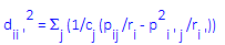
In this formula, dii'² stands for the squared distance between the two points, cj stands for the column total for the j'th column of the standardized frequency table (where the sum of all entries or mass is equal to 1.0), pij stands for the individual cell entries in the standardized frequency table (row i, column j), ri stands for the row total for the i'th column of the relative frequency table, and the summation (S) is over the columns of the table. To reiterate, only the distances between row points, and correspondingly, between column points are interpretable in this manner; the distances between row points and column points cannot be interpreted.
- Judging the quality of a solution
- A number of auxiliary statistics are reported, to aid in the evaluation of the quality of the respective chosen numbers of dimensions. The general concern here is that all (or at least most) points are properly represented by the respective solution, that is, that their distances to other points can be approximated to a satisfactory degree. Shown below are all statistics reported for the row coordinates for the example table discussed so far, based on a one-dimensional solution only (that is, only one dimension is used to reconstruct the patterns of relative frequencies across the columns).
Row Coordinates and Contributions to Inertia Staff Group Coordin. Dim.1
Mass Quality Relative Inertia
Inertia Dim.1
Cosine² Dim.1
(1) Senior Managers -.065768 .056995 .092232 .031376 .003298 .092232 (2) Junior Managers .258958 .093264 .526400 .139467 .083659 .526400 (3) Senior Employees -.380595 .264249 .999033 .449750 .512060 .999033 (4) Junior Employees .232952 .455959 .941934 .308354 .330974 .941934 (5) Secretaries -.201089 .129534 .865346 .071053 .070064 .865346 - Coordinates
- The first numeric column shown in the table (spreadsheet) above contains the coordinates, as discussed in the previous paragraphs. To reiterate, the specific interpretation of these coordinates depends on the standardization chosen for the solution. The number of dimensions is chosen by the user (in this case we chose only one dimension), and coordinate values are shown for each dimension (that is, there will be one column with coordinate values for each dimension).
- Mass
- The Mass column contains the row totals (since these are the row coordinates) for the table of relative frequencies (that is, for the table where each entry is the respective mass, as discussed earlier in this section). Remember that, if you chose as the method of standardization the Row profiles (interpret row dist.) option button or the default Row & column profiles option button on the Options tab of the Correspondence Analysis Results dialog box, the row coordinates are computed based on the row profile matrix. Put another way, the coordinates are computed based on the matrix of conditional probabilities shown in the Mass column.
- Quality
- The
Quality column contains information concerning the quality of representation of the respective row point in the coordinate system defined by the respective numbers of dimensions, as chosen by the user. In the table shown above, only one dimension was chosen, and the numbers in the
Quality column pertain to the quality of representation in the one-dimensional space. To reiterate, computationally, the goal of the correspondence analysis is to reproduce the distances between points in a low-dimensional space. If you extracted (that is, interpreted) the maximum number of dimensions (which is equal to the minimum of the number of rows and the number of columns, minus 1), you could reconstruct all distances exactly. The quality of a point is defined as the ratio of the squared distance of the point from the origin in the chosen number of dimensions, over the squared distance from the origin in the space defined by the maximum number of dimensions (remember that the metric here is
Chi-square, as described earlier). By analogy to Factor Analysis, the quality of a point is similar in its interpretation to the communality for a variable in factor analysis.
Note: The Quality measure reported by Statistica is independent of the chosen method of standardization, and always pertains to the default standardization (that is, the distance metric is Chi-square, and the quality measure can be interpreted as the proportion of Chi-square accounted for, for the respective row, given the respective number of dimensions). A low Quality means that the current number of dimensions does not well represent the respective row (or column). In the table shown above, the quality for the first row (Senior Managers) is less than .1, indicating that this row point is not well represented by the one-dimensional representation of the points.
- Relative inertia
- The Quality of a point (see above) represents the proportion of the contribution of that point to the overall inertia (Chi-square) that can be accounted for by the chosen number of dimensions. However, it does not indicate whether or not, and to what extent, the respective point does in fact contribute to the overall inertia (Chi-square value). The relative inertia represents the proportion of the total inertia accounted for by the respective point, and it is independent of the number of dimensions chosen by the user. Note that a particular solution may represent a point very well (high Quality), but the same point may not contribute much to the overall inertia (example, a row point with a pattern of relative frequencies across the columns that is similar to the average pattern across all rows).
- Relative inertia for each dimension
- This column contains the relative contribution of the respective (row) point to the inertia "accounted for" by the respective dimension. Thus, this value is reported for each (row or column) point, for each dimension.
- Cosine² (quality or squared correlations with each dimension)
- This column contains the quality for each point, by dimension. The sum of the values in these columns across the dimensions is equal to the total Quality value discussed above (since in the example table above, only one dimension was chosen, the values in this column are identical to the values in the overall Quality column). This value may also be interpreted as the correlation of the respective point with the respective dimension. The term Cosine² refers to the fact that this value is also the squared cosine value of the angle the point makes with the respective dimension (refer to Greenacre, 1984, for details concerning the geometric aspects of correspondence analysis).
- A note about statistical significance
- It should be noted at this point that correspondence analysis is an exploratory technique. Actually, the method was developed based on a philosophical orientation that emphasizes the development of models that fit the data, rather than the rejection of hypotheses based on the lack of fit (Benzecri's second principle states that "The model must fit the data, not vice versa;" see Greenacre, 1984, p. 10). Therefore, there are no statistical significance tests that are customarily applied to the results of a correspondence analysis; the primary purpose of the technique is to produce a simplified (low-dimensional) representation of the information in a large frequency table (or tables with similar measures of correspondence).
See also, Correspondence Analysis - Program Overview, Correspondence Analysis - Supplementary Points, Multiple Correspondence Analysis (MCA), and Correspondence Analysis Introductory Overview - Burt Table.