t-test for Independent Samples - t-test Graphs
In the t-test analysis, comparisons of means and measures of variation in the two groups can be visualized in box and whisker plots (for an example, see the following graph) that can be called directly from the results spreadsheet by simply pointing to a selected t-test (using cursor keys or the mouse); various graphs of the distribution of scores by group can also be requested directly from the
t-test for Independent Samples dialog box.
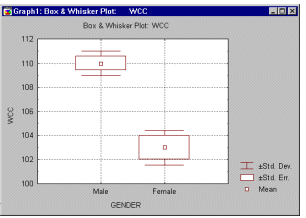
These graphs help you to quickly evaluate and intuitively visualize the strength of the relation between the grouping and dependent variable.
Copyright © 1995-2020 TIBCO Software Inc. All rights reserved.