Graphical Breakdowns
Graphs can often identify effects (both expected and unexpected) in our data more quickly and sometimes better than any other data analysis method.
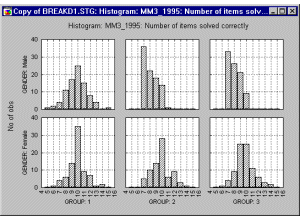
With categorized graphs, you can plot the means, distributions, and correlations across the groups of a given table (e.g., categorized histograms, categorized probability plots, categorized box and whisker plots). The graph below shows a categorized histogram that enables you to quickly evaluate and visualize the shape of the data for each group (group1-male, group2-female).
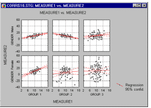
The categorized scatterplot (in the graph below) shows the differences between patterns of correlations between dependent variables across the groups.
Additionally, if the software has a brushing facility that supports animated brushing, you can select (such as highlight) in a matrix scatterplot all data points that belong to a certain category in order to examine how those specific observations contribute to relations between other variables in the same data set.

The Statistics by Groups Results dialog of the Breakdown procedure offers numerous graphics options to plot the means, distributions, correlations, etc. across the groups of the respective table (so-called categorized plots).