Process Analysis - Cause-and-Effect Diagrams
The cause-and-effect diagram provides an efficient summary of factors that impact a process, and hence can be used as a map to guide the overall quality improvement efforts. Therefore, it is one of the important tools for the Define phase of Six Sigma quality control efforts. The diagram is also sometimes referred to as "fishbone chart," because of its appearance, or Ishikawa chart. The latter name refers to the work of Professor Kaoru Ishikawa of Tokyo University who developed this diagram to depict variables that are present in a process (the Japanese name for the diagram is Tokusei Yoin Zu - characteristics diagram; see also Seder, 1962).
The general idea of the chart is rather straightforward. Suppose you want to turn on a reading light in your house one evening, and it won't light up. Now consider the various variables or characteristics that make up the process (cause the light to come on), and that should be considered in order to fix this quality problem:

The cause-and-effect diagram shown above (adapted from Rath & Strong's Six Sigma pocket guide, 2000) spells out the various potential causes of the problem encountered. Usually, the chart is constructed by identifying 1) the major categories of causes that affect the process (in this example Power, Bulb, Plug/Cord, and Lamp), and 2) the individual factors or causes that can be classified into these major categories (e.g., Power outage, No house current, etc.). You could now use this map as a guide to troubleshooting the problem you encountered turning on your reading light. You can also further "augment" this chart (using the custom drawing and other tools of STATISTICA graphics) by adding various sub-sub causes, causes that you ruled out, solutions you have tried, etc.
- Categories of Causes, Tools for Creating the Diagram
- While the example discussed above is rather trivial, when troubleshooting complex production or service processes, creating this diagram can be immensely helpful. For example, producing bug-free computer software of superior quality requires a very complex process that involves numerous different types of resources. These resources (or "variables") that affect the final quality of the software could, for example, be classified into the generic categories (e.g., see Seder, 1962) of
Personnel (e.g., software developers, testers, system engineers),
Machines (e.g., hardware platforms, debugging tools),
Materials (e.g., licensed outside source code, quality of distribution media, compilers),
Methods (choosing the right algorithms and software solutions),
Measurements (e.g., of the speed of the software, user-friendliness, elegance, efficiency), and
Environment (e.g., enterprise-wide solutions vs. single-user licensing, competing and supporting products). All of these factors make up the "big picture" that will create a useful, fast, and ultimately successful computer software product.
In practice, in order to develop a cause-and-effect diagram, Pyzdek (1989) recommends to follow these steps (Pyzdek, 1989, p. 113):
- Develop a flowchart of the area to be improved.
- Define the problem to be solved.
- Brainstorm to find all possible causes of the problem.
- Organize the brainstorming results in rational categories.
- Construct a cause and effect diagram that accurately displays the relationships of all the data in each category.
Once these steps have been completed, transfer the major categories of causes and the sub-causes to the chart as major arrows ("fishbones") and subheaders (of course, the Cause and Effect procedure of STATISTICA Process Analysis will do this for you).
- Six Sigma, and the Cause-and-Effect Diagram
- The cause-and-effect diagram plays a central role in Six Sigma quality programs. During the first stage of the Define-Measure-Analyze-Improve-Control (DMAIC) cycle, this diagram can be of great utility in order to identify the areas, departments, processes, and stakeholders that should be involved in the effort. See Harry and Schroeder (2000), Pyzdek (2001), or Rath and Strong (2000) for additional details; see also Six Sigma.
- How to Specify the Data for the Cause-and-Effect Diagram
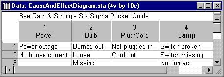
- The STATISTICA cause-and-effect diagram options allow you to specify the variables containing the major categories or classes of causes to be depicted; the numeric, text, date, or other types of values contained in the rows (cases) of each variable will be interpreted as the "minor" or individual causes, belonging to the respective category or class (variable). For example, the data file for the simple diagram discussed earlier would look like this:
- Modifying and Customizing Cause-and-Effect Diagrams
- The true power and versatility of the implementation of the cause-and-effect diagram options in STATISTICA come from the enormous number of customization and special-effects options that are available for all graphs. For example, you can include pictures, bitmaps, videos, custom drawings, embedded graphs, etc., in the diagram; using the STATISTICA Visual Basic options to control Events in STATISTICA, you can even make your cause-and-effect diagram interactive, so that clicking on it will, for example, show a video in a particular place in the diagram. STATISTICA's graphics tools are not limited to the typical (few) options of diagramming programs, so you can create displays that are engaging, persuasive, and sufficiently customized to capture the subtleties of the process you need to represent. Refer to Customization of Graphs for overviews of the countless graphics customization options that STATISTICA makes available to you.