Showing sparklines

Key Performance Indicators, KPIs, are used to monitor performance of a company. They reflect the performance for the most recent time period. If you want to see also the trend over time for a KPI value, you can show a simple line graph, a sparkline, in the KPI tiles.

Important: The values presented in a sparkline are always the primary values.


Sparklines

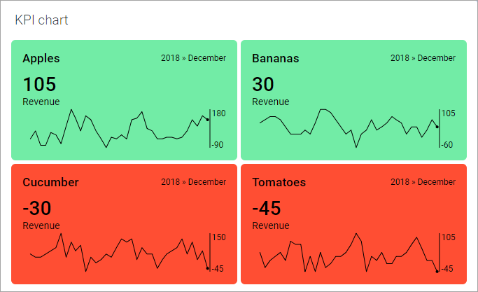
The dot ending a sparkline indicates the value of the most recent measure, and when on the time line it was measured. The sparklines can be supplemented with a scale showing the vertical range.

Procedure

  1. Right-click the KPI in the KPI chart, and select Properties in the opened menu.
    The Properties pop-over for the selected KPI is displayed. In the side panel, the current KPI is highlighted.
  2. In the pop-over, select Sparkline.
    The Sparkline section is shown.
  3. Make sure the Show sparkline check box is selected.
  4. To show the vertical range, select the Show scale check box.
  5. If you want the value 0 to be within the range, select the Include origin check box.
  6. Click to select whether to use One scale for all sparklines in the KPI, or Multiple scales.
    Use One scale for all sparklines if you want to compare the sparklines under the same conditions for all the tiles within the KPI. The Multiple scales option is useful, for example, if the data to present in the different sparklines is of very different magnitudes, and you are, in the first place, interested in seeing the trend for each tile category.
    To hide the sparklines, simply clear the Show sparkline check box.

Example

In the image above, multiple scales are used for the sparklines, and origin is not included in the scale.