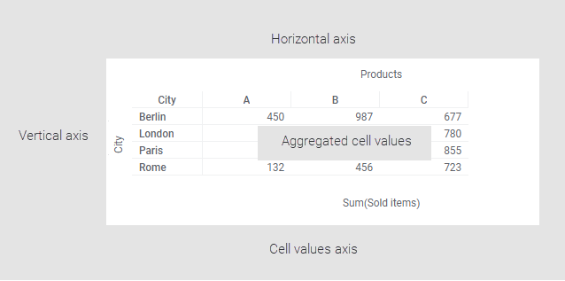
Creating a cross table
Cross tables are used to summarize large amounts of data, and then present the result in a structured table format.
The cross table is a grid of cells defined by a
Vertical axis and a
Horizontal axis. On these axes, data columns are specified to organize the data.
The actual contents of the table cells are aggregated values, for example, sums or averages of the data, defined by the intersection of the two axes. What data you want to aggregate is selected in another axis, the
Cell values axis.
Procedure
 to open the flyout.
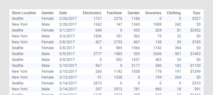
Example
The data table contains purchases made by customers in January, February and March at two different store locations.
The cross table below gives you an overview of the monthly sum of toys purchases made by men and women at each store location.
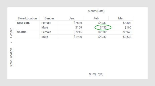
For example, the value $433 represents the sum of toys purchases made by men in New York during February.
Copyright © Cloud Software Group, Inc. All rights reserved.