Custom theme settings
In the Edit Custom Theme dialog, you customize the look and feel of the pages. The starting point is one of the predefined visual themes, the light theme or the dark theme.
To reach the dialog, select .
Because the combinations of visual settings are numerous, experimenting is recommended when customizing a visual theme. You will instantly see the result of a changed setting.
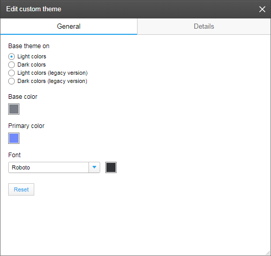
In the General tab, you first specify which predefined theme to base your custom theme on, the theme with Light colors or the theme with Dark colors. (If you want older analyses to keep their schemes, make sure the legacy version is selected.)
You use Base color to define the color of label texts, and the general background color in panels and the page navigation area. The Primary color defines the color of details like filter sliders or active page indication (the indication is not used by default).
In the different sections of the Details tab below, visual attributes can be set for specific parts of the user interface. For more information about the different parts, see Custom themes overview.
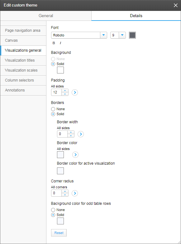
The image above shows one of the sections, Visualizations general. From this section, detailed settings applied to visualizations in general can be made. For example, you can give the visualizations a background color (this affects also the page navigation bar colors), set the padding, that is, change the distance between the actual content and the visualization border, and customize the appearance of the border, or even remove borders. Note that clicking the arrows offers options to apply a setting on certain sides or corners.
The other sections in the Details tab are described below:
- In the Page navigation area section, you define the appearance of the page title text and the color to use for indicating the active page's tab.
- In the Canvas section, you can change the color of the background on top of which the visualizations are placed. This is also where you specify the distances between the visualizations, and the distances between visualizations and the surrounding panels (padding).
- In the Visualization titles section, you define the title bar position and appearance as well as the title text appearance and its position within the bar.
- In the Visualization scales section, you define whether or not to show scale lines and tick marks. If shown, their colors can be set.
- In the Column selectors section, you control the appearance of the column selector texts.
- In the Annotations section, you control the appearance of added annotations.