Creating a visualization
Data can be of many different kinds. Therefore, to present the data in the best way, there are several types of visualizations available.
Create a visualization from the Data in analysis flyout
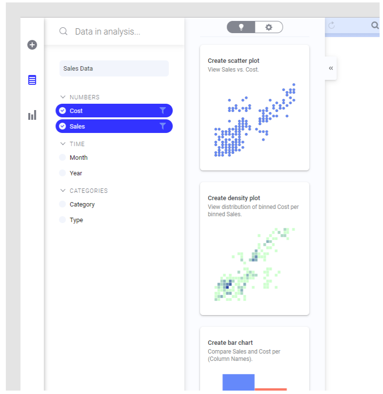
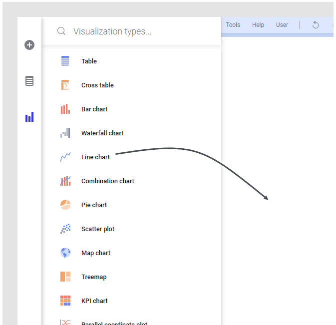
To create visualizations, use the Data in analysis or Visualization types flyout, or search for what you want to visualize. A page in an analysis can contain more than one visualization, but to make room for further visualizations, you can add more pages.When you want to explore certain data columns in your data table, and get suggestions on how they can be visualized, you use the Data in analysis flyout to create visualizations.
- On the authoring bar, click
 to open the
Data in analysis flyout.
- If your analysis contains more than one data table, select the data table you are interested in from the drop-down list.
- Select the data columns of interest.
To the right, you get suggestions on visualizations based on the selected data. If you hover with the mouse on a visualization, you can click MORE LIKE THIS, and similar visualizations are suggested. The visualizations might also show data from other columns, if certain findings related to the selected data are discovered.
- Click, or drag, the visualization you find suitable to the analysis page.
- Explore it as it looks, or adjust it to your needs.
Create a visualization from the Visualization types flyout
Another option is to create visualizations from the very beginning and make your own settings. To learn how to set up the different visualizations from scratch, click the links at the bottom of this page.Create a visualization by searching
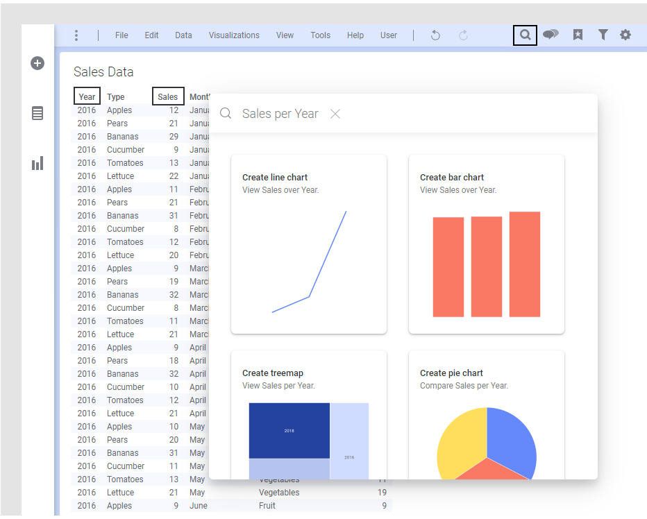
You can create a visualization by typing search criteria in a text field.
- Click
Find
 on the menu bar.
- In the opened search field, type what you are looking for in your data.
You get suggestions on visualizations matching your search criteria. The visualizations might also show data from other columns, if certain findings related to the selected data are discovered.
- Drag the visualization you want to use to the analysis page
- Adjust the visualization to your needs. For information on the different visualization types, see the links below.
- Creating a table
The table visualization presents all details of the loaded data. The individual values are arranged in columns and rows. - Creating a cross table
Cross tables are used to summarize large amounts of data, and then present the result in a structured table format. - Creating a bar chart
In a bar chart, you can compare values for different categories in your data. - Creating a waterfall chart
A waterfall chart shows how a value changes after being affected by various factors that either increase the value, or decrease it. The resulting value is then presented. - Creating a line chart
A line chart is used for showing trends, and in most cases trends over time. It can also be used for discerning certain patterns. - Creating a combination chart
In a combination chart, you have the option to display both bars and lines in a single visualization. Because of the overlay effect, lines are drawn on top of the bars, it is easy to compare values for different columns or categories in your data. Trends can be identified, and you can spot deviations directly. - Creating a pie chart
A pie chart is a circle graph that is divided into sectors. It is used to compare values for different categories in your data on a relative basis. Each pie sector represents a specific category, and its size the category's contribution to the whole value, expressed as a percentage. The values are usually sums. - Creating a scatter plot
In a scatter plot, markers are displayed in a two-dimensional coordinate system. It is useful for getting an overview of how your data is distributed across two dimensions. - Creating a map chart
A map chart positions your data in a context, often geographical, using different layers. The layers can be either data layers, such as marker layers or feature layers, or reference layers, such as map layers, Tile Map Service layers (TMS), Web Map Service layers (WMS), or image layers. By adding different layers to the map chart, you can configure the map to suit your needs. - Creating a treemap
A treemap is used for displaying huge amounts of data that can be structured hierarchically (tree-structured). It presents the data using differently sized and colored rectangles. - Creating a KPI chart
A KPI chart is used to quickly inform about the current performance of a company or organization. You create different KPIs, Key Performance Indicators, which measure factors that are crucial to monitor, and present them in a grid of tiles. Examples of KPIs to monitor are net revenue, sales growth, or customer satisfaction. - Creating a parallel coordinate plot
A parallel coordinate plot is used to compare data values which are of completely different types or magnitudes within a single visualization. The values are normalized and then presented as points on a line with one point per data column. The visualization is useful also for examining patterns. - Creating a histogram
In a histogram, you can show the distribution of numerical data. The entire range of the numerical values is divided into equal intervals on the Category axis, and for each interval, it is indicated on the Value axis how many individual data values that fall within it. - Creating a trellised visualization
A visualization that is trellised is split into a number of panels, where each panel represents a subset of the data. Using trellised visualizations, you can spot similarities and differences between the subsets of data, or within the subsets. - Duplicating a visualization
A copy of a visualization can be created to be used as starting point for creating another similar visualization.


 to open the

