Basic example of a KPI
The principles for creating a KPI, key performance indicator, are explained using a simple example.
For details about the different settings in a KPI, see Adding a new KPI to a KPI chart.
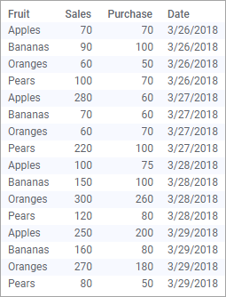
The data table below lists, for four days, the purchase and sales figures for some fruit types.
Assume you want to monitor the latest sales performance regarding the absolute figures for sales and purchases per day and fruit type. You also want to be alerted on sales figures less than 200 per day.
Creating a KPI chart from scratch based on the data above results in this KPI:
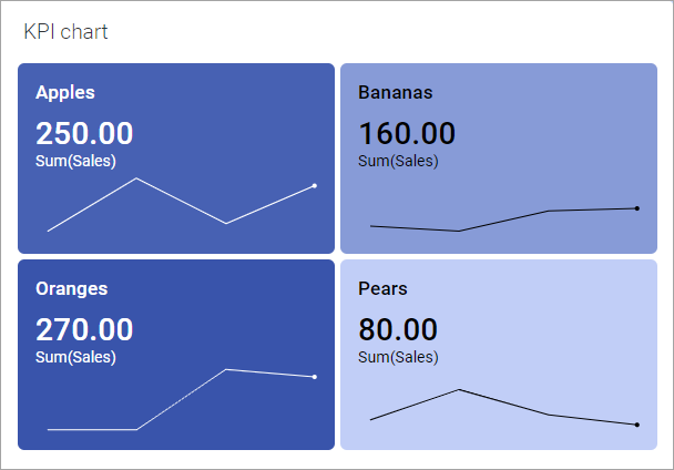
The Sales figures for the most recent date are shown as the primary values in the tiles. A sparkline, ended by a dot indicating the current value, shows the sales trend over the four days.
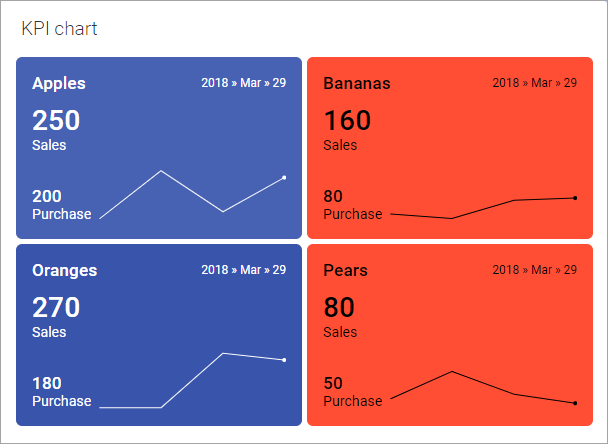
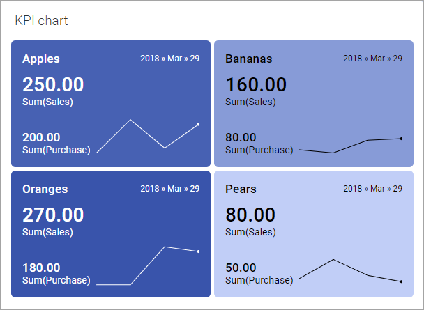
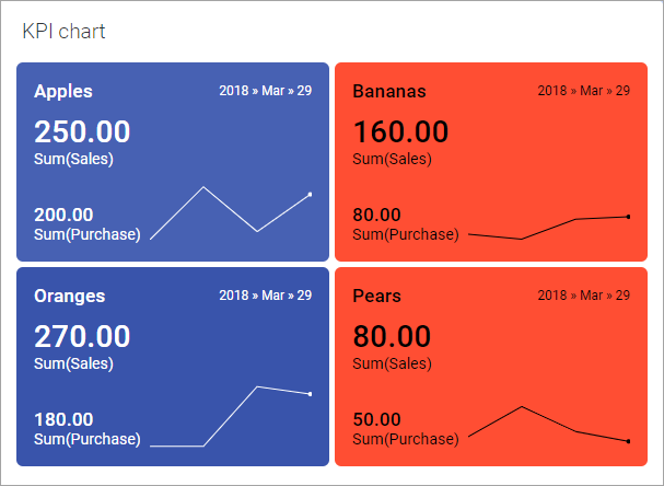
To keep an eye of also the Purchase figures, you can let the comparative values in the tiles show these figures. The image below shows the result. In addition, the Show time in tile check box is selected to indicate the time periods in question.
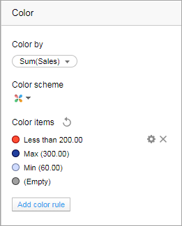
The background colors of the tiles can be used to indicate performance levels. You can for example distinguish tiles with sales figures less than 200 by using a red color. In the Color section of the Properties pop-over, a color rule is added that colors tiles with this condition fulfilled in red:
The resulting KPI shown below.
Furthermore, you can refine the appearance by changing the display name of an axis and changing the formatting of a column.