Box and Whisker Chart
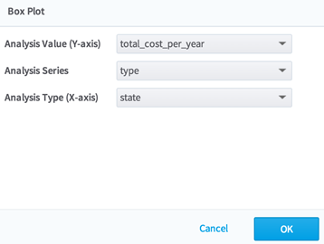
The Box-And-Whisker Chart allows users to choose an analysis value column, an analysis series column, and an analysis type column from a dataset.
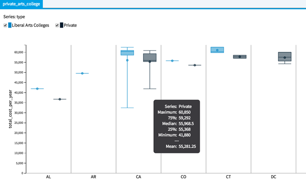
The maximum value, minimum value, mean, median, Q1 & Q3 of the Analysis Value of each Analysis Series in each Analysis Type are plotted in Box-And-Whisker diagrams in the resulting graph.
The Box-And-Whisker Chart is accessible from the Explore menu of the operator toolbar or by right-clicking an appropriate operator.
Related concepts
Copyright © Cloud Software Group, Inc. All rights reserved.