Linear Regression Use Case (1)
The following use case analyzes a United Nations dataset with sample Education, Literacy, Life Expectancy and GDP data.

- Datasets
-
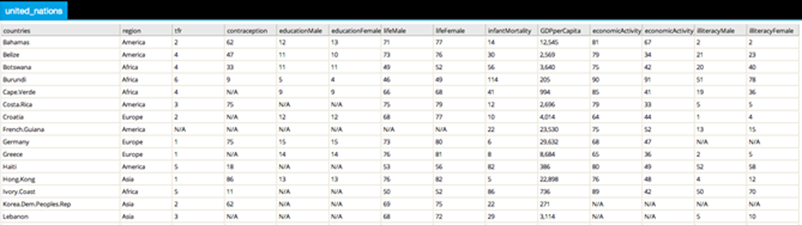
The exact dataset used is UN.csv (10KB).
The collected United Nations dataset can be imported into Team Studio and quickly viewed using the Preview window. The first few rows are shown below:
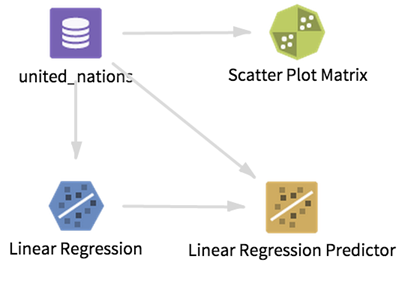
Workflow
Prior to selecting and running a Linear Regression Operator, various Data Explorer Operators2, such as the Scatter Plot Matrix and Correlation Analysis plots, can be used to quickly assess whether there appears to be any sort of linear relationship between the dependent and independent variables. The following shows part of the Scatter Plot Matrix for some of the UN data:
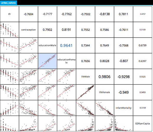
A Scatter Plot Graph is displayed in the matrix for every pair of selected variables.
In this example, several evident linear relationships are displayed, such as a strong linear relationship between the educationMale and educationFemale variables.
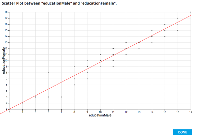
This can be investigated further clicking on the particular Scatter Plot Graph to view one variable (educationFemale) as the Y and the other (educationMale) as the X-axis.
Note that as the education of males goes up, so does the education of females. Looking at this data shows that the number of years a country has female education starts with a 1.3 year deficit with respect to male education, but it grows with a slope above 1 (meaning that countries that educate men longer have less of a deficit in educating women.)
However, these two variables are so perfectly correlated it is suspicious - perhaps they are collinear variables instead? Colinearity is a linear relationship between two explanatory variables in a model. Two variables are perfectly collinear if there is an exact linear relationship between the two. So educationMale and educationFemale are almost collinear and the modeler might likely remove one of them from the model.
Looking at the linear relationship between educationFemale and illiteracyFemale shows the expected result that as education of the female decreases, the illiteracy rate for the females in the country increases.
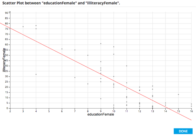
These results might trigger the idea to create a model that predicts a country's female illiteracy rate based on its female education levels.
One interesting model from this data might be life expectancy as a general indicator of a country's well-being. The predictors might be variables like education, contraception, infant mortality rates, and illiteracy levels. Since the male and female variables in the data are so strongly collinear, the modeler would want to eliminate the redundancy. The educationFemale variable would likely be picked since it indicates both education levels and the emancipation of women and, therefore, has more information contained in its value.
The step of eliminating redundant, or collinear, independent variables is a very important one in linear regression modeling.
Within Team Studio, the modeler can use the Linear Regression Operator to create a model using the United Nations data and a Linear Regression Operator in order to predict the years of lifeFemale as the dependent variable and educationFemale, contraception, infantMortality, and illiteracyFemale as the independent variables, as follows:
Results
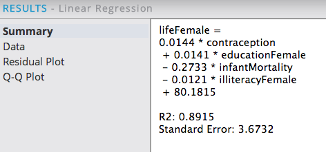
The Summary results tab shows the overall Linear Regression equation, coefficient values and variables along with an R2 and Standard Error values for the model.
Note: An R2 value of 0.8915 shows a very high predictive capability (89% predictability). The Standard Error is +/- 3.67 years from the real female life expectancy, which seems like a reasonable error amount.
The Data Results tab provides the specific β Correlation Coefficients for each of the independent variables along with the related SE, T and P-Value statistics. When analyzing this data, the modeler is looking for independent variables that have both a low P-value ("confidence" level) and a high β Coefficient ("strength" level).
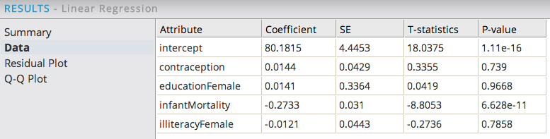
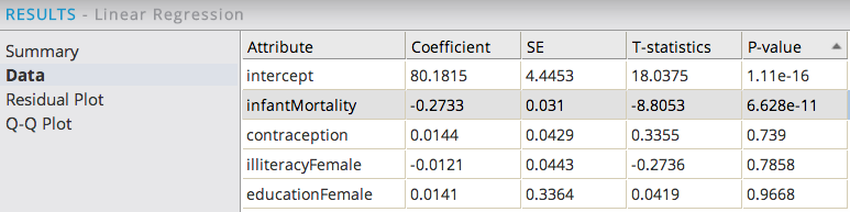
The data can also be sorted by β Coefficient values in order to understand which of the independent variables with low P-value has the greatest strength or correlation effect on the dependent variable. A high β indicates a change in the value of the independent variable has a greater effect on the change in the value of the dependent variable. In this example, educationFemale has the strongest correlation effect on female life expectancy.
Sorting the data by the P-value is usually the best way to analyze this data to understand the next modeling steps required. The variables with the lowest P-values are the ones the modeler should have the highest confidence of being true predictors in the model. Variables with P-values over 0.05 might be considered as optional for including in the model as there is a greater chance they might not be true predictors (that is, illiteracyFemale might be removed from the model next). In this example, infantMortality has a very low P-value, which makes intuitive sense for it to have an inverse correlation with female life expectancy levels.
Looking at the Residual Plot provides a way to analyze the overall fit of a Linear Model on the data.
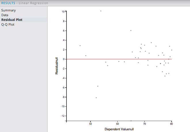
The example Residual Plot above shows a somewhat random distribution of the residuals, with most of the observed data points being between ages 65-80.
The Residual Plot is a graph of (actual Y - predicted Y) on the vertical axis and predicted Y on the horizontal axis. For example, for x=66 (life expectancy age predicted to be 66), the residual is only 1 year older. This indicates the linear regression model does a pretty good job of predicting observed life expectancy rates.
Looking at the Q-Q Plot is an additional check that can be done in order to see if a linear model is appropriate for the data.
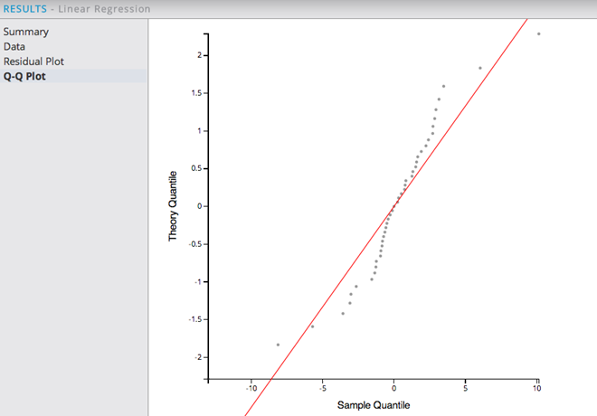
When looking at the Q-Q Plot, the distribution of the Residuals should match the theoretical (normal) distribution represented by the straight line. The points are expected to fit along the line y=x. This example above indicates a pretty good linear fit of the data near and above the average lifetime and less reliable of a prediction out of that range. However, since QQ plots show whether the distribution of the sample data on the X-axis matches the expected normal distribution of the linear model forecast on the Y-axis, they are not as critical to having a good model as a high R2 value.
When there are outliers or if the line is curved at the beginning or the end as in this example, the modeler may decide to exclude the outliers, or maybe add non-linear terms or interactions to improve the model.
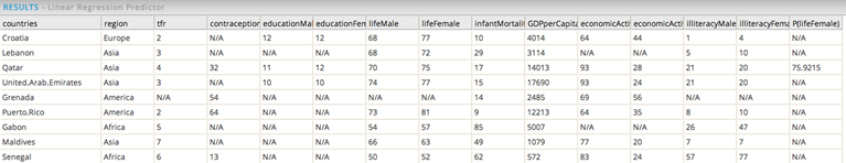
As a final step, the Linear Regression Operator is linked to the Prediction Operator, the predicted P(lifeFemale) values can be seen as well, as follows:
Summary
The predicted values are within a useful range of the actual, observed values. Note: the Prediction operator only processes rows that have no missing values for the selected independent variables. So in this example, not all the data rows have a P_lifeFemale prediction value.
In summary, when analyzing a Linear Regression model overall, look for a high R2 value coupled with a randomly distributed Residual Plot and a strong match of the Q-Q Plot. These three things, co-existing together, provide high confidence in the fit of the Linear Model.