K-Means Predictor - MADlib
The k-means predictor (MADlib) operator output is simply the assignment of the input data members to the k number of clusters, the centroids already predetermined by the K-means (MADlib) operator.

Information at a Glance
Unlike the Regression or Decision Tree/CART operators, the k-means predictor does not provide a final answer or prediction. Rather, it provides an overall understanding of the inherent structure of the data set the modeler is analyzing. This might be very helpful for understanding the inherent demographic groupings of a consumer data set.
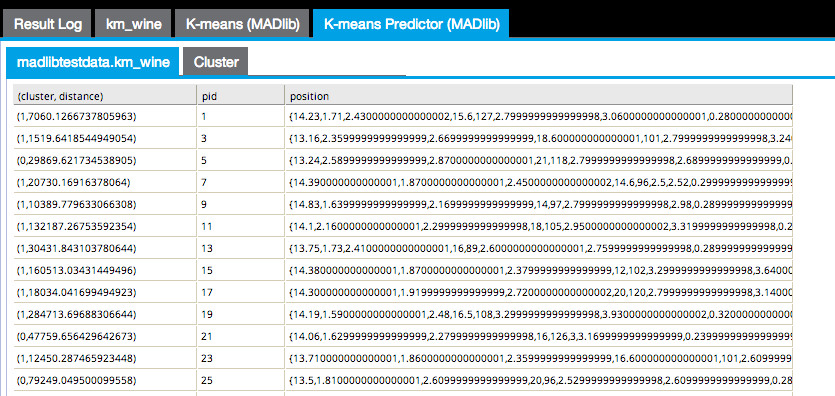
The first results tab in the following image shows the (cluster, distance) cluster assigned to each point and the distance between the point and the cluster centroid, the pid or point ID, and the position of the point itself.
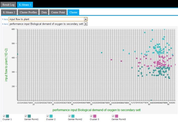
The Cluster results tab displays a cluster graph, which is a visualization of each cluster's member values based on two of the variable dimensions used for the k-means analysis.
Configuration
Output
- Visual Output
- The
Cluster results tab displays a cluster graph, which is a way to visualize each cluster based on two of the variable dimensions used in the k-means analysis. Although there is typically some overlap between members of the clusters, the goal is to minimize cluster overlap. For a perfect cluster analysis model, there would be zero overlap between the clusters for each variable analyzed.
The output can only be displayed in two dimensions at a time. Therefore, the modeler must review all the possible clustering diagrams in order to get an overall assessment of which attribute dimensions have the greatest influence on the clustering.
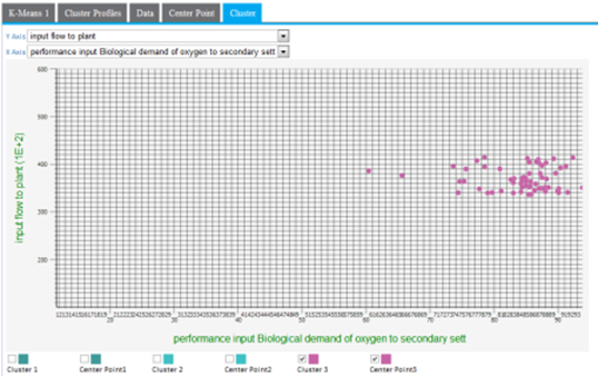
Cluster graphing can be toggled on and off per cluster. Therefore, the graph can be viewed showing one cluster at a time, which helps understand just the spread of members per cluster and visually see their distance from their center, as in the following example only showing cluster3 results.
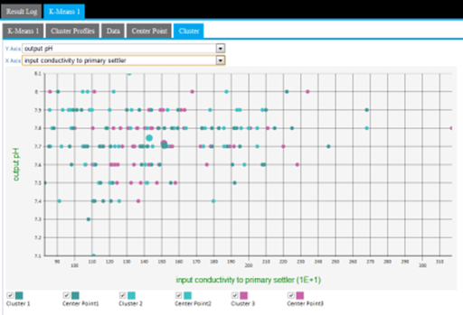
A lot of cluster overlap for two variables might indicate that they are not as significant in the cluster analysis, or that there is not much variation of the overall population for those particular variables. The following example shows a more intermingled cluster visualization when the y-axis dimension is changed from input flow to plant to output pH.
Another cause of cluster overlap might be that the variable values were not appropriately normalized before the analysis was run. For example, when minimizing the distance in the cluster, a difference in pH of "7" is not as significant as the difference in input flow to plants value of "10,000."
- Data Output