Attribute Quality
After you deploy the custom UI page for the attribute quality, the quality attribute score data is displayed on the graph.
The data quality is displayed on the chart, summary control, or statistics widget.
- Chart widget: a graphical representation of data. Displays the following options:
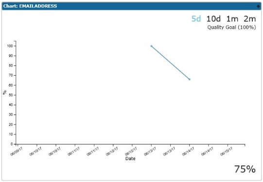
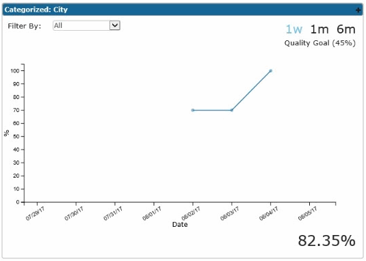
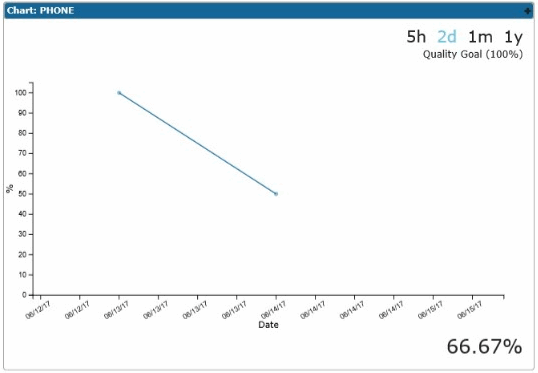
- A line chart of attribute data quality. It plots date on x-axis and attribute score on y-axis.
- The time filters are displayed on the upper right corner of the chart. The expected quality goal for the attribute is displayed under the time filter if it is defined from TIBCO MDM Studio UI Builder. You can filter the data by using the time filter to draw the line chart within certain time period and category filter to display the line chart of the attribute within its categorized attribute.
- The value of the attribute in which quality attribute is categorized is displayed only if it is defined. The value of the attribute is displayed as a drop-down list on the upper left corner of the chart.
- Current data percentage is displayed at the lower right corner of the chart.
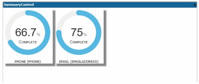
- Summary control widget: draws a radial progress chart of attribute data quality. It displays the average data score of the attribute. The repository name and attribute name is displayed under the chart. The following figure shows the average summary for the PHONE and EMAIL ADDRESS repositories:
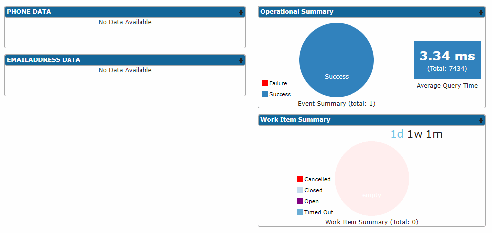
- Statistics widget: draws a pie chart to monitor event summary and work item summary; and number display of query summary.
- For creating widgets, refer to the following sections in TIBCO MDM Studio UI Builder User's Guide:
- For attribute quality modes, goal, and categorization, refer to Viewing Attributes.
- For configuration properties of attribute quality, refer to the section, "Configuration Properties of Attribute Quality" in TIBCO MDM System Administration.
Copyright © Cloud Software Group, Inc. All rights reserved.

