Controls
Controls are the objects on a form that take your input, such as text fields, check boxes, and radio buttons. Controls must be placed within a pane. Controls can be rearranged within the form by dragging-and-dropping them.
Controls can be copied and pasted within a form or between forms. It is also possible to re-arrange the position of controls by dragging the controls within the form Outline view. Controls always include their associated labels, although these can be hidden.
Textarea
The Textarea control allows users to type multiple lines of text. The length, in number of characters, and the number of lines are configurable. The default values are 25 characters and 10 lines.
You can make this control read-only.
Checkbox
Checkbox controls represent Boolean values. In effect, they are on/off switches that may be used as a toggle. The switch is on (that is, the Boolean value is true) when the check box is selected. By default, a Boolean IN/OUT data parameter is displayed as a check box. If the data parameter is mandatory, it means the check box must be selected, otherwise a form validation rule prevents the form from being submitted. Use this feature when you want the user to acknowledge that some aspect of the form has been checked or considered. If you need the user to select true or false with the check box, the data parameter must be optional rather than mandatory.
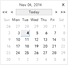
Date
The Date control allows users to specify date, either in a string in the correct format, or by clicking a calendar widget. The calendar opens when the user clicks the icon next to the Date control’s text field:
You can make this control read-only.
Time
The Time control has up and down arrows for incrementing the hour or minute value, or for toggling between AM and PM. The value that is changed by clicking the arrow depends on whether the cursor is in the hour field, the minute field, or the AM/PM field. You can also specify a time by keying in a string in the correct format.
You can make this control read-only.
Date-Time
The Date-Time control allows users to input a date and time. The date portion of the control has a calendar widget for selecting a date with the mouse. The time portion has up and down arrows for incrementing the hour or minute value, or for toggling between AM and PM. The value that is changed by clicking the arrow depends on whether the cursor is in the hour field, the minute field, or the AM/PM field. You can also specify a date and time by keying in a string in the correct format.
You can make this control read-only.
Duration
The Duration control allows the users to specify a duration using a configurable set of units. The Properties tab of the Properties view for the Duration control allows you to select which units are displayed for parameters of type Duration. The supported units are:
Any combination of these units can be enabled.
You can make this control read-only.
Hyperlink
The Hyperlink control allows the Form Designer to place a clickable hyperlink on the form.
Image
The Image control allows the Form Designer to place an image on the form, referenced by a URL.
Label
The Label control allows you to display static text that the user cannot edit. The label control still has its own label field that is used to identify the value being rendered by the label control.
Pass-through
The Pass-through control is a widget that allows users to specify a block of arbitrary HTML into a form. Specify the HTML fragment in the large editing box on the Properties property sheet. The markup is inserted directly into the browser DOM at runtime.
The binding dialog allows you to set the markup via a binding or computation action, just as with other form values. (Bindings allow you to tie the value of an item, such as a control, to the value of something else in the form, without coding.) You do not need to configure bindings or computation actions, however, in order for the Pass-through control to work.
Radiogroup
The Radiogroup control allows users to choose among the listed options. Only one option (one radio button) can be selected at one time.
Button
There are various kinds of buttons on the palette: Button, Cancel Button, Submit Button, and Close Button.
When one of the Cancel, Submit, or Close buttons is added to the canvas, an associated Rule is also added to the Form to handle the select event on that button. A generic Button that is added must be configured to invoke an action when clicked.
The Properties views are identical for each of them, except that the default value that is selected in the Button Type list on the Properties tab is primary for the Submit Button, and it is peripheral for the other button types. This means that a Submit Button that is placed on a form from the palette, by default, is invoked on a mouse click or when you press the Enter key. (If the focus is within a textarea control or similar control, the Enter key is interpreted by the local component. It may not invoke the Submit button.) Buttons of the other types are invoked only when they are clicked. Primary buttons are distinguished with a dark single-pixel border. A form may contain at most one Primary button.
In addition to primary or peripheral, the value of the Button Type list can be set to associative.
An associative button is one that is associated with another control. For example, an associative button called browse might be located next to a file upload control.