Categorized Graphs
One of the most important, general, and also powerful analytic methods involves dividing (splitting) the data set into categories in order to compare the patterns of data between the resulting subsets. This common technique is known under a variety of terms (such as breaking down, grouping, categorizing, splitting, slicing, drilling-down, or conditioning) and it is used both in exploratory data analyses and hypothesis testing. For example: A positive relation between the age and the risk of a heart attack may be different in males and females (it may be stronger in males). A promising relation between taking a drug and a decrease of the cholesterol level may be present only in women with a low blood pressure and only in their thirties and forties. The process capability indices or capability histograms can be different for periods of time supervised by different operators. The regression slopes can be different in different experimental groups.
There are many computational techniques that capitalize on grouping and that are designed to quantify the differences that the grouping will reveal (e.g., ANOVA/MANOVA). However, graphical techniques (such as categorized graphs discussed in this section) offer unique advantages that cannot be substituted by any computational method alone: they can reveal patterns that cannot be easily quantified (e.g., complex interactions, exceptions, anomalies) and they provide unique, multidimensional, global analytic perspectives to explore or "mine" the data.
What are Categorized Graphs? Categorized graphs (the term first used in Statistica software in 1990; also recently called Trellis graphs, by Becker, Cleveland, and Clark, at Bell Labs) produce a series of 2D, 3D, ternary, or nD graphs (such as histograms, scatterplots, line plots, surface plots, ternary scatterplots, etc.), one for each selected category of cases (i.e., subset of cases), for example, respondents from New York, Chicago, Dallas, etc. These component graphs are placed sequentially in one display, allowing for comparisons between the patterns of data shown in graphs for each of the requested groups (e.g., cities).
A variety of methods can be used to select the subsets; the simplest of them is using a categorical variable (e.g., a variable City, with three values New York, Chicago, and Dallas). For example, the following graph shows histograms of a variable representing self-reported stress levels in each of the three cities.
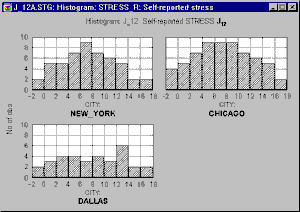
One could conclude that the data suggest that people who live in Dallas are less likely to report being stressed, while the patterns (distributions) of stress reporting in New York and Chicago are quite similar.
Categorized graphs in Statistica also support two-way or multi-way categorizations, where not one criterion (e.g., City) but two or more criteria (e.g., City and Time of the day) are used to create the subsets. Two-way categorized graphs can be thought of as "crosstabulations of graphs" where each component graph represents a cross-section of one level of one grouping variable (e.g., City) and one level of the other grouping variable (e.g., Time).
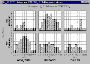
Adding this second factor reveals that the patterns of stress reporting in New York and Chicago are actually quite different when the Time of questioning is taken into consideration, whereas the Time factor makes little difference in Dallas.
- Categorized graphs vs. matrix graphs.
- Matrix graphs also produce displays containing multiple component graphs; however, each of those component graphs are (or can be) based on the same set of cases and the graphs are generated for all combinations of variables from one or two lists. Categorized graphs require a selection of variables that normally would be selected for non-categorized graphs of the respective type (e.g., two variables for a scatterplot). However, in categorized plots, you also need to specify at least one grouping variable (or some criteria to be used for sorting the observations into the categories) that contains information on group membership of each case (e.g., Chicago, Dallas). That grouping variable will not be included in the graph directly (i.e., it will not be plotted) but it will serve as a criterion for dividing all analyzed cases into separate graphs. As illustrated above, one graph will be created for each group (category) identified by the grouping variable.
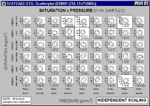
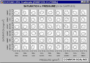
- Common vs. Independent scaling.
- Each individual category graph can be scaled according to its own range of values (independent scaling),
or all graphs can be scaled to a common scale wide enough to accommodate all values in all of the category graphs.
Common scaling allows the analyst to make comparisons of ranges and distributions of values among categories. However, if the ranges of values in graph categories are considerably different (causing a very wide common scale), then some of the graphs may be difficult to examine. The use of independent scaling may make it easier to spot trends and specific patterns within categories, but it may be more difficult to make comparisons of ranges of values among categories.