Conceptual Overviews - Matrix Plots
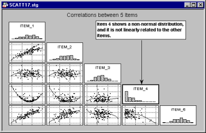
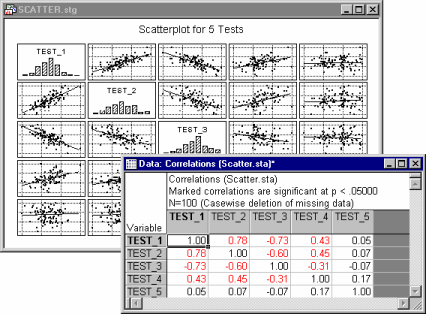
Matrix graphs summarize the relationships between several variables in a matrix of true X-Y plots. The most common type of matrix plot is the scatterplot matrix, which can be considered to be the graphical equivalent of the correlation matrix (e.g., see Basic Statistics and Tables).
- Scatterplot matrices
- In the graph shown above,
scatterplots are shown for each pair of variables; the linear regression line is also shown in each scatterplot.
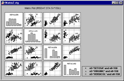
Scatterplot matrices can be either square (as the one shown above) or rectangular, when two lists of variables are selected (analogous to rectangular matrices). If the matrix is square then on the diagonal of the scatterplot matrix, the distribution for each variable is represented in a histogram.
Graphs such as the one shown above provide an efficient summary of the relationships between the variables in an analysis. For example, a variable that does not correlate with any of the other variables will "stick out" and be easily identified.
- Line plot matrices
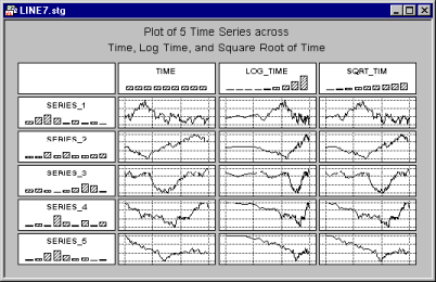
- In addition to matrix scatterplots such as the ones shown above, which are typically used to summarize the relationships between some random variables, you can summarize several sequential processes in line plot matrices, such as the one shown below, which is based on a real-life dataset.
Here, several Y variables are plotted against a single X variable denoting time; thus, the "behavior" of several variables over time is summarized in this graph.
Applications
The most common application for matrix plots is to summarize the variables in an analysis (their distributions and relationships) in a single graph.
This is useful, for example, when constructing measurement scales (e.g., see Reliability and Item Analysis) or when performing exploratory analyses of survey data (e.g., questionnaire data, economic data, process control data, etc.).
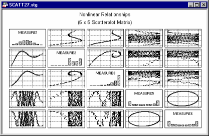
For example, shown below is a summary matrix scatterplot for 15 variables.
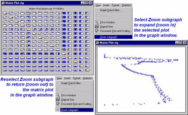
The density of this graph makes it difficult to examine individual scatterplots; however, you can easily "zoom-in" on individual graphs. To do this, select the plot by single-clicking in the area surrounding the individual scatterplot, then select Zoom subgraph from the View menu. In the illustration below, the fifth scatterplot on the top row has been selected and expanded in the matrix plot window. Once you have finished examining the individual plot, you can reset the matrix plot (i.e., return to the original matrix plot) by once again selecting View - Zoom subgraph.
As you can see in the illustration above, you can easily expand and examine any of the individual graphs.
In exploratory data analysis it is often useful to examine the contribution of observations that meet specific conditions to the overall shape of relations between variables. The multiple subset facility available in the matrix plot allows the user to mark subsets of cases defined by logical conditions.