What is the difference between hidden and excluded case states?
In Statistica, case states enable you to add supplementary case information that can be employed in further analyses. The primary function, and in most instances the only function, of case states is to determine the appearance of the case in a graph.
This is particularly true for the Hidden case state. When a case state is Hidden, the case is not visible in most graphs; however, it is used in all analyses, both those from the Statistics menu and those that are related to graphs, example, fit lines, statistics, regression bands. Essentially, Hidden cases are cases whose point markers are turned off in the graph, while their values are used in all computations.
The Excluded case state is quite different because its application is not limited to graphs. In fact, Excluded cases are not included in any analysis or graph calculations. This means that if you perform an analysis from the Statistics menu (example, calculate descriptive statistics using the Basic Statistics and Tables module), Excluded cases are not used in the computations. However, Excluded cases are displayed in most graph types. Their point marker is turned on, but they are removed from computations.
As mentioned above, the Excluded case state always affects any equations or fit lines in a graph, while the Hidden case state never affects equations or fit lines. However, the case states actual affect on the plot depends on the type of graph being plotted.
The effect of Hidden case states on various graph types. Hiding cases only visibly affects graphs that plot individual points (example, scatterplots, variability plots that show raw data, surface or contour plots where raw data is shown). When cases are hidden with any of these types of plots, the fitted equations or reported statistics stay the same, but hidden cases are not displayed.
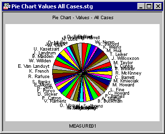
For example, consider the two pie charts with values (that is, pie charts that show each individual case) shown below. When the second pie chart was created, all cases where ADVERT=COKE were marked Hidden. This pie chart obviously contains fewer slices.

When cases are Hidden on graphs that do not show individual data points (example, histograms, pie charts based on counts, surface plots that do not show raw data), there is no visible affect on the graph. For example, the following two pie charts seem identical even though when the second chart was created, all cases where ADVERT=COKE were marked Hidden. This is because the pie chart is based on counts (not individual cases), and Hidden cases are not omitted from those counts.

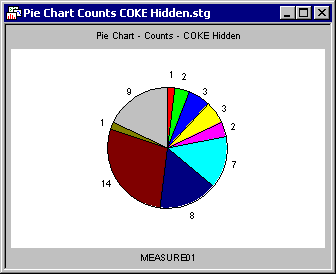
The effect of Excluded cases states on various graph types. Excluding cases has an opposite effect on the various graph types. Because excluded cases are not used in calculations, applying the Excluded case state only visibly affects graphs that display fitted plots or distributions (example, histograms, pie charts based on counts, the actual fit of a surface plot). For example, in the pie chart of counts, all cases where ADVERT=COKE are marked Excluded.
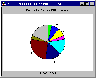
Compare this to the pie chart showing all cases (in the previous section). When COKE cases are Excluded, there are only nine slices (the red slice is gone), and the counts are smaller for all but one category. Histograms are another type of graph that are visibly affected by Excluded cases. Consider the two histograms below. In the first one, all cases are used to create the histogram, but in the second one, the COKE cases were marked Excluded.
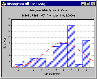

Notice that the fit of MEASURE01 (given in the subtitle) is different for the two graphs, and the columns, which reflect counts for each category, are different as well.
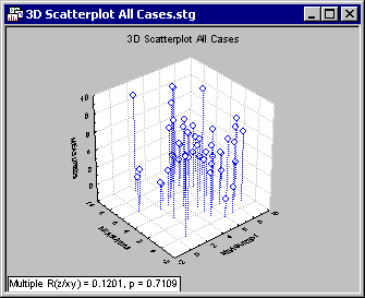
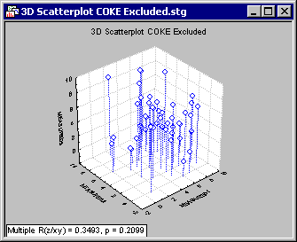
Graphs that display raw data (without any fit type or statistics) is unaffected by the Excluded case state, as seen in the folowing two 3D scatterplots. Except for the statistics reported in the lower-left corner of each graph, the two plots are identical even though the COKE cases are excluded in the second graph.
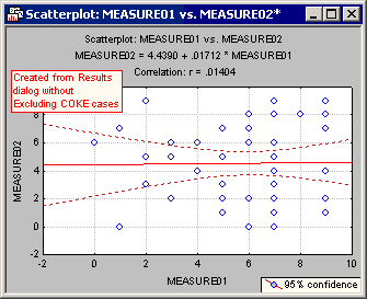
Of course, many graphs in Statistica combine both raw data and fitted data. Consider the 2D scatterplot of Measure01 vs. Measure02, below.

All cases have been used, that is, the COKE cases are neither Hidden nor Excluded.
In the next graph, all cases where ADVERT=COKE have been Hidden.

Notice that the fit line (shown in the title and indicated in the graph in red) is the same for both graphs; however, there are fewer points displayed in the second graph.
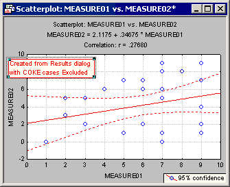
Now compare this to the graph where COKE cases have been Excluded.
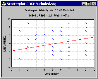
The plot has the same number of point markers as the first scatterplot; however, the fit line is very different.
- Graphs from analyses
- Because Excluded data points are excluded from all analyses, these points are not displayed in results graphs. For example, if you exclude the ADVERT=COKE cases of Adstudy.sta, compute descriptive statistics, and from the Descriptive Statistics dialog box create a scatterplot, the COKE cases are not displayed in the scatterplot or used in the computations.