Example 1: Correspondence Analysis and Supplementary Points
This example is based on a fictitious data set presented in Greenacre (1984, p. 55) to illustrate how to interpret the results of a correspondence analysis. This data set is also discussed in the Introductory Overview. In this example, the different formats of data files accepted by the Correspondence Analysis module is illustrated, and the typical results of correspondence analysis is explained. Also, the use of supplementary points for aiding in the interpretation of results is demonstrated.
- Ribbon bar. Select the Home tab. In the File group, click the Open arrow and select Open Examples to display the Open a Statistica Data File dialog box. Smoking.sta is located in the Datasets folder.
- Classic menus. From the File menu, select Open Examples to display the Open a Statistica Data File dialog box. The data file is located in the Datasets folder.
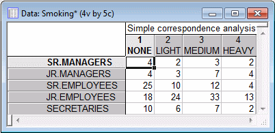
This file contains the frequency table, as presented in Greenacre (1984, p. 55).
This example explains interpretation of results using correspondence analysis.
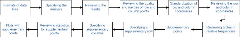
Click each process block to know the details
Formats of data files
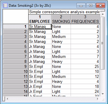
The Correspondence Analysis module provides great flexibility with regard to the permissible formats of input data. For example, in addition to the raw frequency table as contained in the file Smoking, you could also specify the two-way table by including in the data file two grouping variables (one for the Employee group, another for the Smoking category). This format for the table is illustrated in the example data file Smoking2.sta.
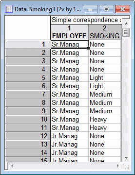
Finally, you can analyze raw data that are not pretabulated. The data in the example file Smoking3.sta are organized in this manner, that is, it only contains two variables (Employee and Smoking) with codes to indicate to which group each case belongs; there are a total of 193 cases in that file.
Specifying the analysis
- Start
Correspondence Analysis using one of the following two ways:
- Ribbon bar: Select the Statistics tab. In the Advanced/Multivariate group, click Mult/Exploratory and from the menu, select Correspondence to display the Correspondence Analysis (CA): Table Specifications Startup Panel.
- Classic menus: From the Statistics - Multivariate Exploratory Techniques submenu, select Correspondence Analysis to display the Correspondence Analysis (CA): Table Specifications Startup Panel.
- In this example, the data file contains frequencies without grouping variables; therefore, select the Frequencies w/out grouping vars option button under Input on the Correspondence Analysis (CA) tab. [If you want to use the file Smoking2.sta, select the Frequencies with grouping variables option button; to use the file Smoking3.sta, select the Raw data (requires tabulation) option button.]
- Select the variables. Click the
Variables with frequencies button to display the standard variable selection dialog box. Select all variables, and then click the
OK button.
Note: When you use this data file format (that is, the input is a tabulated frequency table), Statistica interprets the selected variables as the columns of the table to be analyzed, and the cases as the rows of the table. Since the data in file Smoking.sta are arranged in that manner, click the OK button in the Startup Panel to perform the correspondence analysis. The Correspondence Analysis Results dialog box is displayed.
Reviewing the results
Eigenvalues: If you are not familiar with the correspondence analysis technique and the most important statistics that are customarily computed, you can review the Introductory Overview at this point. To reiterate, if you considered the relative row frequencies as coordinates in a space consisting of as many dimensions as there are columns, and the relative column frequencies as coordinates in a space consisting of as many dimensions as there are rows, then the main goal of the analysis is to reconstruct the distances between the row points and to reconstruct the distances between the column points, in a space defined by as few dimensions as possible.
First, click the Eigenvalues button on the Advanced tab to produce the spreadsheet that contains information about the number of dimensions that are necessary to reconstruct the information in the table.

The first column shows the Number of dimensions; a maximum of three dimensions can be extracted, in which case the (relative) frequency table can be reconstructed exactly. The Singular Values are computed by the so-called generalized singular value decomposition of the table of relative frequencies. The Eigenvalues are the squared Singular Values, and they sum to the Total Inertia, which is listed in the header of the spreadsheet as .08519. The total inertia is defined as the Chi-square value (16.442) divided by the total number of cases (193). Thus, as discussed in the Introductory Overview, the correspondence analysis can also be considered to be a decomposition of the total Chi-square value, in much the same way that principal components analysis decomposes the total variance/covariance matrix of continuous variables.
As you can see, the dimensions are computed so that the first dimension extracts the most information (that is, has the highest eigenvalue), the next dimension extracts the second most information, and so on. The first dimension in this case extracts 87.76% of the total inertia. The inclusion of the second dimension increases the inertia to 99.51%.
Thus, accept the default 2 dimensions, and click the Row and column coordinates button on the Advanced tab.
Reviewing the quality and inertias of row and column points
Two spreadsheets are displayed; one for the row coordinates and one for the column coordinates.
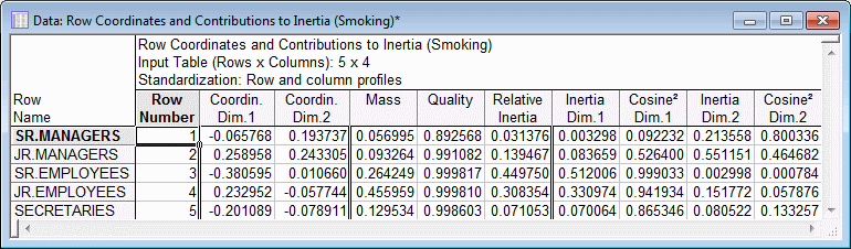
The statistics reported in these spreadsheets are discussed in the Introductory Overview. First look at the Quality of the points. The Quality of a point is defined as the ratio of the squared distance of the point from the origin in the chosen number of dimensions, over the squared distance from the origin in the space defined by the maximum number of dimensions (remember that the metric here is Chi-square, as described in the Introductory Overview). By analogy to Factor Analysis, the quality of a point is similar in its interpretation to the communality for a variable in factor analysis. As you can see, both the row and column points are represented quite well in the two-dimensional solution; the quality for all points is .89 or higher.
The Relative inertia values pertain to the proportion of the total inertia accounted for by the respective point. Note that a point may be well represented in a particular solution, but not contribute much to the total inertia. From the spreadsheets shown above one can see that the row that contributes most to the overall inertia is that representing the Senior Employees, and the column that contributes most is that representing the None smokers.
The quality for each point, due to each dimension can be found in the columns labeled Cosine2. The Cosine2 values summed across the two dimensions is equal to the total Quality value. The relative contribution of each point to the inertia for each dimension (remember that the Eigenvalues represent the inertias associated with each dimension) is also shown in the spreadsheets above.
Standardization of row and column coordinates
There are several options available on the Options tab for standardizing the row and column coordinates. Note that the interpretation of the row and column coordinates depends on the method of standardization that is chosen; however, the quality of representation and relative inertia values shown in the spreadsheets above are not affected by the chosen method of standardization.
The coordinates can be computed based either on the matrix of relative row frequencies (Row profiles standardization; the analysis is based on the so-called row profile matrix, where the sum of all relative frequencies within each row, across the columns, sums to 1.0), or the relative column frequencies (Column profiles standardization; the analysis is based on the so-called column profile matrix, where the sum of all relative frequencies within each column, across the rows, sums to 1.0). In most cases, the Row & column profiles standardization is most appropriate (the default). In that case the Euclidean distances between the row points, and the distances between the column points can be interpreted in a meaningful manner (that is, the distances between the points are Chi-square distances). However, note that the distances between the row and column points have no meaningful interpretation, regardless of standardization.
Reviewing the row and column coordinates
The best way to quickly review the row and column coordinates is to plot them.
- On the Advanced tab, click the Row & col. - 2D button under Plots of coordinates.
- A 2D scatterplot is displayed, simultaneously showing the row and column points in the two dimensions.

To reiterate, direct comparisons between row and column points are not meaningful. However, you can make meaningful interpretations of the general locations of row and column points, and their relations within each type of point. For example, if you review the 2D graph of the row and column points, you can see that the first (horizontal) dimension, which accounts for most of the inertia (and is, therefore, the most important dimension, explaining most of the differences between the patterns of relative frequencies in the rows of the table, and in the columns of the table), is characterized by None smokers on the left, and Light, Medium, and Heavy smokers to the right; the row points that are farthest to the left on this axis are the Senior Employees and Secretaries. This would suggest that much of the total inertia is due to the difference between non-smokers and smokers, and that there are relatively more non-smokers among Senior Employees and Secretaries.
Reviewing tables of relative frequencies
You can easily verify this interpretation by reviewing the tables of relative frequencies. On the Review tab, click the Row percentages button and then the Column percentages button.

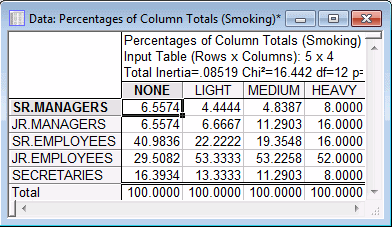
The relative row and column frequencies shown in these spreadsheets support the interpretation of the first dimension: There are a relatively large percentages of None smokers among Senior Employees and Secretaries. This makes the respective row profiles in the table of relative row frequencies, and the respective column profile (None) in the table of relative column frequencies different from all the others.
Supplementary points
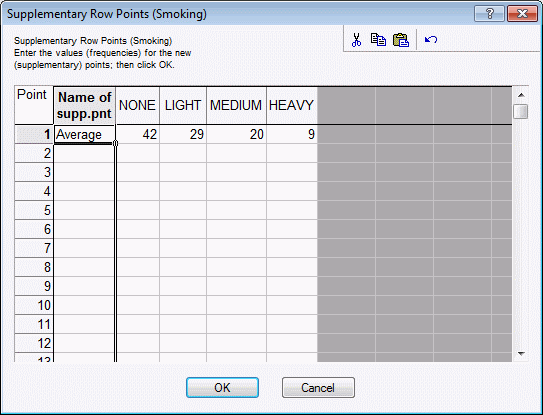
Specifying a supplementary row
- On the Supplementary points tab, click the Add row points button.
- The Supplementary Row Points dialog box is displayed where you can specify the supplementary row points. Remember that in row profile standardization, the analysis is performed on the relative row frequencies, which sums to 1.0; thus, it does not matter whether you enter 42 or .42, that is, percentages or proportions, the results will be the same either way.
- To enter a supplementary row, first type a name or label for the row into the first column of the spreadsheet (example, type Average). Next type in the values 42, 29, 20, and 9 under the respective column headers None, Light, Medium, and Heavy.
- To accept these values, exit the dialog box by clicking the OK button; if you exit the dialog box by closing it or clicking the Cancel button, your entries are discarded.
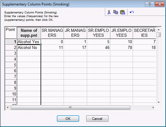
Specifying supplementary columns
Reviewing statistics for supplementary points
After specifying the supplementary rows, whenever you select any of the plots of the coordinates, or when you select the spreadsheets of row and column coordinates, the resulting displays incorporate the results for the supplementary rows and columns. For example, shown below are the coordinate values and related statistics, along with the statistics for the standard row and column points reviewed earlier, that are displayed after you click the Row and column coordinates button on the Advanced tab.

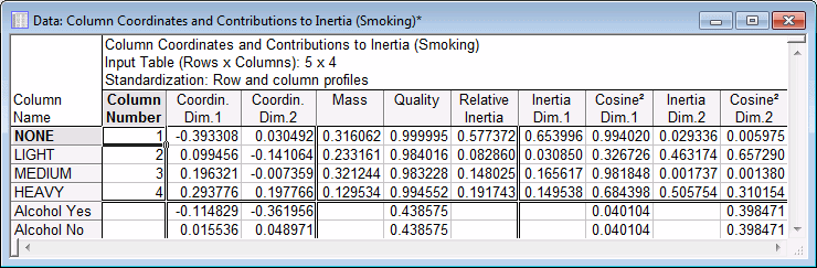
The interpretation of these statistics is the same as that for the points that were used to perform the analysis. It appears that the two-dimensional solution represents the new row point Average (that is, national average) very well (the Quality is .7613). The new column points are not quite as well represented, however, still over 40% of the total squared (weighted) distance of these points from the origin in the space defined by the maximum number of dimensions is accounted for by the two-factor solution (the Quality is equal to .4386 for both supplementary column points).
At this point, you may want to try to enter as supplementary row and column points the respective column and row totals for the entire table. You can see that those points are represented by coordinates that are equal to 0 for all dimensions. This illustrates that the space defined by the two dimensions is weighted by the respective column and row totals, which define the origin of the coordinate system. Thus, you could interpret the distances of the points from the origin as (Chi-square) distances from the respective column and row totals.
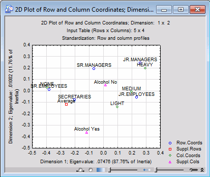
Plots with supplementary points
- Click the Row & col. - 2D button under Plots of coordinates on the Advanced tab.
- The supplementary row point for the national Average is plotted on the left side of the origin for the horizontal axis (the coordinate value is -.2584; see the first table). Thus, you can infer that there are relatively more None smokers on average in the nation than there are in the current sample.
- The supplementary column points Alcohol Yes and Alcohol No approximately line up along the second axis, which also appears to distinguish between different degrees of smoking, that is, Light, Medium, and Heavy (as mentioned above, the first axis appears to distinguish between None smokers and smokers). Thus, there is some indication that Heavy smokers are also more likely to consume alcohol (specifically, the pattern of frequencies across the staff groups for Alcohol is more similar to the pattern of frequencies for the Heavy and Medium smokers). However, remember that correspondence analysis is primarily a descriptive and exploratory technique to represent categorical data in graphical displays, and no claims of statistical significance are implied.