Example: Creating a Graph of Input Data
Graphs of Input Data can use the context of the current selection in an analysis spreadsheet to define which variables to use, but they always use data from the input data file to create the selected graph. For a detailed discussion of the characteristics of Graphs of Input Data, see Graphs of Input Data.
For this example, open Adstudy.sta located in the Examples\Datasets folder of your Statistica installation folder. You can open it using the File - Open Examples menu (it is in the Datasets folder), the Open Data button on any Startup Panel, or the
![]() toolbar button. Adstudy.sta contains the results of a (hypothetical) survey given by a hotel to its customers. In addition to polling customers on their preferred cola soft drinks, the surveyors asked them to rate the hotel's performance on a number of items such as room service, cleanliness, front desk service, etc.
toolbar button. Adstudy.sta contains the results of a (hypothetical) survey given by a hotel to its customers. In addition to polling customers on their preferred cola soft drinks, the surveyors asked them to rate the hotel's performance on a number of items such as room service, cleanliness, front desk service, etc.
Producing the Graph
- With Adstudy.sta open, select Statistics - Basic Statistics/Tables from either the menu bar or the Statistica Start button
 menu on the Statistica Analysis bar to display the Basic Statistics and Tables Startup Panel.
- Select Correlation matrices from the Basic Statistics and Tables dialog to display the Product-Moment and Partial Correlations dialog.
- Click the One variable list button to display a variable selection dialog, and select variables Measure01 through Measure23 for analysis.
- Click the OK button on the variable selection dialog to return to the Product-Moment and Partial Correlations dialog.
- Click the Summary: Correlation matrix button on the Quick tab to produce the analysis spreadsheet shown below.
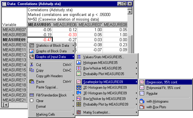
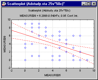
Examination of the spreadsheet of product-moment correlations reveals few correlations of significance greater than .05 (displayed in red by default). Notable among these is the correlation of -0.47 displayed between Measure05 and Measure09. We can easily create a scatterplot of these two variables by selecting their correlation value and then using the Graphs of Input Data command. Right-click on that correlation and select Graphs of Input Data - Scatterplot by Measure09 - Regression, 95% Conf from the shortcut menu. The resulting raw data scatterplot of the two variables is shown below: