Example 3: Gage Repeatability and Reproducibility
- Overview
- Suppose you are manufacturing small kilns that are used for drying materials used in other manufacturing processes. Assume for this example that the temperature range at which these kilns operate is usually between 90 and 110 degrees Celsius (°C). Before performing a process capability analysis (see
Example 2: Process Capability Analysis), you want to ensure that the measurement system you are using is sufficiently precise to detect variability between kilns. A repeatability and reproducibility (R & R) study will first be designed to assess the precision of the measurement system, and then the results of that experiment will be analyzed.
Designing the R & R experiments For the first part of this example, it is irrelevant which data set is open, but a data set must be opened to access the Process Analysis Procedures. Since we will use Temperat.sta in the second part of this example, open this data file and start Process Analysis:
Ribbon bar. Select the Home tab. In the File group, click the Open arrow and on the menu, select Open Examples to display the Open a Statistica Data File dialog box. Open the Temperat.sta data file, which is located in the Datasets folder. Then, select the Statistics tab. In the Industrial Statistics group, click Process Analysis to display the Process Analysis Procedures Startup Panel.
Classic menus. On the File menu, select Open Examples to display the Open a Statistica Data File dialog box. Open the Temperat.sta data file, which is located in the Datasets folder. Then, on the Statistics - Industrial Statistics & Six Sigma submenu, select Process Analysis to display the Process Analysis Procedures Startup Panel.
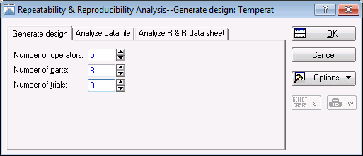
Double-click Gage repeatability & reproducibility to display the Repeatability & Reproducibility Analysis - Generate design dialog box.
Now, suppose you have five engineers who are routinely involved in the production process. Those engineers will serve as your operators of the gages; thus, enter 5 in the Number of operators box.
Also, assume that within the available time frame, you can manage to run a study where each engineer measures 8 kilns (parts) three times (3 trials). Therefore, enter 8 as the Number of parts and 3 as the Number of trials in the respective boxes on the Generate design tab. The Repeatability & Reproducibility Analysis dialog box - Generate design tab will now look like this:
Note: you can also specify single-trial designs with the Process Analysis module. In that case, the repeatability and reproducibility of measurements cannot be separately estimated, but will both contribute to the variability across operators measuring the same part. This type of "abridged" R & R study is useful in order to perform periodic checks on the precision of the measurement system. - Reviewing results
- Click the
OK button in the
Repeatability & Reproducibility Analysis - Generate design dialog box to display the
Repeatability & Reproducibility Design dialog box.
The design of the R & R study can be displayed (and saved) either in the Standard Statistica data file format (using the Data files tab), or the Standard gage R & R data sheet format (using the R & R data sheets tab) without any grouping or coding variables (see, Gage Repeatability and Reproducibility Overview for details).
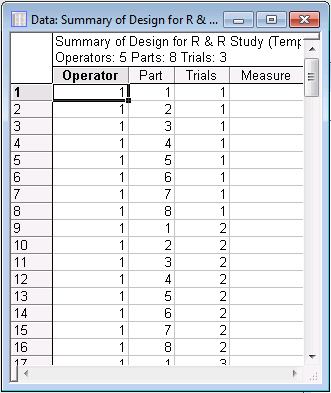
For this example, choose the Standard Statistica data file format, i.e., use the Data files tab. In this format, the design summary can be displayed in the spreadsheet in two ways: in Randomize trials or in Standard order, which is selected by default. Leave the default option button selected, and then click the Summary: Display design button in the Standard Statistica data file format group box to create the spreadsheet.
Note: a blank column (Measure) is added to the spreadsheet so that when you print this spreadsheet, you will have a convenient data entry form. Note also that you can save this design in a standard Statistica data file (so that you can later enter the measurements and analyze the data, see below) via the Save design button.Part of the Standard order design summary spreadsheet is shown below:
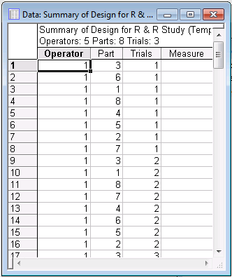
When you select the Randomize trials option button, Statistica will randomize the parts within operators and trials. It is always recommended to randomize the experiment in this manner in order to rule out any serial effects.
For example, operators may tire, and measurements taken later in the experiment may be less accurate than those taken early on. Part of the Randomize trials design spreadsheet is shown below.
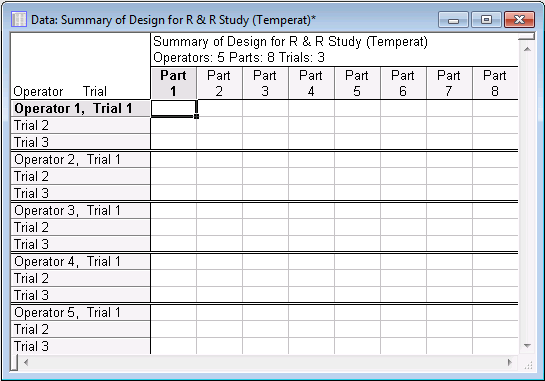
- Standard R & R data sheet
- This way of displaying the design in a spreadsheet is particularly suited if you want to use the (printed) spreadsheet to facilitate data entry. Shown below is the summary of the design displayed in this format. (Click the
Summary: Display design button on the
R & R data sheets tab.)
As you can see, in this format there are no grouping variables (columns) in the spreadsheet; instead, each column represents the data for one part. This format of presenting the R & R experiment is often used in the applied literature (e.g., ASQC/AIAG, 1990).
- Analyzing the R & R Experiment
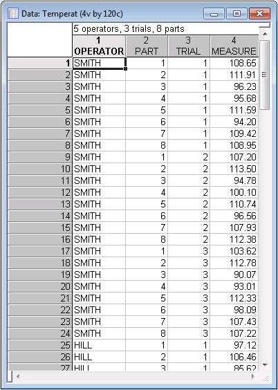
- Now, assume that you have completed the study and recorded the measurements in the data file Temperat.sta. Close all the spreadsheets and/or workbook in Statistica except the Temperat.sta data file.
Note: the file has been "enhanced" by adding in the first variable of the file the last names of the engineers as alphanumeric values. In this way you can more easily identify the operators later in the analysis.
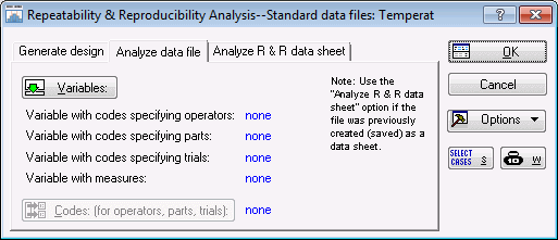
Click the Cancel button in the Repeatability & Reproducibility Design dialog box to close it and return to the Repeatability & Reproducibility Analysis - Generate design dialog box. Select the Analyze data file tab.
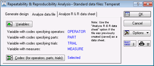
The operator names (codes) are given in variable OPERATOR, the part numbers are given in variable PART, the trial numbers (codes) in variable TRIAL, and the measurements in variable MEASURE. Click the Variables button to display a standard variable specification dialog box and then specify those variables, as shown below.
Click the OK button to return to the Analyze data file tab. Then, click the Codes: (for operators, parts, trials) button, and in the resulting dialog box, select all codes by either clicking the All button for each variable or the Select All button to select all codes for all of the variables.
Click the OK button to return to the Analyze data file tab, which will now look like this:
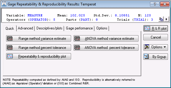
Finally, click the OK button to proceed to the Gage Repeatability & Reproducibility Results dialog box.
This dialog box contains options to review the results of the analysis. To graphically view the results of this study, you can choose from several types of plots. First, click the Repeatability & reproducibility plot button on the Quick tab.
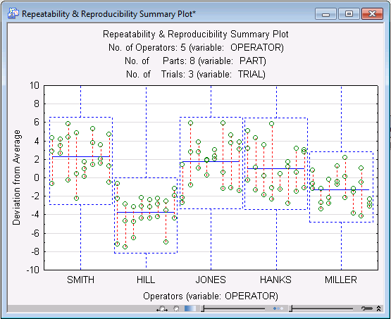
- Interpreting the plot
- The individual points plotted here are the deviations of the respective measurements from the average measurement for the respective part. For example, look at the furthest upper-left point (an approximate value of 4.4). This point represents a measurement of Part 1 by engineer Smith; specifically it shows that the measurement deviated from the average measurement for part 1 by about plus 4.4 degrees Celsius. The other two measurements made by Smith on the same part are connected to the point via the vertical line. Thus, you can see that the two other measurements deviated from the average for Part 1 by about 3.0 and -0.4. The second vertical line (to the right) represents the three measurements of Part 2 made by engineer Smith, and so on. Here is how you can interpret the information in this plot:
- Location of the box
- Each operator is represented by a box. The location of this box allows you to identify operators who are generally biased in all three measurements.
For example, operator Hill "sticks out," in that his measurements are generally below the average measurements of the same parts by other engineers. The average deviation of the respective operator's measurements is also indicated by the dashed horizontal line in each box.
- Height of the box
- The height of the box is an indication of the variability of measurements across trials. In our example, it seems that operator Miller generally produced less variability across measurements on the same part than any of the other engineers.
- Length of vertical lines connecting points
- These lines connect the different trials by each operator for each part. Therefore, excessively long lines identify wide ranges of measurements on the same part, and thus greater imprecision; if all trials yield identical measurements, there are no lines at all, but only points.
- The "perfect" plot
- What would this plot look like if you had perfect repeatability and reproducibility? If there were perfect repeatability, all repeated measurements on the same parts would be identical, and you would see no vertical lines. If there were perfect reproducibility, all operators would produce identical measurements, therefore, the location of all boxes with regard to the y-axis would be identical at value 0.
- Analysis of Variance (ANOVA) results
- Now look at some numerical output. As described in the Process Analysis - Gage Repeatability and Reproducibility Overview and
Technical Notes, the
Process Analysis module can estimate the different variance components either from ranges or from the ANOVA table. The former method is still popular because most of the necessary computation can be done by hand; however, the ANOVA method is more accurate and should thus be preferred (see
ASQC/AIAG, 1990, page 65).
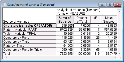
After returning to the Results dialog box, select the Advanced tab. Click the Complete ANOVA table button. Two spreadsheets will be produced; the first one shows the sums of squares for all effects.
If you are not familiar with the ANOVA method or with the concept of main effects and interactions, it is recommended that you read the Introductory Overview to the ANOVA/MANOVA module, which discusses these concepts and provides examples.
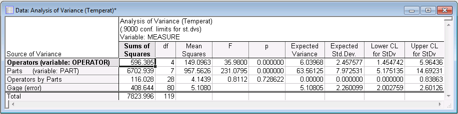
It is customary in R & R studies to regard the variability due to the interactions involving the Trials factor as error variability. This assumption seems reasonable, since, for example, it is difficult to imagine how the measurement of some parts will be systematically different in successive trials, in particular when parts and trials are randomized. The next spreadsheet shows the ANOVA results, treating all interactions by Trials as error.
Looking at the results in this spreadsheet it appears that the Operator by Parts interaction is not Statistically significant. Thus, we could ignore this interaction and consider a simpler ANOVA model without this interaction (select the No 2-way (Operator-Part) interaction check box on the Advanced tab).
Now review the right-most columns of the spreadsheet shown above. In these columns you find the estimates for the variances (and standard deviations) for the components of interest. Once again, consider what you would like your ideal measurement system to look like. Ideally, if you had a perfectly repeatable and reproducible measurement system, then all operators would arrive at identical measurements regardless of trial. Therefore, there would be no variability due to operators (perfect reproducibility), no variability due to trials (perfect repeatability), but only variability due to parts.
- Components of variance
- To express the variance components in terms of percentages of the total variability, click the
ANOVA method variance estimate button on the
Advanced tab.
The last column of numbers reports the variability due to different sources relative to the total variability in the measurements: Repeatability of measurements accounts for 6.5%, reproducibility across appraisers accounts for 8.1% of the total variability, the part-to-part variation accounts for 85.4%, and the combined repeatability and reproducibility variability accounts for about 14.6% of the total process variability. Thus, most of the variability in measurements is due to differences between parts, as is desirable for a reliable measurement system. Using the common guidelines for evaluating the quality of the measurement system (under 10% = OK, 10% to 30% = questionable, above 30% = needs improvement; see ASQC/AIAG, 1991, page 127), these percentages indicate that the performance of the measurement system is acceptable.
You could now proceed to use this measurement system to put a quality control system (chart) in place (use the Quality Control Charts module), to evaluate your machine capability, or to use designed experiments to improve the quality of your process (use the Experimental Design module). Now, review some additional results available from the Gage Repeatability & Reproducibility Results dialog box.
- Identifying outliers
- The idea behind (Shewhart) quality control charts is discussed in the Introductory Overview to the Quality Control Charts module. In short, you can produce a chart of a quality characteristic across different samples and establish control limits to identify outliers. In this case, you are particularly interested in identifying outliers among your engineers, that is, to identify those operators who produce particularly imprecise measurements; you may also want to identify outliers among parts, that is, to identify those parts that are particularly difficult to measure, and therefore yield imprecise measurements. This type of information may help you locate the causes of imprecision in your measurement system.
To identify outliers with regard to measurement precision, you want to chart the variability of measurements across trials. Two standard charts for controlling the variability of a process are the R chart of ranges and the S (sigma) charts of standard deviations; both can be produced by operators or by parts.
On the Descriptives/plots tab, click the Sigma chart by operator button to produce the plot shown below.
- Interpreting the S chart
- What you see charted here are the standard deviations for the three measurements trials by each engineer (operators) on each of the 8 kilns (parts). The average standard deviation is indicated by the solid lines is at 2.03. The plus 3 times
sigma limit for this chart is at 5.21; this upper control limit is indicated by the dashed line. Again, if you are not familiar with this common choice for an upper control limit, refer to the Introductory Overview of the Quality Control Charts module. To review, extreme outliers would fall above that
sigma limit, and any such outliers indicate that the respective engineer produced particularly unreliable measurements for the respective part. However, you are mostly interested in detecting general patterns here.
For example, as you saw in the summary plot produced earlier, engineer Miller seemed to have produced the least variability across trials; perhaps by observing how engineer Miller is using the temperature gages, you can find out how to make your measurement system even more precise.
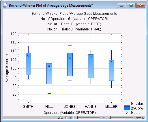
- Box and whisker plot
- Now look at one other plot: the box and whisker plot. This plot provides another summary of the average measurements across trials and across parts. It also allows you to examine whether the measurements are normally distributed, an assumption that must be met before most quality control procedures can be applied (e.g., control charts, process capability analysis, sampling plans).
After returning to the Descriptives/plots tab, click the Box & whisker plot button.
For each operator, this plot summarizes the range of average measurements (averaged across trials) as well as the distribution of those average measurements. In this case, for each operator the median seems to fall in the upper part of each box. The median statistic and the quartile ranges are discussed in greater detail in the Basic Statistics and Tables Introductory Overview, and in the Nonparametrics Introductory Overview. In short, each box denotes the range of values into which the center 50 percent of all measurements fall. The median itself "splits" the distribution in half; that is, it is the point below and above which 50% of all measurements fall. In a normal distribution, the mean is equal to the median and would fall in the center of each box. In our plot, however, the distributions appear to have a "long tail" towards the lower end of the measurements.
In this particular example, the quality control engineer might want to look at the distributions of measurements more closely to determine how serious is the deviation from the normal distribution. In general, unless the distribution is clearly not normal, most procedures are not seriously affected. If such cases should occur though, normality can usually be achieved by applying appropriate transformations to the measurements. For example, log transformations will "pull in" the lower tail of the distribution, etc.