Conceptual Overviews - Pie Charts
The pie chart (the term first used by Haskell, 1922) is one of the most common graph formats used for representing proportions or values of variables. Depending on the selected type of graph (see below), the pie chart will display either raw values or counts (i.e., frequencies) of specific categories of values (such as those which can be displayed in histograms.
Pie Charts of Values
The sequence of values from the variable will be represented by consecutive slices of the pie; the size of each slice will be proportional to the respective value.
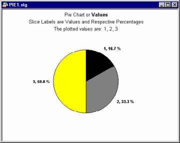
The values should be greater than 0 (0's and negative values cannot be represented as slices of the pie). This simple type of pie chart (sometimes called data pie chart) interprets data in the most straightforward manner: one case = one slice.
Slices of this pie chart can be labeled with case names, case numbers, or values of specific variables, and those labels can also include numeric information (e.g., percentages, see below).
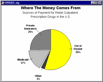
The typical application for simple (raw data) pie charts is to show how some quantity is divided (e.g., how the total amount of the national budget is spent) or how different components contribute to the total outcome (e.g., production in each of several factories that belong to a single, parent company).
Pie Charts of Counts
Unlike the simple data pie chart (see above), this type of pie chart (sometimes called frequency pie chart) interprets data like a histogram. It categorizes all values of the selected variable following the selected categorization technique and then displays the relative frequencies as pie slices of proportional sizes.
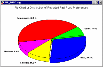
Frequency pie charts categorize the data and display the results of the categorization in terms of relative frequencies of consecutive categories. Thus, those pie charts offer an alternative method to display frequency histogram data (see the section on histograms).