Example 1.2: Analyzing a 26 Full Factorial
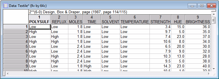
This example is based on the data file Textile.sta. Open this data file:
Ribbon bar. Select the Home tab. In the File group on the Open menu, select Open Examples to display the Open a Statistica Data File dialog box. Double-click the Datasets folder, and then open the data set.
Classic menus. On the File menu, select Open Examples to display the Open a Statistica Data File dialog box. The data file is located in the Datasets folder.
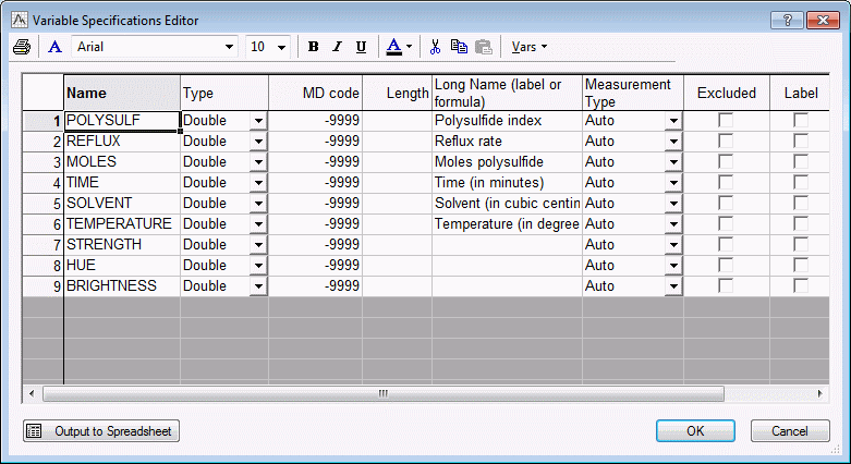
Box and Draper (1987, page 115) report a study of the manufacture of certain dyestuff. The dependent variables of interest are the Strength, Hue, and Brightness of the resulting product. The particular process under investigation was not very well understood in terms of the underlying chemical mechanism; therefore, an empirical study (experiment) was conducted with 6 factors. To view these 6 factors, display the Variable Specification Editor:
Ribbon bar. Select the Data tab. In the Variables group, click All Specs.
Classic menus. On the Data menu, select All Variable Specs.
The low and high settings (levels) for the factors were as follows:
| Factor Setting | ||
| Low | High | |
| Polysulfide index | 6 | 7 |
| Reflux rate | 150 | 170 |
| Moles polysulfide | ||
| Time | 24 | 36 |
| Solvent | 30 | 42 |
| Temperature | 120 | 130 |
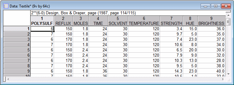
Following are the original settings for the factors; note that text values (Low, High) were also entered to identify the respective settings. You can toggle between text and numeric values in the data file:
Ribbon bar. Select the View tab. Click Display Options, and select Text Labels.
Classic menus. Click the Show/hide text labels button
![]() on the toolbar.
on the toolbar.
Specifying the design. Start the Experimental Design (DOE) analysis:
Ribbon bar. Select the Statistics tab, and in the Industrial Statistics group, click DOE to display the Design & Analysis of Experiments dialog boxl.
Classic menus. On the Statistics - Industrial Statistics & Six Sigma submenu, select Experimental Design (DOE) to display the Design & Analysis of Experiments dialog box.
Select 2**(k-p) standard designs (Box, Hunter, & Hunter) and click the OK button. In the Design & Analysis of Experiments with Two-Level Factors dialog box, select the Analyze design tab.
Click the Variables button to display a standard variable selection dialog box. Confirm that the Show appropriate variables only is not selected.
Select Strength, Hue, and Brightness as the Dependent variables, Variables 1 through 6 as the Indep. (factors), and click the OK button. The dialog box will now look like this.

Click the OK button to display the Analysis of an Experiment with Two-Level Factors dialog box.

Printing all results. Instead of reviewing results variable by variable, let's send all key results to a workbook and a report.
Ribbon bar. Select the File tab. Select Settings, and click Output Manager.
Classic menus. On the File menu, select Output Manager.
Select the Workbook option button as well as Single Report (common for all Analyses/Graphs).
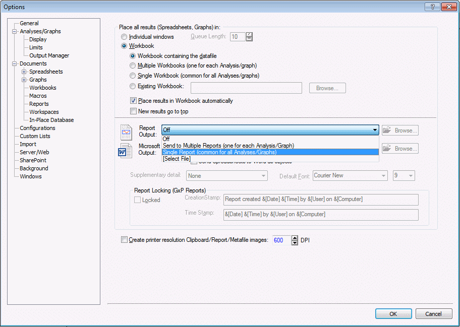
Click the OK button.
To send the results for all the dependent variables, in the Analysis of an Experiment with Two-Level Factors dialog box, select the All variables check box. The dialog box will now look like this:
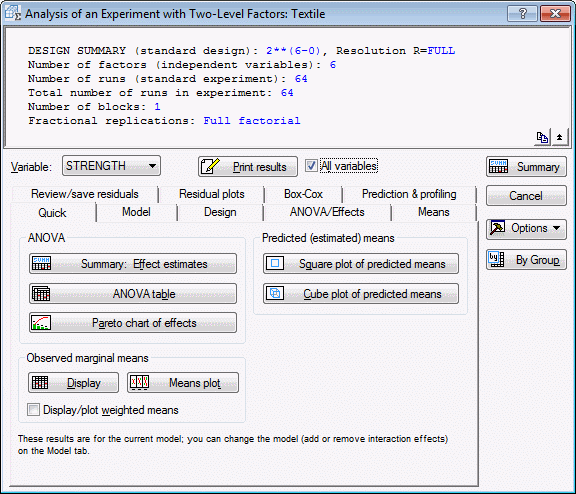
Before sending the results, because this is a full factorial design, let's estimate all 2-way and 3-way interactions. Select the Model tab. In the Include in model group box, select the 3-way interactions option button.
Now, click the Print results button. As you can see, a large amount of information is sent to the workbook and report. However, if you review carefully the ANOVA tables and tables of ANOVA parameters (and their statistical significance), it appears that none of the 2-way and 3-way interaction effects are statistically significant.
Normal probability plot of effects. You can also quickly "cut through the clutter" by displaying the normal probability plot of effects.
In the Analysis of an Experiment with Two-Level Factors dialog box, select the ANOVA/Effects tab.
Select Strength as the current Variable.
In the Plots of Effects group box, select the Label points in normal plot check box and the Plot standardized effects check box.
In the Plots of Effects group box, click the Normal probability plot button.
This plot is constructed by first ranking the (standardized) effects; the ranks are then converted into relative ranks or percentiles, which are converted into the respective values for the standard normal distribution (plotted against the left y-axis in this graph).
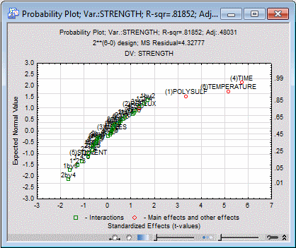
The majority of the main effects and interactions effects are close together, plotted along a line. The sizes of these effects are distributed in the way that one would expect if they were (normal) random around zero. However, the main effects for Polysulfide, Temperature, and Time are clearly separate in the upper-right corner of the plot.
Pareto chart of effects. It appears that a simple main-effects model is sufficient for dependent variable Strength. Therefore, In the Analysis of an Experiment with Two-Level Factors dialog box, select the Model tab. Select the No interactions option button. Then, select the Quick tab, and click the Pareto chart of effects button.
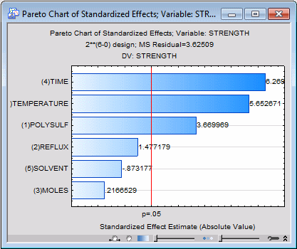
This chart also clearly identifies the main effects for Time, Temperature, and Polysulfide as the most important determinants of resultant Strength.
Plots of marginal and predicted means.
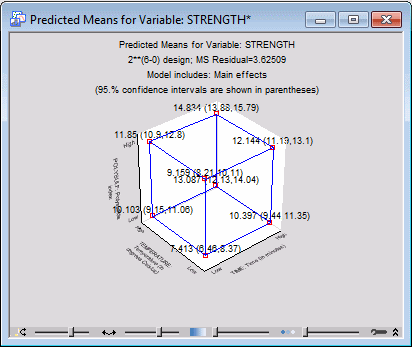
- Cube plot of predicted means
- To assess the effect of those three factors, on the
Quick tab in the Predicted (estimated) means group box, click the Cube plot of predicted means button to display the
Factors for Cube Plot dialog box. Select the three factors Time, Temperature, and Polysulfide as the three variables for the plot. Then, click the OK button to produce the cube plot for the predicted means.
By default, this plot shows the predicted means and their confidence intervals for the three factors, when all other factors are set at their respective means. The highest predicted mean (14.834) occurs at the point where all three factors are set at their respective High settings.
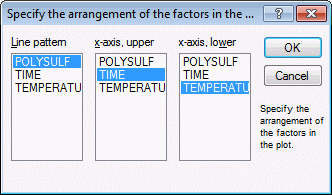
Plot of marginal means. Another plot that is particularly useful for exploring the nature of interactions is the plot of marginal means. Even though there is no indication of any interaction effects in this study, let's look at this graph anyway. On the Quick tab, click the Means plot button to display the Compute marginal means for dialog box. Select the three variables Polysulfide, Time, and Temperature.
Click the OK button to display the Specify the arrangement of the factors in the plot dialog box, where you can select the assignment of factors to the axes and line patterns in the interaction plot. Select Polysulfide as the Line pattern; Time as the x-axis, upper; and Temperature as the x-axis, lower.
Then click the OK button to produce the interaction plot.
- Effect estimates, coefficients, and regression coefficients
- If you look back at the data file, you can see that the factor levels were entered in their original metric, and not in their coded (±1) form. Therefore you can for this analysis review 1) the ANOVA effect estimates, 2) the coefficients for the coded (±1) factors, and 3) the coefficients for uncoded (raw) factors values.
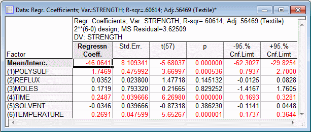
ANOVA effect parameters. Click the Summary: Effect estimates button (either on the Quick tab in the ANOVA group box or on the ANOVA/Effects tab) to produce the ANOVA effect estimates and the coefficients for the coded factor levels. A portion of these results are shown below.
The first 6 columns of the spreadsheet show the ANOVA effect estimates, their standard errors, confidence intervals, etc. The interpretation of the effect estimates is discussed in the Introductory Overview. Specifically, for the main effects, these values can be interpreted as the differences between the low and high settings for the respective factors. (If there were two-way interactions in this model, the respective effect estimates could be interpreted as half the difference between the main effects of one factor at the two levels of a second factor; three-way interaction effect estimates can be interpreted as half the difference between the two-factor interaction effect at the two levels of a third factor, and so on; see, for example, Mason, Gunst, and Hess, 1989, page 127.)
The last four columns of the spreadsheet contain the estimates of the coefficients for the coded factors. These can be interpreted as the regression coefficients for the recoded (to ±1) factor levels.
Regression coefficients. On the ANOVA/Effects tab, click the Regression coefficients button to produce the table of regression coefficients for the original (untransformed) factors (i.e., for the factor values in their original metric).
These are the coefficients that you could use to make predictions from factor values without having to recode those values. However, note that these coefficients are no longer comparable to each other, because their scaling depends on the scaling of the factors.
The conclusions you would reach regarding which factors are important are, of course, independent of the scaling of the factors. Indeed, if you review the spreadsheet shown above, you will see that the statistical significance tests (i.e., the t values) for the main effect estimates and regression parameters are the same. Note, however, that this will not necessarily be the case anymore when the model includes quadratic effects and interactions, as will be discussed in the context of 3(k-p) designs.
- Diagnostic checking of the fitted model
- The analysis so far for dependent variable Strength has revealed significant main effects for factors Time, Temperature, and Polysulfide. Now let's see how well this model fits the data, and whether the prediction residuals for this model are approximately normally distributed (which is an assumption of the least-squares estimation method).
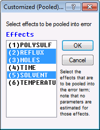
First, pool all non-significant effects into the error term. On the Model tab, select the Ignore some effects check box to display the Customized (Pooled) Error Term dialog box.
Select all nonsignificant main effects (Reflux, Moles, and Solvent) to be pooled into the error.
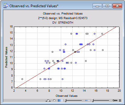
Click the OK button. Select the Prediction & profiling tab, and click the Predicted vs. observed values button.
The predicted values cluster fairly closely and homogeneously around the diagonal line in this plot, indicating a good fit of the model.
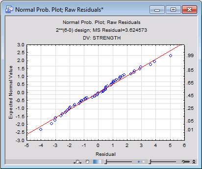
Now, select the Residual plots tab. In the Probability plots of residuals group box, click the Normal plot button to produce the normal probability plot of the residuals
It appears that the residuals follow the normal distribution very closely. Thus, we can conclude that the three-main-effects model provides a good fit for the dependent variable Strength.
See also, Experimental Design Index.