Conceptual Overviews - 2D Scatterplot with Error Bars
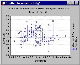
A 2D Scatterplot with error bars is a scatterplot where error bars are generated for all x-axis values that have more than one y-value associated with them. By default, the error bars are calculated as 95% confidence interval around the mean of the y variable for the specific x-value.
As with all STATISTICA graphs, these settings can be modified. In the example below, the error bars represent the minimum and maximum y-value for the specific x-value.
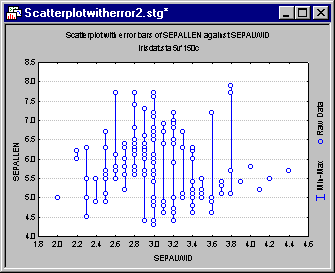
Because the scatterplot with error bars combines scatterplots with box and whisker plots, the graph is useful for visualizing the relationship between the two variables as a whole (e.g., in the example below, X and Y have a quadratic relationship) and for comparing the variability of one variable for specific values of the other variable.

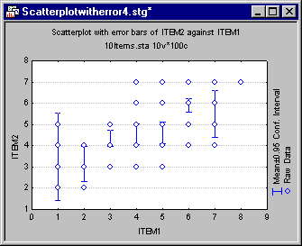
In the graph above, the variability in Y appears to be consistent across the X-values; however, in the graph below, the variability within Item2 when Item1 is 1, is considerably greater than it is for other values of Item1.
See also, Conceptual Overviews - 2D Box (and Means with Error) Plots and Conceptual Overviews - 2D Scatterplots.