Example 1: Standard Regression Analysis
- Data File
- This example is based on the data file Poverty.sta. Open this data file by selecting Open Examples from the File menu (classic menus) or by selecting Open Examples from the Open menu on the Home tab (ribbon bar); it is in the Datasets folder. The data are based on a comparison of 1960 and 1970 Census figures for a random selection of 30 counties. The names of the counties were entered as case names.
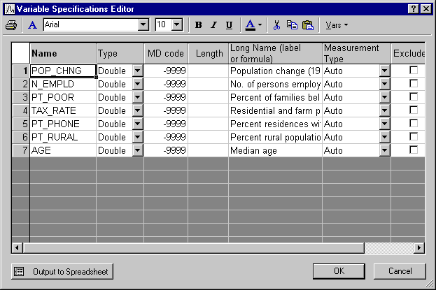
The information for each variable is listed in the Variable Specifications Editor (accessible by selecting All Variable Specs from the Data menu).
- Research Problem
- To analyze the correlates of poverty, that is, the variables that best predict the percent of families below the poverty line in a county. Thus, you will treat variable 3 (Pt_Poor) as the dependent or criterion variable, and all other variables as the independent or predictor variables.
- Starting the Analysis
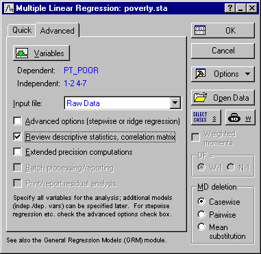
- Select Multiple Regression from the Statistics menu. Specify the regression equation by clicking the Variables button on the
Multiple Linear Regression dialog box - Quick tab to display the variable selection dialog. Select PT_POOR as the Dependent variable and all of the other variables in the data file from the Independent variable list, and then click the OK button. Also, on the
Multiple Linear Regression dialog box - Advanced tab, select the Review descriptive statistics, correlation matrix check box.
Now, click the OK button in this dialog and the Review Descriptive Statistics dialog box is displayed. Here, you can review the means and standard deviations, correlations, and covariances between variables. Note that this dialog is also available from basically all subsequent Multiple Regression dialog boxes, so you can always come back to look at the descriptive statistics for specific variables. Also, there are numerous graphs available.
- Distribution of variables
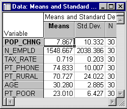
- First, examine the distribution of the dependent variable Pt_Poor across counties. Click the Means & standard deviations button to display this spreadsheet.
Select Histograms from the Graphs menu to produce the following histogram of variable PT_POOR. On the 2D Histograms dialog box - Advanced tab, in the Intervals group box, select the Categories option button, enter 16 in the corresponding edit field, and then click the OK button. In the variable selection dialog, select PT_POOR, and click OK. As you can see in the following image, the distribution for this variable deviates somewhat from the normal distribution. Correlation coefficients can become substantially inflated or deflated if extreme outliers are present in the data. However, even though two counties (the two right-most columns) have a higher percentage of families below the poverty level than what would be expected according to the normal distribution, they still seem to be sufficiently "within range."
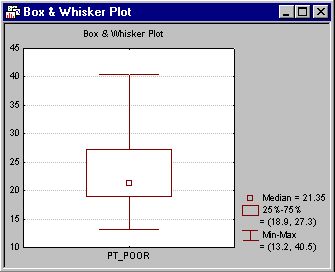
This decision is somewhat subjective; a rule of thumb is that one needs to be concerned if an observation (or observations) falls outside the mean ± 3 times the standard deviation. In that case, it is wise to repeat critical analyses with and without the outlier(s) to ensure that they did not seriously affect the pattern of intercorrelations. To view the distribution of this variable, click the Box & whisker plot button on the Review Descriptive Statistics dialog box - Advanced tab. In the variable selection dialog, select the variable Pt_Poor and click OK. Select the Median/Quart./Range option button in the Box-Whisker Type dialog box, and then click the OK button to produce the box and whisker plot.
(Note that the specific method of computation for the median and the quartiles can be configured "system-wide" on the General tab of the Options dialog box.)
- Scatterplots
- If one has a priori hypotheses about the relationship between specific variables at this point, it may be instructive to plot the respective scatterplot. For example, look at the relationship between population change and the percent of families below poverty level. It seems reasonable to predict that poverty will lead to outward migration; thus, there should be a negative correlation between the percent below poverty level and population change.
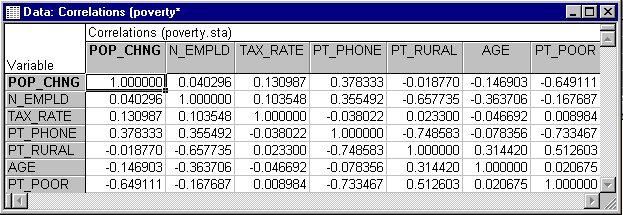
Return to the Review Descriptive Statistics dialog box and click the Correlations button on the Quick tab or the Advanced tab to display the spreadsheet with the correlation matrix.
The correlations between variables can also be displayed in a matrix scatterplot. A matrix scatterplot of selected variables can be produced by clicking the Matrix plot of correlations button on the Review Descriptive Statistics dialog box - Advanced tab and then selecting the desired variables.
- Specifying the Multiple Regression
- Now click the OK button in the Review Descriptive Statistics dialog box to perform the regression analysis and display the Multiple Regression Results dialog box. A standard regression (which includes the intercept) will be performed.
- Reviewing Results
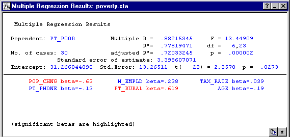
- The Summary box from the top of the Multiple Regression Results dialog box is shown below. Overall, the multiple regression equation is highly significant (refer to Elementary Concepts for a discussion of statistical significance testing). Thus, given the independent variables, you can "predict" poverty better than what would be expected by pure chance alone.
- Regression coefficients
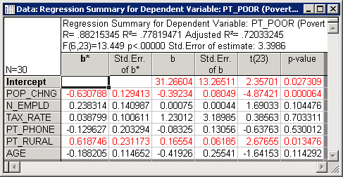
- In order to learn which of the independent variables contributes most to the prediction of poverty, examine the regression (or B) coefficients. Click the Summary: Regression results button on the
Quick tab to display a spreadsheet with those coefficients.
This spreadsheet shows the standardized regression coefficients (b*) and the raw regression coefficients (b). The magnitude of these Beta coefficients enable you to compare the relative contribution of each independent variable in the prediction of the dependent variable. As is evident in the spreadsheet shown above, variables POP_CHNG, PT_RURAL, and N_EMPLD are the most important predictors of poverty; of those, only the first two variables are statistically significant. The regression coefficient for POP_CHNG is negative; the less the population increased, the greater the number of families who lived below the poverty level in the respective county. The regression weight for PT_RURAL is positive; the greater the percent of rural population, the greater the poverty level.
- Partial correlations
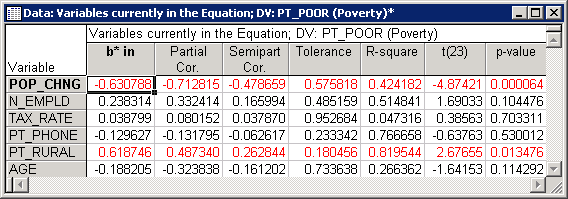
- Another way of looking at the unique contributions of each independent variable to the prediction of the dependent variable is to compute the partial and semi-partial correlations (click the Partial correlations button on the
Advanced tab in the
Results dialog box). Partial correlations are the correlations between the respective independent variable adjusted by all other variables, and the dependent variable adjusted by all other variables. Thus, it is the correlation between the residuals, after adjusting for all independent variables. The partial correlation represents the unique contribution of the respective independent variable to the prediction of the dependent variable.
The semi-partial correlation is the correlation of the respective independent variable adjusted by all other variables, with the raw (unadjusted) dependent variable. Thus, the semi-partial correlation is the correlation of the residuals for the respective independent variable after adjusting for all other variables, and the unadjusted raw scores for the dependent variable. Put another way, the squared semi-partial correlation is an indicator of the percent of Total variance uniquely accounted for by the respective independent variable, while the squared partial correlation is an indicator of the percent of residual variance accounted for after adjusting the dependent variable for all other independent variables.
In this example, the partial and semi-partial correlations are relatively similar. However, sometimes their magnitude can differ greatly (the semi-partial correlation is always lower). If the semi-partial correlation is very small, but the partial correlation is relatively large, then the respective variable may predict a unique "chunk" of variability in the dependent variable (that is not accounted for in the other variables). However, in terms of practical significance, this chunk may be tiny and represent only a very small proportion of the total variability (see, for example, Lindeman, Merenda, and Gold, 1980; Morrison, 1967; Neter, Wasserman, and Kutner, 1985; Pedhazur, 1973; or Stevens, 1986).
- Residual Analysis
- After fitting a regression equation, you should always examine the predicted and residual scores. For example, extreme outliers may seriously bias results and lead to erroneous conclusions. From the Multiple Regression Results dialog box - Residuals/assumptions/prediction tab, click the Perform residual analysis button to proceed to the Residual Analysis dialog box.
- Casewise plot of residuals
- Usually, you should at least examine the pattern of the raw or standardized residuals to identify any extreme outliers. For this example, select the
Residuals tab and click the Casewise plot of residuals button; by default the Raw residuals will be "plotted" in the casewise plot (spreadsheet); however, you can also select other residual statistics in the Type of residual group box.
The scale used in the casewise plot in the left-most column is in terms of sigma, that is, the standard deviation of residuals. If one or several cases fall outside of the ± 3 times sigma limits, one should probably exclude the respective cases (which is easily accomplished via case selection conditions) and run the analysis over to make sure that key results were not biased by these outliers.
- Casewise plot of outliers
- A quick way to identify outliers is to click the Casewise plot of outliers button on the Outliers tab. You can either plot all standard residuals that fall outside the ± 2 times sigma limits or plot the 100 most extreme cases, as specified in the Type of outlier box. When you select the Standard residual (> 2 * sigma) option button, no outliers will be detected in the current example.
- Mahalanobis distances
- Most statistics textbooks devote some discussion to the issue of outliers and residuals concerning the dependent variable. However, the role of outliers in the independent variable list is often overlooked. On the independent variable side, you have a list of variables that participate with different weights (the regression coefficients) in the prediction of the dependent variable. You can think of the independent variables as defining a multidimensional space in which each observation can be located. For example, if you had two independent variables with equal regression coefficients, you could construct a scatterplot of those two variables, and place each observation in that plot. You could then plot one point for the mean on both variables and compute the distances of each observation from this mean (now called centroid) in the two-dimensional space; this is the conceptual idea behind the computation of the Mahalanobis distances. Now, look at those distances (sorted by size) to identify extreme cases on the independent variable side. Select the Mahalanobis distances option button in the Type of outlier box, and then click the Casewise plot of outliers button. The resultant (results spreadsheet) plot will show the Mahalanobis distances sorted in descending order.
Note: Shelby county (in the first line) appears somewhat extreme as compared to the other counties in the plot. If you look at the raw data you will find that, indeed, Shelby county is by far the largest county in the data file, with many more persons employed in agriculture (variable N_EMPLD), etc. Probably, it would have been wise to express those numbers in percentages rather than in absolute numbers, and in that case, the Mahalanobis distance of Shelby county from the other counties in the sample would probably not have been as large. As it stands, however, Shelby county is clearly an outlier.
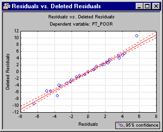
- Deleted residuals
- Another very important statistic that enables one to evaluate the seriousness of the outlier problem is the Deleted Residual. This is the standardized residual for the respective case that one would obtain if the case were excluded from the analysis. Remember that the multiple regression procedure fits a straight line to express the relationship between the dependent and independent variables. If one case is clearly an outlier (as is Shelby county in this data), then there is a tendency for the regression line to be "pulled" by this outlier so as to account for it as much as possible. As a result, if the respective case were excluded, a completely different line (and B coefficients) would emerge. Therefore, if the deleted residual is grossly different from the standardized residual, you have reason to believe that the regression analysis is seriously biased by the respective case. In this example, the deleted residual for Shelby county is an outlier that seriously affects the analysis. You can plot the residuals against the deleted residuals via the Residuals vs. deleted residuals button on the
Scatterplots tab, which will produce a scatterplot of these values. The scatterplot below clearly shows the outlier.
Statistica provides an interactive outlier removal tool (the Brushing Tool
 ) in order to experiment with the removal of outliers to instantly see their influence on the regression line. Right-click in the graph, and select Show Brushing from the shortcut menu. When the tool is activated, the cursor changes to a cross-hair, and the Brushing dialog box will be displayed next to the graph. You can (temporarily) interactively eliminate individual data points from the graph by selecting 1) the Auto Apply check box and 2) the Off option button in the Action box; then click on the point that is to be removed with the cross-hair. Clicking on a point will automatically remove it (temporarily) from the graph.
- Normal probability plots
- There are many additional graphs available from the
Residual Analysis dialog box. Most of them are more or less straightforward in their interpretation; however, the normal probability plots will be commented on here.
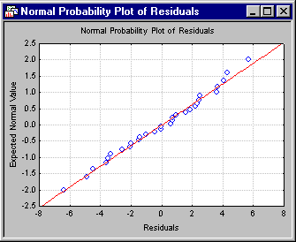
As previously mentioned, multiple linear regression assumes linear relationships between the variables in the equation, and a normal distribution of residuals. If these assumptions are violated, your final conclusion may not be accurate. The normal probability plot of residuals will give you an indication of whether gross violations of the assumptions have occurred. Click the Normal plot of residuals button on the Probability plots tab to produce this plot.
This plot is constructed as follows. First the residuals are rank ordered. From these ranks, z values can be computed (i.e., standard values of the normal distribution) based on the assumption that the data come from a normal distribution. These z values are plotted on the y-axis in the plot.
If the observed residuals (plotted on the x-axis) are normally distributed, then all values should fall onto a straight line in the plot; in this plot, all points follow the line very closely. If the residuals are not normally distributed, then they will deviate from the line. Outliers may also become evident in this plot.
If there is a general lack of fit, and the data seem to form a clear pattern (e.g., an S shape) around the line, then the dependent variable may have to be transformed in some way (e.g., a log transformation to "pull in" the tail of the distribution, etc.; see also the brief discussion of Box-Cox and Box-Tidwell transformations in the Regression Notes). A discussion of such techniques is beyond the scope of this example (Neter, Wasserman, and Kutner, 1985, page 134, present an excellent discussion of transformations as remedies for non-normality and non-linearity); however, too often researchers simply accept their data at face value without ever checking for the appropriateness of their assumptions, leading to erroneous conclusions. For that reason, one design goal of the Multiple Regression module was to make residual (graphical) analysis as easy and accessible as possible.
- Additional residual analyses
- Various additional specialized residual analyses and plots are available in the General Regression Models and General Linear Models facilities of Statistica. However, you can also apply all analytic facilities of Statistica to further explore the patterns of residuals by first creating a stand-alone input spreadsheet of residuals. Select the Save tab and click the Save residuals & predicted button. This will save selected variables from the current input file, along with all residual statistics. The stand-alone spreadsheet that will be created is automatically marked for input, so you can now apply all statistical analysis facilities available in Statistica to create plots or breakdowns, or to use the Time Series facilities to evaluate any serial correlation in the residuals (auto-correlated residuals).