Example 8: Multiple Regression Analysis
This example is based on the data file Poverty.sta that is included with your STATISTICA program. Refer to Example 7 demonstrating simple regression analysis for a description of the data file. See also the Multiple Regression Overviews for a discussion of these methods.
For this example, several possible correlates of poverty will be analyzed and the relative degree to which each predicts the percent of families below the poverty line in a county will be determined. Thus, we will treat variable 3 (PT_POOR) as the dependent or criterion variable, and the remaining variables will be treated as continuous predictor variables.
Ribbon bar. Select the Home tab. In the File group, click the Open arrow and select Open Examples to display the Open a STATISTICA Data File dialog box. Open the data file, which is located in the Datasets folder. Then, select the Statistics tab. In the Advanced/Multivariate group, click Advanced Models and from the menu, select General Linear to display the General Linear Models (GLM) Startup Panel.
Classic menus. From the File menu, select Open Examples to display the Open a STATISTICA Data File dialog box. Open the data file, which is located in the Datasets folder. Then, from the Statistics - Advanced Linear/Nonlinear Models submenu, select General Linear Models to display the General Linear Models (GLM) Startup Panel.
Select Multiple regression as the Type of analysis, Quick specs dialog as the Specification method, and then click the OK button to display the GLM Multiple Regression Quick Specs dialog box.
Click the Variables button to display the standard variable selection dialog box. Select PT_POOR in the Dependent variable list and the remaining variables as the Predictor variables, and then click the OK button to return to the GLM Multiple Regression Quick Specs dialog box.
To view the syntax program automatically generated from the specifications, click the Syntax editor button to display the GLM Analysis Syntax Editor.
The remainder of the specifications for this analysis can use the default specifications, so click the OK (Run) button in the GLM Analysis Syntax Editor or the OK button in the GLM Multiple Regression Quick Specs dialog box to perform the analysis. A warning dialog box will be displayed. For information about this warning, see the GLM Introductory Overview - Summary of Computations, specifically the paragraph about matrix ill conditioning. Click the OK button in the warning.
Reviewing Results.
- Regression coefficients
- When the
GLM Results dialog box is displayed, select the
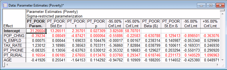
Summary tab, and then click the Coefficients button. In order to learn which of the independent variables contribute most to the prediction of poverty, examine the unstandardized regression (or B) coefficients and the standardized regression (or Beta) coefficients.
The Beta coefficients are the coefficients you would have obtained had you first standardized all of your variables to a mean of 0 and a standard deviation of 1. Thus, the magnitude of these Beta coefficients allows you to compare the relative contribution of each independent variable in the prediction of the dependent variable. As is evident in the spreadsheet shown above, variables POP_CHNG, PT_RURAL, and N_EMPLD are the most important predictors of poverty; of those, only the first two variables are statistically significant (their 95% confidence interval limits do not include 0). The regression coefficient for POP_CHNG is negative; the less the population increased, the greater the number of families who lived below the poverty level in the respective county. The regression weight for PT_RURAL is positive; the greater the percent of rural population, the greater the poverty level.
- Significance of regressor effects
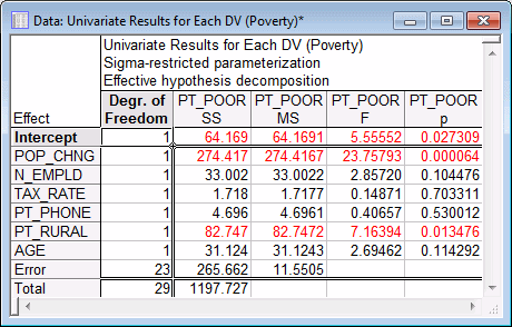
- On the Summary tab, click the Univariate results button to display a spreadsheet containing tests of significance.
As this spreadsheet shows, only the POP_CHNG and PT_RURAL effects are statistically significant, p < .05.
- Residual Analysis
- After fitting a regression equation, we should always examine the predicted and residual scores. For example, extreme outliers may seriously bias results and lead to erroneous conclusions.
In the GLM Results dialog box, click the More results button, located at the bottom of the dialog box. Select the Residuals 1 tab to access the options for analysis of residuals.
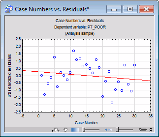
- Casewise plot of residuals
- Usually, we should examine the pattern of the raw or standardized residuals to identify any extreme outliers. In the Resids for default plots group box, select the Standardized option button. Then, click the Case no. & res. button to create a graph with a casewise plot of residuals.
The scale used for the vertical axis of the casewise plot is in terms of sigma, that is, the standard deviation of residuals. If one or several cases fall outside of the ± 3 times sigma limits, we should probably exclude the respective cases (which is easily accomplished via selection conditions) and run the analysis again to ensure that key results were not biased by these outliers.
- Mahalanobis distances
- Most statistics textbooks devote some discussion to the issue of outliers and residuals concerning the dependent variable. However, the role of outliers in the predictor variables is often overlooked. On the predictor variable side, we have a list of variables that participate with different weights (the regression coefficients) in the prediction of the dependent variable. We can think of the independent variables as defining a multidimensional space in which each observation can be located. For example, if we had two independent variables with equal regression coefficients, we could construct a scatterplot of those two variables, and place each observation in that plot. We could then plot one point for the mean on both variables and compute the distances of each observation from this mean (now called the centroid) in the two-dimensional space; this is the conceptual idea behind the computation of the Mahalanobis distance. Now, look at those distances to identify extreme cases on the predictor variable side.
Select the Residuals 2 tab. In the X (var/pred/res) list, select Mah. Dis. Next, click the Histogram of selected X (variable, predicted, or residual value) button to display a histogram of the distribution of Mahalanobis distances.
It appears that there is one outlier case on Mahalanobis distances. To identify this case, select the Residuals 1 tab.
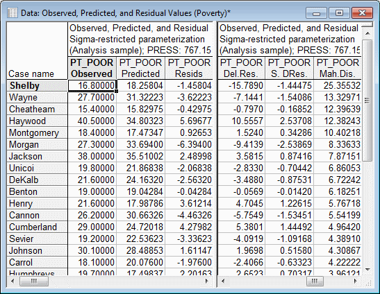
In the Sort obs by drop-down list, select Mahalanobis distance, and then click the Predicted and residuals button to create the Observed, Predicted, and Residual Values spreadsheet.
Note: Shelby county (in the first line) appears somewhat extreme as compared to the other counties in the spreadsheet. If we look at the raw data, we will find that, indeed, Shelby county is by far the largest county in the data file with many more persons employed in agriculture (variable N_EMPLD). Probably, it would have been wise to express those numbers in percentages rather than in absolute numbers, and in that case, the Mahalanobis distance of Shelby county from the other counties in the sample would probably not have been as large. As it stands, however, Shelby county is clearly an outlier. - Deleted residuals
- Another very important statistic that makes it possible for us to evaluate the seriousness of the outlier problem is the deleted residual. This is the standardized residual for the respective case that we would obtain if the case were excluded from the analysis. Remember that the multiple regression procedure fits a regression surface to express the relationship between the dependent and predictor variables. If one case is clearly an outlier (as is Shelby county in this data), there is a tendency for the regression surface to be "pulled" by this outlier so as to account for it as much as possible. As a result, if the respective case were excluded, a completely different surface (and B coefficients) would emerge. Therefore, if the deleted residual is grossly different from the standardized residual, we have reason to believe that the regression analysis is seriously biased by the respective case.
In this example, the deleted residual for Shelby county is an outlier that seriously affects the analysis. We can plot the residuals against the deleted residuals: in the Resids for default plots group box, select the Raw option button. Then, click the Res. & del. res. button, which will produce a scatterplot of these values.
The scatterplot clearly shows the outlier; to label the outlier (Shelby), click the toolbar button to display the Brushing 2D dialog box, and then Label the respective point.
- Normal probability plots
- There are many additional graphs available from the Residuals tabs. Most of them are more or less straightforward in their interpretation; however, the normal probability plots will be commented on here.
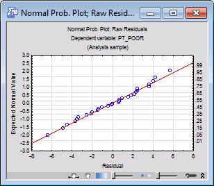
As previously mentioned, multiple linear regression assumes linear relationships between the variables in the equation, and the normal distribution of residuals. If these assumptions are violated, your final conclusion may not be accurate. The normal probability plot of residuals will give you an indication of whether or not gross violations of the assumptions have occurred. In the Probab. plot of resids group box, click the Normal button to produce this plot.
This plot is constructed as follows: First the standardized residuals are rank ordered. From these ranks, z values can be computed (i.e., standard values of the normal distribution) based on the assumption that the data come from a normal distribution. These z values are plotted on the y-axis in the plot.
If the observed residuals (plotted on the x-axis) are normally distributed, all values should fall onto a straight line in the plot; in this plot, all points follow the line very closely. If the residuals are not normally distributed, they will deviate from the line. Outliers may also become evident in this plot.
If there is a general lack of fit and the data seem to form a clear pattern (e.g., an S shape) around the line, the dependent variable may have to be transformed in some way (e.g., a log transformation to "pull in" the tail of the distribution, etc.). A discussion of such techniques is beyond the scope of this example—Neter, Wasserman, and Kutner (1985, p. 134-141) present an excellent discussion of transformations as remedies for non-normality and non-linearity); however, too often researchers simply accept their data at face value without checking for the appropriateness of their assumptions, leading to erroneous conclusions. For that reason, one design goal of the GLM module is to make residual (graphical) analysis as easy and accessible as possible.
See also GLM - Index.