QC Charts Example 6: Specifying Pareto Charts, Changing the Project Header, Printing Results
- Overview
- In general, in a Pareto chart, a histogram of some variable of interest is plotted by categories. For example, you could plot the amount of money (in dollars) lost by product, the number of defects produced per shift, etc. In the histograms, the columns are always sorted in descending order, in order to allow for identification of the major causes of costs or defects more easily. Remember that the major tenet of the Pareto principle is that a minority of factors cause the majority of problems. This example will briefly describe this type of chart.
- Setup of the Data File
- The file Circuits.sta contains data from an example presented by Montgomery (1985, page 146). Open this data file via the File - Open Examples menu. Specifically, it contains the number of defects on printed circuit boards categorized by the type of defect.
Note: these data are already aggregated, that is, the total number of defects by categories has already been computed. If this were not the case, you could analyze the raw data, that is, code numbers that identify to which category a particular defect belongs; the Quality Control module can automatically tabulate such data and generate the aggregate counts (as they are already recorded in the file Circuits.sta). Additionally, the Quality Control module can analyze data that are recorded in the form of both Codes and counts.
- Specifying the Analysis
- Select Quality Control Charts from the Statistics - Industrial Statistics & Six Sigma submenu or from the Data Mining - Process Optimization - QC Charts submenu to display the
Quality Control Charts Startup Panel. Then select Pareto chart analysis on the
Quick tab (or the
Attributes tab or the
Variables tab). Click the
Real-time tab and select the Auto-update option button. Now click the OK button to display the
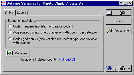
Defining variables for Pareto charts dialog. In this dialog, you can specify the variable for the analysis as well as the Format of input data. For this example, select the Aggregated counts option button, and then click the Variables button and select the variable No_defct (the only variable in the file).
Click OK to produce the Pareto chart and display the Pareto Chart Results dialog.
- Changing the Project Header
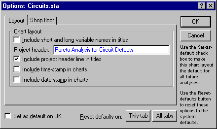
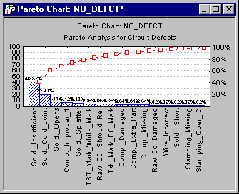
- Notice that the variable name (No_defct) is displayed in the title for the Pareto Chart. You can create a project header and include it in all charts in the
Options dialog. To do this, click the Options button and enter the new project header (for this example, use Pareto Analysis for Circuit Defects) in the Project header field on the
Layout tab. To include this project header in titles, select the Include project header line in titles check box.
Now, click OK to close the Options dialog and update the chart.
- Reviewing Results
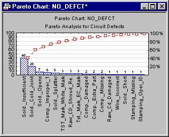
- As already discussed in the
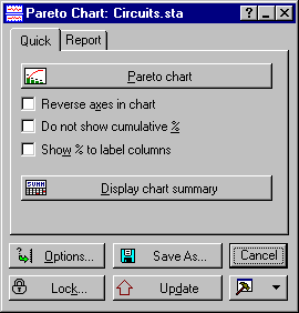
Introductory Overview, it is evident that a few causes/problems account for a majority of the quality losses. In our example, three soldering problems account for almost 70% of all problems. To better view the percentage of errors for each category, you can choose to label the columns of the chart with percentages by selecting the Show % to label columns check box on the
Quick tab and clicking the Update button.
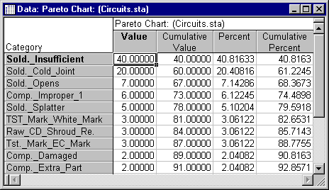
You can also produce a spreadsheet containing a summary of this chart by clicking the Display chart summary button on the Quick tab.
As you can see above, soldering problems (the first three categories) account for about 68.4% of all quality problems.
- Print Results
- Note that you can print the results of our analysis using the options on the
Report tab. The text box below the Print/report results selected below button lists all of the charts and spreadsheets we have produced. Highlight the items you want to print, and click the Print/report results selected below button. The selected items will be printed to a report.
See also QC Chart Examples.

Copyright © 2021. Cloud Software Group, Inc. All Rights Reserved.