Statistica Reporting Tables Overview
Statistica Reporting Tables operates on the currently active input spreadsheet.
There are some important vocabulary and concepts that should be clearly understood when working with the Reporting Tables module. These will be discussed throughout this topic.
The purpose of the module is to produce a report in the form of an output spreadsheet or sequence of spreadsheets. For example, the following image shows a portion of an input spreadsheet and a report produced from that input.
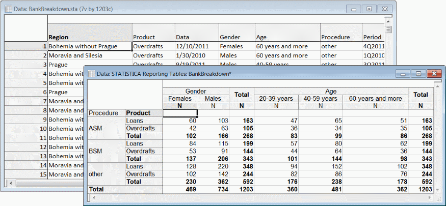
The input spreadsheet is organized into cases (rows) and variables (columns). Input variables are assigned one or more of several possible roles in the report design. Gender, Age, Procedure, and Product are classification variables in this example. Gender and Age are assigned side-by-side to the columns axis of the report; Procedure and Product are assigned nested on the rows axis. A third axis exists; if variables are assigned to the Layers axis, multiple sheets are produced.
The specific values found for a classification variable are referred to as the levels of that variable; they are displayed in the row and column header areas, for example, Females and Loans. The other labels appearing in the header areas are variable names, statistic names, and user-specified labels for Totals and possible for rows or columns associated with missing values of classification variables.
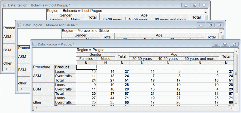
In the following image, Region is assigned to the Layers axis.
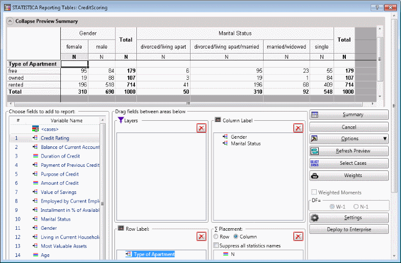
In the examples above, we are reporting just the number of cases in each cell (breakdown variable combination). In general we can report any of the single-variable descriptive statistics, and you can specify as many of them as you like. The "sigma axis” controls a list of variable/statistic pairs. Variables used in this way are said to be analysis variables. The system will lay out each statistic in the order given for every combination of row and column classification variable levels.
In the following image, the mean and standard deviation of requested loan amount versus four demographic indicators is displayed. Observe that there appear to be no males in the input categorized as divorced/living apart/married. Similarly there seem to be no females who are married/widowed.
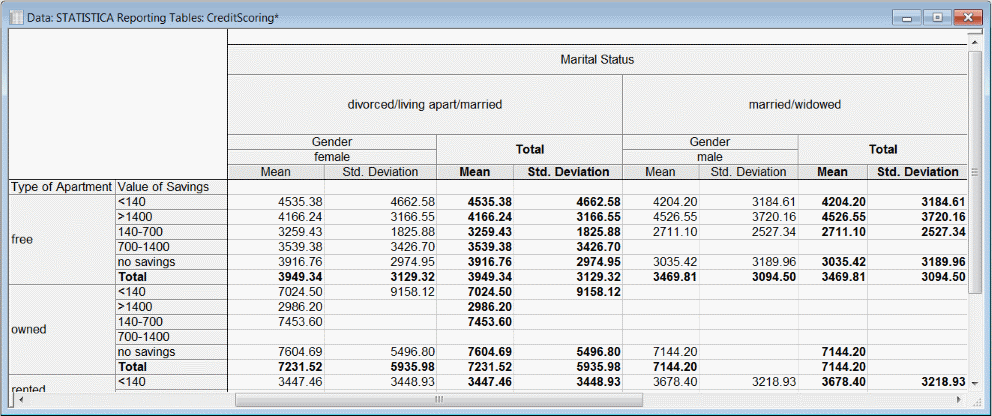
Cells are created in the data grid area for combinations that are empty. We see above that none of the married/widowed males reported non-zero savings amounts but the system had to create blank cells for those combinations because there are data in the corresponding rows and columns elsewhere in the table.
The blanks we see under standard deviation where mean has a value arise from a different rule. The mean of a single observed value is well-defined, but it requires at least two observations to define a standard deviation. So we can conclude that exactly one case in our input falls into the category female, divorced/living apart/married, owned, 140-700. And we can conclude that that individual requested a loan of 7453.6 units of whatever currency we are lending.
The tool used to create these reports is the Statistica Reporting Tables dialog box.
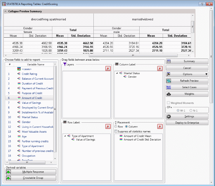
At the top of the dialog box is the preview window. At left is the list of available variables. Below the variable list is a group of buttons used to create special variables or variable groups. In the middle are windows for each of the four axes. On the right side is a group of controls.
To build up an axis, you simply drag-and-drop the desired variables onto the desired axis window. You can delete variables from the axis windows by dragging them back to the list window or by clicking on the deletion icon that is displayed when you position the mouse pointer over the variables.
Classification axes are built up in two ways - nesting and side-by-side. The relationship between a newly dropped variable and those already assigned to the axis is determined by where in the window you drop the new variable.
Both the row and column axes in the previous illustration are nested. This means the breakdown by the second variable will be repeated once for each level of the first variable. This is achieved by dropping each successive variable onto the icon or name of the previous one.
In contrast, a side-by-side design builds an axis by first breaking down on one variable, and then executing a second breakdown by the second variable. This is achieved by dropping the new variable below the existing variable, to make the new variable a new top-level, side-by-side dimension.
You can also create a side-by-side breakdown at a lower nesting level; to achieve that effect you would drop each new variable onto the common parent variable.
A Crosstable Group is a set of categorical variables sharing a common coding scale that are given a special layout treatment. Logically equivalent to side-by-side layout, the variables and levels for the group are assigned to separate axes for a more compact table.
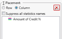
The following image shows the sigma axis. Notice the option buttons for S (sigma) Placement. In the examples we have seen so far, the statistics have been spread across Columns. This is the more common, default setting, and we will describe the effects of various options assuming that option is selected. When the Row option button is selected, the statistics are spread across rows and the labels identifying the statistics are displayed with the row headers.
Once a variable has been dropped onto an axis you can access the specifications dialog box by double-clicking the variable. Variables can be dropped more than once; each appearance can specify one statistic. For the sigma axis, the specifications dialog box contains options to select any of the defined statistics for the selected variable.
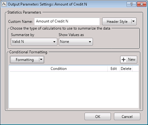
The label describing the statistic is automatically generated, but you can supply a Custom name to override it. Whether the generated or custom name is displayed, the style parameters (font, color, alignment) for the label can be modified by clicking the Header Style button.
Click the Formatting button to customize the display style, including numeric precision, of the statistic itself. The conditional formatting button allows for simple rule-based application of style parameters. More complex conditions will require a post-processing scrip.
If several variables are added to the sigma axis, and the same statistic is specified for all of them, the generated headings in the report will include the variable name.
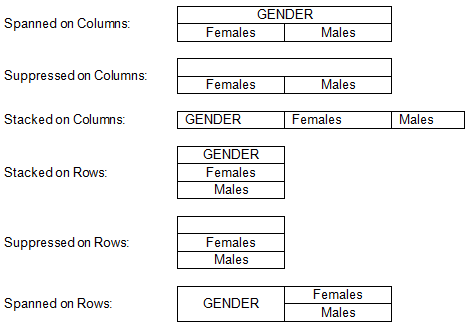
Variables assigned to a breakdown axis have more options. The name of the variable is usually displayed as part of the row or column header layout, but it can be replaced by a custom name string or suppressed altogether. Style parameters can be overridden for the header area assigned to this variable; the style parameters are inherited by subordinate header levels unless overridden again.
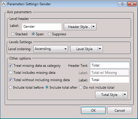
If the variable name display is not suppressed, it can be Stacked or Spanned. Stacked is the default option on the rows axis, spanning is the default on the columns. The effects of the various options are summarized by this table:
The next group of controls in the breakdown variable specifications dialog box has to do with the selection and formatting of the levels of the variable. You can specify that the levels found in the data at runtime be presented in ascending or descending order. (For more control over the selection and ordering of levels, use the options in the Code Settings dialog box associated with each variable, accessed by double-clicking on the entries in the Variable Name pane.)
You can use the Level Style option to override some of the formatting for the level labels, separately from the overall style for the variable and any style associated with the total(s) defined for the variable.
The Treat missing data as category option causes a row or column to be displayed corresponding to those input cases having no value (missing data) for the classification (axis) variable. Cases with missing values for classification variables are always tabulated separately internally; this option just controls whether statistics computed over those cases are displayed in the layout. If they are displayed, the corresponding level label defaults to blank, but can be given a value, e.g., N/A, by typing the value in the Header Text field.
Totals rows or columns can be created associated with each classification variable, and if created they can be displayed before or after the levels of the variable. Before means above or left, after means below or to the right, for row and column axis variables respectively.
Rows and columns, including totals rows and columns, define subsets of the input cases. Statistics are computed over these subsets for display. Thus, the values displayed in total rows or columns are not (generally) the arithmetic sum of the corresponding values in the rows or columns over which the total is computed. Rather, it is the same statistic computed over the set union of the case sets defined by those rows or columns.
Only for N and Sum (and percentages derived from those statistics) would we expect the value appearing in a Total cell to be the arithmetic sum of the corresponding values in the detail cells. Minimum and Maximum would also be expected to have a simple relationship between detail and total cells. Other than that, the values do not have a direct relationship. The median of a variable computed across all cases, for instance, may not be identical to the median of any of the subsets, nor is it necessarily the median of those medians. For another example, if each detail cell has just one case, the standard deviation is not even defined for those detail cells. But the standard deviation for the total cell is well defined - as long as there is more than one detail level.
Following is a larger example, a hand-made spreadsheet provided by a customer, in which we can see how all the pieces fit together:
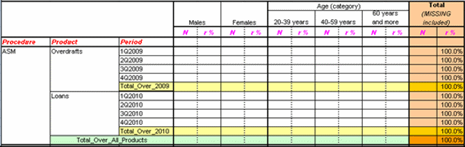
On the columns, we have a gender variable side-by-side with a course-coded Age. Both the variable name and the totals columns are suppressed for gender. For Age, we would specify Total includes missing data and Include total after. We would also override the background color on the totals for Age.
On the rows, note that all three variables have their names displayed in the default stacked arrangement, but with a custom foreground color and italic font. All three variables have totals enabled after; the total for Procedure is not seen in the truncated screenshot. Custom background colors are assigned to each total level. Also, note that the vertical alignment of the level names differ between the row and column header cells; this can be controlled through the style options as well.
The statistics selected in this example are N (number of cases) and row percent, a statistic derived from N. Both are displayed with a custom foreground color and slanted font.
Normally when a categorical variable is assigned to an axis, there is just one level for that variable for each input case and the breakdown data break down into disjoint subsets. Sometimes a logical categorical variable may permit multiple values. This situation can be represented in two distinct ways, known as Multiple Response and Multiple Dichotomies. Both are handled via the Multiple Response button, which creates a node for the group in the variables list. When that node is assigned to an axis, individual cases may be assigned to more than one row or column of the report. Totals are, as with ordinary variables, as statistics computed over the union of the sets of cases so they work as expected.