Conceptual Overviews - 2D Scatterplots
Two-dimensional scatterplots are used to visualize relations between two variables X and Y (e.g., weight and height).

Individual data points are represented by point markers in two-dimensional space, where axes represent the variables. The two coordinates (X and Y) that determine the location of each point correspond to its specific values on the two variables. If the two variables are strongly related, then the data points form a systematic shape (e.g., a straight line or a clear curve), as shown in the example below.

Fitting functions to scatterplot data helps identify the patterns of relations between variables.

If the variables are not related, then the points form a round "cloud."

Homogeneity of Bivariate Distributions (Shapes of Relations)
Scatterplots are typically used to explore or identify the nature of relations between two variables (e.g., blood pressure and cholesterol level), because they can provide much more information than a correlation coefficient. For example, a lack of homogeneity in the sample from which a correlation was calculated can bias the value of the correlation. Imagine a case where a correlation coefficient is calculated from data points which came from two different experimental groups, but this fact was ignored when the correlation was calculated. You can assume that the experimental manipulation in one of the groups increased the values of both correlated variables and thus the data from each group form a distinctive "cloud" in the scatterplot (as shown in the illustration below).
In this example, the high correlation is entirely due to the arrangement of the two groups, and it does not represent the "true" nature of the relation between the two variables, which is practically equal to 0 (if you looked at each group separately).
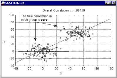
If you suspect that such a pattern may exist in your data, and you know how to identify the possible "subsets" of data, try to run the correlations separately in each subset of observations, or use the Categorized Scatterplot instead.
This example shows an extreme case; however, this and similar types of problems caused by the lack of homogeneity of the population (or the sample) tested are common and are often encountered in research practice.
Another aspect of relationships between variables that can be examined in scatterplots is curvilinearity. There are no "automatic" or easy-to-use tests to measure curvilinear relationships between variables: The standard Pearson r coefficient measures only linear relations; some nonparametric correlations such as the Spearman R can measure curvilinear relations, but not non-monotonous relations. Examining scatterplots allows one to identify the shape of relations, so that later an appropriate data transformation can be chosen to "straighten" the data or select an appropriate nonlinear equation to be fit.

See also, the Basic Statistics and Tables, Nonparametric Statistics, Multiple Regression, and Nonlinear Estimation modules.
Outliers
Another major advantage of scatterplots is that they allow one to identify "outliers" (atypical data points) that artificially increase or decrease ("bias") the correlation coefficient.
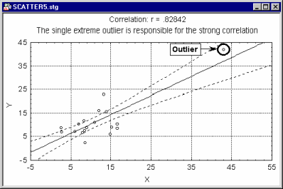
For example, a single outlier can "artificially" increase the value of a correlation between two variables to the point where it becomes highly significant. A scatterplot allows one to identify such anomalies. For example, the correlation between the two variables in the previous illustration would have been nearly 0 without the single outlier. The presence of this outlier "artificially" increases the value of the correlation to a highly significant value.
In STATISTICA, the brushing tools


are particularly useful in such circumstances because they allow you to interactively remove outliers and see how the fitted function or regression line changes.